The market is in a short-term advance within a longer-term decline. The question is: has the market bottomed, and is this the beginning of a longer-term move higher, or is the advance a bear trap?
The market is at an inflection point, and a few of the indicators I will highlight here remind me of a coiled spring. Meaning stocks are poised to move decisively either up or down in the near term.
Below is a chart of the S&P 500, and while the recent move higher has advanced decisively above resistance, the trend is still down if you are looking at the big moves. In addition, the index is below its 200-day moving average, and that average is trending down. Overall, a bearish chart.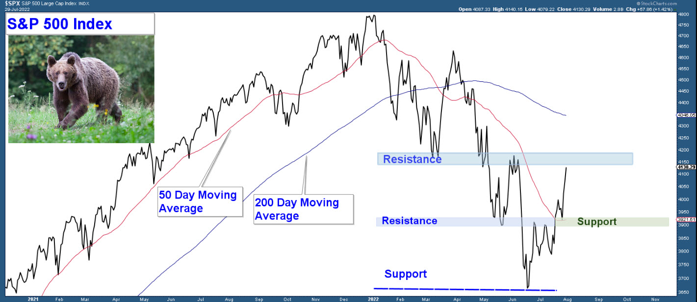
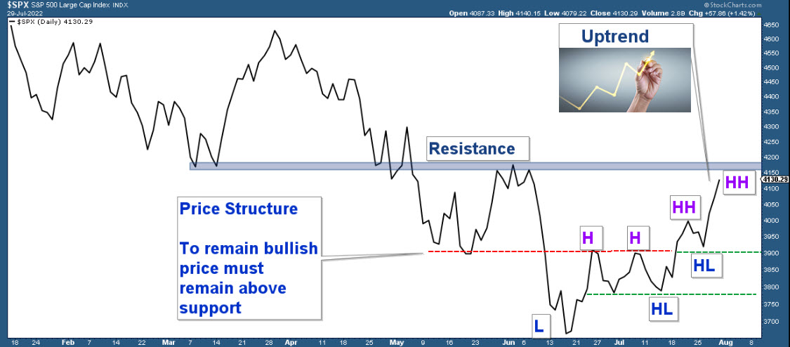
Now, let’s narrow our focus on the recent bounce off the June lows. Again, the advance did move decisively above resistance, and that resistance is now support. This is bullish price behavior.
Also bullish is the fact that you now have a structural uptrend which is defined by a series of higher highs (HH) and higher lows (HL).
Here is what to watch for in the coming weeks.
- Bullish Scenario: The index is right under resistance. A decisive move above this area would suggest market strength and have bullish broad market implications.
- Bearish Scenario: The index falls below support, suggesting market weakness and increased odds of the market falling to new bear market lows.
In summary, a move above resistance would be bullish, and a drop below support bearish.
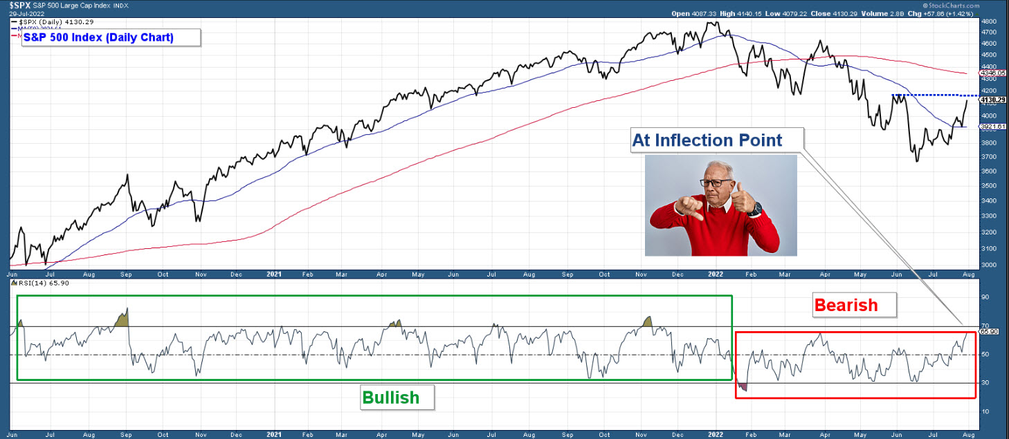
Below is a longer-term chart of the S&P 500 in the upper panel and RSI 14 (a momentum indicator) in the bottom panel.
During bullish market environments, you typically see RSI oscillate between 100 and 30. And during bearish market environments, the indicator will oscillate between 70 and 0. Notice the frequent moves above 70 during last year’s move higher. Then look at the move below 30 that occurred at the beginning of this year. This was a warning that the market environment had changed from bullish to bearish.
Now, look at where RSI is currently. The recent move higher has taken RSI to 65.9. It is just under that dividing line (70). A move above 70 would signal a bullish market environment. Thus, based on this measure, the market is at an inflection point.
One of two things could happen from here. (1)The market moves strongly higher and RSI advances above 70, signaling a new bull market. (2) This higher move is just a bear trap, and RSI suggests that the market is now overbought within a bearish market environment. If this is the case, then I would expect a strong move lower in the coming weeks. Being overbought and sitting under resistance would be a perfect setup for a strong move lower.
Which scenario will play out?
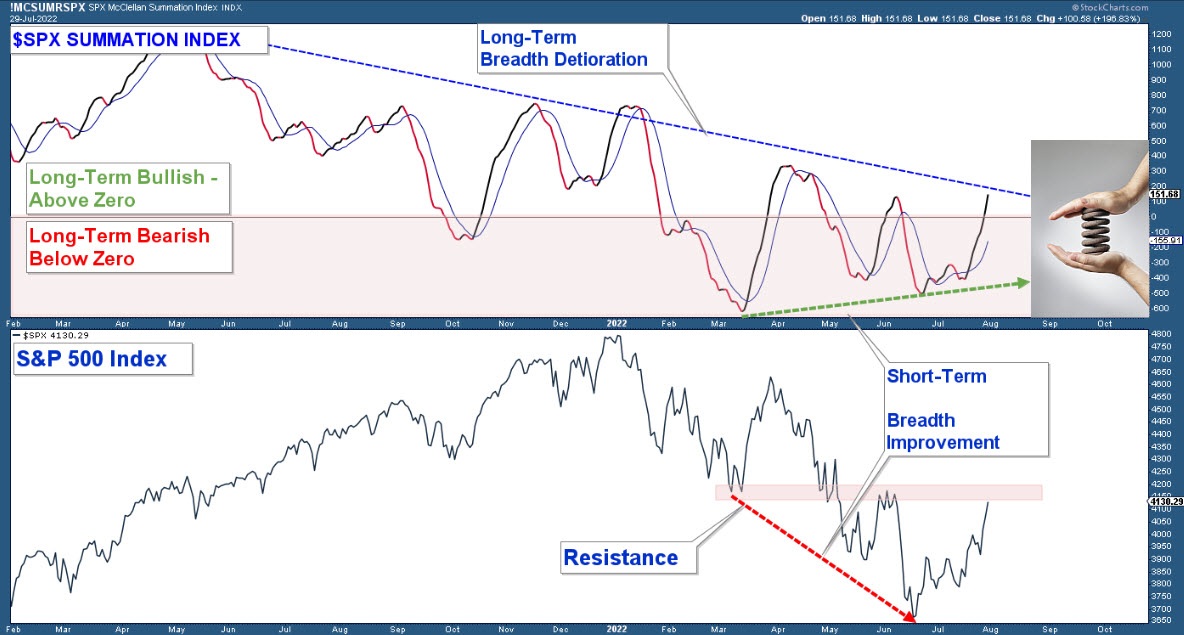
One of my favorite market breadth indicators is the Summation Index which is in the upper panel, and in the lower panel is a chart of the S&P 500 Index. Here are my takeaways from the chart.
- The Summation Index has been trending lower since May of last year. This suggests market breadth deterioration and was a signal that the advance in the market last year was occurring on deteriorating breadth. That move lower has continued in that the series of highs keep occurring lower than the previous highs.
- Now, look at how the index has behaved over the past 5 months. The lows are actually rising, as I have highlighted with the green dashed line, while the S&P 500 has fallen. This is a positive divergence and suggests some short-term breadth strength.
- The index is compressing like a coiled spring between a series of lower highs and rising lows. Also, the index is slightly above zero, which I view as the dividing line between longer-term bullish and bearish market environments.
I believe the Summation Index is displaying long-term weakness and short-term strength. This dynamic has the index coiled like a spring. How this compression resolves itself will offer valuable clues as to the overall strength or weakness of the stock market.
One characteristic of a major bear market decline is fear. This sentiment can be charted using the VIX, which is in the lower panel. When the VIX is rising, it indicates an increase in fear.
The VIX has been rising (red line) since November of last year, which is what you would expect in a bear market correction. However, over the past four months, the VIX keeps topping out at 30 even though the S&P 500 has made a series of lower lows. Like the Summation Index, the VIX is compressing like a coiled spring.
I see one of two things happening from here. (1) Either the VIX falls below the uptrending red line indicating a lack of fear as investors bid up equities. Or (2) the VIX bounces here like it has done previously and advances strongly above the 30 levels confirming the market’s next big move to new lows.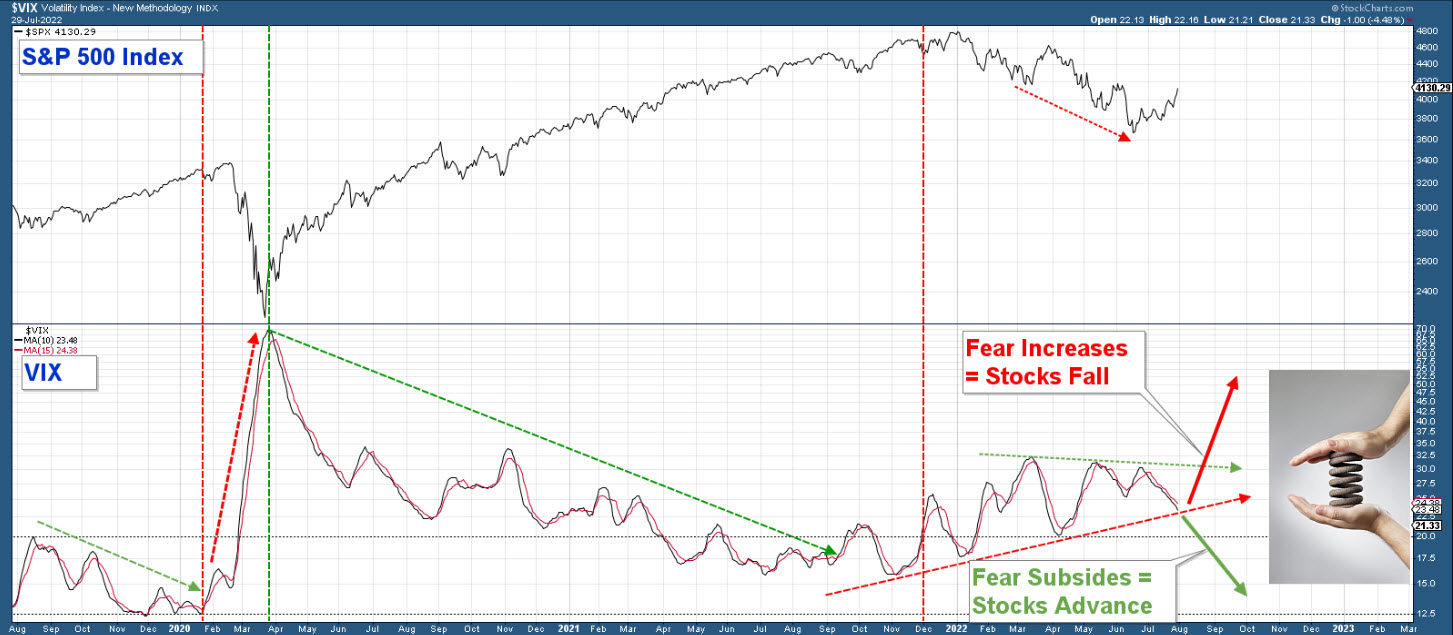
One industry group that I will be watching closely is the Semis. Below is an hourly chart of the iShares Semiconductor ETF (NASDAQ:SOXX)) with TC 2000’s proprietary volume indicator, Time Segmented Volume (TSV), in the lower panel.
Notice the negative divergences that preceded the last two down legs in the chart. Now, look at the current major negative divergence. TSV has fallen hard and is sitting right above zero as the index has made a new high.
If Semi’s fall decisively here, then the broader market is likely to fall, the VIX is going to rise, and the Summation Index is likely to fall back below zero. All of this would signal that this recent advance was nothing more than a bear trap and that markets are likely to fall to new bear market lows.
The move in Semis over the next couple of weeks could be our early warning signal for the market’s next big move.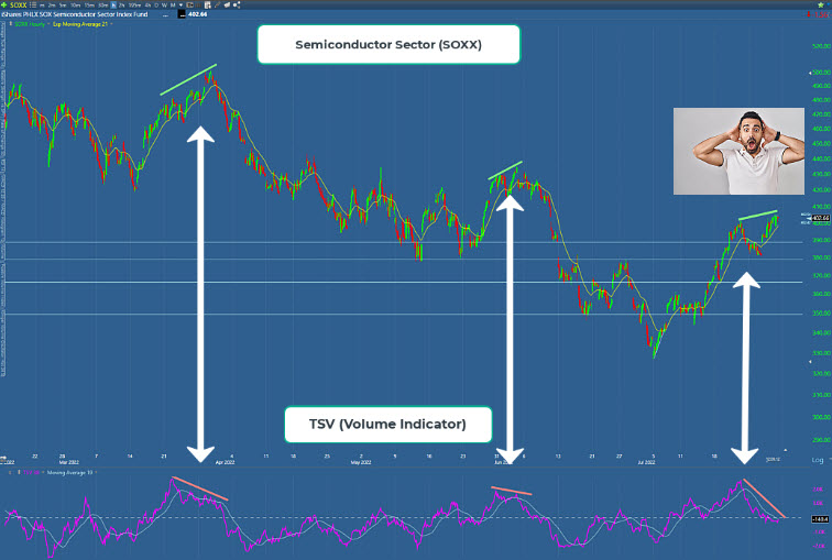
The stage is set. The battle between the bulls and bears has reached an inflection point. Can short-term strength garner enough force in the coming weeks to turn the tide?
Get your popcorn. Things could get interesting.
