This week: technicals check, Fed fun, President precedents, earnings enthusiasm, bond sentiment, equity risk premium, CEO turnover, volatility, diamonds, wine.
Learnings and conclusions from this week’s charts:
-
The 4% selloff has some “healthy correction” hallmarks.
-
Slower/no more rate cuts from here might be a good thing.
-
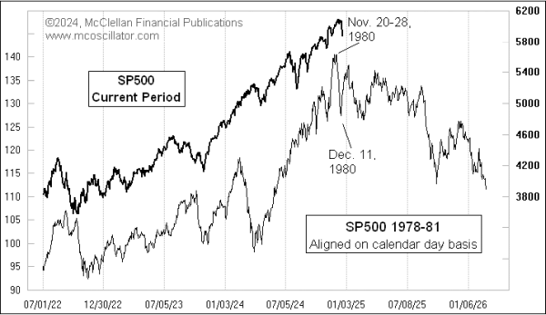
There are some concerning parallels to the early-1980’s.
-
CEO turnover has been surging (something sinister?).
-
Diamonds and Fine Wine prices have been slumping.
Overall, it’s a bit of a mixed bag, there’s signs that the recent selloff is just a healthy correction and that the disappointment around the latest Fed meeting is maybe short-sighted. But then we also need to think about the negative forward-looking equity risk premium and excess enthusiasm on stocks — particularly in the face of a historical President precedent (early-1980s analog). Plenty of food for thought this week in the charts (especially the bonus chart section given the festive season!).
1. Technical Check
Following the peak a couple of weeks ago, the S&P 500 has pulled back just over 4% now — as far as corrections go that’s a small selloff so far. What might make us call it a “healthy correction” would be the thus far successful test of the 50-day moving average (the index only briefly dipped below it, now rebounding), and the washout in 50-day moving average breadth to oversold levels. Kind of looks like a routine selloff.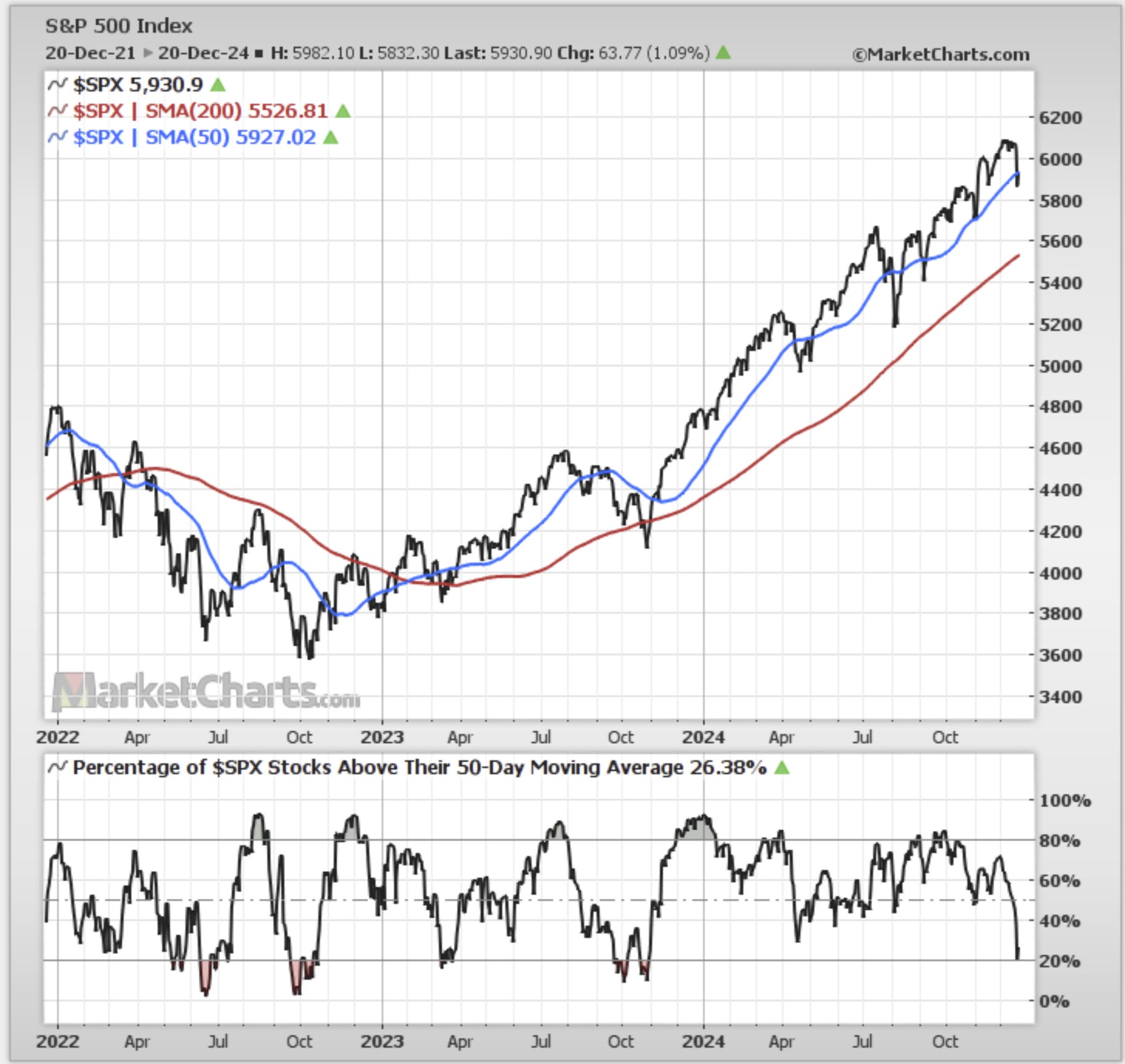
Source: MarketCharts
2. Fed Fun
We’re now just over 3 months and 3 cuts into this rate-cut cycle. If the Fed settles into a slower tempo from here it could be a good case for a slow cycle which is typically actually good for stocks. Moving into a faster tempo would probably be less good, but to be fair that would probably reflect a worse macro backdrop and wider bad things.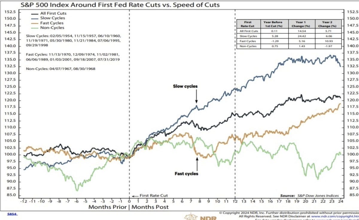
Source: @edclissold via @saxena_puru
3. Short Cuts
Meanwhile, if this is basically it for the Fed on rate cuts, i.e. a brief, small, short flurry of cuts, then the outlook for stocks would be on average fairly decent, volatile but upward-sloping. Of course, it should be noted the exceptions in this chart (the 2 instances down the bottom right) were 1969 (recession) and 1976 (inflation resurgence) — which is a reminder to not let anyone ever tell you that the macro doesn’t matter!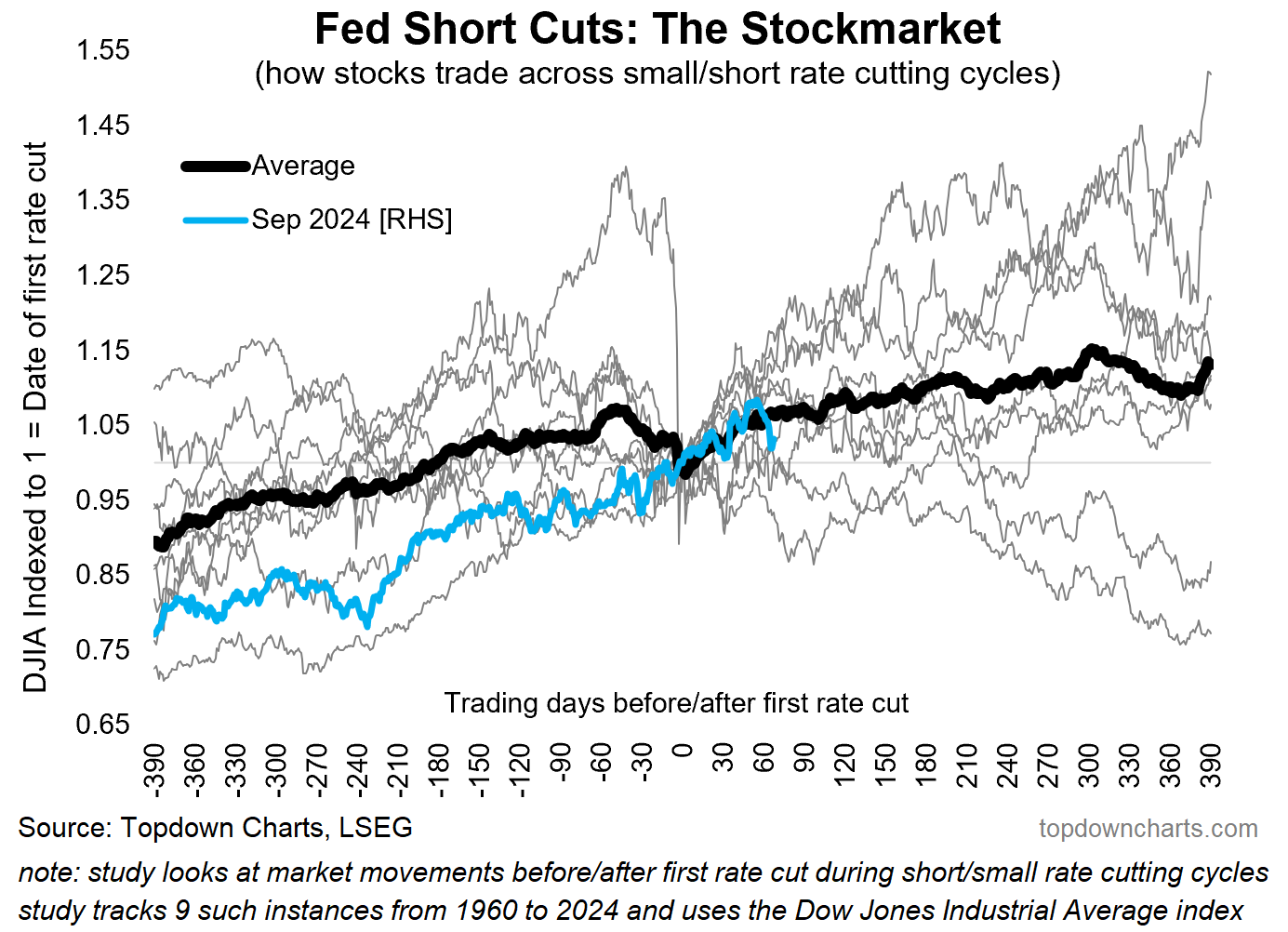
Source: Fed Short/Small Rate Cut Cycles Analysis
4. Reaganomics Analog
Looks like things are largely running to script here (as always though be careful with analogs), and perhaps for good reasons as the present arguably echoes the past:
“Reagan's victory [in 1980] was both anticipated and celebrated by Wall Street, as he was seen as a "transformative" candidate with the promise of solving all of the problems which faced the country then. And Reagan arguably was a transformative president, but the first two years were not a pleasant time to be a stock investor”
Source: Tom McClellan
5. Trump Act I vs Act II — Consensus Earnings Outlook
One thing very closely linked to the previous chart that I keep coming back to is the contrast between now vs when Trump was first elected. Back then, consensus estimates among Wall Street analysts for long-term earnings growth was just turning up from some of the worst sentiment on record.
Now? It’s at one of the highest readings as AI hype sweeps across a bullish crowd. Arguably sentiment and expectations were too glum back then, and too overhyped now. This means any bullish expectations around the second coming of Trump are going to face a high hurdle and we may well need to go through a cathartic period just like the early days of the Reagan administration.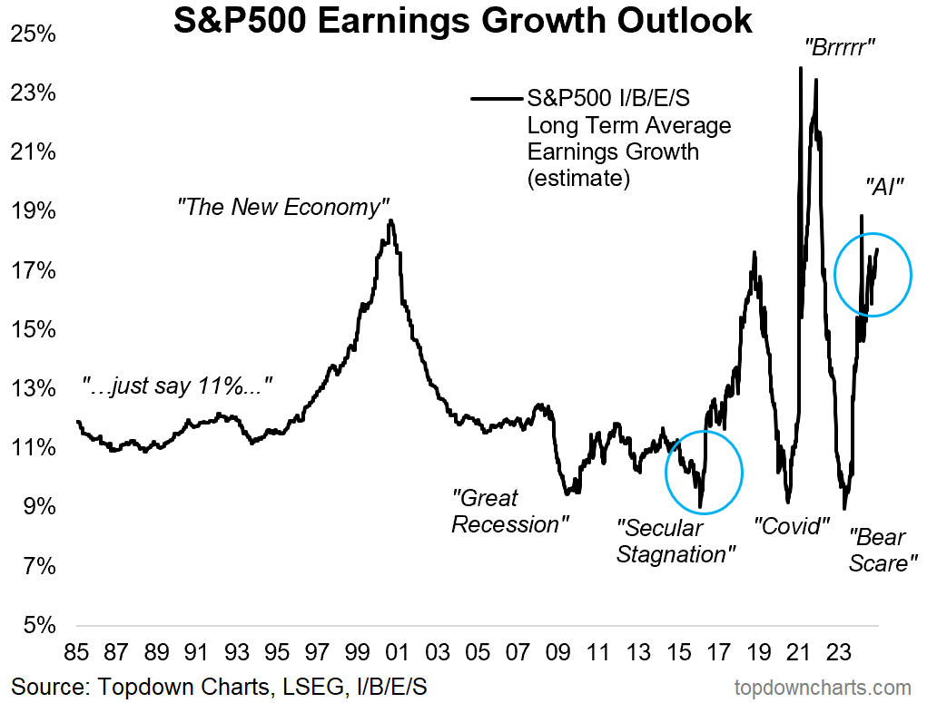
Source: Topdown Charts
6. Treasuries
While sentiment is riding high on stocks, the same can not be said about treasuries, and we’ve just had another washout in bond market sentiment.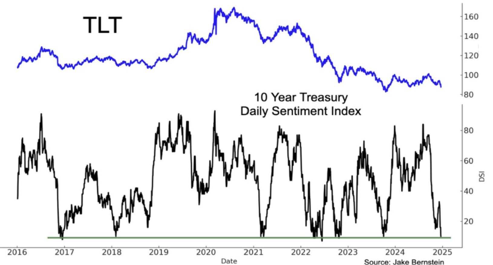
Source: @subutrade SubuTrade
7. Expected Equity Risk Premium
Indeed, whereas stocks face ample scope for disappointment, bonds face ample scope for upside surprise. The longer-term expected returns outputs imply a negative equity risk premium in the coming years — a stark contrast to the last few years where bonds have been stuck in bear market vs stocks going from bull to bull. This is not a consensus view, certainly not in recency-bias retail land.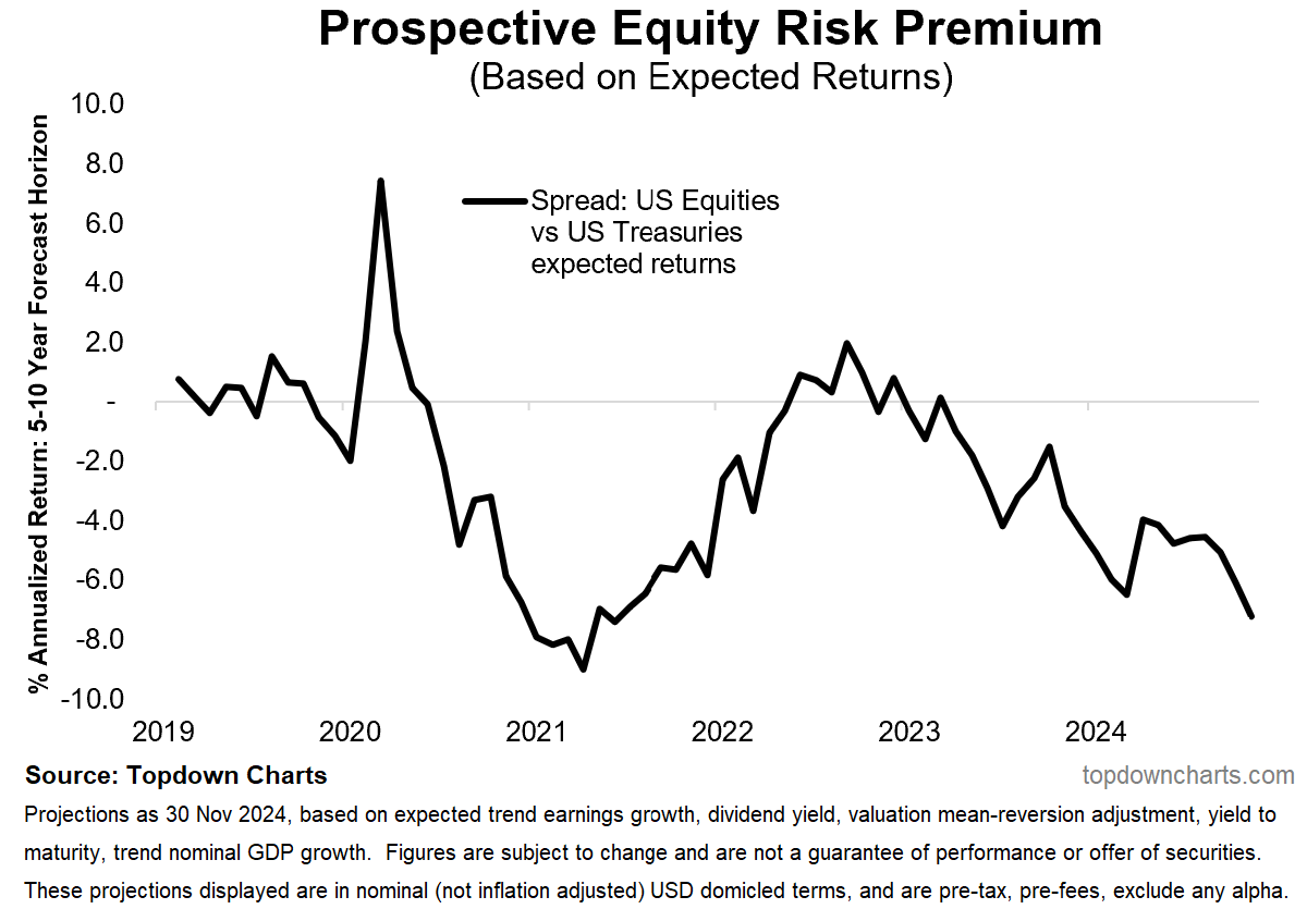
Source: Chart of the Week - The Prospective ERP
8. CEO Turnover
This is a curious chart, “A record 1,824 CEOs have exited in 2024, up 19% from last year. Reasons include stepping into advisory roles (506), retirement (405), or no reason given (470)” — I can’t help but think maybe some of these are folk trying to cash out at the top, or perhaps more a reflection of pretty much all stocks ex-tech turning in sluggish performance (e.g. US earnings ex-tech have been stagnant/sideways for the past few years).
It seems unlikely that retirement is surging as a main reason but then we should expect some uplift in retirements (and there is evidence of that in the labor market data). It does mark a shift from the pace seen in recent years and certainly makes me think. Might need to dig into this further…
