This week in the sentiment snapshot I take a look at volatility. For context, in the sentiment snapshot series I look at some of the charts from the weekly survey on Twitter, which asks respondents to indicate whether they are bullish or bearish for primarily technical or fundamental rationale. On that note, the overall net-bullish sentiment has now made almost a full recovery so it leads us into a question of whether this is well-placed optimism... which leads into a series of charts on the VIX and volatility.
The key takeaways from the weekly sentiment snapshot are:
- Net bullish sentiment recovered to the strongest point since the correction began, with fundamentals sentiment reaching a new high.
- Sentiment has diverged from the VIX to the bullish side.
- Volatility is likely to stay higher from here, but with a positive fundamentals backdrop it may well be the more virtuous form of volatility.
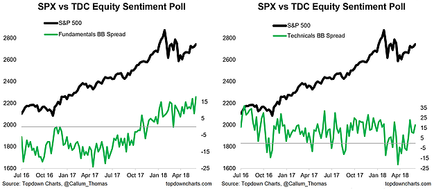
1. Equity Sentiment - Fundamentals vs Technicals: A new survey high was reached this week for "fundamentals" net-bullish equity sentiment. This along with a tick up in technicals sentiment has brought the overall net-bulls to an almost full recovery since the correction began (more about that in the next chart). On the all important question of whether we see a new high in the S&P 500 this year, it's all going to come down to the fundamentals i.e. the earning/macro pulse, and that there is such optimism on the fundamentals is a positive sign in this respect. Albeit my inner contrarian is saying 'hmmm'...
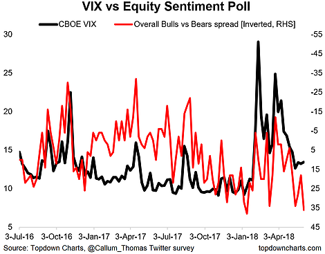
2. Overall Bulls-Bears vs the CBOE VIX: The next chart shows overall bulls vs bears (inverted) against the CBOE S&P 500 VIX. There has been an interesting transition in this chart. Back in 2016 it seemed to move in lockstep with the VIX, but then decoupled in 2017—generally implying a higher level of the VIX or more bearish than what the VIX implied. But now you might argue that survey respondents have swung the other way to being too optimistic vs the still elevated VIX. It's a cliché saying, but: one of these is wrong...
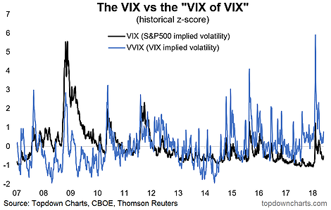
3. The VIX vs the V-VIX (Volatility of Volatility): Continuing with the 'one of these is wrong' theme, this chart shows the z-score of the VIX and the VVIX (implied volatility of the implied volatility index). A gap is starting to open up again between these two, and I would point out that the last time a gap like this began to open up it proved prescient for one of the largest VIX spikes in recent years. Could just be noise between two very noisy series, but one worth monitoring.
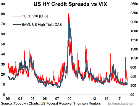
4. Credit Spreads vs the VIX: Keeping with the VIX, this chart is really key in my view, and a core contributing factor as to why I have erred on the side of optimism through the correction. Throughout the major VIX spike earlier this year, US high yield credit spreads were basically unchanged... essentially sleeping through the equity market volatility. Were we to see a matching moving in credit spreads it would have been a different story—it speaks again to the fundamentals picture, which remains intact for now.
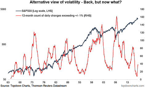
5. An Alternative Measure of Stock Market Volatility: But that is not to say that the return of volatility is over. This chart shows an alternative view of stock market volatility—the rolling 12-month sum of daily percentage moves exceeding +/- 1%. The bottom line is that it has sharply turned the corner from a more than 50-year low. Historically when this indicator turns up, it tends to keep going.
If this is a late-90's scenario that could mean a virtuous rise in volatility, but if it is more of a pre-financial crisis scenario that would mean a more sinister rise in volatility. As I've mentioned previously, I expect volatility to be generally higher from this point on in the cycle as the global monetary policy tides have turned. I'm not flagging a bear market just yet, but the game has clearly changed at this point.
