On a normal day, over the past six years, it was easy to find a bearish story on the stock market. Even though the trend over most of that period was solidly higher. So you can imagine that during the last six months—with the broad markets moving mainly sideways—the bearish rhetoric has gotten louder. Yes there are signs that point to a top, just not in the actual index prices yet. So that debate will continue.
But one spot where there is no debate about where prices are going is in the semiconductor sector. It's going nowhere but up.
I first used these two charts back in January to talk about the long term implications for the Philadelphia Semiconductor Index, the SOX. Today, the story remains the same.

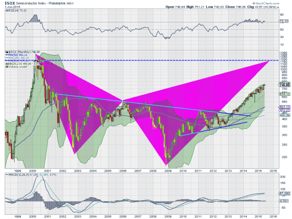
The monthly chart above shows the breakout on the SOX over 2013 and its continuation, the harmonic Bat pattern that targets a move to 1175 before a reversal. The RSI is still on track, bullish and floating along at the 70 level. The MACD is also continuing its slow rise. Finally the Bollinger Bands® are driving higher along with the price. But the monthly timeframe may be a bit long for some traders and investors in this market.

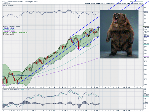
Looking at the weekly chart you can see why the bears are getting so mean. The SOX is sticking that Andrew’s Pitchfork right in their eyes. The bump in the road in the back half of 2014 is nothing but a distant memory now as the index rises along the Median Line of the Pitchfork. And with the MACD crossing up and rising while the RSI is bullish and rising, you have to wonder if whoever is holding that Pitchfork is laughing at the bears as they scream.
Disclosure: The information in this blog post represents my own opinions and does not contain a recommendation for any particular security or investment. I or my affiliates may hold positions or other interests in securities mentioned in the Blog, please see my Disclaimer page for my full disclaimer.
