It’s not hard to throw a rock and find a piece of pessimistic data or commentary that will feed an equity bear's appetite. I know my personal bias is to lean more cautious when evaluating the markets, but when the data that I rely on is telling me something different, I must respect what it's showing. Which brings me to the market’s breadth, specifically the Advance-Decline Line, which has confirmed the recent strength in U.S. equities.
We can take this breadth analysis a step further by looking at the individual sectors, and seeing if the strength in the broad market’s breadth is relying heavily on just a few sectors or if strength is stretched across the entire market. Below I have listed the nine S&P 500 sectors using only price data (not adjusting for dividends) and their respective Advance-Decline Lines. The Advance-Decline Line simply adds and subtracts the number of stocks going up and down in a cumulative total. If more stocks are rising, the line will rise -- and vice versa when more stocks are declining. I use this type of indicator to understand if there’s support for an underlying price movement. If a market or ETF breaks out, I prefer to see broad participation by the underlying stocks.
Materials
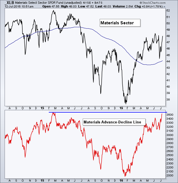
While the sector itself is still nearly 8% off its high, its respective Advance-Decline (A-D) Line is already nearly back to its prior high.
Energy
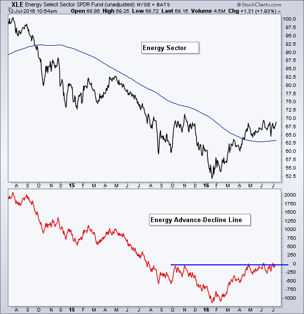
While the energy sector is still in a down trend of lower highs and lower lows, it’s breadth has improved somewhat as it advances with price to challenge its prior high.
Financials
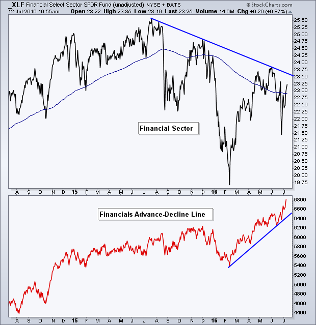
Financials have been one of the worst-performing sectors YTD, largely due to the declining yield curve. However, when looking at the performance of the individual financial names, XLF's A-D Line is already at a new high.
Industrials
When taking into account dividends, XLI is already at a new high. But when looking at just price, it still sits a few cents under its 2015 peak. But once again, the sector’s breadth measurement has already set a new high. 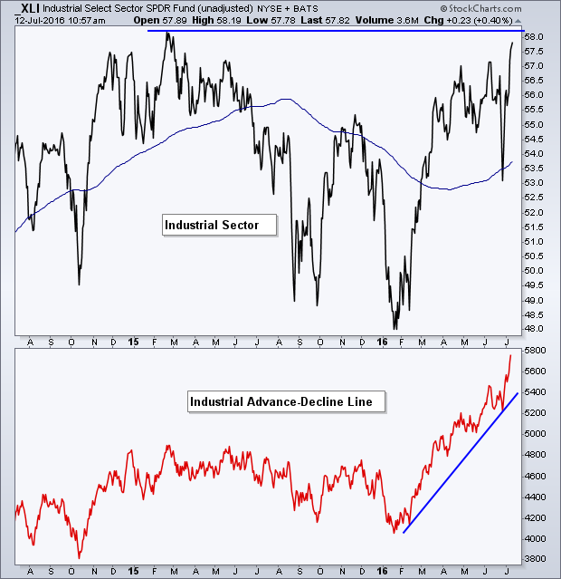
Technology
Tech is right at its 2016 high and is just itching to breakout; and so far it has the full support of its A-D Line as it broke its April ’16 high back in June.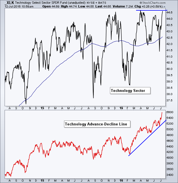
Consumer Staples
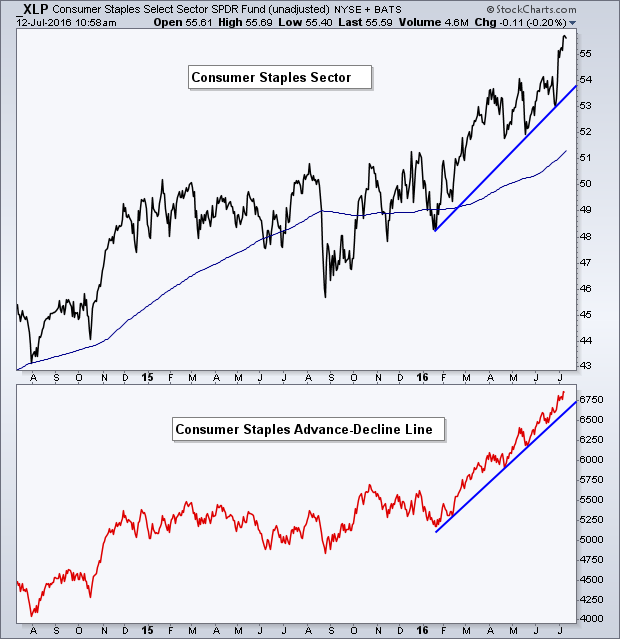
XLP has been in a clear up trend as it makes new highs in price for the bulk of the last year. What about its Advance-Decline Line? Yep, right there with it as it marches higher.
Utilities
XLU has been one of the stronger-performing sectors YTD, clearing its 2015 high back in May. It’s A-D Line has created almost a straight line higher as individual utility names retain their up trends.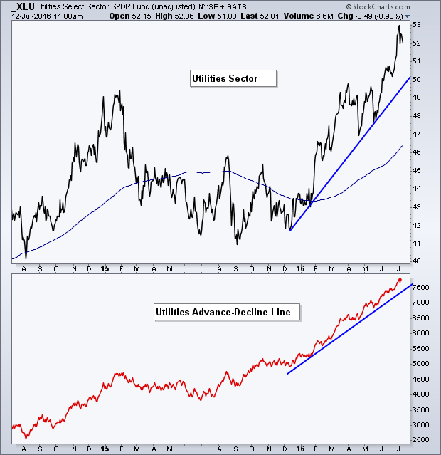
Health Care
The health-care sector still sits below its high but has recently broken above a level of resistance around $73. The A-D Line for the sector has been leading price higher, having already made a new high.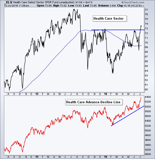
Consumer Discretionary
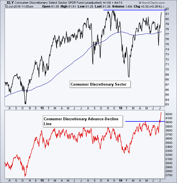
The consumer discretionary sector is just under its prior high but its breadth has already broken out.
As you can see, from a breadth perspective using the sector’s individual Advance-Decline Lines, the market appears to be much healthier than what the macro economists would lead you to believe. I understand profit margins are contracting, margin debt is high, Europe is falling apart but there is a difference between economies and markets, and we’re seeing a clear separation when looking at the major nine S&P sectors and their respective breadth indicators.
While it’s possible we see the market digest these gains and see some type of back-filling, it’s hard to argue that the current up trend is anything but strong based on the underlying breadth strength in the S&P sectors.

