The following four 3-Year Daily charts show the relative strength/weakness of the S&P 500 compared with the MSCI world stock Index.
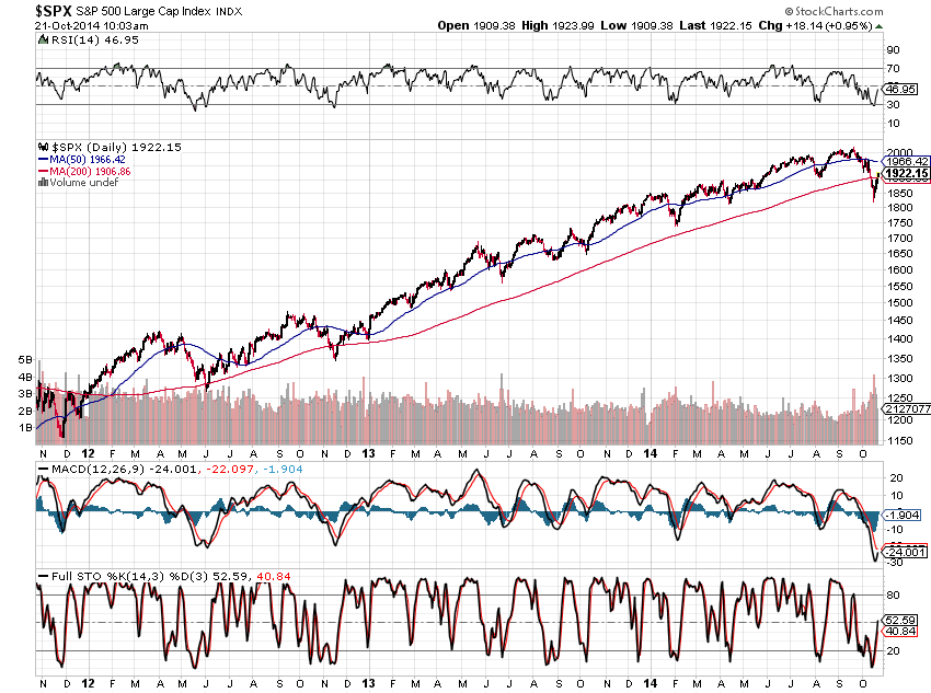
Chart #1 shows a fairly steady climb of the S&P 500 during the past three years. Recent action in October has put in a lower low and broken the uptrend on this daily timeframe. Lower lows have also been made in all three indicators (RSI, MACD & Stochastics)...hinting of further weakness ahead.
 |
| CHART #1 |
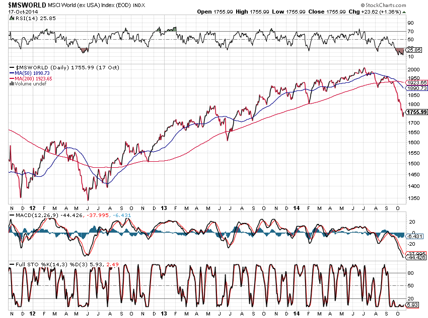
Chart #2 shows a more difficult climb of the WORLD Index once it broke above major resistance in January of 2013. This market topped out in July of this year, lost all of its 2014 gains, along with much of its 2013 gains, and hasn't yet recovered.
 |
| CHART #2 |
It's hard to imagine that the S&P 500 will operate under smooth, believable (realistic), and sustainable bullish conditions during the balance of this year and into next if conditions continue to deteriorate in the WORLD Index.
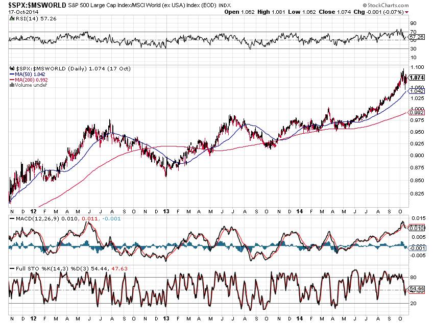
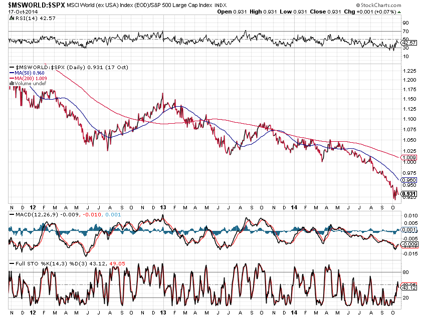
In this regard, watch for any strengthening of the WORLD Index versus the S&P 500 over the coming days/weeks...or continued weakness...as depicted on the following two ratio charts of S&P 500:WORLD and WORLD:S&P 500.
No confirmation of a turnaround is indicated yet for the WORLD Index (see Chart #4) as the RSI and Stochastics Indicators are still below the 50% level; however, the MACD has crossed up and the MACD Histogram is above zero...hinting of a possible slowdown in its decline.
 |
| CHART #3 |
 |
| CHART #4 |
