Bad Hair Days Are Back
We recently discussed the many divergences between major US indexes, which led us to expect that a downturn in the stock market was close (see The Calm Before the Storm for details). Here is an update of the comparison chart we showed at the time:
The divergences between various indexes seem to be resolving as expected.
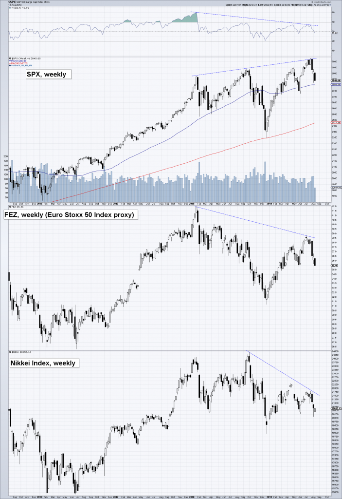
The next chart shows analogous divergences between the S&P 500 Index and two major foreign stock markets:

US stocks have diverged from European and Japanese stocks as well.
Sometimes an increase in market volatility does not mean much – but when it happens at a time when the market is trading at extremely high valuations, money supply growth has been low for quite some time and leading economic indicators are weakening, it can be a major warning sign. There are also other reasons to suspect that the recent market upheaval is likely to be of more than just short term significance.
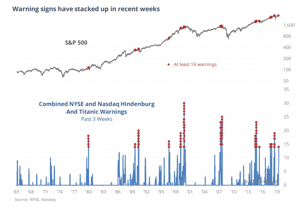
For one thing, there has been a cluster of “Hindenburg Omens” and “Titanic Syndromes” recently. Both are indicative of a growing lack of trend uniformity and weakening market internals. A brief explanation: the Hindenburg Omen is a sell signal that occurs when new highs and new lows each exceed 2.8% of advances plus declines on the same day. The Titanic Syndrome is triggered when 52-week lows outnumber 52-week highs within seven days of an all-time high in the index concerned.

A cluster of Hindenburg Omens and Titanic Syndromes, via sentimentrader
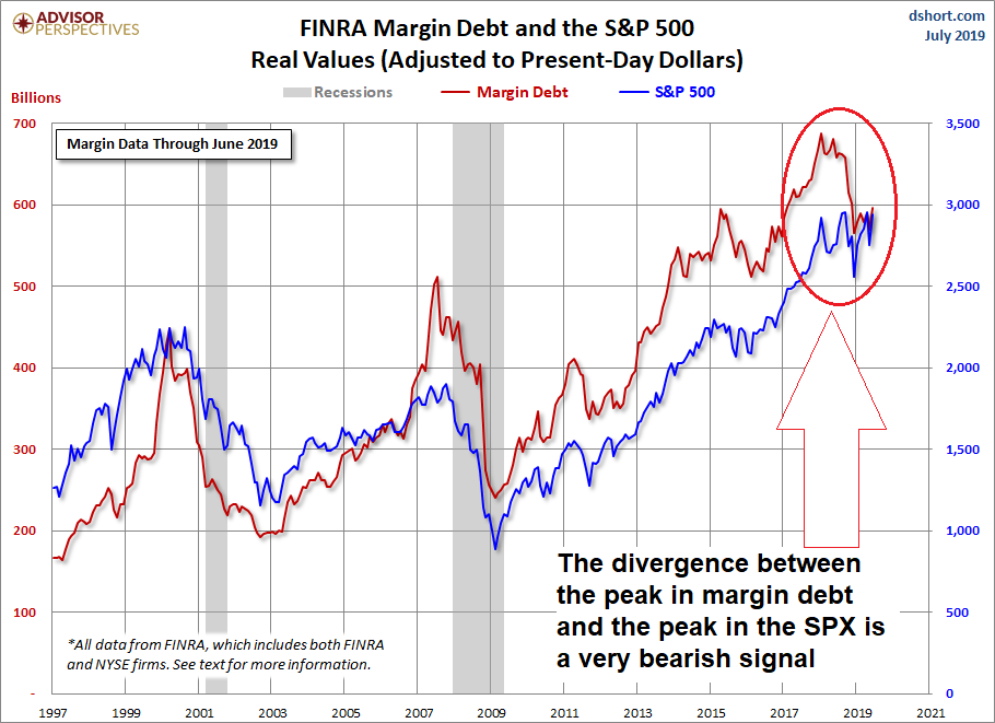
For another thing, margin debt has actually peaked several months ago, long before the stock market reached its recent high. This often tends to happen near major turning points in the market, although it does not always happen: e.g. in 1937 and 1973 the peak in margin debt actually lagged the peak in stock prices. Still, it definitely happens more often than not.

Margin debt and the S&P 500 Index – peaks in margin debt tend to lead major stock market tops.
None of this guarantees a specific outcome – but the probabilities are definitely not stacked in favor of the bulls at the moment.
Addendum – A Chart to Keep People Awake at Night
Below is a weekly chart of the Euro Stoxx Bank Index. The index is currently challenging a long term support level that was first put in at the height of the euro area debt crisis in late 2011. The sense of urgency and panic that was palpable at the time is conspicuously absent at present – which actually increases the likelihood that the support level will break. Needless to say, that would not be good. In fact, it would probably be doubleplus-ungood.

Euro Stoxx Bank Index – something seems to be very wrong with European banks… bondholders and depositors probably have good reason to be apprehensive.
