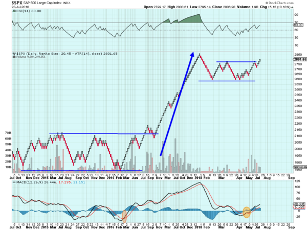
Not everyone is a day trader. Even those that sit and watch screens every day all day long need a break. And a different perspective. Renko charts can give that. Kind of a combination of Point and Figure charts and candlestick charts, Renko charts cut out a lot of the noise but stay close to the short term trend changes. Each brick builds either up or down only when a significant amount of change has occurred like Point and Figure charts. And also like Point and Figure charts time is much less important to the chart.
In this way I like to think of the bricks like Lego® pieces. Not today’s Lego where you buy a model of Falling Water and build it step by step with specialized pieces, but the Lego of my childhood, a bucket of different sized pieces that you used your imagination to put together. The Renko chart below of the S&P 500 shows you would have done pretty well following it over the last 4 years.

Four intermediate trends in consolidation before the long trend higher beginning in November 2016. It caught the pullback as early as the first week of February and the current consolidation. Now it is also showing a breakout to the upside with a new trend that started at the beginning of July. I will not add a Technical Analysis overlay on top and give you an outrageous target to the upside. All you need to know with Renko is that it is rising.
The information in this blog post represents my own opinions and does not contain a recommendation for any particular security or investment. I or my affiliates may hold positions or other interests in securities mentioned in the Blog, please see my Disclaimer page for my full disclaimer.
