There is always a lot of noise in the markets. Fear and greed working against each other create the market and both sides are vocal in their reasoning for their positioning. This time of year the noise level gets ramped up. It starts with the Jewish holidays, and the adage “Sell Rosh Hashanah, buy Yom Kippur” and then turns to the fear that lingers about October, a legacy of the 1929 and 1987 crashes. My friend Josh Brown hit the nail on the head this morning with just 2 tweets.
With that backdrop it seems a good time to pull back from the day to day and see what is going on. And the picture is actually quite good.
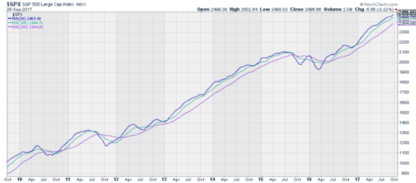
The chart below shows the S&P 500 over the last 8 years. It does not show the actual price of the Index though. Instead it shows three simple moving averages: the 50, 100 and 200 day moving averages. Look what it is telling you.

There are two periods of noise worth reviewing. The dip in the 50 day SMA in 2011 coincides with the first correction in the S&P 500 since the Financial Crisis. It dropped below the 100 and 200 day SMA and got tangled in them for nearly 6 months. the second is the period from late 2015 into 2016. Again the 50 day SMA moved lower and tangled itself in the other SMA’s. During this timeframe the S&P 500 corrected through time.
But what else is this chart telling you? Following both of those periods the SMA’s have moved steadily higher, not quite in parallel but close to it. This is continuing today. There is no imminent risk of a downturn in this chart. While it is always prudent to manage the risk in your account, the biggest risk is usually deciding to not be involved. There are times when not being involved in the market looks like a wise decision, but this does not appear to be one of them.
The information in this blog post represents my own opinions and does not contain a recommendation for any particular security or investment. I or my affiliates may hold positions or other interests in securities mentioned in the Blog, please see my Disclaimer page for my full disclaimer.
