As a reminder, SlopeCharts has the ability to present charts based on combining symbols, modified with any mathematical mutations you might like. Below I am showing three simple ratio charts, each of which is pretty interesting.
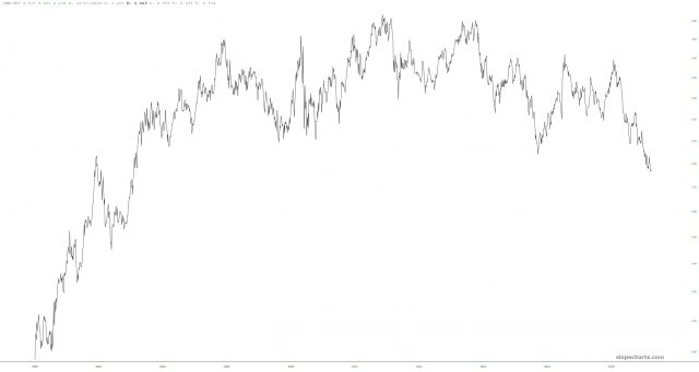
The first is IWM/SPY, which nicely shows how, over the course of many years, small caps have been losing the battle against the S&P 500. If this were an individual stock, it would look very shortable, because that is one huge inverted saucer.

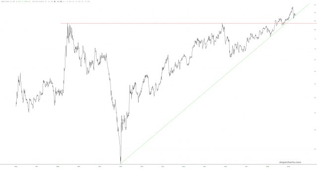
Next is GLD/SLV, which will be of interest to the precious metals crowd. Gold is manning up against silver in a big way, and once again, this ratio chart has actually created a very clean pattern.

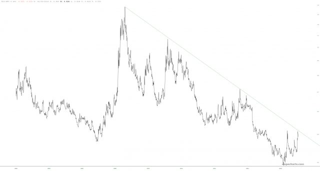
Finally, the ratio of bonds versus stocks, TLT/SPY. The trendline has shown where, historically, bonds have retreated. Maybe it’ll happen again. Or maybe not. That’s why trendlines are useful: they can help us identifying important trend changes.

