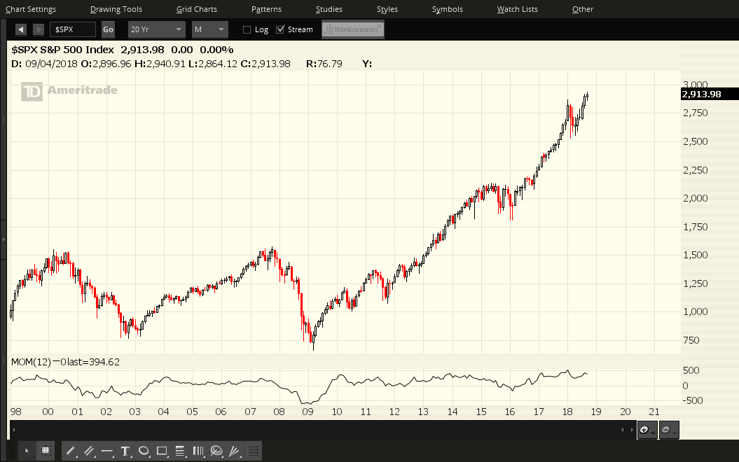
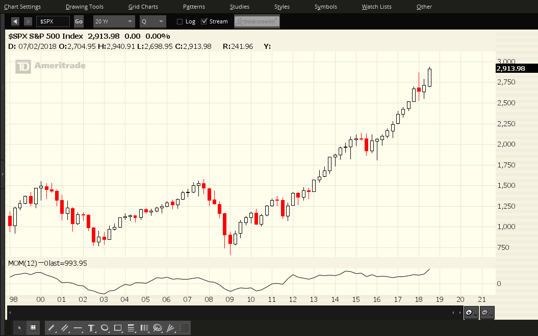
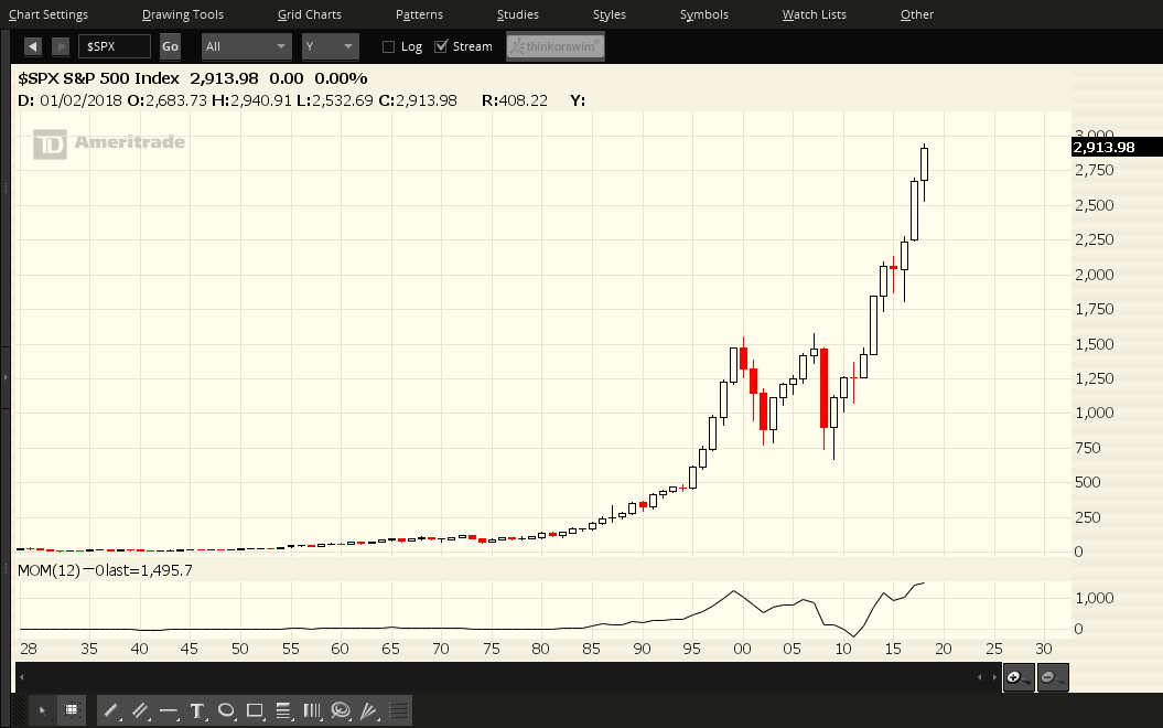
Each of the last candles on all three timeframes for the S&P 500 closed higher than its prior time-period candle.
The most notable feature of the Yearly chart, in particular, is that price could, in fact, reach a resistance target of 3033 (as I described in my post of August 6th) by the end of this year. Such a price level would end up producing a candle range for 2018 on the Yearly timeframe that equals or slightly exceeds the candle range of each of the prior two years. It would also complete a very bullish cycle for this year.
 |
 |
 |
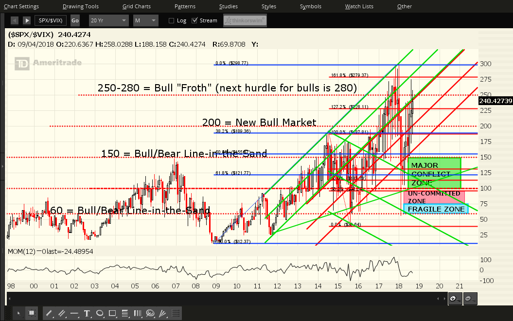
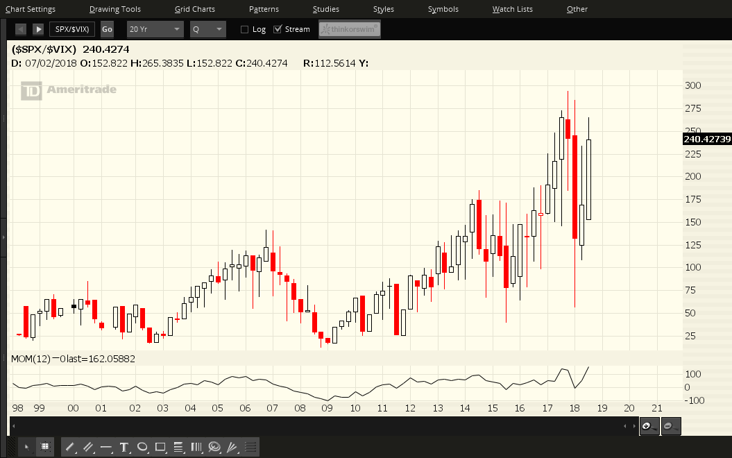
Each candle on the following three ratio charts of the SPX:VIX Ratio represents:
- a period of one month (Chart #4)
- a period of one quarter (Chart #5)
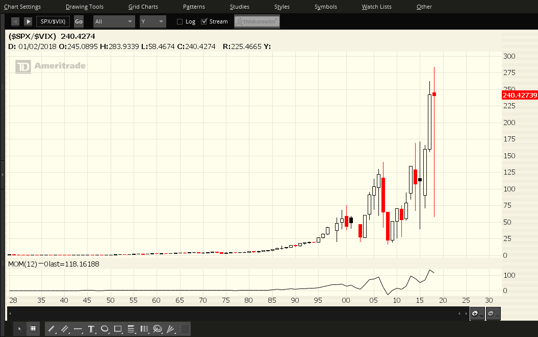
- a period of one year (Chart #6)
I've mentioned several support levels over the past year...notably 150 and 200, as shown on the Monthly timeframe. Price is slightly below the "Bull Froth" level, but is above the "New Bull Market" level of 200. 280 represents a major hurdle to be reached and overcome on this ratio.
The Yearly chart shows how volatile price action has been this year, as evidenced by the massive 2018 candle range, and by the multiple re-tests of each of the candles on the Monthly timeframe.
We may see a re-test of part of the Q3 candle for the first-to-mid part of the Q4 candle, particularly as the November 6 mid-term election draws near. However, watch for the Momentum indicator to pop back above the zero level on the Monthly timeframe to signal a fall in volatility if price does not pull back on this ratio. Such price action would set the scene for the SPX to plough ahead towards 3033, with little resistance. In this regard, it's important for it to hold above 2900 (and that the ratio hold above 200), inasmuch as what was once a major resistance level/target (as mentioned in my above-noted article) is now major support.
 |
 |

