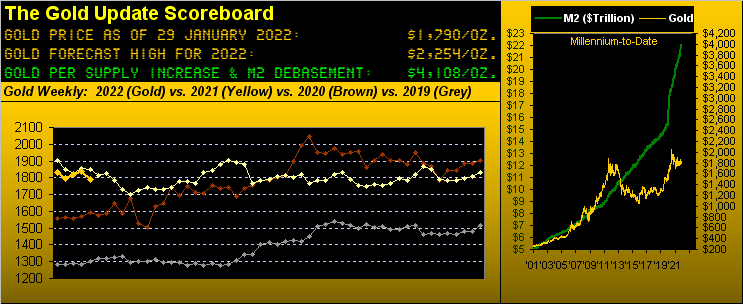
"We begin this evening with Breaking News: the U.S. Money Supply has just crossed the $22 Trillion level, its pace these last two years increasing by $1 Trillion every four months, or some $8.6 Billion per day. {You should think about that} More later on this developing story, but first, to Gold..."
This title for this week's missive is a quaint way of putting it, eh? More laid bare it could well read "Gold Harnessed, Silver Tarnished" or "Gold Whacked, Silver Shellacked!" Yet any way we couch it, the near-term technicals look terrible. We love Gold, but as the late great Howard Cosell would say, "That's tellin' it like it is!" Which is what we endeavor to do week-in and week-out.
Indeed from high-to-low since we met a week ago, Gold was kicked in the teeth to the tune of dropping 75 points (from 1854 to 1779) within last weeks final four trading days. Maintain that pace of points loss and Gold shall reach zero ("0") on 15 June of this year. (That'd be pretty terrible, just in case you're scoring at home).
Notwithstanding our cheery opening, let's go back to University and Macroeconomics 101. Doubtless you well remember that classroom: guns and butter, price stability, marginal propensity to consume, the super cute person sitting one row down to your left, economic growth, and so on.
Now fast forward and let's focus on the latter—economic growth—given this past Thursday's first peek at Q4's annualized pace of the Gross Domestic Product ("GDP" +6.9%) relative to its Chain Deflator ("CD" +6.9%). Recall from your class Professor Iamecon's formula to calculate Real Growth ("RG"):
■ GDP - CD = RG ... thus for Q4: 6.9% - 6.9% = 0.0%
Moreover, the Federal Reserve's favorite gauge of inflation—Core Personal Consumption Expenditures—after having been +0.5% for both October and November, stayed the course with another +0.5% for December. Annualizing such consistent increases gives us +6.0%, basically bang-in-line with the Chain Deflator.
Thus as outlined two missives ago, the StateSide economy—rather than "really" growing—is stagflating. And you regular readers shall also recall: during such scenario historically, the price of Gold has skyrocketed.
But given the paradigm of today wherein Gold ownership has been relegated to the Old Timers' League, price performance—rather than a firework—is but a fizzling dud. That's right, Bud. These days, folks we encounter under the age of 50 laugh when we speak of Gold: none of them own it, nor have they any intention to so do, (until they pony up to buy it upon price being beyond 10,000). Either way, today's road to wealth—rather than paved with yellow bricks—is littered with shiny objects. So be it until it isn't.
"Well again, mmb, there's also all that dollar strength..."
As discombobulated as 'tis Squire, the Dollar is refuting any and all things learned back at University in Professor Iamecon's Macroeconomics classroom. For today's axiom is: the more there is of something, the more 'tis worth. The numbers prove it just across these past two years:
■ U.S. Money Supply ("M2") on 03 January 2020: $15.5 trillion; Dollar Index: 96.521
■ U.S. Money Supply today on 29 January 2022: $22.1 trillion; Dollar Index: 97.215
That's right: M2 in just two years has increased a staggering +43%; but nonetheless, the Dollar Index now is higher too. (Write to University to request your course tuition refund).
Thus as titled, technically for Gold it now looks terrible. Per the following chart of Gold's weekly bars from a year ago-to-date, the parabolic Long trend denoted by the rightmost series of blue dots is about to flip Short: price need merely trade below 1779 in the new week and it seals the deal. With Gold having settled Friday at 1790 and the expected weekly trading range now 49 points, the normal price flutter alone shall make it so. Yes Bunky that's right: get ready at minimum for the annoying perma-price of 1780 all over again:
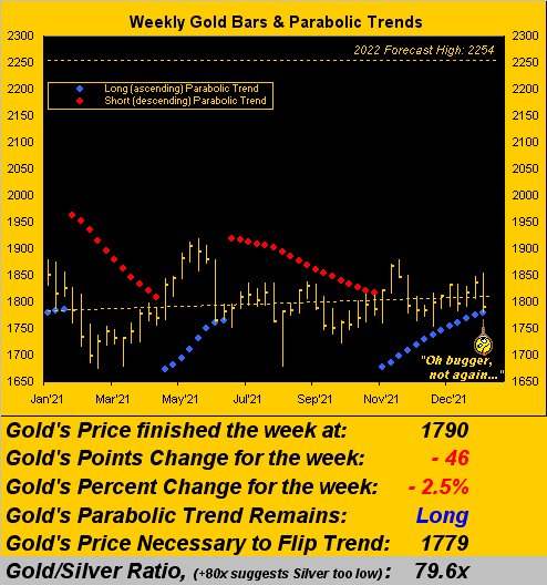
Further, 'tis not just our deMeadville analytics that look lousy for Gold: the standard "canned" studies that come with whatever platform you use also have near-term negative notions: be it by Gold's daily bars, those weekly, or even those monthly, the MACDs ("moving average convergence divergences"), price oscillators, moneyflows, EMAs ("exponential moving averages") and parabolics are not near-term promising one wit. 'Course to the contrarian, all of that is a massive buy signal ... on verra ...
Yet to be fair, the burning question "How low is low?" ought be addressed. This is not a prediction, but should the year-over-year lows of the 1680s bust, structurally onto the board comes 1613. (Let's not go there).
And then there's Silver. After herein excitedly extolling her virtue a week ago, she suffered her third-worst weekly decline by both points and percentage loss since the "Ovid to Covid" back in March 2020. Precious metal Silver settled her week at 22.49 ... and yet she's "worth" 61.75 ... go figure, (we do):
■ Gold Scoreboard Valuation 4108 ÷ Average Gold/Silver Ratio 66.5x = Silver Valuation 61.75
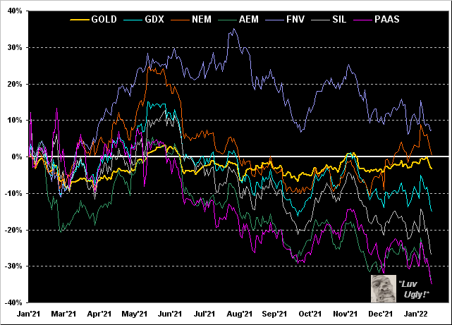
Next, let's keep it ugly in reviewing Gold's percentage tracks along with those of key precious metals equities from this time last year-to-date. Therein we've Franco-Nevada (NYSE:FNV) +8%, Newmont (NYSE:NEM) 0%, Gold itself -3%, the VanEck Vectors Gold Miners Exchange-Traded Fund (NYSE:GDX) -15%, the Global X Silver Miners Exchange-Traded Fund (NYSE:SIL) -27%, Agnico Eagle Mines (NYSE:AEM) -34%, and Pan American Silver (NASDAQ:PAAS) -35%. Ugly indeed:
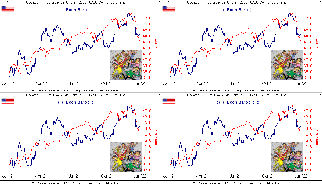
More ugly? We've got it right here—> The Economic Barometer:
That on the heels of Dow Jones Newswires having just stated this past Thursday the "U.S. Economy Grows as Fourth-Quarter GDP Shows Strongest Year in Decades." Any mention therein of the Chain Deflator? No. Nor was there in the New York Times extensive exposé on it all. Nor was there at the website of CNBS.
Oh to be sure, those with a political bent might suggest "Anything to make Joey look good"; but the present bent of the Econ Baro now is ugly. And the panicky bunch in the Baro at lower right well-represent the arguably "younger" shiny objects crowd that have yet to experience a true market "correction". Why even the once-venerable CNN tells us "Get ready for more wild swings. Volatile markets are back. After a long period of calm, market volatility has returned in dramatic fashion." They don't know what "dramatic" is. Save for the aforementioned and very short-lived (great pun) "Ovid to Covid", the S&P futures haven't put in a "limit down" day for some 12 years. (Get ready).
As for the metrics from the past week, December's New Home Sales improved and there was less strain on Initial Job Claims. But: Consumer Confidence, Durable Orders, Pending Home Sales, Personal Income, Personal Spending, the Employment Cost Index, and Michigan's "Go Blue!" Sentiment all came in worse than their prior period.
Then there is Q4 Earnings Season, which for the S&P 500 (with 148 of the 505 constituents having reported) finds 80% having improved over the like period of 2020. But: the average year-over-year increase—whilst admirable at +37.5%—is nowhere near what is necessary to halve the price/earnings ratio (our live reading now 42.0x) back to its median as the yield environment rises. That for the all-risk S&P is presently 1.419%; risk-free debt yields from 5-to-30 years range from 1.624% to 2.083%.
And specific to the Fed, we got from its Open Market Committee on Wednesday exactly what was expected: tapering toward termination of asset purchases with a doubling of the FedFunds rate on 16 March ... unless the Baro continues to tumble ... or in the interim inflation provokes a Volcker-like "massacre".
Speaking of which, have you of late bought a quart of Oil for your car? With (save for one trading day) this year's first month now in the books, Big Oil is the only positive component thus far amongst the eight BEGOS Markets. Here's how they stand:
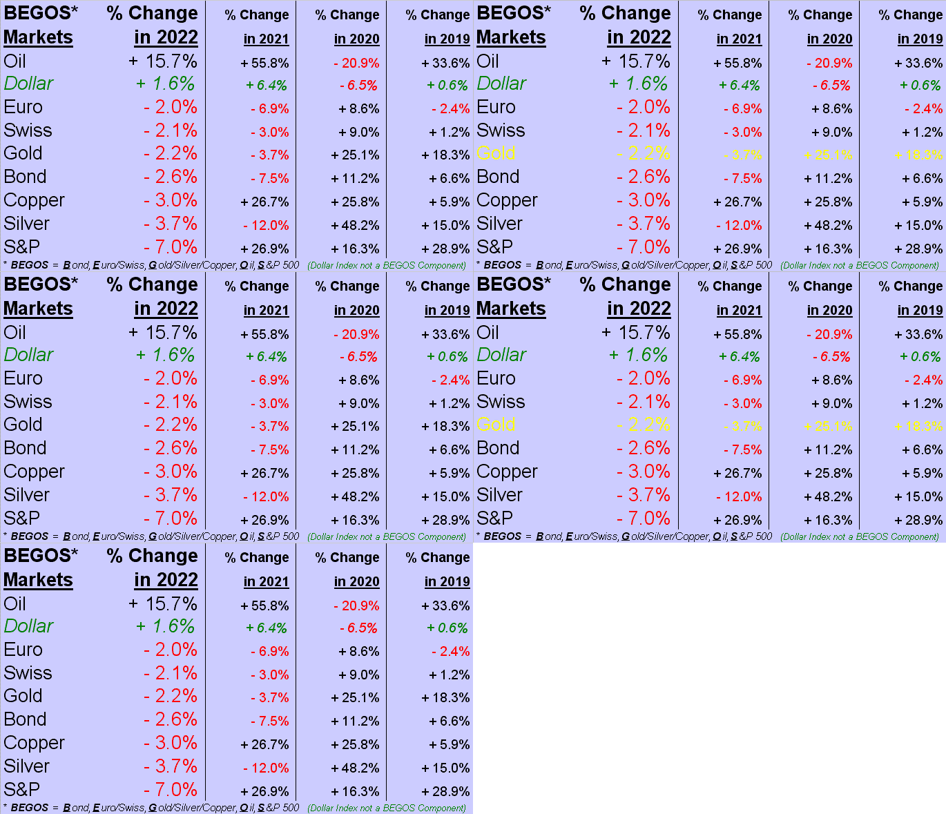
And as it starts its demise, believe thy eyes, that is the S&P 500 in last place. As inferred above, -7% to this point is peanuts; and true, from the year's high-to-low, the Index has already been -12%. But: priced today at 4432, we see this current downtrend initially testing 3984 (-17%); then would come 3950 (-18%), followed by 3827 (-21%), and then more vigorously 3588 (-26%). Just some good "back-of-the-napkin" numbers for reference should you find yourself conversing with a "shiny objects" person.
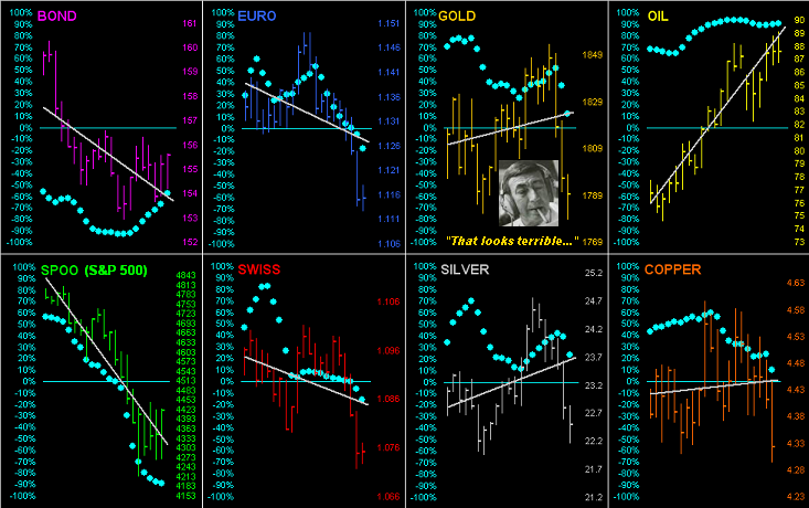
Visualizing said S&P trend, 'tis at the lower left as we go 'round the horn for all the BEGOS Markets' past 21 days. The baby blue dots denote the consistency of the diagonal grey trendlines. And specific to our Metals Triumvirate (Gold/Silver/Copper) it does not look good, all three trendlines given their declining "Baby Blues" rotating toward negative. You tell 'em, Howard:
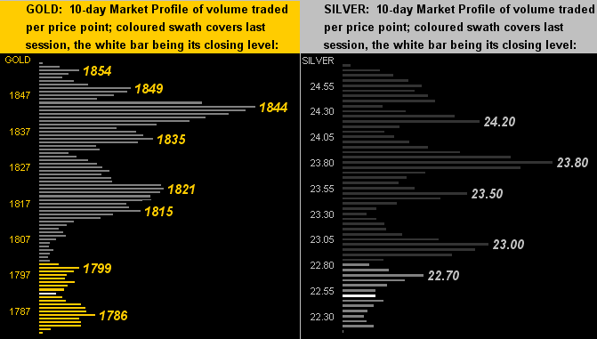
Now to the 10-day Market Profiles we go for Gold on the left and Silver on the right. Clearly both are lying low, with technically more downside to go:
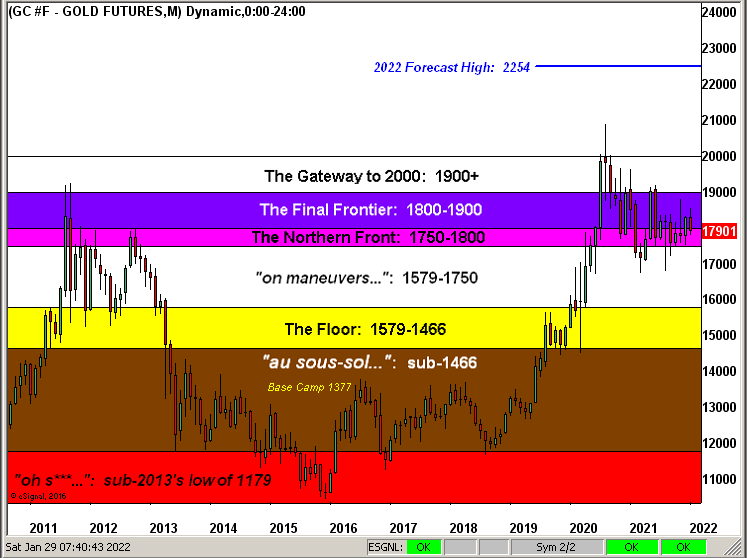
Finally it being month-end (save for Monday), here we've Gold's Structure by the monthly candles since 2011. The endless battling between The Northern Front and Final Frontier continues just as it did a decade ago when the U.S. Money Supply was half was 'tis today. To which we're again prone to say, 'tis diabolical:
Next week looks to bring more bad news for the Econ Baro: of the 13 metrics on the docket, by consensus at least half are expected to be worse than their prior period. 'Course we've learned over the 25 calendar years of maintaining the Baro that hardly does "consensus" turn out to be "actual". But: fortunately for Gold—to end on a fundamental positive—its "actual" worth (4108) is better than double its price (1790)!
Cheers!