A Comparison To Last Year
At the beginning of last year, the stock market was advancing to new all-time highs just like it is doing currently. The difference this year is that market internals are positive and support a bullish market bias.
Last year, market internals were suggesting that risk was elevated, and I wrote about this in our Feb. 13, 2020, update titled Stock Market Looking Frothy. The market peaked on Feb. 19, 2020, and fell about 33% by mid-March.
Market Conditions 2021
In last month’s newsletter, I indicated that the weight of the technical evidence was bullish for the stock market. Here is a quote that summarized my view from that update:
“In a strong bullish market, you historically see a risk-on environment, positive market breadth, sector rotation and declining volatility. This is exactly what I continue to see in market technicals and as a result, I view market conditions to be favorable for stocks in the near and intermediate-term.”
What Has Changed Since Then?
Long-term, the market continues to look bullish. However, market internals are suggesting that the odds of short-term weakness are increasing. Based upon strong longer-term technicals, any weakness is likely to be minor and shouldn’t change the longer-term bullish trend.
A Long-Term View
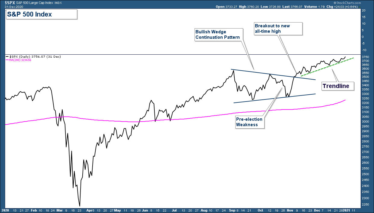
November and December were strong months for stocks. The S&P 500 advanced strongly out of a consolidation pattern and is trending higher above a trendline. The index is sitting at all-time highs and well above its 200-day moving average (pink line). From a pure price perspective, the market is in a bullish uptrend. That is irrefutable.
Let’s now look deeper at market technicals to see if there is strength or weakness under the surface. One characteristic of a strong bullish market is a risk-on environment.
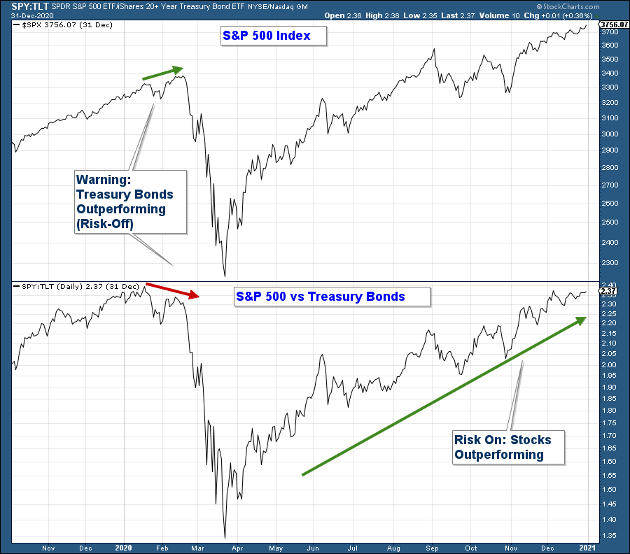
Below is a relative strength chart comparing the performance of the S&P 500 to that of Treasury Bonds which is considered a risk-off asset. When the S&P 500 is outperforming Treasury Bonds the line rises, which confirms the market’s preference for higher risk stocks over the safety of Treasury Bonds. As you can see in the lower panel, stocks continue to strongly outperform.
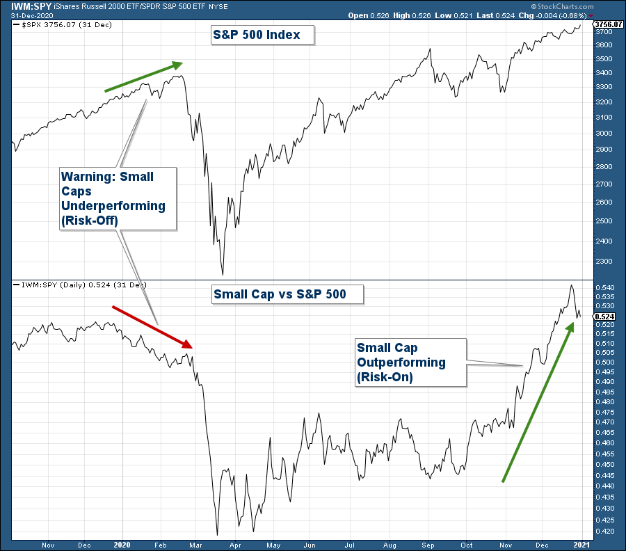
Another example of the market’s preference for riskier, higher-performing assets is what we are seeing in the outperformance of small-cap stocks. In the lower panel is a chart of the relative performance of a small-cap index relative to the S&P 500. Notice how strongly the line advanced over the past few months.
The recent outperformance of small cap stocks is bullish in that it not only signals a risk-on environment but also sector rotation which is the hallmark of a bullish market environment.
Short-Term View
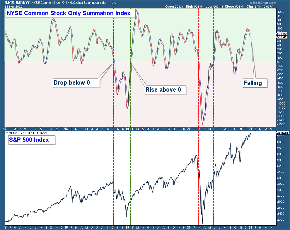
Below is my favorite breadth chart the Summation Index. There are two things that I look for on this chart. One, is the index below or above the zero line (area above zero is notated green and below is red). As a general rule, if the index is below zero market breadth is longer-term weak and caution is advised. And two, I look for moving average crossovers. When the index crosses below its 10-day moving average it suggests short-term breadth has turned negative and positive when it crosses up above this moving average.
Notice how the index has recently crossed below its moving average but is above zero. This suggests that short-term breadth is deteriorating but given it’s well above zero, longer-term breadth is still bullish.
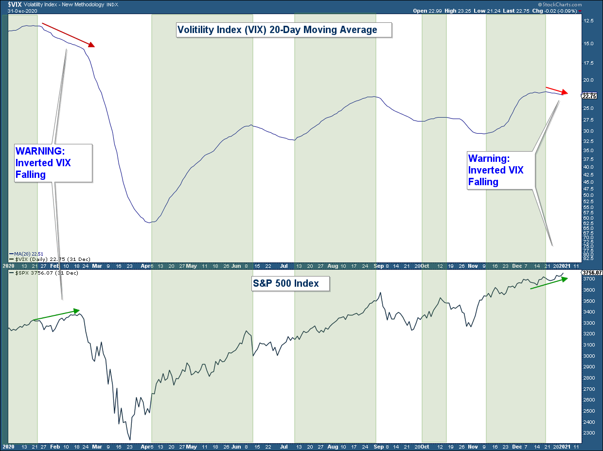
Below is a chart of the VIX – Volatility Index, a sentiment indicator that is commonly referred to as a fear index. Instead of showing the daily VIX data points, I am charting the 20-day moving average to more easily detect the trend and inverted the index to make it easier to compare to the S&P 500. Also, I have shaded the chart green when the VIX has risen, which is what you want to see when confirming a bullish market environment.
The VIX usually has an inverse relationship to the stock market. When that relationship breaks down, I have found that it can be an early warning signal that short-term market conditions may be on the cusp of changing. Keep in mind that the VIX chart below is inverted which makes the Index look to be positively correlated to the S&P 500.
Look at the left-hand side of the chart. Prior to the 33% drop in the S&P 500 at the beginning of last year, the VIX signalled a warning that market conditions may be deteriorating by diverging negatively with the S&P 500 index.
On the far right side of the chart, you can see that the VIX has again started to diverge with the S&P 500. Please keep in mind that I am not predicting a major market drop like we experienced last February. Market internals are mainly positive and thus any short-term weakness is likely to be minor.
The weight of the technical evidence continues to support our bullish longer-term market thesis. While short-term market technicals are beginning to deteriorate, any market weakness is likely to be minor given the strength of longer-term market technicals.
You can read Craig Thompson's original post here.
