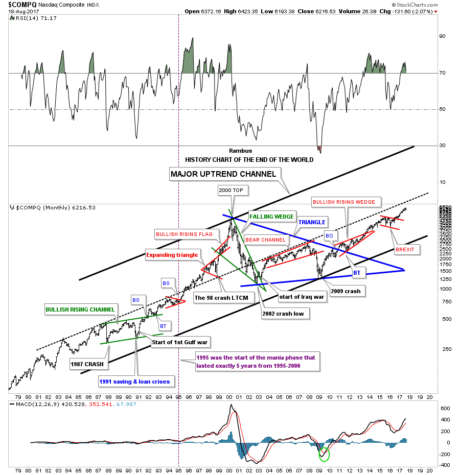
Years ago I built this 40 year chart for the COMPQ which I call the, “HISTORY CHART OF THE END OF THE WORLD.” One day I thought about all the events that I’ve experienced as a trader and decided to put them on a chart to see what it looked like. In hindsight I wish I had put the end of the world events on the INDU or the SPX, but I put them on the COMPQ which still gives you a feel for what happened in the past.
Some of you veterans who were trading, I hate to say it, in the old days, will remember some of these events which felt like the end of the world when you experienced them in real time. Starting at the 1987 crash, it is still the biggest one day percentage move down in history which totally felt like the end of the world, but as you can see the world didn’t end.
In 1991 there were 2 events that felt like the end of the world which were the saving and loans crisis and the start of the first Gulf war. What the 1987 crash, the saving and loans and the 1991 Gulf war created was the green massive bullish rising channel or flag which launched the biggest stock market rally in history.
Some of you may remember in 1998 the LTCM, Long Term Capital Management debacle, which led to a hard 3 month shakeout which felt like the end of the world, No one knew at the time what would happen, but as you can see the COMPQ broke out of the red expanding triangle with the last consolidation pattern of the 90’s tech bubble, the red bullish rising flag, forming on the top rail the expanding triangle.
It took 10 years for the COMPQ to consolidate the tech bubble forming the blue triangle halfway pattern. Big patterns lead to big moves.
The last annotation on this chart is the BREXIT vote low which was not nearly as bad as most of the previous end of the world events, but many were very bearish if you recall.
Keep in mind when you look at the price action starting at the beginning of this chart into the 2000 top that each high was a brand new all time high. Also note how the bull market created a series of higher highs and higher lows except for the red expanding triangle that formed in 1998. Now compare our current bull market that began in 2009 to the 1980’s and 1990’s bull market which is showing higher highs and higher lows as well.
I can tell you that none of those end of the world events were any fun to be in the markets, but what they showed me was that they always led to new highs during the bull market years with our current bull market no exception so far. Corrections or consolidation periods are inevitable any bull market, so as long as the bull market is making new highs and higher lows the trend is your friend. Have a great weekend. All the best…Rambus
PS: One last observation. Note how the price action accelerated beginning in 1995 into the 2000 top. That happened once the dashed mid line gave way.
