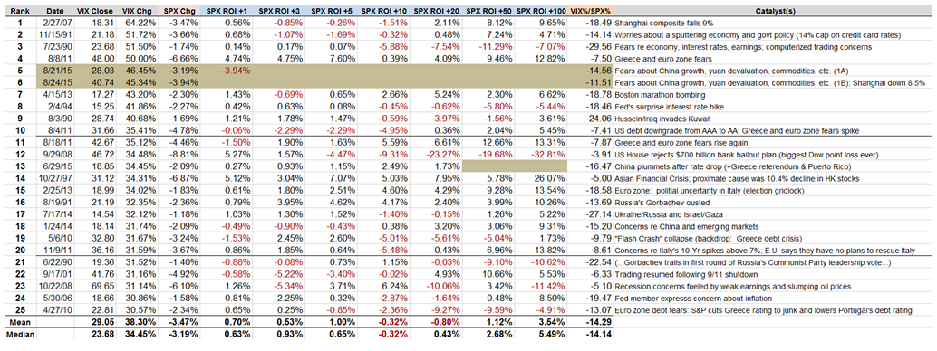
Many readers have commented that one of their favorite of my regular graphics is the table of VIX spikes of 30% or more that I update periodically in this space, along with the subsequent performance in the S&P 500 Index following these spikes.
This time around I have elected to add an additional column that identifies the catalysts involved (necessarily a subjective process) in each instance. When thinking about these catalysts, it might be helpful to compare the nature of the threat and the size of the VIX spike to changes in volatility during various high-profile historical events, an analysis I captured in Volatility During Crises. Another useful exercise is to think about the fundamental factors influencing each VIX spike in the context of A Conceptual Framework for Volatility Events, which I find particularly useful in helping to gauge just how large of a VIX spike a certain type of event might trigger.
Of course the table below has its own set of data nuggets, both fundamental and technical. One interesting statistic I find worth highlighting is the relatively high frequency of large VIX spikes that have occurred during the past five years. VIX data goes back 26 years and yet more than half of the VIX spikes in this table data are from the past five years. I think it is no coincidence that the VIX ETPs (initially iPath S&P 500 VIX Short-Term Futures Exp 30 Jan 2019 (NYSE:VXX) and iPath S&P 500 VIX Mid Term Futures Exp 30 Jan 2019 (NYSE:VXZ)) were launched in 2009 and the inverse VIX ETPs (VelocityShares Daily Inverse VIX Short Term linked To SP 500 VIX Short Fut Exp 4 Dec 2030 (NASDAQ:XIV) and VelocityShares Daily Inverse VIX MT ETN (NYSE:ZIV) and leveraged VIX ETPs (starting with VelocityShares Daily 2x VIX Short Term linked to SP 500 VIX Short Fut Exp 4 Dec 2030 (NASDAQ:TVIX)) were launched in the following year, when big VIX spikes suddenly became more common – much more so than during the 2008 financial crisis, the dotcom crash, etc. For additional information on the subject of more VIX spikes in spite of a generally lower volatility environment, check out 2014 Had Third Highest Number of 20% VIX Spikes.

As noted previously, based on the data for all VIX spikes in excess of 30%, the SPX has a tendency to outperform its long-term average over the course of the 1, 3 and 5-day periods following the VIX spike. Also worth noting that that 10 and 20 days following the VIX spike, the SPX has a tendency not only to underperform, but to decline. Further, while the huge decline following 9/29/08 VIX spike tends to dwarf the other data points, even when you remove the 9/29/08 VIX spike it turns out that the SPX still loses money in the 10 and 20-day period following a VIX spike. When the analysis is extended out 50 trading days, the SPX is back to being profitable, but performing below its long-term average. On the other hand, when the analysis includes 100 days following the VIX spike, the SPX is back to outperforming its long-term average.
In summary, this data suggests that following a 30% one-day VIX spike, there appears to generally be a tradable oversold condition in stocks that lasts approximately one week, followed by a period of another month or so in which the markets typically has difficulty coming to terms with the threat to stocks. This tendency makes today’s market action even more remarkable in that today was by far the worst performance of the SPX in a day following a 30% VIX spike.
Taking a longer-term perspective, looking out at least one quarter, all fears are usually in the rear view mirror and stocks are likely to have tacked on significant gains.
As noted many times here in the past, the data in this table supports the idea of both short-term and longer-term mean reversion, but calls into question the role of mean reversion in the 10-20 days following a VIX spike, where fundamental factors have a tendency to overwhelm a technically oversold condition in stocks.
Disclosure(s): short VIX at time of writing
