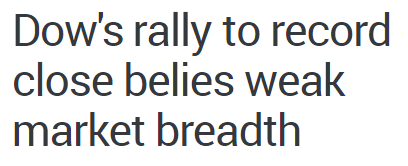
All things being equal, during a healthy rally, we prefer to see a high number of stocks participate in the move (strong market breadth). In recent weeks, you may have come across something similar to the MarketWatch headline below:

Market breadth can be tracked in numerous ways. One of the most logical is to compare the health of narrow indexes, such as the Dow which contains only 30 stocks, to broader indexes, such as the NYSE Composite, which contains over 1,900 stocks.
Breadth Before 10% Plunge In Stocks
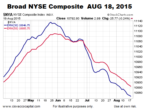
As described in this week’s video in detail, the S&P 500 experienced a waterfall decline of over 10% following the close on August 18, 2015. Notice in the chart below how vulnerable the trends were in the broad NYSE Composite Stock Index before the S&P 500’s big drop.

How Does The Same Chart Look Today?
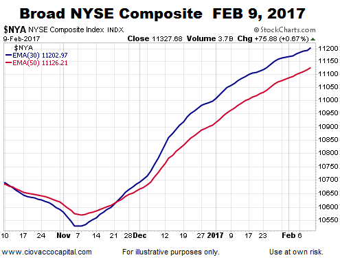
The answer to the question above is “much better”. Instead of the moving averages making a series of lower highs and lower lows, the 2017 version of the same chart looks much healthier (see below). Recent gains have been much more broad-based than what transpired in the spring and summer of 2015.

Similarities And Differences: 2015 vs. 2017
This week’s stock market video covers some potentially troubling similarities in the area of sentiment between August 2015 and February 2017. The video answers the question…how concerning is this piece of evidence?
Additional Measure Of Market Breadth
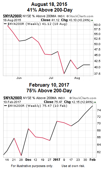
The 200-day moving average provides a guidepost for long-term trends. All things being equal, we prefer to see a stock or ETF above their 200-day moving average. Just prior to the 10% plunge in August 2015, only 41% of the 1,900 stocks in the NYSE Composite were above their 200-day moving average. Contrast the weak state of long-term trends in 2015 to the present day (first chart vs. second chart below).

