Mention the word Breadth in a room full of traders, investors or economists and each one will have a different measure or tool they use to determine the health of the market. Everyone has their own views. It is not just broken down by traders, and then investors and then economists. Each person will be different. And their views are usually strongly held. So it is often best to find what works for you and stick with that, allowing others to co-exist, rather then to try to engage and persuade others to use your measure. Yet I will attempt to do just that.
I tend to follow price action first and then let derived indicators, like momentum or volatility either confirm or give me pause. But one measure I use to measure breadth in the market is a fairly common one. It is the percentage of stocks that are above their 200 day Simple Moving Average (SMA). One of the simplest measures of whether a stock or index is in a bullish or bearish tend is whether it is trading above or below the 200 day SMA. So an accounting of how many stocks are above their 200 day SMA is a very simple measure of Breadth.

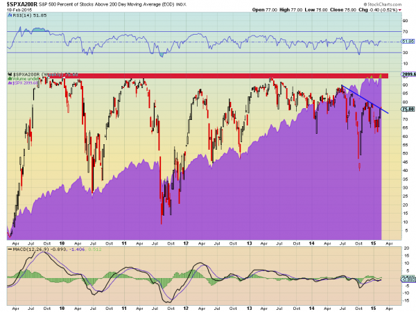
The chart above shows the percentage of stocks in the S&P 500 trading above their 200 day SMA since the March 2009 low. It also shows the growth of the S&P 500 behind it. There are several concepts that you can take away from this chart.
First, the measure rarely gets into the 90% range. This makes sense as the higher number the greater the buying frenzy and then potential for a climax and fall. The second is that pullbacks tend stop in the 40-50% range, at least in the current 6 year bull market.
With more stocks above the 200 day SMA than below it- this could be used as a crude definition of a bull market, so this makes sense as well. It also suggests that a move below 40% could be cause for concern. Although 2 data points in 2010 and 2011 show that it is not a certainty.
What has happened in those cases is the percentage stayed lower for a prolonged time, and there were correction in the market, but each less than 20% before a sharp rise. Finally, the last 8 months has seen the measure move from 90 down to 75 in a steady decline. Almost a smooth resetting of the measure. At 75 Breadth is far from being overbought at 90 or higher. It is also far from being in the danger zone under 40. And over this time the S&P 500 has moved to new highs. I do not believe that you can use this one measure (or any breadth measure) to forecast what happens next.
But what this measure tells me is that the S&P 500 is in a strong bull market, far from overbought and no where near danger levels. There is nothing in this chart to suggest any reason for the market to pause or retreat.
Disclaimer: The information in this blog post represents my own opinions and does not contain a recommendation for any particular security or investment. I or my affiliates may hold positions or other interests in securities mentioned in the Blog, please see my Disclaimer page for my full disclaimer.
