One of the pieces of data I keep a close eye on when evaluating the S&P sectors is the distance they’ve moved relative to various moving averages. I believe in the long-term market trends will often persist, but there’s a degree of ‘snap-back’ that also can exist when securities and markets begin to run too far too fast.
The Technology Sector has had a great year so far in 2018, up over 8% while the S&P 500 has risen less than 3%. What makes that performance disparity interesting is that tech is currently the largest sector weighting in the S&P 500. So when tech is doing well it should be (in a sense) passing some of those gains over to the broad index, bolstering up its performance as well. However, the relative performance between the two has separated to historically rare levels.
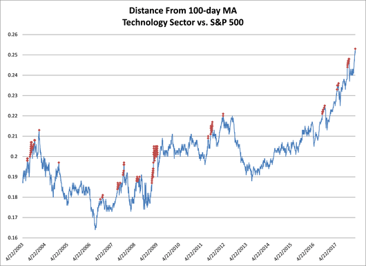
Below is a chart of the ratio between the tech sector (via XLK) and the S&P 500 (via SPY) going back to 2003. The red dots indicate when the ratio has gotten more than 4% above its long-term moving average. As you can see, getting this far above the moving average is not very common. We saw a string of days greater than 4% coming off the March ’09 low as well as a clustering in 2011 and most recently before the February ’18 correction. However, notice that when the ratio gets this stretched it often snaps-back, meaning when the blue line is declining the technology sector is under-performing the broad market.

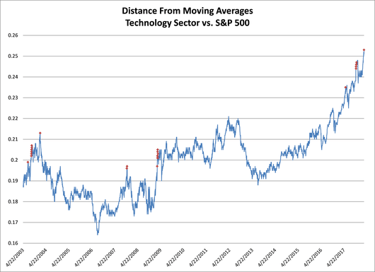
I also like to look at a composite of moving averages, which is what this next chart shows the median distance from several moving averages of various lengths. The red dots show when the XLK vs. SPY ratio has resembled the current level we’re at today. The sample size shrinks considerably compared to the chart above when we were just looking at the single MA. A few days before the February declined matched our current level, as did one day in 2017 before a decline in relative performance. We then would need to go back to 2009 to find a prior time where XLK was outperforming the S&P 500 at its current rate and then before that was in November 2007 and 2003, both marking major highs in relative performance for technology.

So has the technology sector run too far too fast? In a relative sense I would say yes it has. There are still several industries within the tech space that I believe have very strong charts and could continue to strength.
It’s important to note that when we discuss relative performance it doesn’t necessarily mean an absolute decline in price. We could continue to see tech appreciate along with the index and still underperform. Going forward I’ll be looking for confirmation of an impending slow down in tech, specifically looking at the supply and demand of the sector as well as its ratio to the S&P 500. Based on historical examples, we may see the technology sector slow down its current impressive ascent or potentially decline in absolute terms.
Disclaimer: Do not construe anything written in this post or this blog in its entirety as a recommendation, research, or an offer to buy or sell any securities. Everything in this post is meant for educational and entertainment purposes only. I or my affiliates may hold positions in securities mentioned in the blog. Please see my Disclosure page for full disclaimer.
