Because I spend so much time digging into inflation data and learning about how inflation works (and how securities and markets work, in different inflation regimes), I am always delighted when I come across something new, especially something simple and new that I could have previously stumbled on, but didn’t.
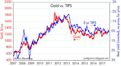
Recently, a friend sent me a link to an article by Scott Grannis (aka Calafia Beach Pundit). I occasionally read Scott’s stuff, and find it to be good quality. I’m not writing this article to either criticize or support most of his column, but rather to point to one particular chart he ran that amazed me. Specifically, he showed the 5-year TIPS yield against the nominal price of gold. Here is his chart:

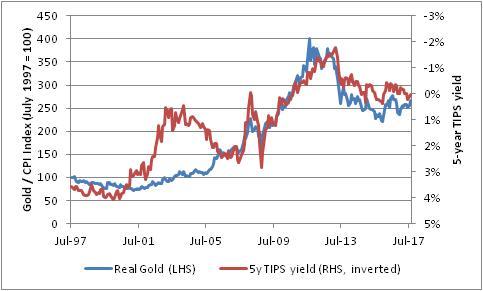
He also showed the price of gold versus TIPS on a longer-term basis. I’ve replicated that here, although I’ve deflated gold by the CPI since the longer the time frame, the less the nominal price of gold will resemble its real price. It’s still basically the same picture:

This is an amazing chart, even allowing for the divergence in the 2000s (which some people would call prima facie evidence that the Fed eased too much back then). And it just tickles me because I’ve never noticed the correlation at all, and yet it’s really quite good. But here’s the really amazing part: there is no immediately obvious reason these two series should be related at all.
One of them is a price index. In Scott’s version, which isn’t adjusted for inflation, it should march upward to the right forever as long as the general price level continues to rise. Obviously, real yields will not march ever lower forever. When we adjust for the general level of prices, the real price of gold should, like real yields, oscillate (since the long-term real return to gold is approximately zero) so we have removed the tendency for nominal prices (unlike yields) to have a natural drift. But even in real terms, apples-to-apples, it’s an astonishing chart. What this chart seems to say is that when expected growth is poor, gold is worth more and when expected growth is strong, gold is less valuable. But that seems a bit crazy to me.
Okay, one possible interpretation is this: when expected returns from other asset classes such as stocks and bonds and inflation-linked bonds are low, then the expected return from gold should also be low, which means its price should be high. That makes sense, although it is hard to find many gold investors who think as I do that the expected forward-looking real return to gold right now is negative.
Heck, I wrote about that last month (see The Gold Price is Not ‘Too Low). It makes some sense, though. But the implication is that as inflation rises, and yields – both real and nominal – rise, then gold prices should fall. I think you’d discover it difficult to find an investor in gold who would think the gold price should fall if inflation picks up!
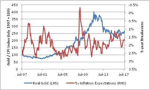
Where you would think to see more of a relationship is in inflation expectations versus gold. When inflation expectations are high, you’d think you would see gold prices high and vice-versa. But that chart has really nothing suggestive at all, possibly since inflation expectations have really been fairly grounded for the last twenty years. Gold prices, however, have not!

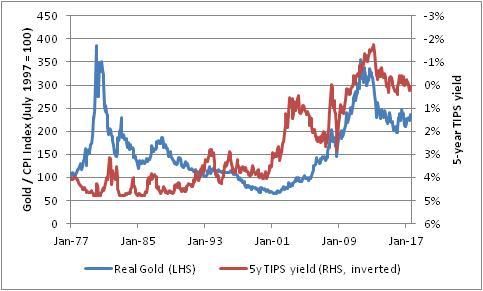
So going back to the original Grannis chart, I am still very suspicious. Fortunately, some time ago we developed a very long history of real interest rates, using a more advanced approach than had previously been applied (you can see the long-term series in this article). That series is derived, rather than observed as the TIPS series is, but it’s probably pretty close to where TIPS yields might have traded had they existed during that period. And when we look at real gold prices versus 5y TIPS yields…

…we get a pretty disappointing chart. What I see is that in the 1970s and early 1980s, high gold prices were associated with high real yields; in the 2000s and 2010s, a high gold price was associated with low real yields.
So, this is a bit of a bummer in one sense but a relief in another sense. That initial chart suggested some very weird dynamics happening between real yields, inflation expectations, and the price of a real commodity. I think this latter chart indicates that the relationship we saw was not some fundamental previously-undiscovered truth – sadly, I guess – but rather something more prosaic: an illustration of how the relative values of all assets tend to move more or less together. TIPS are expensive. Bonds are expensive. Stocks are expensive. Gold is expensive. Unfortunately, I don’t think that tells us a lot that we didn’t already know (although I have strong opinions about the relative ordering of the richness/cheapness of those asset classes).
