Before I start today’s article, let me say that I don’t like to write about gold. The people who are perennially gold bulls are crazy in a way that is unlike the people who are perennial equity bulls (Abby Joseph Cohen) or perennial bond bulls (Hoisington). They will cut you.
That being said, they are also pretty amusing.
To listen to a gold bull, you would think that no matter where gold is priced, it is a safe haven. Despite the copious evidence of history that says gold can go up and down, certain of the gold bulls believe that when “The Big One” hits, gold will be the most prized asset in the world. Of course, there are calmer gold bulls also but they are similarly dismissive of any notion that gold can be expensive.
The argument that gold is valuable simply because it is acceptable as money, and money that is not under control of a central bank, is vacuous. Lots of commodities are not under the control of a central bank. Moreover, like any other asset in the world gold can be expensive when it costs too much of other stuff to acquire it, and it can be cheap when it costs lots less to acquire.
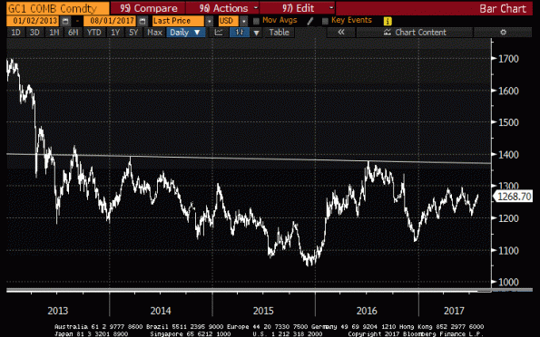
I saw somewhere recently a chart that said “gold may be forming a major bottom,” which I thought was interesting because of some quantitative analysis that we do regularly (indeed, daily) on commodities. Here is one of the charts, approximately, that the analyst used to make this argument:

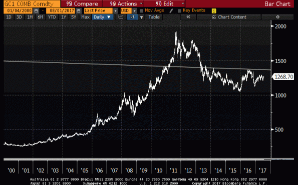
I guess, for context, I should back up a little bit and show that chart from a longer-term perspective. From this angle, it doesn’t look quite like a “major bottom,” but maybe that’s just me.

So which is it? Is gold cheap, or expensive?
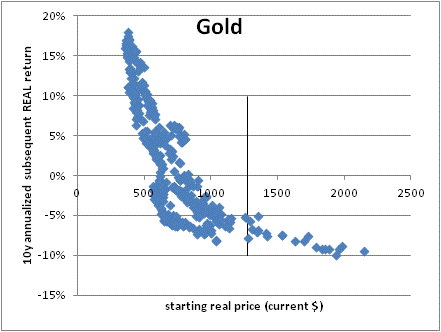
Erb and Harvey a few years ago noticed that the starting real price of gold (that is, gold deflated by the price index) turned out to be strikingly predictive of the future real return of holding (physical) gold. This should not be terribly shocking – although it is hard to persuade equity investors today that the price at which they buy stocks may affect their future returns – but it was a pretty amazing chart that they showed. Here is a current version of the chart (source: Enduring Investments LLC):

The vertical line represents the current price of gold (all historical gold prices are adjusted by the CPI relative to today’s CPI and the future 10-year real return calculated to derive this curve). It suggests that the future real return for gold over the next decade should be around -7% per annum. Now, that doesn’t mean the price of gold will fall – the real return could be this bad if gold prices have already adjusted for an inflationary future that now unfolds but leaves the gold price unaffected (since it is already impounded in current prices). Or, some of each.
Actually, that return is somewhat better than if you attempt to fit a curve to the data because the data to the left of the line is steeper than the data to the right of the line. Fitting a curve, you’d see more like -9% per annum. Ouch!
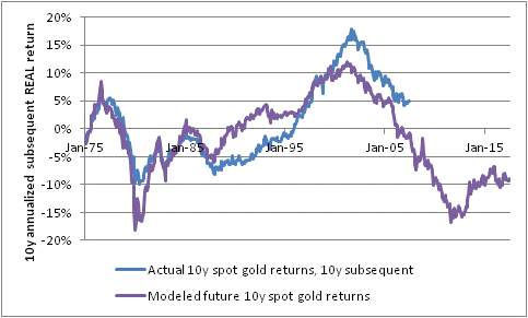
In case you don’t like scatterplots, here is the same data in a rolling-10-year form. In both cases, with this chart and the prior chart, be careful: the data is fit to the entire history, so there is nothing held ‘out of sample.’ In other words, “of course the curve fits, because we took pains to fit it.”

But that’s not necessarily a damning statement. The reason we tried to fit this curve in the first place is because it makes a priori sense that the starting price of an asset is related to its subsequent return.
Whether the precise functional form of the relationship will hold in the future is uncertain – in fact, it almost certainly will not hold exactly. But I’m comfortable, looking at this data, in making the more modest statement that the price of gold is more likely to be too high to offer promising future returns than it is too low and likely to provide robust real returns in the future.
