Repeating Patterns and Positioning
A noteworthy confluence of patterns in gold and gold stocks is in evidence this year. At the close of trading on December 26, the HUI Index has given a (tentative) buy signal by completing a unique chart pattern, which is why we decided to briefly discuss the situation. As usual, things are not as straightforward and simple as they would ideally be, but there is always an element of uncertainty – one has to accept that as a given. Let us look at a chart illustrating one of said patterns:

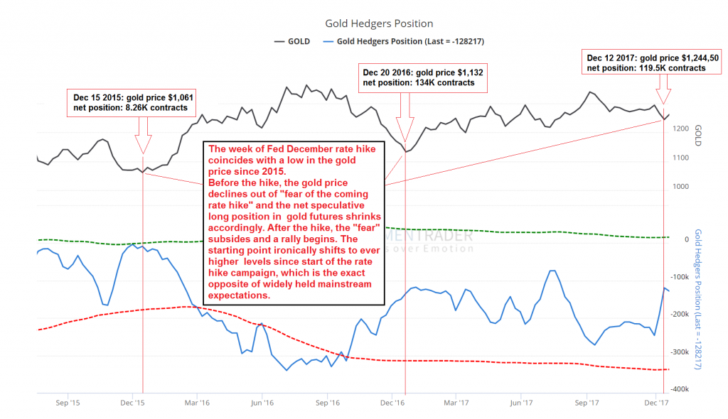
This chart shows the gold price, the weekly net hedger position in gold futures (the inverse of the net speculative position), with the Fed’s December rate hikes in 2015, 2016 and 2017 highlighted by red vertical lines. Keep in mind that the December 2015 hike was the start of the current rate hike campaign. In the weeks leading up to it, the gold market was in the grip of a bearish hysteria, just as it approached a major lateral support level. Nearly every day Bloomberg, Reuters and other mainstream financial media published articles by “experts” no one had ever heard of before (or since!), along with reports from analysts working for various well-known investment banks, all of whom stridently insisted that the beginning rate hike cycle was going to be the most bearish thing that could possibly befall the gold market, and that a further collapse in prices was nearly certain to coincide with it.
Not surprisingly, the exact opposite has happened. You were definitely not surprised if you were reading this blog at the time – see for instance “Gold and the Federal Funds Rate”. As we pointed out therein:
“[The] guessers at SocGen might actually have improved their statistical odds a bit if they had said “now that the Fed is hiking rates, gold prices should rise”.
As noted in the chart annotation, in all three years gold prices declined into a December low, seemingly driven by fear of the coming rate hike and then proceeded to rally in a typical “buy the news” scenario. The declines tended to lower net speculative long positions to levels conducive to a renewed advance. So far the gold price lows coinciding with these rate hikes are increasing by approximately $100 per year. We expect this uptrend to accelerate noticeably once the rate hike campaign is unceremoniously thrown overboard. ETA: sometime next year, the precise timing depends on when the asset bubble peaks and reverses – the clock is ticking on that.
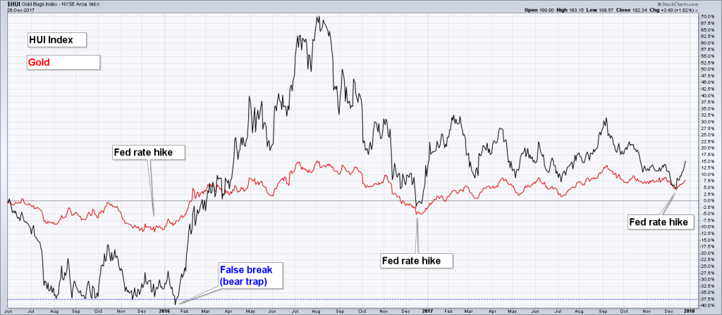
Naturally, there is no guarantee that the December low will once again result in a playable multi-week (or even better) rally this year, but so far things look actually good for that idea. Here is a chart showing the moves in the HUI index and gold prices over the past 2 years and 7 months (i.e., including the drawn-out bottoming period from July 2015 to January 2016).

As this chart shows, the HUI has once again taken off like a scalded cat right after the rate hike. After the 2015 rate hike low, the index lurched lower one more time in early January, as the broader stock market suffered one of its biggest declines since the 2009 low.
We have highlighted the false break of support (a.k.a. bear trap) that occurred at the time (it was even more pronounced in the XAU Index, which actually fell below its low of late 2000). False breaks of major lateral support levels that put in a multi-year low tend to be of long term significance; usually these prices are never seen again.
A comparison that comes to mind is the false break of support in the S&P 500 Index in 1982, which at the time greatly excited Joe Granville and his flock as we recall. Granville expected it to lead to a major price collapse, but the excitement didn’t last long and the index waved good-bye to these price levels forever. On the chart above we also want to draw your attention to the most recent divergence between the HUI and the gold price. While the gold price put in a higher low in December vs. its low in early July, the HUI broke below its July low before reversing. Such divergences are typically seen near medium to long term turning points .
Eerie Self-Similarity
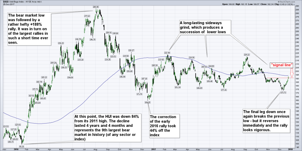
Below we take a closer look at the chart pattern in the HUI in isolation. The extremely lengthy consolidation pattern following the strong rally in the first half of 2016 increasingly wore investors out. Their patience was undoubtedly tested quite a bit, particularly in light of other stocks and cryptocurrencies going bananas at the same time.
Per experience, such long-lasting, grinding sideways ranges often turn out to be very powerful set-ups though. In the gold sector we would for instance point to the consolidation from July 2015 to January 2016 (see the chart above) as a recent example of such a patience-challenging “grinding pattern”. The HUI went nowhere for months, occasionally teased traders with false starts, and in the end even threatened to break down… only then did a powerful rally finally kick in.

“Pattern completion” in the HUI was achieved this Tuesday with a close above the red signal line (the decisive criterion was the reversal of the entire immediately preceding down-leg by closing above the upper boundary of the small sideways range which started in late October). Unfortunately, the 200 day-moving average is directly above the current index level; given the fact that this moving average provided stiff resistance for much of 2017, the index may struggle a bit in the near term, even if it eventually surpasses it.
The broader XAU index has already overcome its 200-dma, but this is probably mainly due to the fact that Freeport-McMoran Copper & Gold (NYSE:FCX) is one of its constituents, and has a large weight in the index. While FCX does produce a lot of gold (its gold production is estimated to reach 2.3 million ounces in 2018), it is primarily a copper producer (the world’s second largest). In recent days the stock was particularly strong due to copper rallying to its highest level since early 2014.
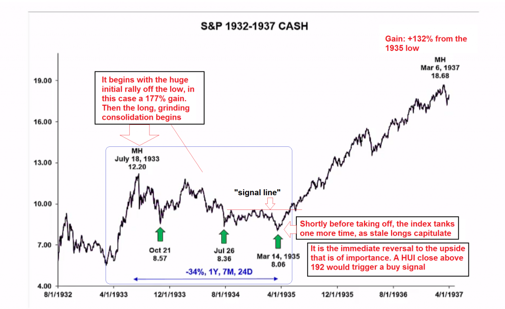
What makes the pattern especially interesting is that there exists a strikingly self-similar pattern that was also built after a major bear market (a slightly worse bear market even) – namely in the S&P 500 Index right after the 1932 low. This pattern similarity was discovered by James Flanagan of Gann Global, who spends quite a bit of time and effort looking for potentially useful historical chart analogs in the markets he analyzes.
We should add that self-similar patterns as such often have only limited value. For a number of reasons, this particular analog is quite interesting though. For one thing, several other signals are currently falling into place as well, such as the speculative positioning in futures and the “buy the news” effect after the Fed rate hike we mentioned above (as you will seein Part 2, there are still more signals). Moreover, this consolidation pattern is both complex and quite unique, and the similarities are really striking.
Not only were the preceding bear markets of nearly the same size, the initial rally from the low in 1932 was just as rapid and produced almost the same percentage gain as the one seen in the HUI in early 2016; the subsequent consolidation took a roughly similar amount of time to play out; and lastly, the shape of the consolidation pattern extremely closely matches the one in HUI and XAU.
Especially noteworthy is the succession of slightly lower lows in the course of the sideways consolidation. This must have been quite frustrating for investors at the time. It probably felt as though the initial ray of hope provided by the rally off the bottom in 1932 was yet another false dawn. It turned out though that it had indeed heralded the end of the bear market.
Here is the chart of the SPX from 1932 to 1937 which shows the self-similar pattern and what happened after it concluded:

The SPX from 1932 to 1937 – this is a snapshot we have taken from a Gann Global presentation. The blue rectangle contains the initial rally and the subsequent consolidation pattern. The 132% rally following on the heels of the consolidation was definitely nothing to sneeze at
Playing it Safe
The recent break to a lower low in the HUI followed by an immediate reversal was the last ingredient that was hitherto still missing to complete the same pattern. If one wants to play it extra-safe, one can always wait for the index to move a bit further above the “signal line” level, as this would entail overcoming the 200-dma in the case of the HUI as well.
Of course there is no guarantee whatsoever that the ultimate outcome will actually be similar. One can of course always limit the risk by setting a stop-loss level in case the idea fails to work out. Depending on what instruments one uses, options may offer a viable alternative as well (both for playing the rally potential and/ or to hedge a position).
In Part 2 we will look at cycle signals, sentiment as well as recent insider activity (the latter is particularly interesting: there was quite a big surge in insider buying, which rarely happens in this sector).
