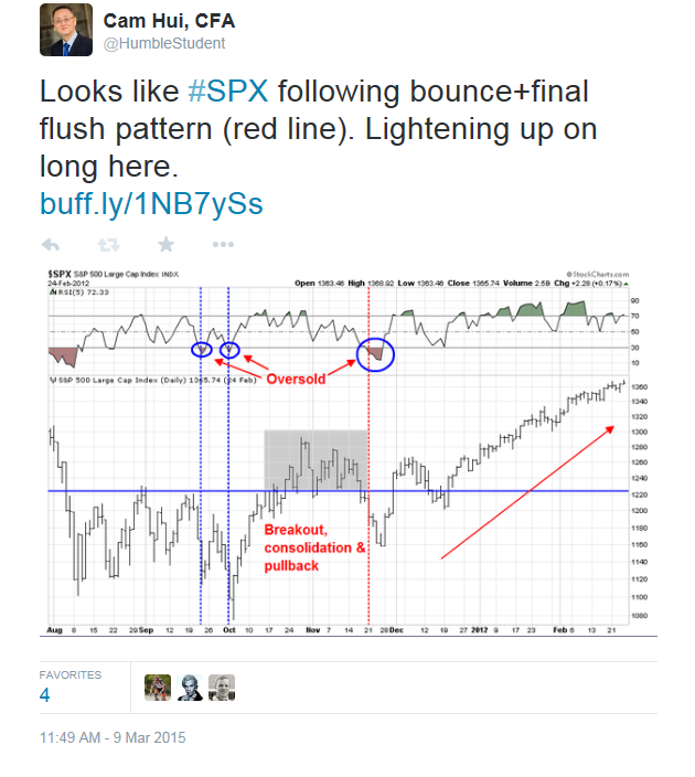
In my last weekend post, I wrote that US equities was getting close to a bottom and I stand by those remarks. Using the market patterns of 2011 and 2012 as a template, I thought that stocks was getting oversold and downside risk was limited to 1-2% (see Bullish, but "data dependent"):
In some cases, the market rebounded right away. In another, it required a final flush before seeing a durable bottom.
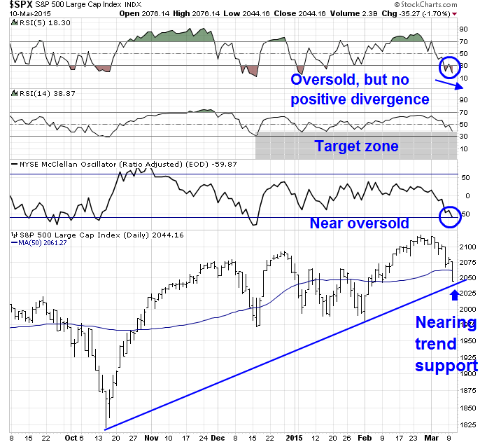
My main takeaway from 2011 and 2012 is that near-term downside risk is limited to 1-2% from current levels. Today's SPX chart shows that the market is oversold on RSI-5. There is technical support at the 50 day moving average (2062) and further support at the uptrend line drawn from the October low (about 2040), which is roughly 1.5% below Friday's closing levels.
On Monday, we got an unimpressive bounce and I tweeted that the final flush scenario was in play:

On Tuesday, stock prices sold off dramatically and readings are at or very close to oversold levels where a durable bottom have been seen in the past. The chart below of the S&P 500 with 5-day RSI, 14-day RSI and McClellan Oscillator (NYMO) tells the story. RSI-5 is oversold, but not showing a positive divergence of higher low, though past bottoms have not necessarily shown such readings. RSI-14 closed at 38.87, which is nearing the range where the market has bottomed in the past few months. NYMO came in at -59.87, which is just a fraction away from an oversold reading of -60. Finally, the SPX closed at 2044.16, below the key 50 day moving average, but just above trend line support at about the 2040 level.
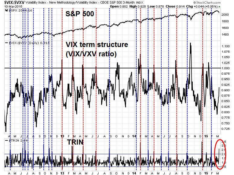
In addition, fear indices are starting to spike. The chart below of the VIX term structure, as measured by the VIX-VXV ratio, and TRIN shows capitulation-like market behavior. The VIX-VXV ratio is rising, though it is not inverted (above 1). TRIN spiked to 2.64, which indicates panic selling.
I have drawn blue vertical lines to mark past instances in the last three years when TRIN has risen above 2 and red vertical lines to mark past instances when the dual conditions when VIX term structure inverted and TRIN was over 2. The red lines have been much better at calling bottoms, but the blue lines have, more often than not, indicated instances when the market either bounced or downside risk was limited.

In short, market technicals suggest that stocks have either made a bottom or are very close to a bottom. I have no idea what stock prices will do in the next couple of days, but the odds favor higher stock prices in the next week.
Disclosure: Cam Hui is a portfolio manager at Qwest Investment Fund Management Ltd. ("Qwest"). This article is prepared by Mr. Hui as an outside business activity. As such, Qwest does not review or approve materials presented herein. The opinions and any recommendations expressed in this blog are those of the author and do not reflect the opinions or recommendations of Qwest.
None of the information or opinions expressed in this blog constitutes a solicitation for the purchase or sale of any security or other instrument. Nothing in this article constitutes investment advice and any recommendations that may be contained herein have not been based upon a consideration of the investment objectives, financial situation or particular needs of any specific recipient. Any purchase or sale activity in any securities or other instrument should be based upon your own analysis and conclusions. Past performance is not indicative of future results. Either Qwest or Mr. Hui may hold or control long or short positions in the securities or instruments mentioned.
