Market Review
We currently have moves ongoing in the following:
- Gold
- Japanese yen
- USD/NOK
- Copper
- GBP/CAD
An additional move is developing in AUD/NZD. Below we will also comment on the Canadian dollar, New Zealand dollar, Australian dollar and U.S. stock indexes.
Moves in Progress
Copper (daily chart)
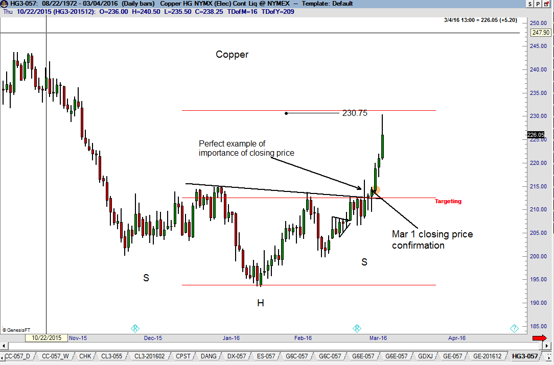
There are several observations worthy of note on the daily Copper chart. First, note the premature breakout on Friday, February 26. The market broke out of the H&S bottom, but the rally could not hold. Following a premature breakout, traders should be on extra alert and jump on a subsequent closing price breakout. Second, the advance and close on Monday, Feb. 29 and especially on Tuesday, March 1, confirmed the H&S bottom. Both days served as buying opportunities. Third, for all practical purposes the target was met by Friday’s advance. I typically am conservative on determining “measured moves.” We are now flat, having taken a crazy ride on the long side this past week.
Gold (weekly and daily charts)
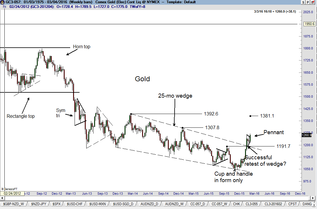
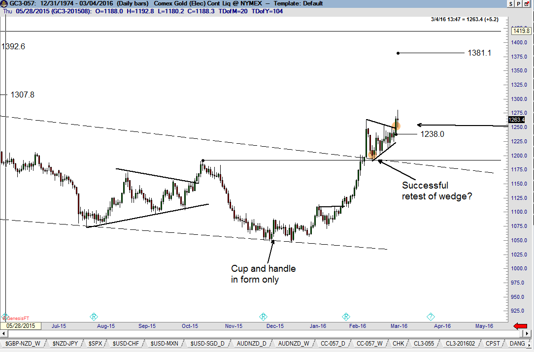
The dominant chart development in Gold is the completion on February 11 of a massive falling wedge on the weekly chart. The advance this past Thursday completed a 3-week pennant on the daily graph. While the target in Gold is $1381, I believe this rally is over-extended and may be susceptible to a shake-out of weak longs. Remember, a falling wedge pattern is allowed to experience substantial backing and filling. I remain long Gold with stops presently under Wednesday’s low.
GBP/CAD
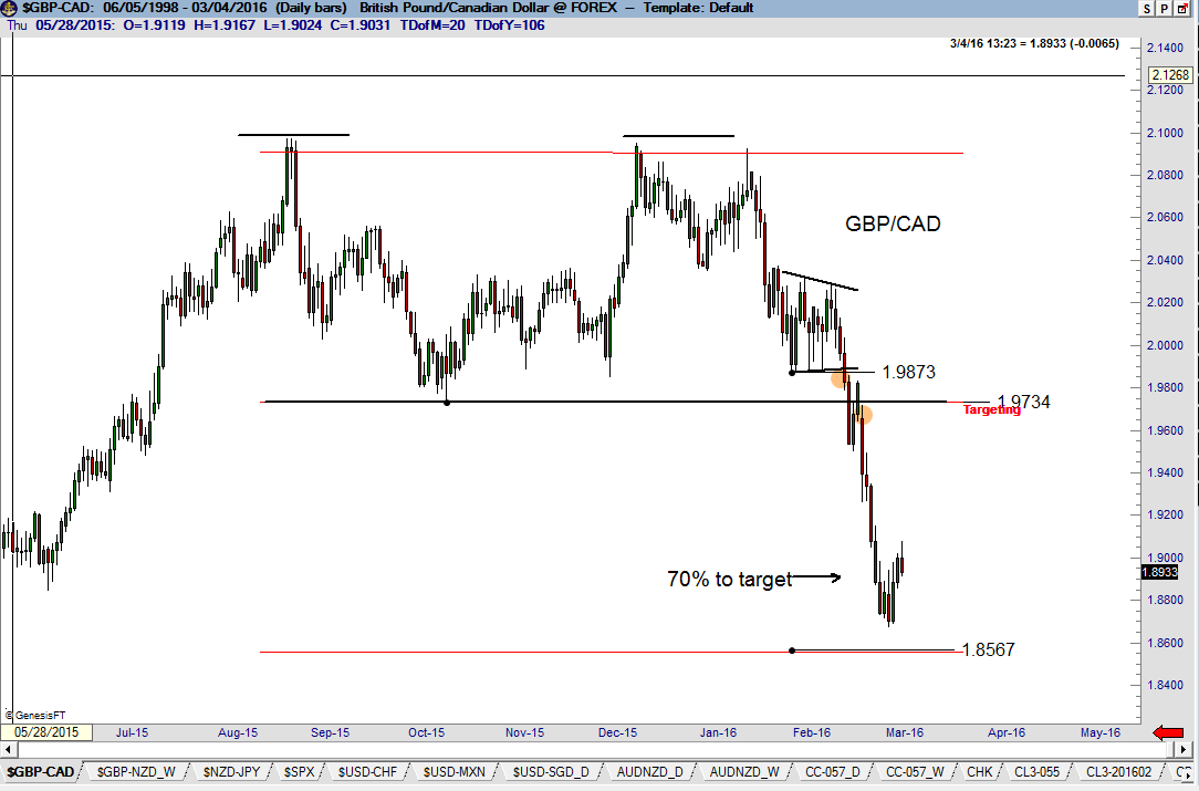
The dominant chart construction in this forex pair is the double top completed on Feb. 17 and confirmed on Feb. 22. The target of 1.8567 is well within reach. We are flat GBP/CAD preferring to just be long CAD.
USD/NOK (weekly and daily charts)
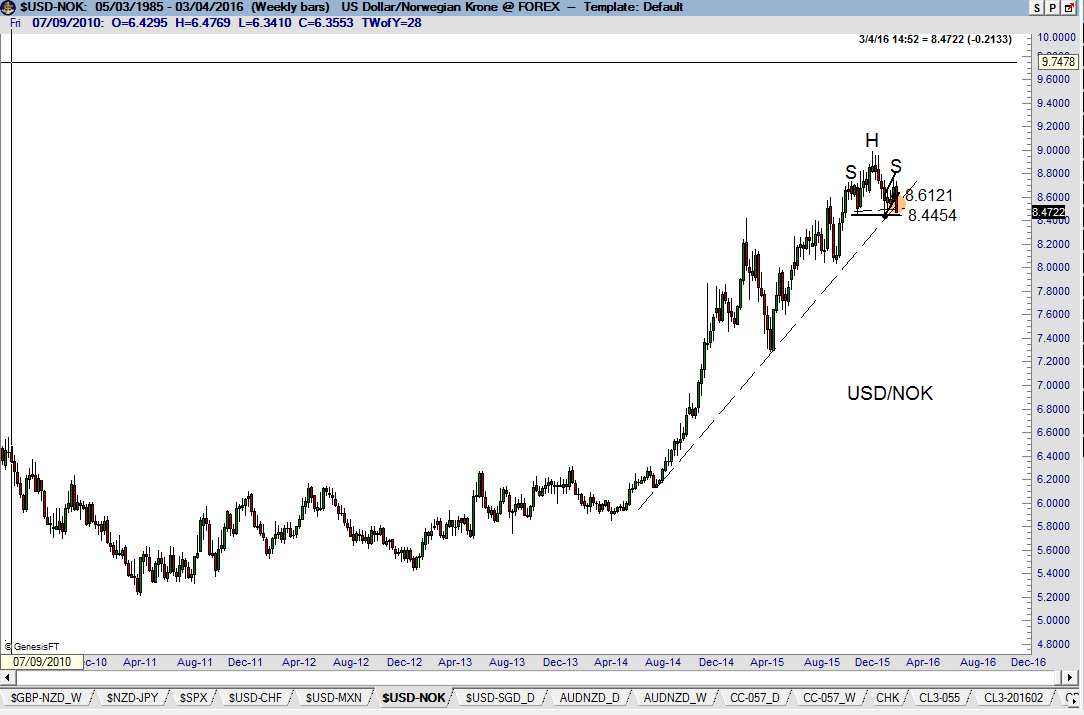
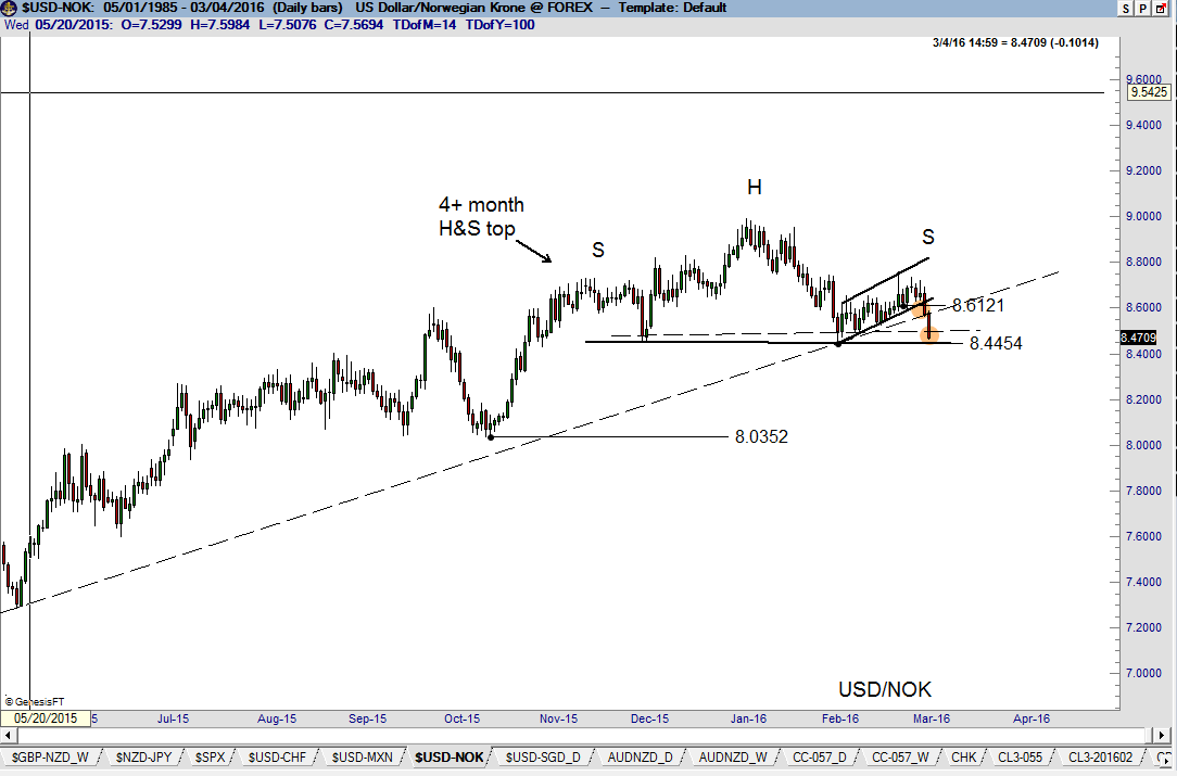
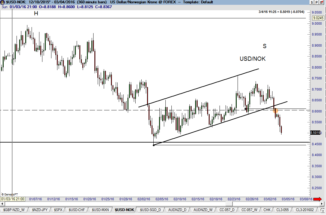
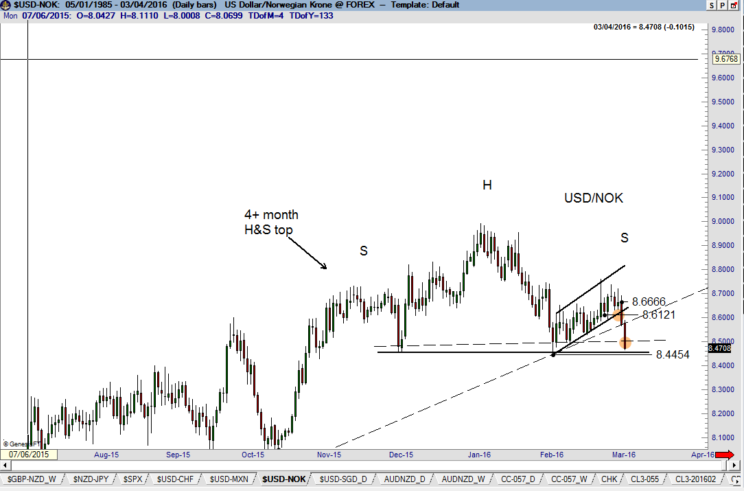
[See the discussion of this cross-rate in the section on trading tactics.] The only time I really pay attention to trend-lines is when a dominant multi-contact point TL is violated simultaneous with the completion of a chart pattern. This occurred this past week in USD/NOK. I am German/Swedish and my wife is pure Norwegian, so it is tough for me to openly pay tribute to anything Norge. Thankfully she does not read my updates. The dominant chart construction in this forex pair is the violation of an 18-month trendline and completion of the right shoulder of a possible 4+ month H&S top. Note that the right shoulder took the form of a bear channel or flag. I love it when a chart has a lot going for it, such as this one. We enter the upcoming week with a two-layer short position and a desire to go 100% short. My target is 8.035 or so. The orthodox right shoulder low has not been violated, so technically this H&S top is not in place. However, the H&S is complete on a closing price line chart, so I consider this move to have begun. Go Norway!
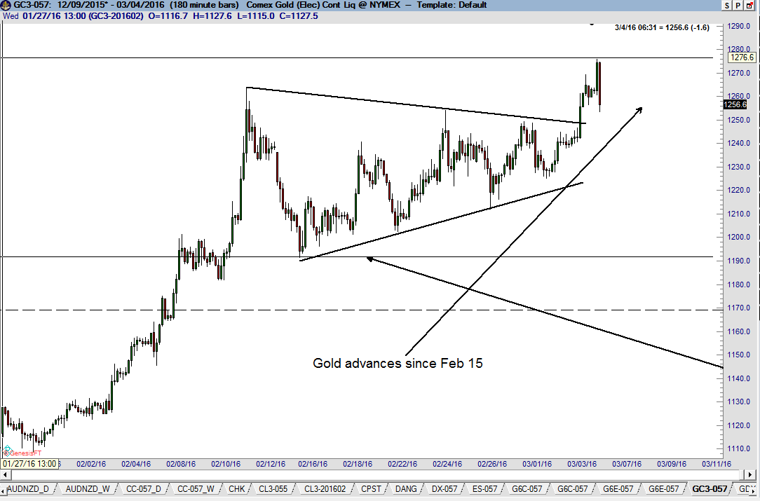
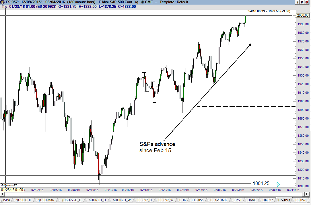
The death of another sacred cow – the relationship between Gold and U.S. stocks (see charts, bottom of page)
Market participants (and the fools on CNBC and Bloomberg) become fixated by the connection of one market to other markets. These sacred cows in the imagination of market participants (and pretty-faced broadcasters) have been around throughout my career as a trader and eventually die of natural causes. But, most importantly, they do die. I have never quite understood the fixation on these correlations in the minds of traders.
This is a true story – when I first entered the industry at the CBOT in 1975 the market was convinced that Gold and Wheat prices held the key to each other. Figure out where Wheat was going and you would know in which direction Gold would trend. Some other market correlations that have been considered as sacred over the years include:
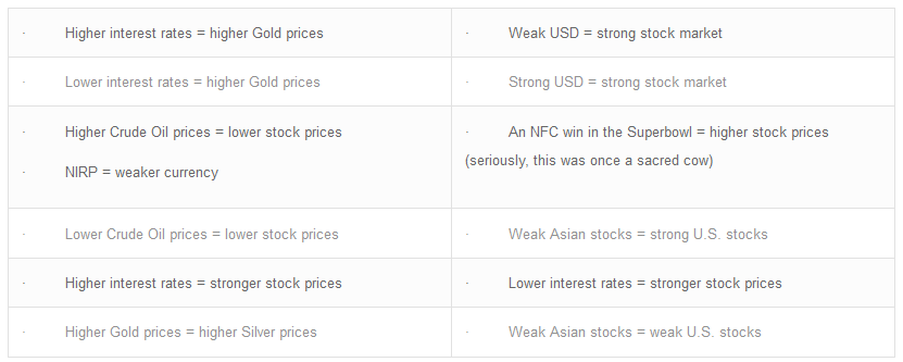
Hopefully you get the picture that market participants become mesmerized over market correlations that often are coincidental and seldom last very long. Of course some markets are highly correlated. Higher T-Bond prices usually equal higher T-Note prices. Higher Soybean Meal prices correlate with higher Soybean prices. Higher Crude Oil prices correlate with higher RB Gas prices. And, a stronger NFC usually correlates with a weaker AFC.
What I find particularly amusing are the complicated grand scenarios invented by traders because of a single price chart. I see this type of narrative all the time on social media:
“A bottom in Crude Oil. This must mean that stocks will do X, interest rates will do Y and the U.S. Dollar will do Z.”
My caution to you all is this – do not be a chart book economist!
Getting back to Gold and U.S. stocks, the conventional wisdom has been that Gold and U.S. stocks are inversely correlated. But wait! In recent days, both Gold and U.S. stocks have advanced together. The world must be off its axis. Nature is amiss.
Japanese yen futures (weekly and daily charts)
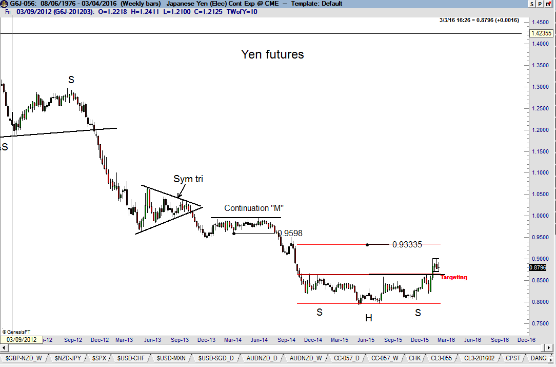
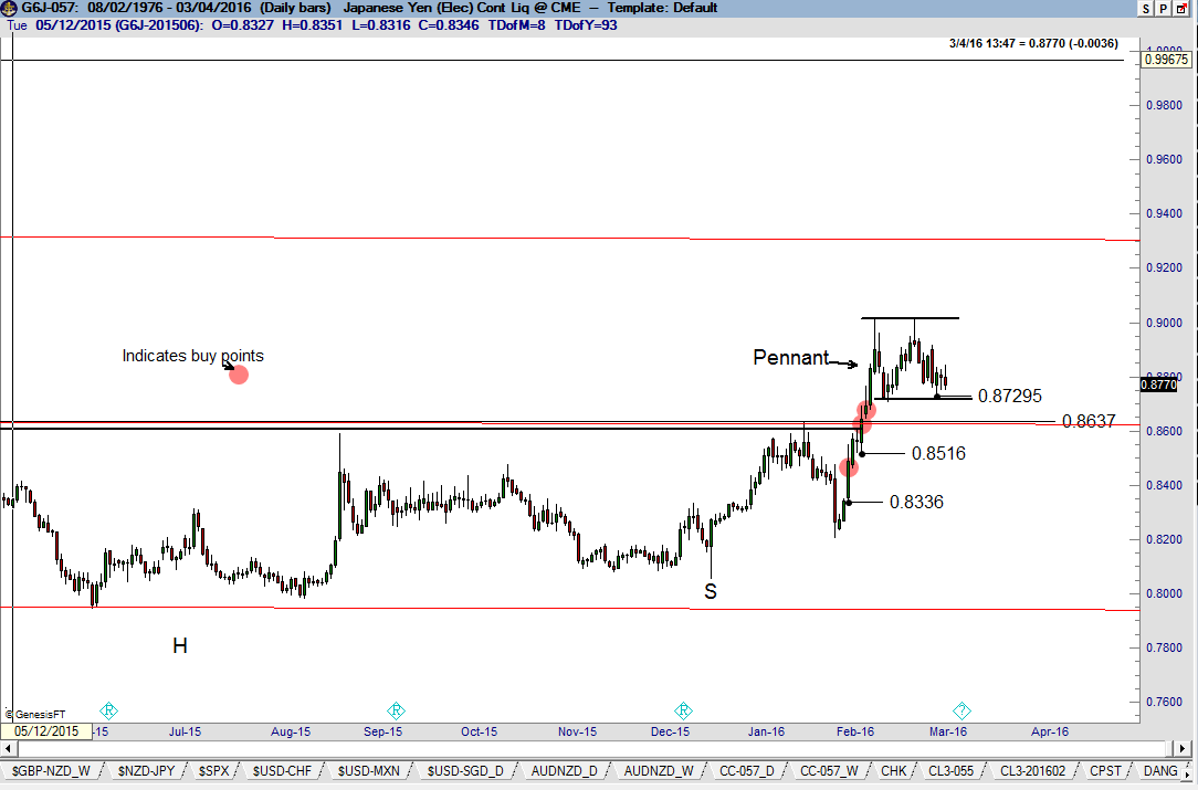
The dominant Japanese yen chart construction in this market is the massive H&S bottom completed on the weekly and daily graphs on Feb 8. The daily graph shows that the market’s momentum has stalled. This stalling price action could indicate a retest of the underlying H&S neckline around 8640. If this current correction holds above 8730, a subsequent new high would complete a 4+ week pennant. I am protecting a layer of my position under the recent low. I will add to my position if a bullish pennant is completed. The target in Yen futures remains 9330.
Other Markets
U.S. stock index futures (S&P weekly graph)
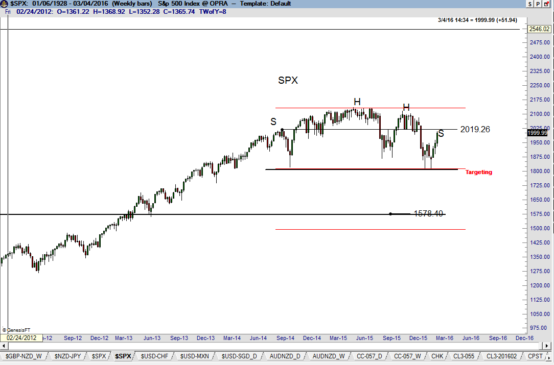
Since I have already tipped my hat on my bias on the U.S. stock market indexes in favor of the bears, I might as well go with the flow. In last week’s Update I mentioned 1990 to 2000 as an area to watch on the S&P chart. Friday’s high was 2007 in futures, 2009 in SPX. Right or wrong, here is my thinking – IF (always a big IF) SPX is forming a complex H&S top with a double head, then the right shoulder high would equal the height of the left shoulder high at 2019. A high in the 1990 to 2020 zone would provide near-perfect balance to the H&S top. If 2020 or so does not restrain this push up, then it is back to the drawing board, thankful that “the opinion was not a position.”
This advance has not cost me money. Being on the sidelines is a position. I was extremely interested in shorting S&Ps on Friday, but did not do so. I may have more courage this coming week.
Canadian Dollar futures (daily CAD/USD and weekly USD/CAD charts)
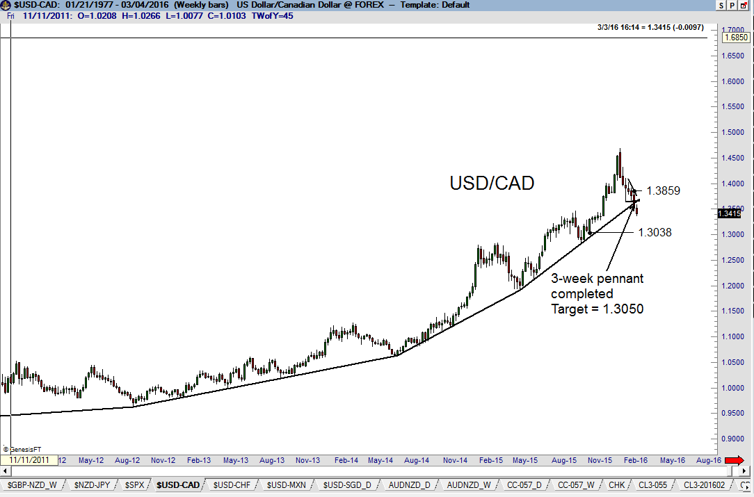
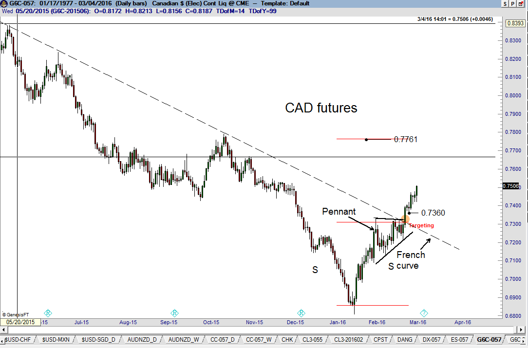
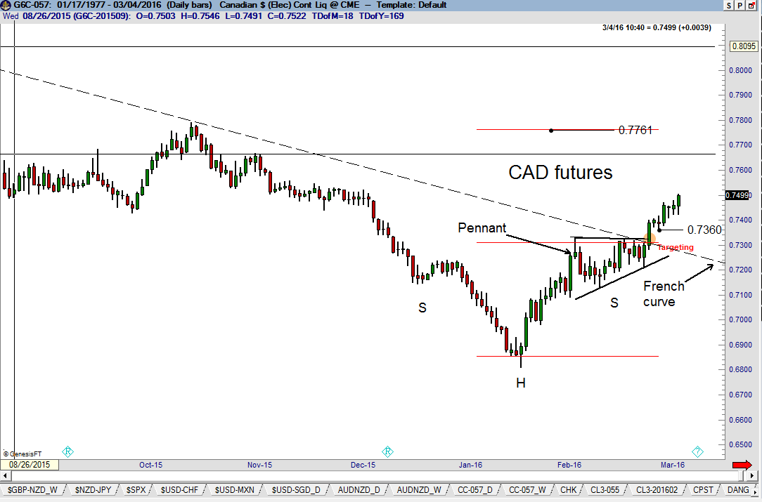
The advance in CAD on Feb 25 simultaneously completed a 3-week pennant on the daily graph and violated a French Curve on the weekly graph. The spot USD/CAD weekly chart best shows the French Curve. Remember, spot USD/CAD trades at a reciprocal value to CAD futures prices. The target in futures is .7760 or so. I have already peeled off Layer One of my position and am actively advancing the protective stop on Layer Two.
Risk and Trade management – Where the rubber meets the road
I often refer to risk and trade management as being far more important components for trading success than is trade identification (signaling). Worded in a different way, following is my rank ordering of the importance of the tactical components of a trade.
- How you manage the trades you enter (i.e., how you handle your profits or losses)
- How you size and lever trades
- Where and how you get into trades
- What market you trade and entry devices you utilize
Even the listing above is entirely inadequate because such things as emotional stability, capitalization, patience, trading practices and discipline occupy a separate level of higher priority than do trading tactics.
By my own admission, I have probably not done an adequate job explaining the tactical guidelines dictating my trading maneuvers. Not necessarily in the rank order presented above, let me paint a clearer picture of how I approach these tactical components.
Sizing and levering trades
This topic relates to the risk I am willing to take in a trade. As a general rule, my benchmark risk per trade (all contracts or shares of a trade combined) is 100 basis points or 1% of my trading capital. This benchmark level is adjusted on a per trade basis according to a grid containing such items as the nature and duration of the exact pattern being traded, the totality of my existing positions, confidence level, etc. I end up with a range of 30 BPs to 120 BPs, but occasionally (once or twice each year) may risk might be extend to 200 BPs. I refer to a 200 bp risk as a “bet the family farm” trade.
The sizing of a trade is easily determined once I establish my likely entry level and the level at which I will throw in the towel. For example, I am currently long CAD futures (see above). I bought CAD at a price of .7336 with an average initial risk of $620 per futures contract. I sized the risk of the trade at 50 bps risk ($5,000 per $1M of capital). Thus, my entry position size was 8 contracts per $1M. Interestingly (and not explained herein), had the market’s upside breakout occurred just two days later, I would have risked 80 to 100 bps on the trade. Several more days of testing the upper boundary of the pennant would have given me more confidence to greatly increase my leverage and trade sizing.
Where and how I enter trades
Every trader must come to terms with their own tactical operations. I can only speak to my practices. I trade based on the construction and completion of recognizable classical chart configurations on weekly charts (to establish trading themes) and daily charts (for timing and risk management). Based on leverage and sizing considerations (see section above) I have a good idea of the position size I want to enter. In futures, the total position size will range from five contracts per $1M to 20 contracts per $1M. In spot forex, a typical size is $800k worth of the cross being traded.
I enter trades in layers – typically three layers deep. The entry points can consist of the following:
Layer One – Periodically a daily chart might form a recognizable smaller pattern in the late stages of a larger weekly chart pattern. In such a case I will use the launching pattern to enter one-third of my planned total position. An example of this “launching” type pattern can be found in USD/NOK where the right shoulder of a large H&S top formed an independent 5-week channel or flag (shown on the 6-hour chart for emphasis). If I enter a Layer One position on an intraday basis, I will scramble out quickly if the trade does not receive closing price confirmation.
Layer Two – My focus at this point in a trade becomes the boundary of the major pattern under consideration. There can be some complication on the precise identification of a boundary depending upon how the neckline is drawn, in the case of a H&S. Again, using USD/NOK as an example, note that the neckline of the H&S using the orthodox lows of the bars (solid line) is different than the neckline of a H&S using closing prices (dotted line). Which neckline represents the real breakout? I consider both of them and make a judgement call. Sometimes my judgement is right and sometimes it is wrong. Layer Two positions typically represent 1/3rd to ½ of my total anticipated position size. At times – and for reasons far too complex to discuss herein – I may enter Layer Two positions with an intraday stop. Otherwise, Layer Two positions are based on the closing price completion of the pattern in question.
Layer Three – The final 1/3rd to ½ of my total anticipated position is established based on a closing price completion of the pattern under consideration. The close in USD/NOK on Friday completed the closing price H&S top. I added short leverage accordingly.
How I manage a trade
Just as I enter a trade in layers, I also exit trades in layers.
Layer One – I am extremely aggressive in managing the Layer One portion of a trade. Not only will I aggressively advance a protective stop in the direction of a profitable trade, but I may also take a profit within a few days of trade entry. My profit goal in doing so is generally about $1,500 per futures contract (or an equivalent FX layer). The idea behind this practice is to protect the overall trade against a net loss should a market quickly reverse itself. I am then willing to re-enter Layer One leverage – but only on a price correction.
Layer Two – I am moderately aggressive in managing Layer Two of a trade. I will attempt to move the Layer Two protective stop to a break-even position as quickly as possible, and will then use daily chart reaction lows in the case of a bull trend (or daily chart rally highs in the case of a bear trend) to re-adjust my stop levels. There are a few techniques explained in my book, “Diary,” that also illustrate techniques to advance stop protection. The chart of EUR/GBP shown here displays the establishment of a full three layer position as well as the advancement of stop protection based on the natural progression of the bull trend.
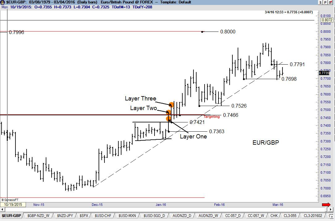
Layer Three – I will advance the protective stop on Layer Three to breakeven if it makes sense based on the chart, but will then advance the stop slowly, offering a market the maximum opportunity to reach the implied target of the pattern in question.
Overriding trade and risk management guidelines:
- Profits are taken at the implied target of the major pattern being traded
- Losses are not taken home on Fridays
- All attempts are made to prevent any Layer of a position to become a popcorn trade
- Capital preservation always takes precedent over chart interpretation (i.e., live to trade another day)
Energy (weekly Crude Oil and daily Heating Oil charts)
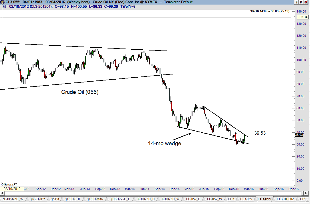
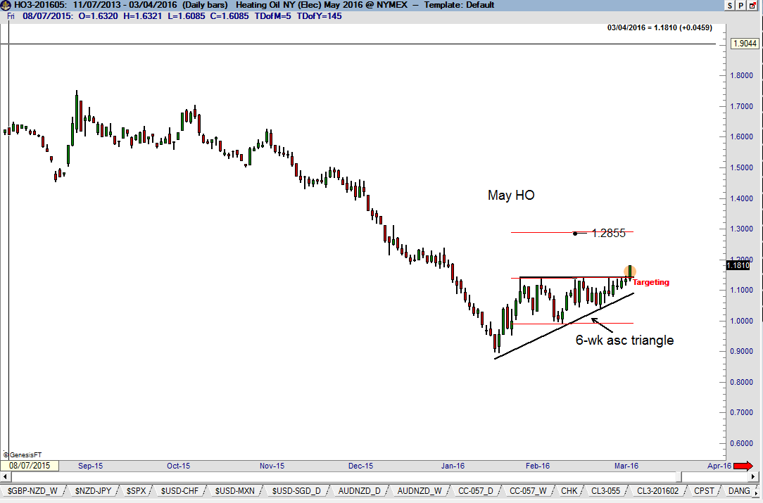
In recent Updates I have discussed the concept of chart morphology as it relates to Crude Oil. We saw morphology display itself this past week. The weekly Crude Oil chart (the version with the roll-over on the first trading day of the expiring month) displays a possible falling wedge pattern. I fully expect this pattern to morph several times in the months ahead before the Crude Oil charts are resolved. The rally in May Heating Oil on Friday completed a small ascending triangle on the daily graph. This pattern should propel prices toward 1.2850. I love tight little patterns like this, especially if they serve a continuation function. But small tight reversal patterns can also offer swing trade opportunities.
AUD/NZD (weekly and charts)
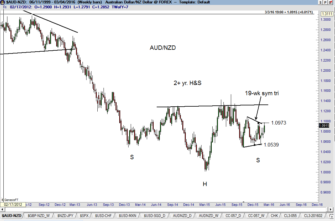
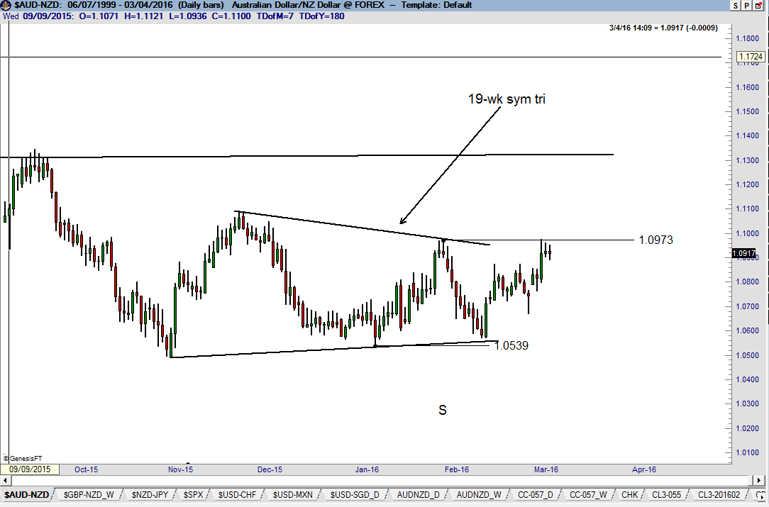
AUD/NZD is setting up as a possible move. The weekly graph displays a potential H&S bottom pattern. Note that the right shoulder has taken the form of a symmetrical triangle. For a number of weeks our Update has pointed out that the resolution of this daily chart triangle might hold the key to the H&S pattern. This symmetrical triangle is a wonderful example of the type of daily pattern capable of launching a much larger pattern (the weekly chart H&S). I will trade this triangle (and H&S) accordingly.
The “Look-Back” Test
As a trader I have absolutely no control if a trade will be a profit or loss. None! Zero! Ingen! Keiner! Aucun! Geen! Tiada! The only variable I control is order entry. I am a glorified order enterer and that’s it. And when it comes to entering orders, my job is singular:
To identify set ups, including entries and exits – based on classical charting principles – that will be clear a year or more from now. My trading action must be able to stand the test of time and the critical evaluation of hindsight. Whether a trade produced a profit is secondary.
I operate under the principle that long-term profitability will take care of itself if I restrict my trading to the “Look-Back Test” and apply rigid risk and trade management principles. In the process, a given trade is nothing more and nothing less than a datum point in a series of data points, all subject to random probability assignment.
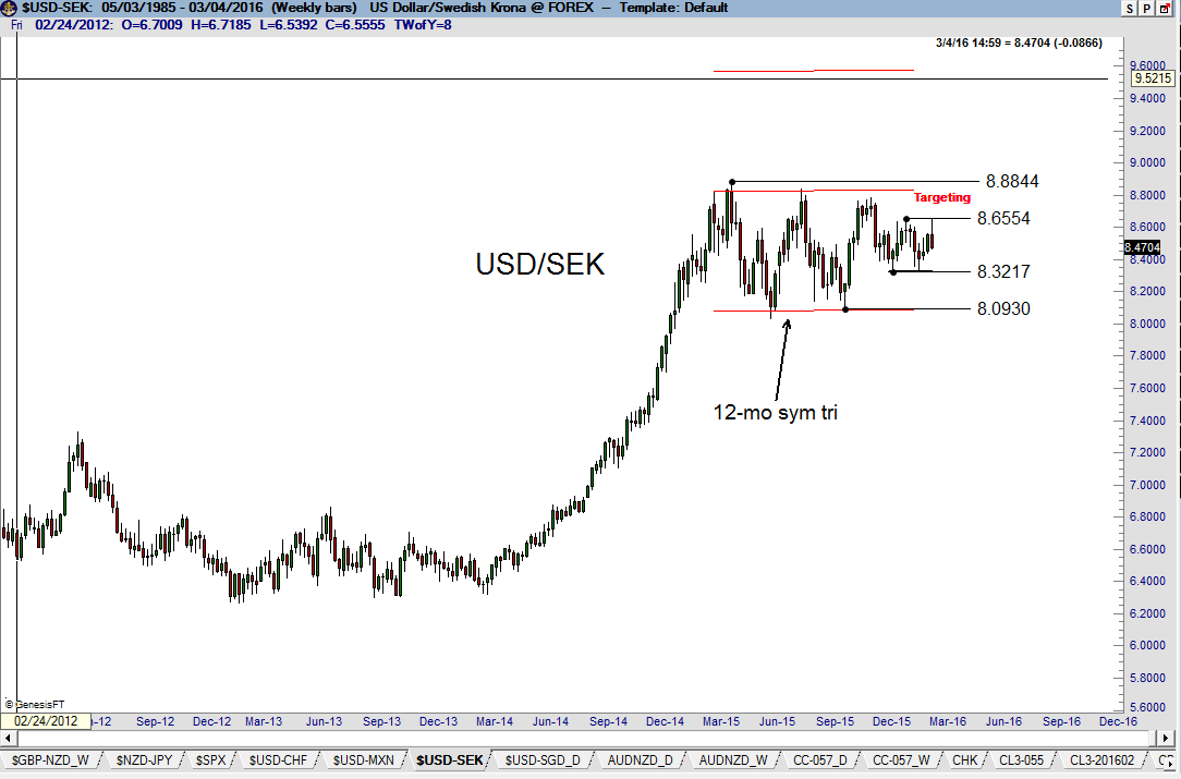
USD/SEK (weekly chart)
With Norway leading the way, how much further behind can Sweden be? The weekly chart exhibits a 12-month triangle. This pattern may set up as an opportunity to extend leverage in a long Scandinavian theme. However, if the signals in USD/NOK prove to be false, then USD/SEK could be a screamer to the upside.
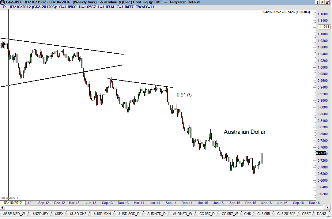
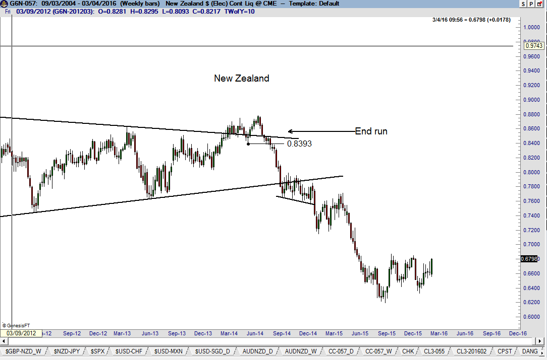
Australian Dollar and New Zealand Dollar
During the past week, quite a few of you asked my opinion on going long the Australian dollar or New Zealand dollar. It is my desire to trade patterns with very well-defined labeling. I do not have a clue what the AUD and NZD charts are doing. A market going up is never enough reason for me to be long. The AUD and NZD charts, in my opinion, are a real mess. The best case that can be made is that AUD is forming a double-bottom looking pattern, but the chart construction does not meet the strict criteria of the double bottom. Frankly, I am glad that classical charting principles have well defined rules – and that I cannot call any old chart construct any old name I might choose.
