With today's release of the April S&P/Case-Shiller Home Price we learned that seasonally adjusted home prices for the benchmark 20-city index were up month over month at 0.5%. The seasonally adjusted year-over-year change has hovered between 4.4% and 5.4% for the last twelve months.
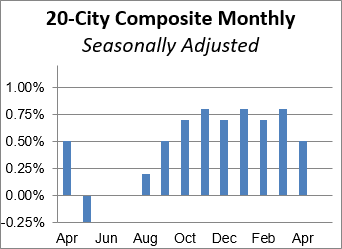
The adjacent column chart illustrates the month-over-month change in the seasonally adjusted 20-city index, which tends to be the most closely watched of the Case-Shiller series. It was up 0.5% from the previous month. The nonseasonally adjusted index was up 5.4% year-over-year.
Investing.com had forecast a 0.6% MoM seasonally adjusted increase and 5.4% YoY nonseasonally adjusted for the 20-city series.
Here is an excerpt of the analysis from today's Standard & Poor's press release.
"The housing sector continues to turn in a strong price performance with the S&P/Case-Shiller National Index rising at a 5% or greater annual rate for six consecutive months," says David M. Blitzer, Managing Director and Chairman of the Index Committee at S&P Dow Jones Indices. "The home price increases reflect the low unemployment rate, low mortgage interest rates, and consumers' generally positive outlook. One result is that an increasing number of cities have surpassed the high prices seen before the Great Recession. Currently, seven cities – Denver, Dallas, Portland OR, San Francisco, Seattle, Charlotte, and Boston – are setting new highs.
However, the outlook is not without a lot of uncertainty and some risk. Last week’s vote by Great Britain to leave the European Union is the most recent political concern while the U.S. elections in the PRESS RELEASE c G R fall raise uncertainty and will distract home buyers and investors in the coming months. The details in the S&P/Case-Shiller Home Price data also hint at possible softness. Seasonally adjusted figures in the report show that three cities saw lower prices in April compared to only one city in March. Among the 20 cities, 16 saw either declines or smaller increases in monthly prices in the seasonally adjusted numbers." [Link to source]
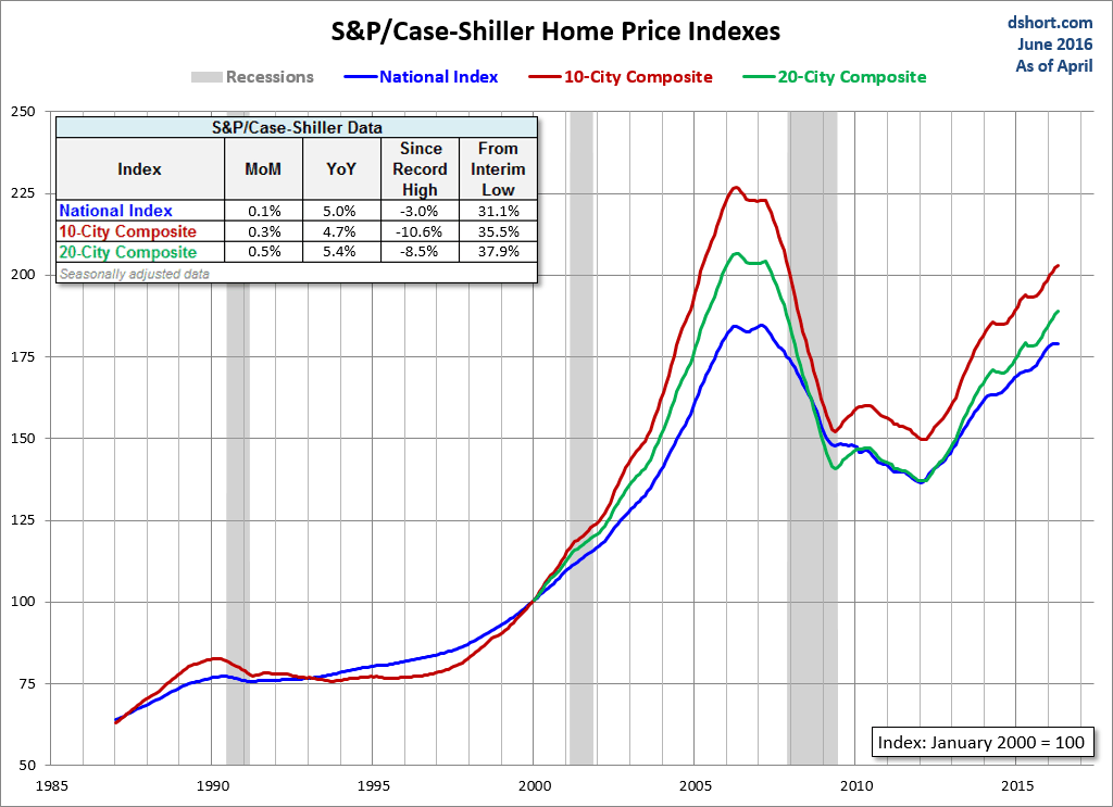
The chart below is an overlay of the Case-Shiller 10- and 20-City Composite Indexes along with the national index since 1987, the first year that the 10-City Composite was tracked. Note that the 20-City, which is probably the most closely watched of the three, dates from 2000. We've used the seasonally adjusted data for this illustration.
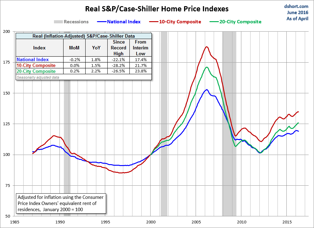
For an understanding of the home price data over longer time frames, we think a real, inflation-adjusted visualization of the data is an absolute necessity. Here is the same chart as the one above adjusted for inflation using a subcomponent of Bureau of Labor Statistics' Consumer Price Index, the owners' equivalent rent of residences, as the deflator. Among other things, the real version gives a better sense of the dynamics of the real estate bubble that preceded the last recession.
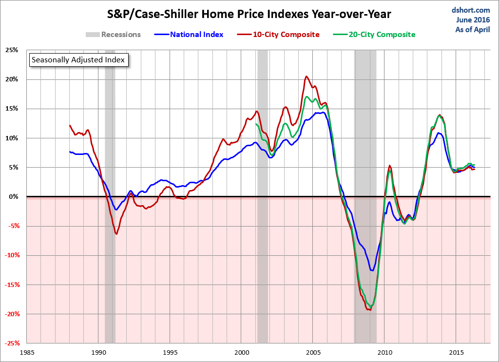
The next chart shows the year-over-year Case-Shiller series, again using the seasonally adjusted data.
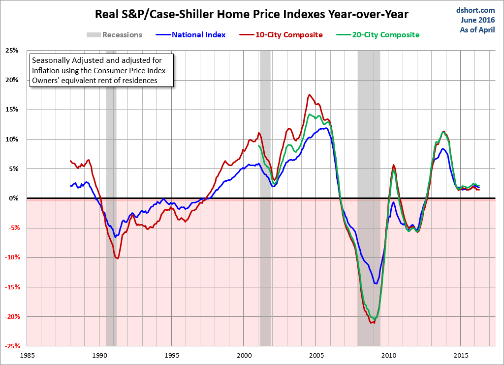
Here is the same year-over-year overlay adjusted for inflation with the Consumer Price Index owners' equivalent rent of residences.
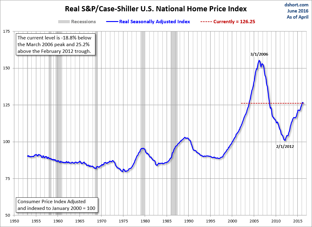
For a long-term perspective on home prices, here is a look at the seasonally and inflation-adjusted Case-Shiller price index from 1953, the first year that monthly data is available. Because the CPI owners' equivalent rent of residences didn't start until 1983, we've used the broader seasonally adjusted Consumer Price Index.
