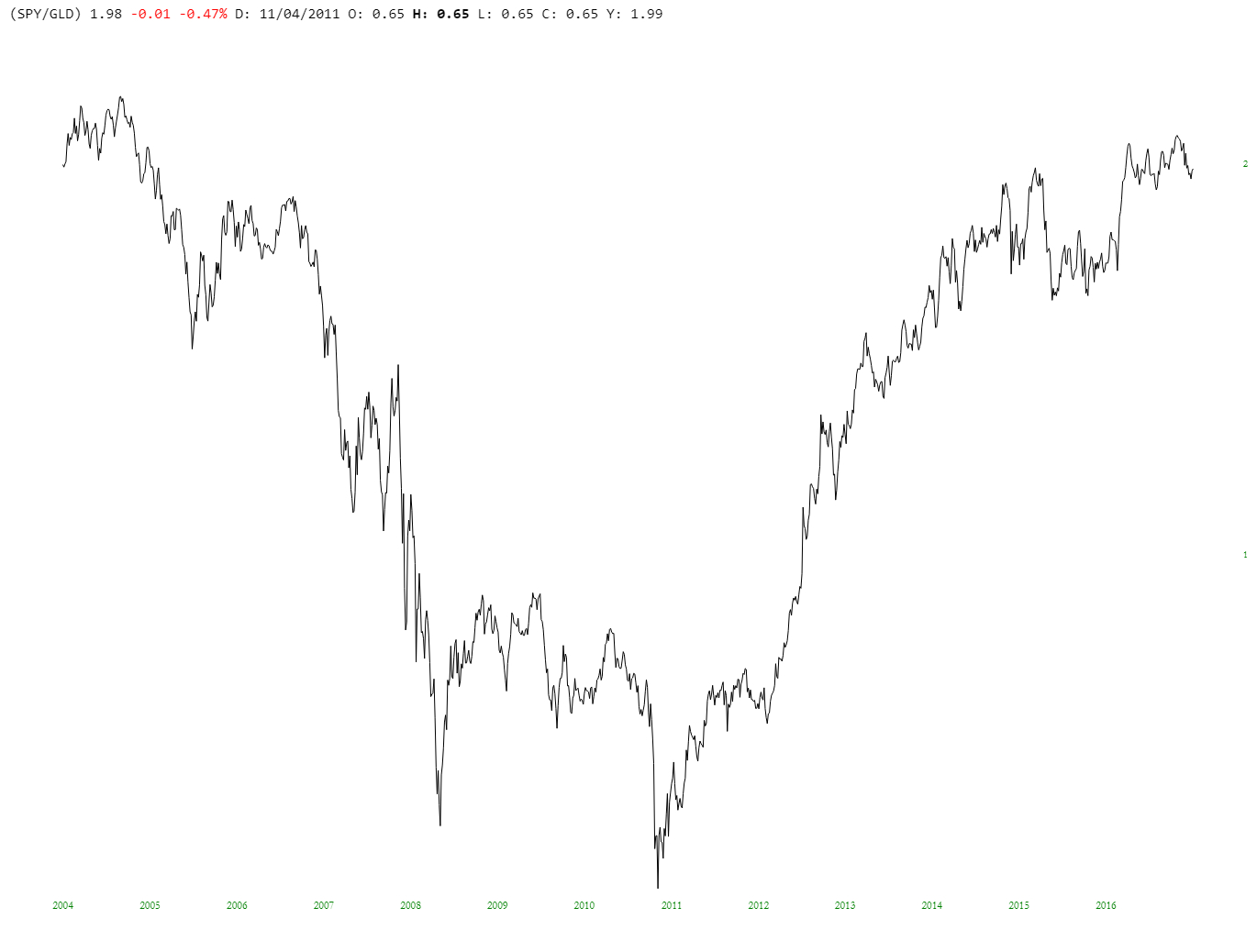
Using good old SlopeCharts, I thought I’d do a little experiment. As you know, stocks are at lifetime highs, but in nominal terms. I wondered what things look like in terms of “real” money (as measured by GLD (NYSE:GLD)), so I entered the symbol (SPDR S&P 500 (NYSE:SPY)/GLD) and got this result:

What jumped out me is that, in these terms, we are actually lower than we were in the pre-financial crisis peak! In addition, the ultimate low for the market wasn’t the famous March 2009 bottom, but instead took place a couple of years later (which makes sense, if you look at bank and financial stocks, which plunged until then). Food for thought.
