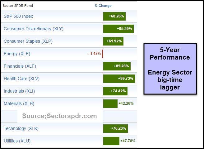
Below looks at the S&P 500's sector performance over the last 5 years. The winner for the lowest performance is the energy sector (-1.42%). Indeed, Energy Select Sector SPDR (NYSE:XLE) is lagging the S&P 500 by almost 70% during that same 5-year period.
The big question: Is it time for energy to rally?
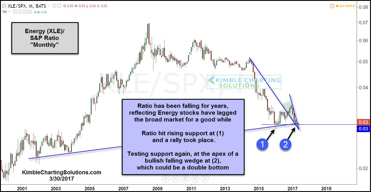
The next chart looks at XLE/S&P 500 ratio over the past 17 years. It's a pattern worth looking at.
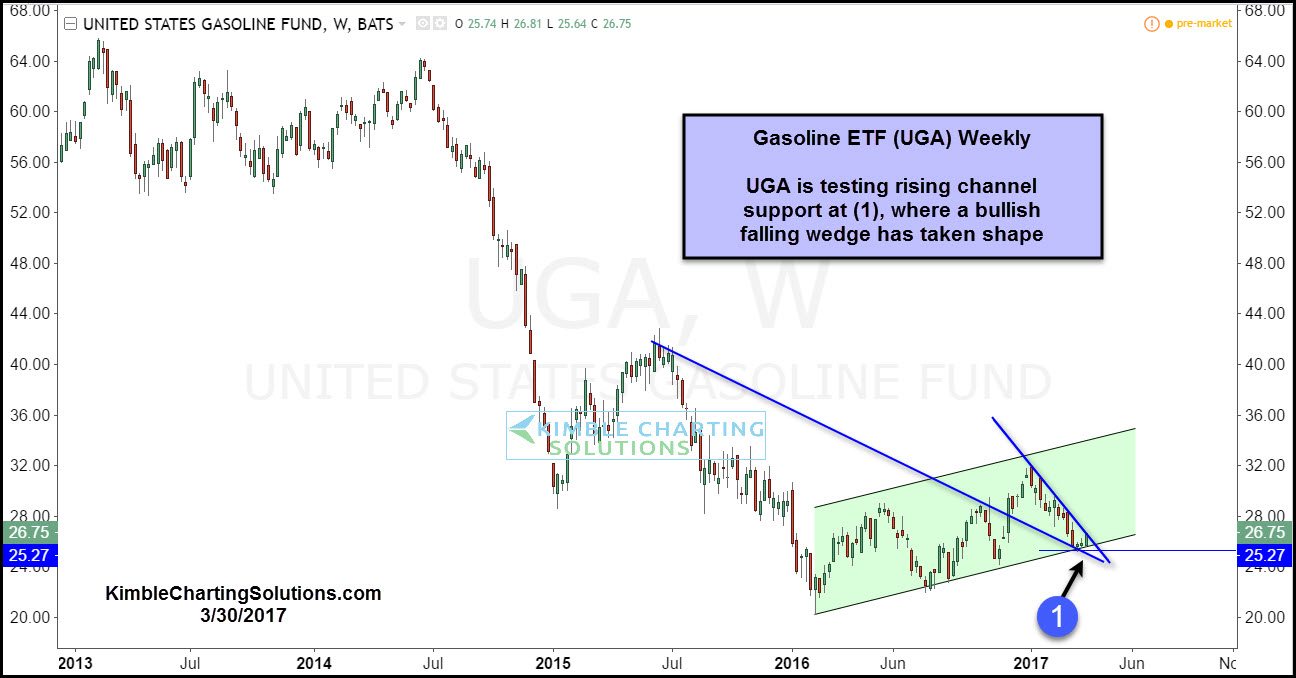
XLE's pattern presents a nice entry point, with a stop below the support test at (2). Another test of support in this space is taking place in the UGA chart below.
From a long-term trend perspective, there's no doubt that the trend in both charts is down -- lower highs and lower lows and below long-term moving averages. For the trend follower, this is less than interesting.
If you like to buy low in hard-hit sectors with tight stop-loss parameters, we find both of these charts very interesting as both have been out of favor and are testing key support levels.


