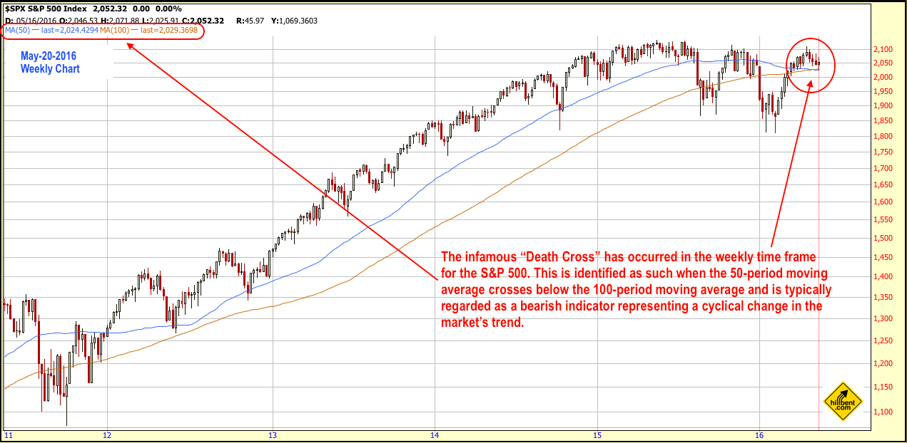
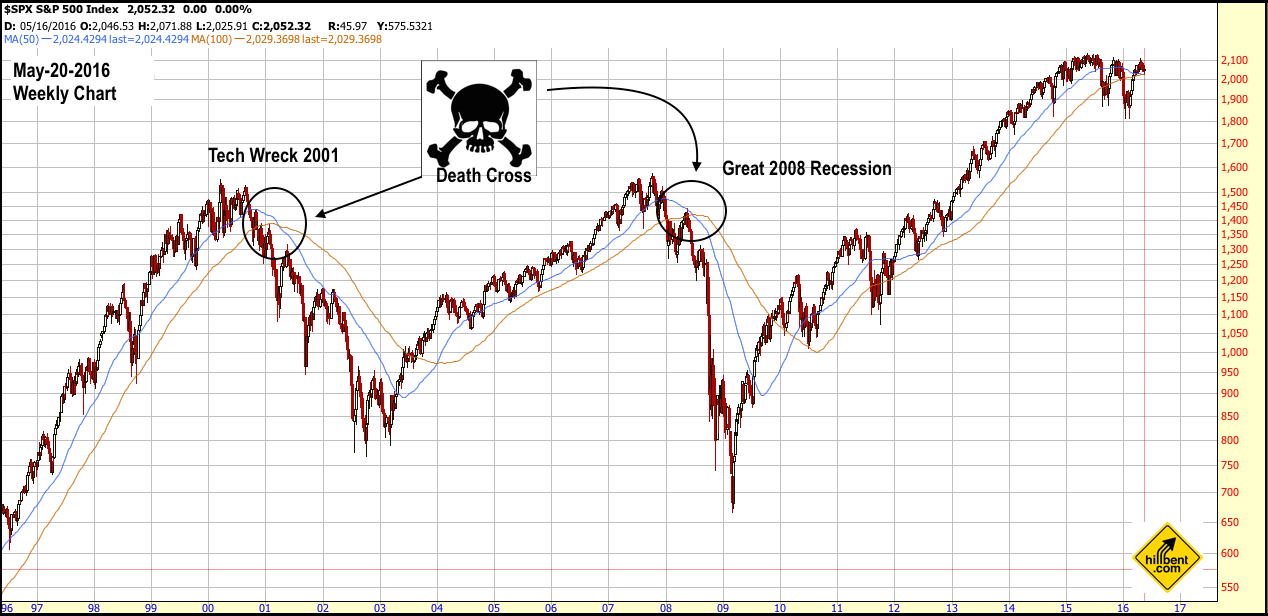
The Death Cross, whereby the 50-moving average crosses under a moving average of 100 or 200, occurred recently in a weekly time frame for the S&P 500. The subject has raised some concerns amongst investors as financial media pundits emphasized that it has occurred only twice in the previous 16 years. One occasion marked the onset of the Great Tech Wreck in 2001 and the other ushered in the Great 2008 Recession. The inference is that because both preceded some of the worst carnage of capital destruction experienced in investment history, the reemergence of this pattern indicates a high probability or almost guarantee that another bear market is imminent. (See charts below)


However, the reality is that these last two financial crashes were so severe that their ghosts continue to haunt the market. Completely ignoring this indicator is not wise, but neither is believing Chicken Little financial media pundits frantically running around and screaming "the sky is falling ". Before dismantling the myth of the Death Cross and reconstructing it within a proper context, let me state, as a proponent of technical analysis, that even I raise an eyebrow when I see this crossover. Now, in true Hillbent fashion, shall we begin?
- Expand historical data and sampling: If the market is basing perceptions on probabilities, then due diligence requires a larger sampling of data to quantify the validity of such assumptions. Instead of analyzing only 16 years of history, let's review the last 86 years or so of weekly market data for the S&P 500, which spans from 1930 to the present. (That sounds fair enough to me, but if you disagree, please feel free to share your comments explaining why.)
- Include inverse indicator for more complete analysis: Next, if investment outlooks and decisions are being made upon the Death Cross indicator, then by default one must accept its inverse indicator, i.e. the Golden Cross (which is when the 50 period moving average crosses above the 100 or 200 period moving average and signals a shift to a bullish market trend). After all, you can't just use the indicator for part of the time and then arbitrarily abandon it before it changes. (Well, actually you can and, by doing so, just realize that you are no longer using the indicator, but something else.)
- Quantify the results: Lastly, the overall efficacy of the indicator in terms of its performance and consistency to generate its intended results shall be measured to gauge the accuracy of its current predictability being touted by financial media and other investment professionals.
And here are the results...
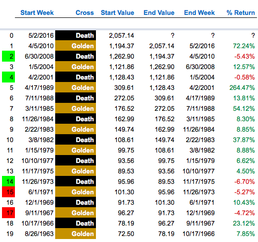
S&P 500 History of Death Cross Cycles, Part One
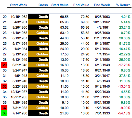
S&P 500 History of Death Cross Cycles, Part Two
- Over the last approximate 86 years, the S&P 500 has experienced 38 cycles of bull and bear markets, if you apply and accept the standards of the Death Cross and Golden Cross indicators. There have been 19 bull markets and 19 bear markets dating back to July-1930 and up to the present May-2016. 16 out of 86 years represents at 19% of the historical period I am analyzing and the 2 Death Crosses merely reflect at 11% of those which actually occurred in this period. To give such weight to a small sampling is completely absurd and I rest my case. (On the other hand, discussing the Death Cross in a sensationalistic context is sexy and makes for good financial pornography and conversation over cocktails.)
- Out of the 19 occurrences of the Death Cross during this period, it has achieved its intended result of negative percent changes only at 21% (4 out of 19) of the time. On the other hand, the Golden Cross has proven to be more reliable as it achieved its intended result of positive percent changes at 74% (14 out of 19) of the time. Note that the intended results are highlighted in green and the unintended results are highlighted in red (see table below).
- Overall, of the 38 combined cycles of Golden (19 bullish) and Death (19 bearish) Crosses that have occurred, 76% (29 out of 38) have generated positive returns, while 24% (9 out of 38) have delivered negative returns.

- In terms of performance, below are the historical results for the SP-500's 38 aggregated cycles of Death and Golden Crosses. It is clearly evident that one would have lost money more often than profiting from following this "bearish indicator". The information (see table below) is completely objective and unbiased as I have no television ads to sell or eyeballs to attract for PPV clicks. (Perhaps, Warren Buffet is right in that one would be wrong to bet against the American economy.)

Conclusion Summary...
As a capital markets strategist who weights a considerable portion of research efforts towards technical analysis, I have a tremendous amount of respect for the use of moving averages and consider them a valuable tool. However, when it comes to determining market cycles, making strategic investment decisions and asset allocation of capital , I do not believe the infamous Death Cross is the most practical tool one can or should use. Instead, there are other more reliable technical analysis indicators which, when used in conjunction with other fundamental and quantitative tools, increase the odds of accuracy and timing (a subject I am currently undertaking in a soon to be published white paper).
(Disclaimer: Past performance is not indicative of future results and does not guarantee such either. Please note that I do not refute the existence of bear markets and am well aware of the bear's ability to destroy capital and ruin the financial fates of any and many. This is why it is imperative that one understands the risks and benefits of one's individual investment objectives and time horizon or consult with a professional advisor who does and is capable of such and fully discloses any existing or potential conflicts of interests as a fiduciary, if applicable.)
