Without doubt it’s been a tough few years for Australian share market investors. At times there have been signs of hope and in early 2015 the S&P/ASX 200 and ASX All Ordinaries briefly edged near 6000.
There was also a glimmer of hope that the market would bounce back strongly after the GFC when the market rallied towards 5000 after nearly crashing to 3000 in 2008. Those were not pleasant days to be holding long positions, but at least something was happening. At the beginning of 2010 the ASX All Ordinaries Index was around 4800 – today it’s at around 5200 – which means that in just over 6 years the market has risen a paltry 400 points.
In early 2009 I wrote:
“…I do not expect the Australia stock market to outperform the U.S. stock market when the next bull run comes along. Australia has just been through a great period of around 17 years without a recession and all good things come to an end. In addition Australia has in the last 5 years or so enjoyed rising assets prices, low unemployment, cricket wins, a commodities boom and has indeed been the lucky country. However all this luck has come at a price, Australia has not really diversified it’s economy because there did not seem to be any need to do so. Therefore in 2008 we still generally export raw materials and then import products made from these materials from countries such as Japan, China and South Korea.” Source: Is the golden era for the Australian stock market over?
Today little has changed and the ASX All Ords and ASX 200 have both underperformed the US Dow Jones Industrial Average (DJIA) and S&P 500 Index (SPX). In 2009 I suggested the golden era was over for the Australian stock market – in 2016 this is now the reality.
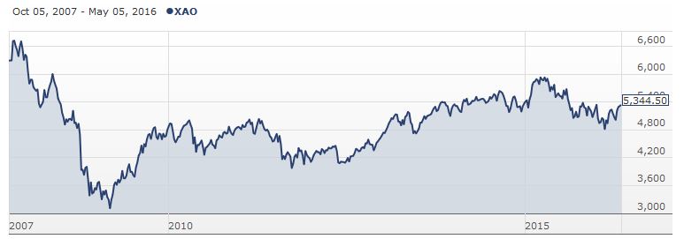
To highlight this point let’s look at what the All Ordinaries Index has done (or not done) since the market high in late 2007.
ASX All Ordinaries Index (XAO) 2007 – 2016
Although the All Ords did fall back close to 4000 in 2011 and 2012 it has not gone close to testing the GFC lows of 2009 and it’s unlikely (but not impossible) that we will see those lows again. On the other hand the market has not been able to move past the high point set in late 2007 and it doesn’t look like that’s going to happen this year and probably not next year either.
Basically the Australian stock market is stuck around the trading ranges I outlined in 2013 in ASX All Ordinaries Index: Charts, Analysis & Trading Ranges and to be honest I did not expect those trading ranges to still be in play today. But they are.
Although the overall market has not moved much since 2010 there have been some fundamental changes with some of the bluest of blue chip stocks being sold off heavily, while quietly other stocks have surged up the charts.
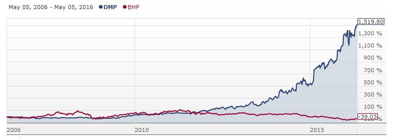
Two good examples of these are Domino’s Pizza Enterprises Ltd. (AX:DMP) and BHP Billiton (AX:BHP).
Domino’s Pizza and BHP Billiton Ltd 10 Year Share Price Chart
Some years ago I looked at DMP in some detail but I failed to take any action. Since then of course it has soared, whereas BHP continues to languish. Certainly if someone had suggested back in 2010 that Domino’s would trade at 3 times the price of BHP shares then I would not have believed them. But that’s how it is today.
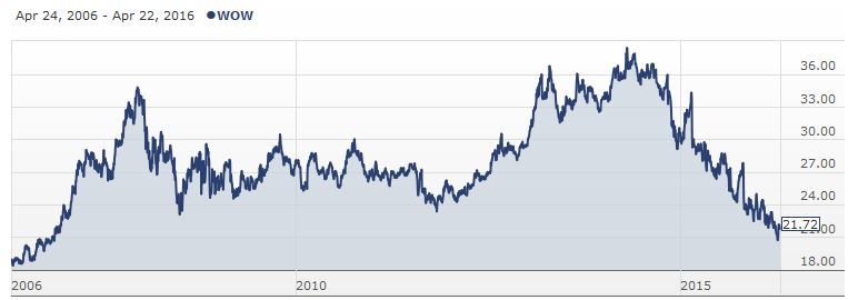
Another blue chip stock in trouble is Woolworths Limited (AX:WOW). This stock was once considered almost essential to have in a defensive shares portfolio but over the last few years it has fared badly mainly due strategic business planning blunders by the management team.
Woolworths (ASX:WOW) 10 Year Share Price Chart
Around the middle of 2014 Woolworths shares were trading around $37 and now they are struggling to stay above $20 which is lower than the level they traded around during the depths of the GFC!
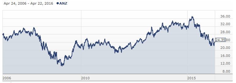
Meanwhile the big four banks (ANZ Banking Group (AX:ANZ), Commonwealth Bank Of Australia. (AX:CBA), National Australia Bank Ltd (AX:NAB) and Westpac Banking Corporation (AX:WBC)) have seen their stocks move from powering the ASX higher to effectively being a bit of a drag along with commodities, energy and mining related stocks.
Australia and New Zealand Banking Group (ASX:ANZ) 10 Year Share Price Chart
ANZ is a stock which reflects how the broader Australian stock market has fared since the GFC. There have been signs of life, the occasional strong rally but then the market falls back into a fairly narrow range. For years now the stock market has essentially done very little and it’s often only been dividends which have been able to make investing in the market worthwhile.
This pattern wears down investor confidence and many investors will look elsewhere for better returns which in Australia often appears to be residential property. Longer term I doubt this is a good trend though.
My strategy for dealing with current malaise that grips the ASX is twofold. Firstly I follow the trading ranges that I have outlined above and look to buy a stock that is potentially oversold with the aim of selling into a rally. Secondly I have been diversifying away from ASX listed Australian companies via Exchange Trade Funds (ETFs) that provide exposure to international markets or commodities.
However this strategy is not without risk and all investors should adapt a strategy which suits their objectives and obtain reliable investment advice as needed.


