- Due to the Fed raising interest rates, the short-end of the curve is moving higher at an accelerated rate.
- The long-end of the curve is moving higher, but at a slower pace.
- The yield curve is currently compressing in much the same manner as it has during the last three expansions.
Once again, we're seeing stories about the flattening yield curve. From the NY Times:
But if you’re in the business of making economic predictions, it has become very difficult to disregard an important signal from the bond market.
The so-called yield curve is perilously close to predicting a recession — something it has done before with surprising accuracy — and it’s become a big topic on Wall Street.
From MarketWatch earlier this week:
The yield curve for U.S. government bonds flattened after the Federal Reserve raised its benchmark Fed-funds rate by a quarter percentage point to a range of 1.75% to 2%. The yield spread between the 2-year note yield and the 10-year note yield , a popular gauge of the yield curve's slope, narrowed by one basis point to 40 basis points, or a 0.40 percentage point, the tightest since Aug. 2007.
So, let's look at the data, starting with the short end of the curve:
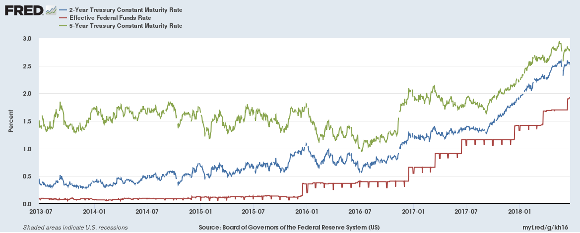
The first round of Fed tightening in 2016 didn't have much of an impact. While the effective Fed Funds rate rose (in red), the 2-year (in blue) and 5-year (in green) actually came in a bit. But the short-end of the curve started to rise in late 2016, anticipating the next round of tightening; both the 2- and 5-year rose about 25 basis points before the Fed hike. After the next round of Fed tightening in early 2017, both rose about 50 basis points. At the end of 2017, both started to rise again, this time increasing about 100 basis points.
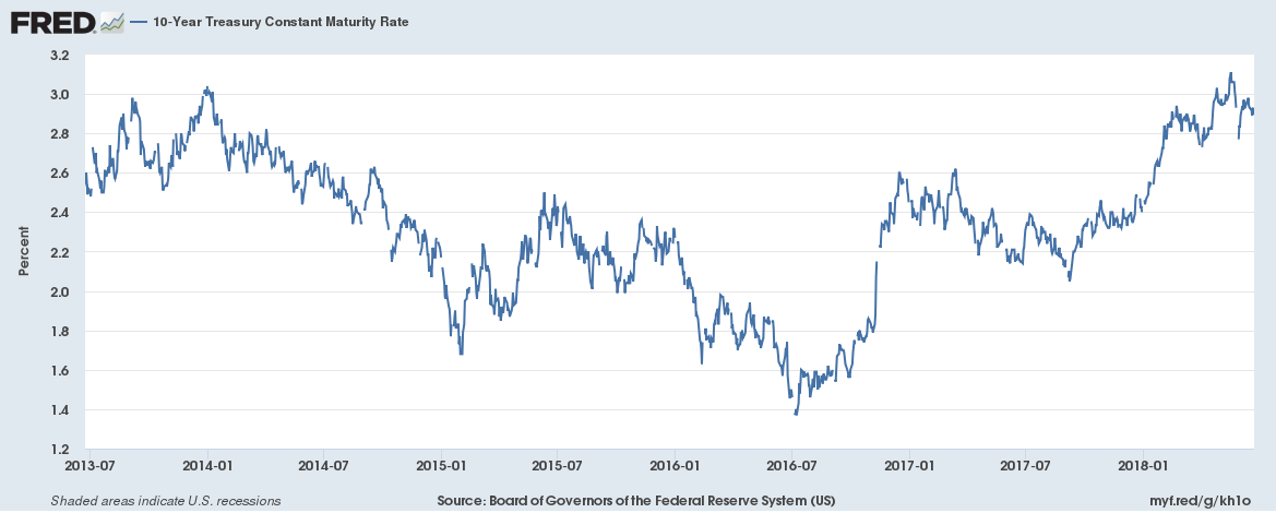
Next, let's look at the 10-year CMT:
There are two general trends. The 10-year moved about 160 basis points lower between 2013 and 2016. It then reversed course by the same amount between 2016 and today.
What's happening is actually pretty standard; the short-end of the curve is rising more than the long-end, leading to a contraction of the curve. Here's the long-term chart of the 10-year Fed Funds rate:
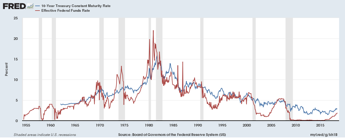
Notice that the Fed Funds rate (in red) usually does most of the heavy lifting; there's no difference between the recent expansion and the preceding two.
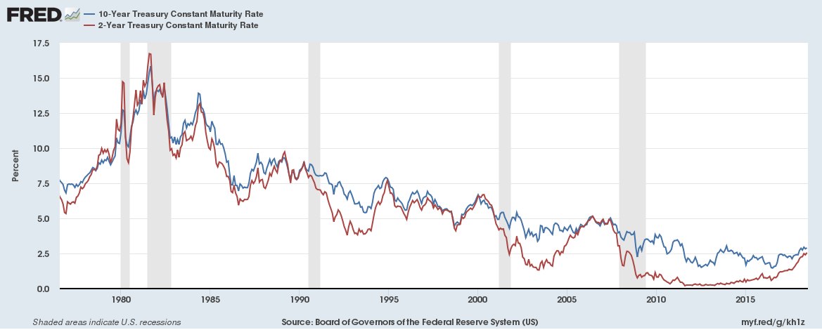
We see the exact same pattern playing out for the 10- and 2-year.
Let's look at the data as a spread:
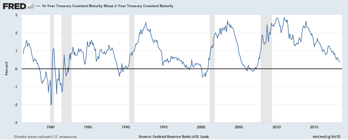
The 10-year-2-year spread is now below 1%. In fact, it's below 50 basis points, which is very narrow. During the last three expansions, this measure of yield curve tightness has turned negative between 1-2 years before a recession.
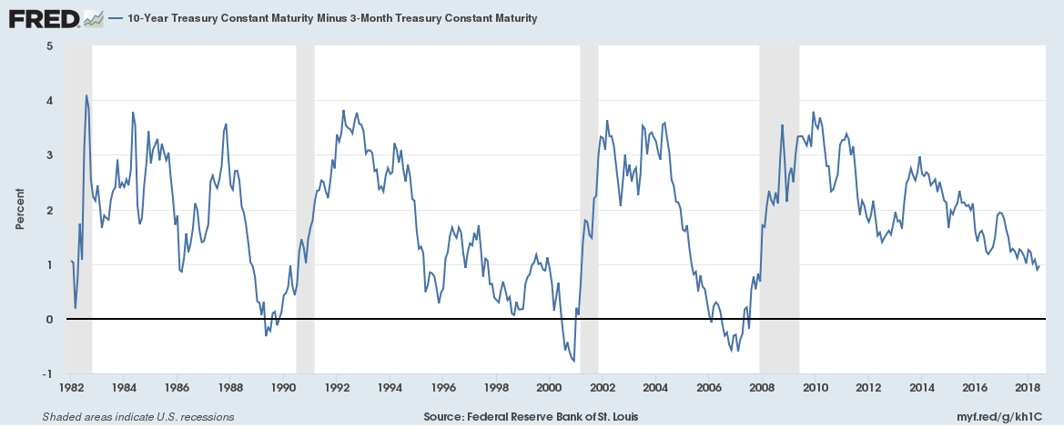
We see the exact same situation with the 10-year-3-month spread, which also has a solid history of predicting recessions.
What about quantitative easing? Doesn't that mean this indicator is no longer valid? After all, the Fed has greatly expanded its balance sheet. The Fed announced at their September 2017 meeting that they would start to normalize their balance sheet:
In October, the Committee will initiate the balance sheet normalization program described in the June 2017 Addendum to the Committee's Policy Normalization Principles and Plans.
If there was a time for the long-end to blow out, it would have been over the last nine months. Yet, the curve has continued to tighten.
So, does this mean we're headed for a recession? As of now, there are no signs of such in the leading or coincidental indicators (see here and here). But these numbers only give us 6-12 months of visibility. The yield curve contracts more than a year before a recession, meaning it could simply be the first piece of data to turn.

