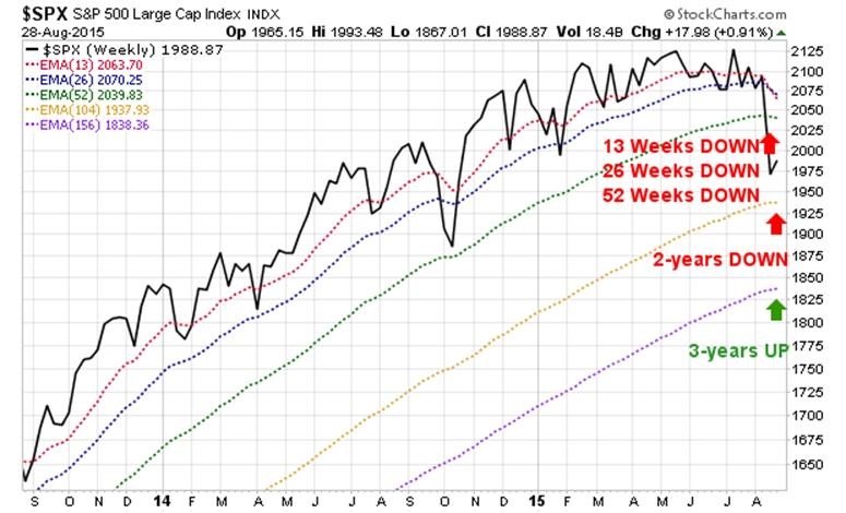
The S&P 500 is the most important US stock index — most followed, most used as a benchmark, most used to measure and compensate fund managers, among the longest histories, and covering most of the market-cap of the US. That index is in a downtrend, and a more defensive position is appropriate.
Moving averages are the simplest way to judge whether a trend is UP or DOWN. A trend, whether UP or DOWN remains in force until proven otherwise. No proof of a reversal back to UP is evident at this time.
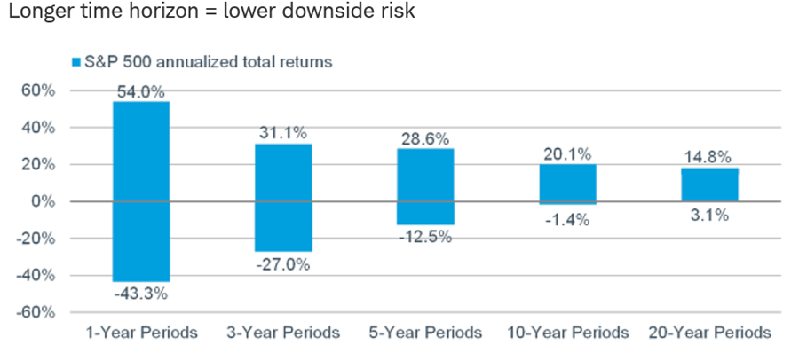
However, over long periods, downtrends such as this become less of a problem as the length of the period increases (thanks to Frank Case of AlacrityConsultingAssociates for pointing us to this chart from Charles Schwab), which clearly makes the point).
Just how much more defensive you should be varies:
- based on your time horizon before needing to draw on the portfolio for living expenses
- based on your surplus or deficiency of assets for those near or in retirement
- based on your level of conservatism or aggressiveness in your long-term allocation
- based on the spread of your assets across tax-deferred and regular taxable accounts
- based on your emotional capacity to withstand short-term fluctuations in your portfolio value
- based on how reasonable your believe our market conditions analysis to be
- and other factors
There are many forms of being more defensive, only one of which is exiting the stock market – for example:
- selling some stock and holding tactical cash
- substituting more aggressive stocks with more conservative stocks
- increasing bond allocation while decreasing stocks allocation
- purchasing long/short or market neutral funds
- purchasing inverse funds
- shorting index funds against individual stock portfolios
- purchasing PUT options
- purchasing certain minimally correlated alternative assets
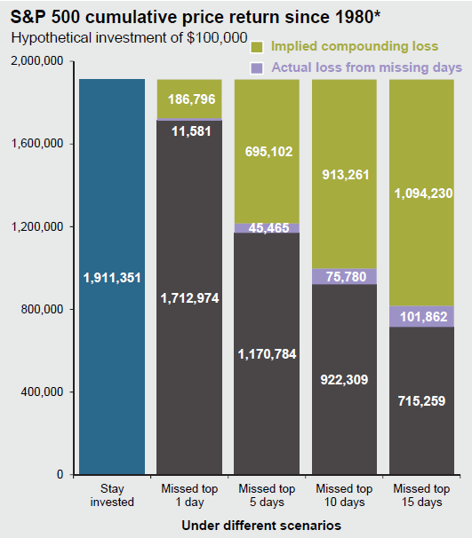
Let me be very clear, the aggregate historical evidence is that attempting to enter and exit the market (except for major Bears, like 2000 and 2008), results in underperformance. You get out after a decline has begun, and get back in after a recovery has taken place (or worse yet, you are whipsawed and get in and out a few times during a cycle with each round trip being less profitable than having stayed invested). Getting in and out is a two decision process, why and when to exit, and why and when to re-enter. For most people that means underperformance.
However, for those for whom preservation and avoidance of major drawdowns during periods of withdrawal is paramount, underperformance is an acceptable “opportunity cost” in exchange for “risk of ruin” (outliving assets). The risk of outliving assets is increased when a schedule of fixed or rising withdrawals is made from a highly volatile portfolio (thus the rationale for holding bonds as well as stock over the long haul); and is particularly dangerous if the early years of retirement are characterized by declining markets.
This chart for JP Morgan Asset Management shows the impact of being out of the market for certain numbers of top performing days from 1980 through 2014 (note that some of the top performing days are during early days of recoveries).
We’ll talk more about that and sustainable retirement withdrawal rates in a future post.
So what you should or should not do is quite particular to your circumstances.
All that said, what is the condition of the stock market today? It is in a downtrend, but what are some of the details?
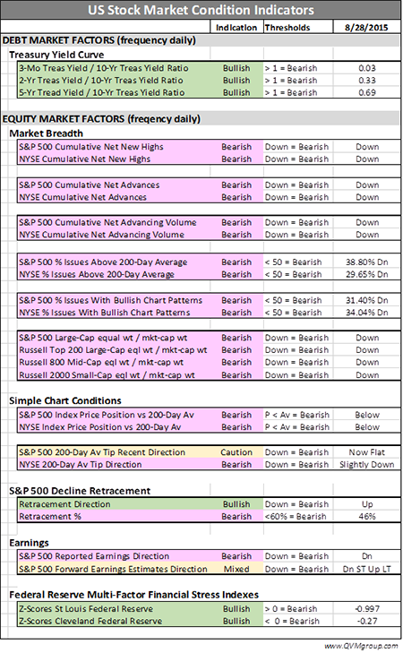
A summary of US stock market details is this:
- We are in a correction, or at least were last week – it is uncertain whether the rally of last few days is temporary or will be followed by a new test of the recent low – we assume a new test is likely
- The yield curve (namely the “term spread” – short-term Treasury rates compared to long-term Treasury rates) IS NOT predicting a Bear
- The Federal Reserve Financial Stress Indexes ARE NOT predicting a Bear
- The Breadth indicators for the S&P 500 and other key indexes are virtually all in very negative territory, explaining the Correction and possibly predicting a Bear
- The price to moving average data for the indexes are all negative, explaining the Correction and possible predicting a Bear
- The reported earnings are down which may predict a Bear.
- The forward earnings estimates are up, giving a more favorable view – but other unlike the other indicators are only opinions, not facts
- Valuation expressed as “earnings yield” (inverse of P/E) is in the “normal” range
Here is a table that lists and quantifies the indicators. Following the table are the charts from which we pulled the indicator values (along with a bullet point discussion of each chart). You can decide for yourself if you agree with our UP and DOWN readings on the indicators that required a visual inspection.
THE SUPPORTING CHARTS
——————————————
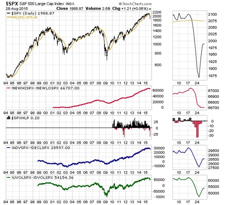
OBSERVATIONS ON FIGURE 1
- S&P 500 in Figure 1 top panel shows price below the 200-day average –BEARISH
- Top panel also shows the 200-day average up with a flat end – BULLISH/NEUTRAL
- Next panel (red) shows cumulative net new highs down – BEARISH
- Next panel (red and black) shows new highs less new lows divided by sum of highs and lows – strong pike down points toward bottom and reduction in spike suggest possible Correction bottoming
- Next panel (blue) shows cumulative net advancing issues down – BEARISH
- Next panel (green) show cumulative net advancing volume down – BEARISH
FIGURE 1
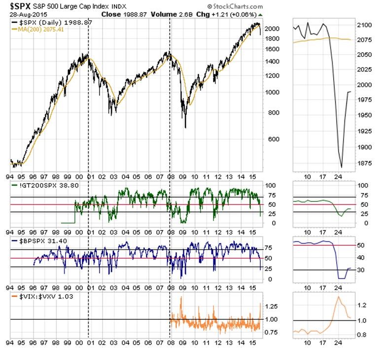
OBSERVATIONS ON FIGURE 2
- S&P 500 in Figure 2 top panel same as Figure 1
- Next panel (green) shows % of index constituents above 200-day average down and at 38.8% — BEARISH
- Next panel (blue) shows % of index constituents with Bullish Point & Figure charts down and at 31.4% – BEARISH
- Next panel (orange) shows 1-month option implied S&P 500 volatility divided by 3-month implied volatility – elevated but moderating – suggesting possible Correction bottoming
FIGURE 2
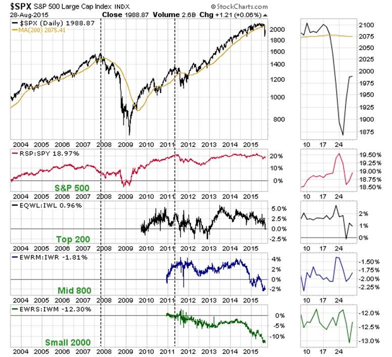
OBSERVATIONS ON FIGURE 3
- S&P 500 in Figure 3 top panel same as Figure 1
- Next panel (red) shows equal weighted S&P 500 divided by market-cap weighted S&P 500 – down slightly recently – BEARISH
- Next panel (black) shows equal weighted Top 200 divided by market-cap weighted Top 200 – down – BEARISH
- Next panel (blue) shows equal weighted Mid 800 divided by market-cap weighted Mid 800 – down – BEARISH
- Next panel (green) shows equal weighted Small 2000 divided by market-cap weighted Small 2000 – down — BEARISH
FIGURE 3
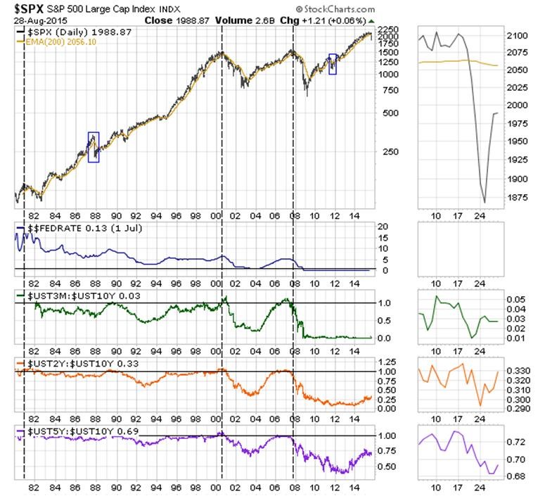
OBSERVATIONS ON FIGURE 4
- S&P 500 in Figure 4 top panel same as Figure 1
- Next panel (blue) shows Federal Funds Rate flat at 0.13% — BULLISH (declining after peaking would be BEARISH)
- Next panel (green) 3-mo / 10-yr yield ratio at 0.03 – BULLISH (ratio of >=1 would be BEARISH)
- Next panel (orange) 2-yr / 10-yr yield ratio at 0.33 – BULLISH (ratio of >=1 would be BEARISH)
- Next panel (purple) 5-yr / 10-yr yield ratio at 0.60 – BULLISH (ratio of >=1 would be BEARISH)
FIGURE 4
OBSERVATIONS ON FIGURE 5
- S&P 500 in Figure 5 top panel same as Figure 1
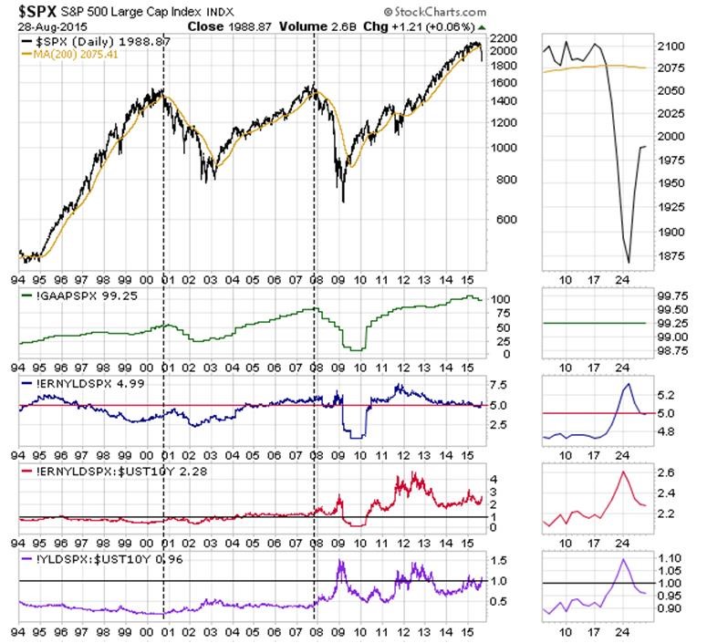
- Next panel (green) shows the quarterly reported GAAP earnings, down from peak – BEARISH
- Next panel (blue) shows the earnings yield (inverse of GAAP P/E) at 4.99% — normal range – NEUTRAL
- Next panel (red) shows earnings divided by 10-yr Treasury yield at 2.28x – FAVORABLE
- Next panel (purple) shows dividend yield divided by 10-yr Treasury yield at 0.96x (with better tax treatment) – FAVORABLE
FIGURE 5
OBSERVATIONS ON FIGURE 6
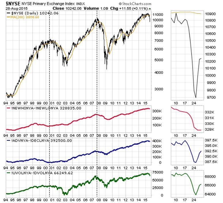
- New York Stock Exchange in Figure 6 top panel shows price below the 200-day average –- BEARISH
- Top panel also shows 200-day average slightly turned down at the tip — BEARISH
- Next panel (red) shows cumulative net new highs down – BEARISH
- Next panel (blue) shows cumulative net advancing issues down – BEARISH
- Next panel (green) show cumulative net advancing volume down – BEARISH
FIGURE 6
OBSERVATIONS ON FIGURE 7
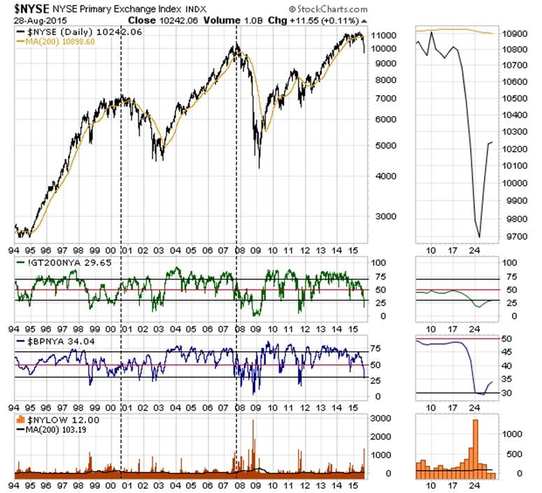
- New York Stock Exchange in Figure 7 top panel same as Figure 6
- Next panel (green) shows % of index constituents above 200-day average down and at 29.65% — BEARISH
- Next panel (blue) shows % of index constituents with Bullish Point & Figure charts down and at 34.04% – BEARISH
- Next panel (orange) shows the number of new lows and the 200-day average of that count – recently spiked and now declining — suggesting possible Correction bottoming
FIGURE 7
OBSERVATIONS ON FIGURE 8
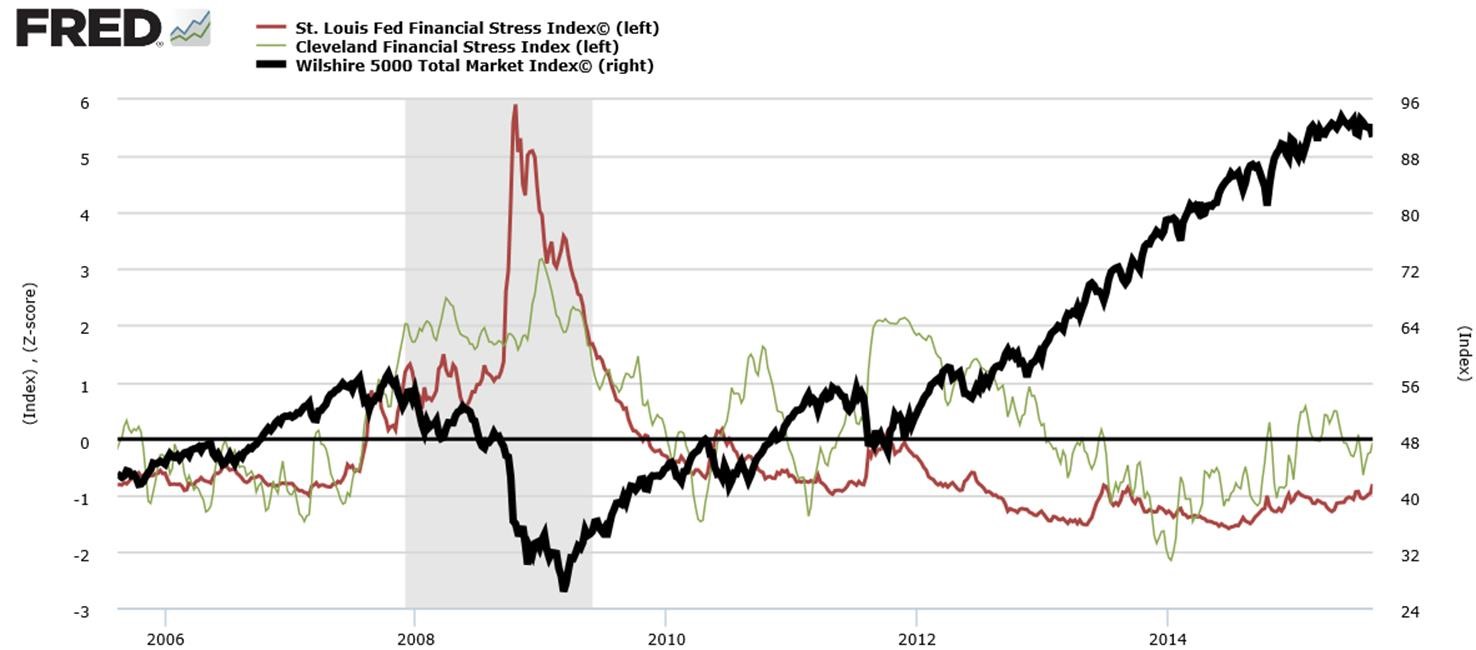
- St. Louis Fed Financial Stress Index at -0.997 (normal = 0, < 0 = below normal stress) — NEUTRAL
- Cleveland Fed Financial Stress Index at -0.27 (normal = 0, , < 0 = below normal stress) — NEUTRAL
- Black line is Wilshire 500 stock index (virtually 100% of investable US stocks)
FIGURE 8
OBSERVATIONS ON FIGURE 9
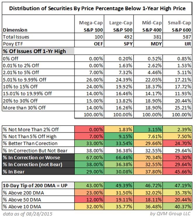
- S&P 100 Mega-Cap: 67.00% in Correction or Worse; 38.00% in Correction and 29.00% in Bear
- S&P 500 Large-Cap: 66.46% in Correction or Worse; 36.38% in Correction and 30.08% in Bear
- S&P 400 Mid-Cap: 70.34% in Correction or Worse; 32.55% in Correction and 37.80% in Bear
- S&P 600 Small-Cap: 75.30% in Correction or Worse; 29.64% in Correction and 45.66% in Bear
FIGURE 9
OBSERVATIONS ON FIGURE 10
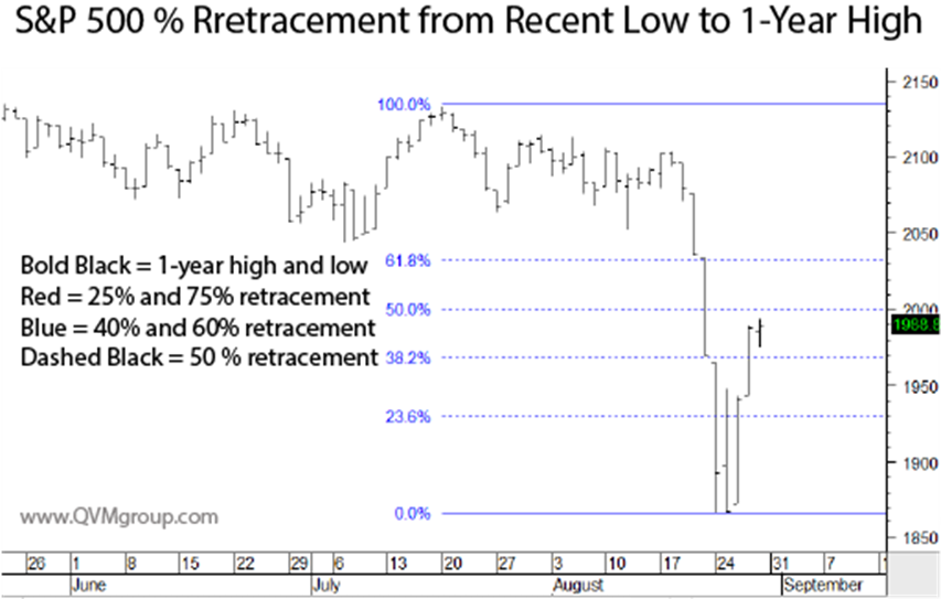
- S&P 500 has retraced 46% of its drop from a high of 2132,82 to a low of 1867.98, standing now at 1988.87 – still BEARISH
- An important resistance level around 60% retracement has yet to be tested before this rally can begin to be seen as possibly sustainable – would become NEUTRAL to slightly BULLISH at 60%
FIGURE 10
OBSERVATIONS ON FIGURE 11
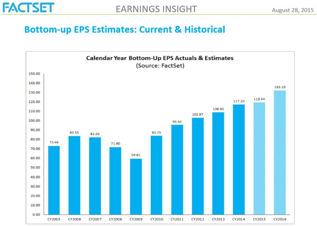
- (shown in Figure 4) first half 2105 reported are down (mostly due to energy) — BEARISH
- Bottom-Up operating earnings estimate for 2105 full year is modestly higher than 2014 – NEUTRAL
- Bottom-UP operating earnings estimate for 2016 full year is higher than for 2015 (but forecasting accuracy out that far is suspect) — BULLISH
FIGURE 11
SUMMATION
Patience tends to be rewarded in markets. We may reach Bear status, but so far the technical data is mixed and not conclusive that a Bear comes next or soon (although one may be statistically due because of the age of the Bull market).
Reflecting the mixed data, for those client in or near retirement, and who do not have excess assets, we are essentially half invested and half cash within our equity policy allocation, and have been for about a month or more.
——————————————
NOTES ABOUT SOME INDICATORS
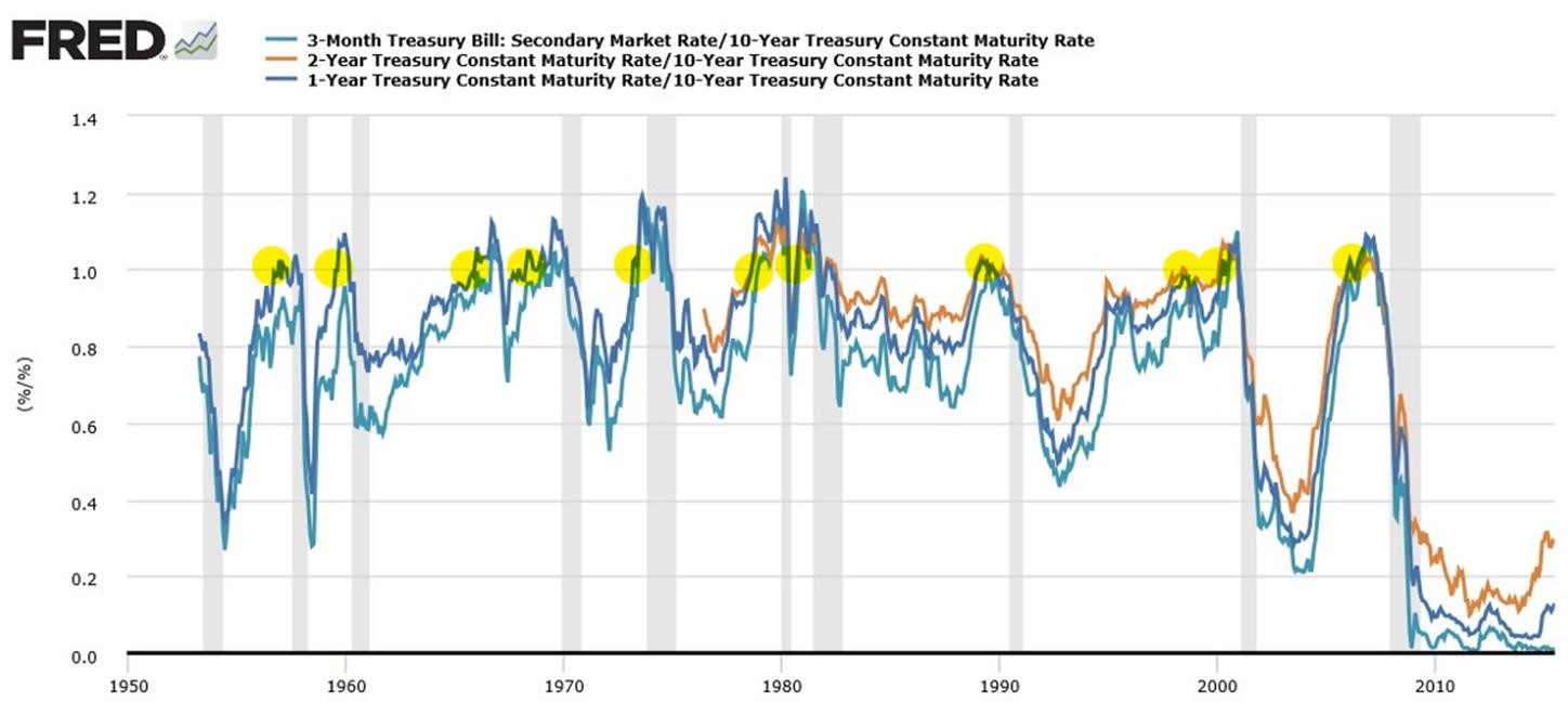
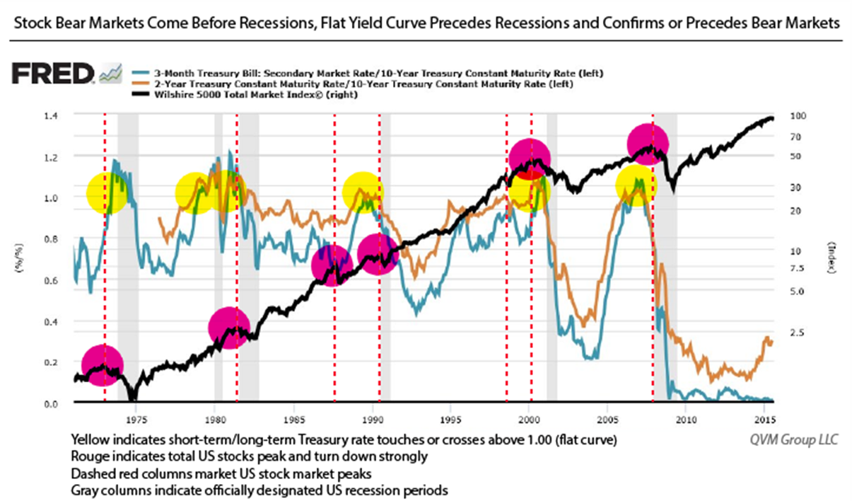
Yield Curve (steep, flat or inverted from short-term to intermediate to long-term): We use the ratio of the yields instead of the spread to “normalize” the relationship over long periods where rates are sometimes very high with large absolute differences, and other times when rates are low and the absolute differences are much smaller. The ratio approach eliminates that comparison problem. While the yield curve has predicted 11 of the past 9 recessions, a recession has NOT begun without a preceding or coincident flat or inverted yield curve. Stocks begin Bear markets before recessions, and the yield curve almost always goes flat before stocks move to a Bear. Here is what the New York Fed said:
“The difference between long-term and short-term interest rates (“the slope of the yield curve” or “the term spread”) has borne a consistent negative relationship with subsequent real economic activity in the United States, with a lead time of about four to six quarters. The measures of the yield curve most frequently employed are based on differences between interest rates on Treasury securities of contrasting maturities, for instance, ten years minus three months.
The measures of real activity for which predictive power has been found include GNP and GDP growth, growth in consumption, investment and industrial production, and economic recessions as dated by the National Bureau of Economic Research (NBER).
… The yield curve has predicted essentially every U.S. recession since 1950 with only one “false” signal, which preceded the credit crunch and slowdown in production in 1967″.
This chart illustrates the yield curve predicting recessions:
This chart shows how the yield curve tends of go flat before the stock market goes into a Bear:
FEDERAL RESERVE STRESS INDEXES
St. Louis Fed Financial Stress Index
The STLFSI measures the degree of financial stress in the markets and is constructed from 18 weekly data series: seven interest rate series, six yield spreads and five other indicators. Each of these variables captures some aspect of financial stress. Accordingly, as the level of financial stress in the economy changes, the data series are likely to move together. The latest STLFSI press release, with commentary, can be found here.
Cleveland Financial Stress Index
The CFSI tracks stress in six types of markets: credit markets, equity markets, foreign exchange markets, funding markets (interbank markets), real estate markets, and securitization markets. The CFSI is a coincident indicator of systemic stress, where a high value of CFSI indicates high systemic financial stress. Units of CFSI are expressed as standardized differences from the mean (z-scores). here
ETFs DIRECTLY REFERENCED:
S&P 500 (NYSE:SPY), S&P 400 (NYSE:MDY), S&P 600 (NYSE:IJR), Russell Top 200 (NYSE:IWL), Russell 800 (NYSE:IWR), Russell 2000 (NYSE:IWM), Equal Weight S&P 500 (NYSE:RSP), Equal Weight Russell Top 200 (NYSE:EQWL), Equal Weight Russell 800 (NYSE:EWRM), Equal Weight Russell 2000 (NYSE:EWRS)
