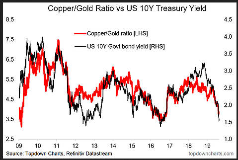
Last week I outlined some of the extreme moves in bond yields, and this week I'm taking a quick look at one of the bond market's close traveling companions; the copper-to-gold ratio.
It's an interesting indicator to track for a few reasons, but the basic intuition or reason for tracking it is that copper tends to respond to swings in global growth and gold tends to respond to swings in risk appetite. Thus a situation where growth slows and risk appetite turns sour should see the copper-to-gold ratio collapse.
And that's exactly what we've been seeing lately.
Indeed, some of you will recall some form of the below chart which was wheeled out when bond yields were rising as a reason for yields to keep rising, and then when the ratio rolled over as a harbinger of lower yields. It makes a degree of economic sense given bond yields tend to respond to growth and risk appetite in the same manner as well.

So if we (or at least me) think that bond yields look overdone, is the collapse in the copper to gold ratio also overdone?
It's an important question, and its answer will depend in large part on whether the global economic cycle is at its end ...or about to extend. If the global policy pivot by central banks can help avert a recession then one of the first places that we will be able to see it will be in the copper-to-gold ratio (as it turns back up).
But at the same time these are markets, and changes in risk appetite and growth expectations are just as much about swings in sentiment as they are about reality.
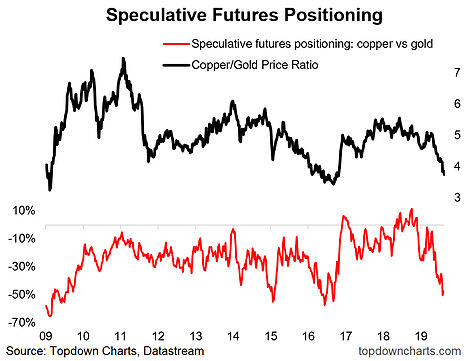
Perhaps the best way to show this, and probably a good indicator to track for making judgements about the future path of the copper-to-gold ratio, is the spread in speculative futures positioning for copper vs gold. The chart below shows the copper-to-gold ratio against this relative futures positioning indicator. Perhaps unsurprisingly it has fallen to an extreme low.

That is, speculative futures positioning in copper is at multi-year lows, and for gold it's at multi-year highs. Typically with sentiment indicators like this you want to pay attention when they reach an extreme. Going solely off this chart you would say that the red line is giving a contrarian bullish signal for copper vs gold. So it's fair to say that objectively the odds of a rebound in copper vs gold are decent at this point.
But it's often dangerous or at least sub-optimal to look only at one chart or one indicator, so let's take a quick look at a couple of key drivers/macro factors for each side of the ratio.
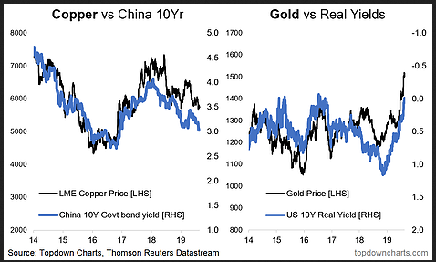
First, copper tends to travel relatively closely with the China 10-year government bond yield. This makes sense given China accounts for over 50% of world copper demand. It's no secret that China's economy has been slowing, and hence it makes sense to see copper weaker in this context.
Second, gold tends to travel relatively closely with U.S. real yields. This makes sense from the point of view that the opportunity cost of holding gold is much lower when cash is yielding negative returns in real terms (if anything, it makes holding gold seem like a good idea).

So while there is definitely a sentiment component, you're basically left asking "what's going to happen to U.S. real yields and Chinese government bond yields?"
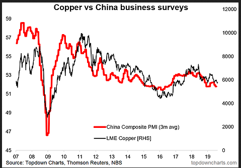
...and that basically makes what seemed like a simple problem into a more complex beast. To simplify—perhaps even over-simplify—I think the biggest driver and what it will mostly come down to is what happens with China.
Faced with the trade war, global growth slowdown, previous policy tightening, and structural headwinds, China has seen a cyclical slowdown, and to date it has only introduced piecemeal stimulus measures as it seeks to avoid the same kind of indiscriminate credit surge wholesale stimulus packages of the past.

So in the end we're left wondering when/will China step up stimulus? When will the trade war end? (and) When will the global economy shake off its current malaise?
Leaving aside the sentiment aspect, at the very least we can say it's worth keeping a close eye on the copper-to-gold ratio as it will be one of the first things to move when (if) the global economy picks up again. So make sure it's in your global chart monitors!
But to offer some final thoughts on the outlook, in my view we are either at or near a bottom in the copper-to-gold ratio. This is based on the contrarian bullish signal in positioning, the overbought and overvalued signals in Treasuries (if Treasuries are overdone then arguably this is also overdone), and a constructive outlook for the global economy. As I mentioned in my just published Monthly Chartbook, my base case is that we are in a global slowdown and that it's more likely that we see the economic cycle extend vs end.
