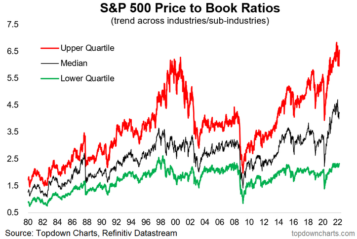
Valuation Cohorts — The Upper Reaches of Expensiveness: This chart presents the price-to-book ratio picture across the industries/sub-industries that comprise the S&P 500. As you can see, the Upper Quartile of industries are trading at price-to-book ratios *higher* than that seen during the dot com bubble, and this is despite a (minor) reset. Even the Lower Quartile is at the upper end of the range, and last but not least: the Median is well above that ever seen in recent history.
This has left a yawning relative value gap between the cheaper end of the market vs the more expensive end of the market (aka value vs growth). It’s valuation charts like this that really show what’s at stake if we end up in a situation of runaway inflation, a rapid tightening of financial conditions/monetary policy, and potential subsequent economic slowdown.
Sooner or later the excesses on display in this chart will need to be resolved one way or another. This is one reason why value vs growth is an attractive proposition from a relative standpoint, but as always we should note that value stocks could end up outperforming growth stocks simply by losing less vs the more expensive parts of the market…

Key point: The most expensive part of the market is more expensive than usual.
