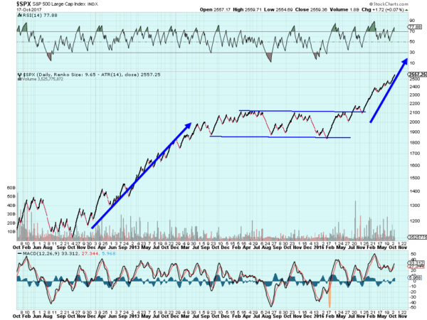
The S&P 500 has steadily marched higher since the election after a nearly 2 year movement in a broad range. Well at least that is one interpretation. The Renko chart below illustrates this point. Renko charts are similar to Point and Figure charts in a couple of ways. They do not consider time. And they only lay a new brick when price moves a predetermined amount.
The chart below uses the Average True Range (ATR) on a 14 day basis to set the brick size. So in a sense it also incorporates a measure of volatility. Using Renko charts can provide a measure of clarity, removing a lot of the noise of day to day swings and forcing you to withdraw from a short term view. So what does this chart tell us?
The move higher from a base at 1200 into the long channel took 3 years. The channel itself lasted 2 years. A symmetrical move out of the channel would give a target to 2800 in November 2019. It could take more time or less. Or it does not have to get that far. But other factors support a stronger market. The RSI is strong and rising. The MACD is also turning higher and bullish. The last time these momentum indicators broke into these ranges the S&P 500 rose 200 points.
The information in this blog post represents my own opinions and does not contain a recommendation for any particular security or investment. I or my affiliates may hold positions or other interests in securities mentioned in the Blog, please see my Disclaimer page for my full disclaimer.

