The Long Term Outlook for the Asset Bubble
Due to strong internals, John Hussman has given the stock market rally since the February low the benefit of the doubt for a while. Lately he has returned to issuing warnings about the market’s potential to deliver a big negative surprise once it runs out of greater fools. In his weekly market missive published on Monday (entitled “Sizing Up the Bubble” – we highly recommend reading it), he presents inter alia the following eye-popping chart:
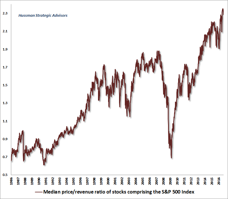
The median price-sales ratio of S&P 500 component stocks
In terms of the median price-sales ratio the stock market isn’t just overvalued; its valuation is by now beyond good and evil, exceeding every previous bubble peak. Other measures of valuation are not at similar extremes, but as Mr. Hussman shows in his bubble dissection, this is largely a function of the distribution of valuations across different market capitalization buckets.
The extreme overall market valuation in terms of P/E ratios seen in early 2000 was e.g. skewed by the fact that big cap stocks were the most overvalued sub-sector at the time. Since stock market indexes are capitalization-weighted, overall market valuation was distorted accordingly.
On the other hand, this also meant that there were actually still quite a few places to hide when the bubble popped, or let us rather say, sectors and stocks one could shift into. The current market provides almost no such opportunities. Moreover, bonds were still sporting decent yields at the time. Currently most “safe” government bonds are at best offering investors a creative way to lose money with apodictic certainty.
Valuations are of course not really relevant for near term or even medium term market action. They do allow us to make fairly reasonable predictions regarding the market’s long term return potential though. At current valuations, the long term outlook is quite bleak.
It needs to be stressed in this context that historically, this has been independent of the level of interest rates, in spite of the fact that interest rates do of course exert an important influence on the valuations of titles to capital in the near to medium term.
There are good reasons for that: while money supply expansion and artificially low interest rates drive asset price bubbles, they also distort the capital structure, and the associated boom periods invariably give way to busts – in these bust phases, valuations will tend to contract even amid sharply declining interest rates.
We inter alia keep track of the business cycle by looking at the ratio of capital versus consumer goods production. The ratio is mainly driven by large swings on the capital goods side, as the higher stages of the economy’s production structure are as a rule most strongly affected by monetary pumping.
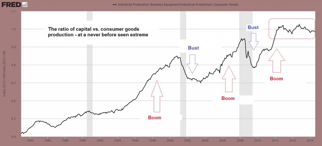
The production of capital goods (specifically, business equipment) vs. the production of consumer goods. There are also non-monetary reasons for the long term upward trend in the ratio (such as the increase in the global division of labor), but the biggest driver has been monetary pumping. The ratio tends to contract sharply in bust phases.
This is a logical consequence of the element of time: the further removed a good is from the consumption stage, the more its valuation will be affected by interest rates. In these terms, the current boom period easily ranks as the most extreme in history, and is mirroring what has happened in equity and bond markets.
Below we show updates of several long term market sentiment/ positioning indicators we are tracking. These are confirming the message Mr. Hussman deduces from valuations and the message conveyed by the ratio shown above. The current bubble is one of the largest ever, and therefore bound to eventually meet with a very unpleasant denouement.
Long Term Market Sentiment – Complacency Remains Rife
The indicators shown below mainly have to do with cash and debt – i.e., they show how big the cash reserves of various market participants are relative to total market capitalization, as well as how much leverage investors have taken on. The first chart shows the cash reserves of mutual funds as a percentage of their assets:
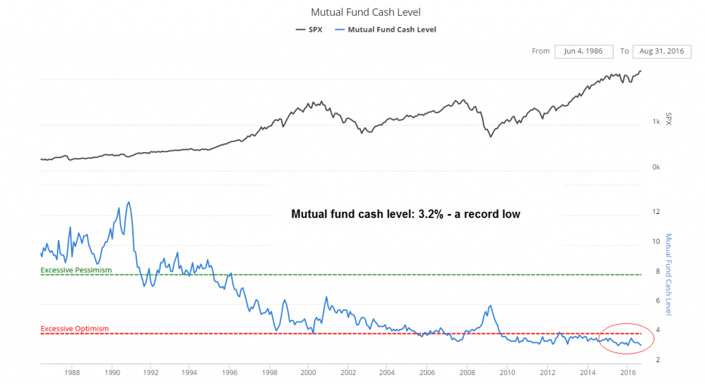
The mutual fund cash-to-assets ratio is back at 3.2%, a record low. This level is seen for the second time: the first time was in 2015
Obviously, so far it hasn’t hurt the market that this ratio has been at extremely low levels for several years. But this is just the reverse of what could be seen at the long bull market’s beginning in the late 70s to early 80s – at the time, mutual fund cash levels remained very high for a long time. The recent extended period of complacency is probably a sign that the eventual bear market is likely to be particularly severe and protracted.
The next chart is what we call the “general cash is trash index” – it shows the ratio of market capitalization to money market fund assets. It currently stands way above its previous highs.
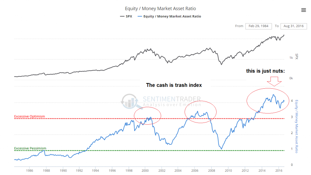
Cash is trash: the ratio of market capitalization to money market fund assets
A similar picture is painted by the ratio of retail money market fund assets to the market capitalization of the S&P 500. In spite of the fact that the market is reportedly “hated” on an anecdotal basis, the cash reserves of retail investors are very small relative to the stock market’s valuation.
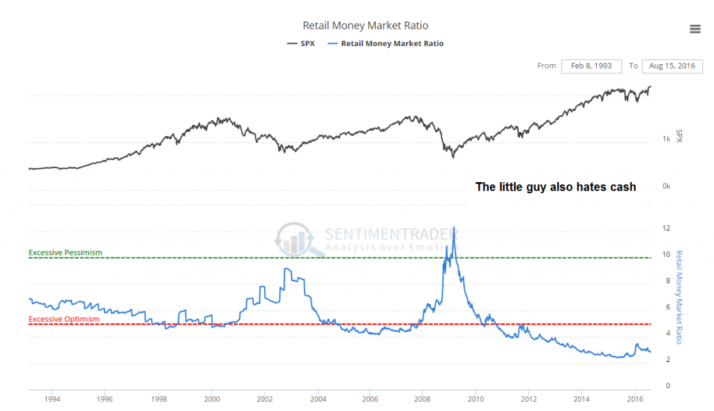
Retail money fund assets are also at a very low level relative to the market capitalization
We also track Rydex money market fund assets, which serve as a microcosm of market sentiment. We have shown this chart before (namely late last year or early this year) and have left the previous annotations unchanged. A new comment has been added in red:
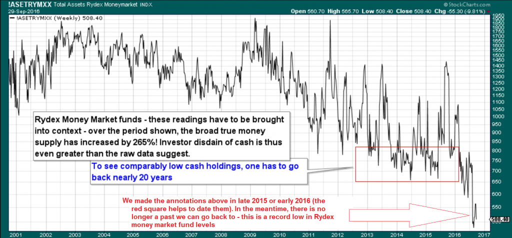
When we last showed this chart, we noted that one had to go back 20 years to find a similarly low level of assets in Rydex money market funds. In the meantime, there is no longer a historical occurrence it can be compared to, as assets in Rydex MM funds have plunged by approx. another 40% since then .
Lastly, margin debt and available cash in investor accounts, while still off the record highs/lows recorded in 2015, remain near historical extremes:
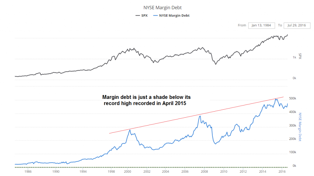
Nominal margin debt remains at an extreme level, but is still below its 2015 peak; this actually represents a bearish divergence
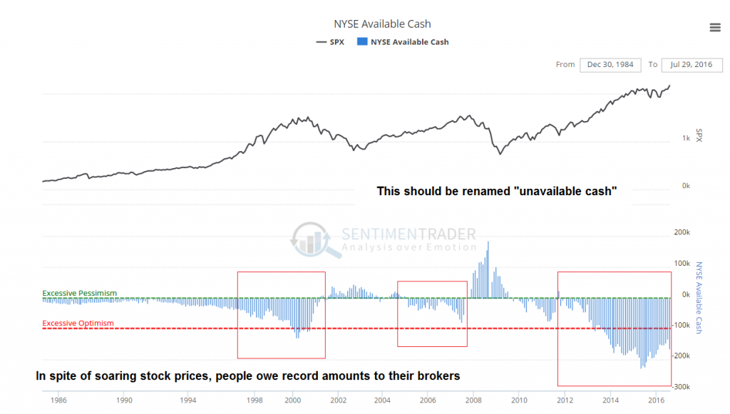
This indicator should perhaps be referred to as “un-available cash” at the moment, as investor net worth remains deeply negative, mirroring the high level of margin debt.
As noted above, these charts are not very useful for timing purposes – but they are all warning that the longer term outlook continues to be fraught with extreme danger. Once the market begins to decline and losses exceed a certain threshold, many investors will be forced to sell to meet redemptions and margin calls, which will exacerbate the downturn.
Short Term Signals
The next chart shows a number of market internals. The cumulative NYSE a/d line still looks strong, but we suspect this is partly due to the recent blow-off in bond markets induced by central bank policy (which is driving up the prices of fixed income ETFs).
New high/new low indicators and the percentage of stocks still above their 200- and particularly their 50-day moving average, have diverged from prices at the most recent market peak though. Such divergences are not always a sign that the market is about to turn down in the near term. Nevertheless, divergences of this type do regularly occur prior to downturns (as you can see below, it happened just before the last two big corrections as well).
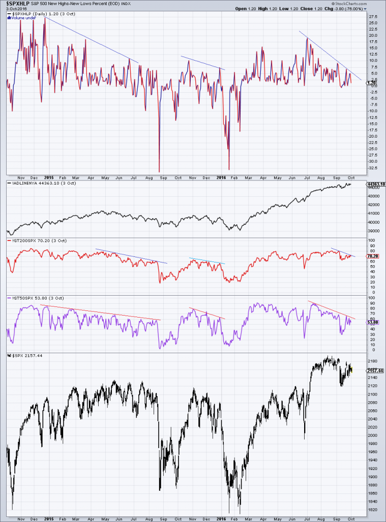
S&P 500 new high/new low percent, cumulative NYSE advance/ decline line, the percentage of stocks above their 200 and 50 day moving averages and the SPX. Divergences similar to the ones that could be observed prior to the August 2015 and January 2016 selling squalls are once again in evidence – click to enlarge.
Conclusion
This is definitely not a market that should be approached with a “buy and hold” strategy. The above charts are suggesting that one should strive to hold more of the one asset most investors seem to disdain based on the nonsensical “TINA” rationalization that is accompanying the current asset bubble: namely cash or cash equivalents.
We hasten to add that so-called “cash on the sidelines” always remains the same in the aggregate (or rather, its amount changes only in response to money creation by the central bank and/ or lending by fractionally reserved commercial banks); the money that exists has to be held by someone (and money market fund assets are actually not money anyway).
It does however matter who is holding the bulk of these cash balances – after all, not everybody invests in the stock market. Since most investors have arrangements with their brokers to shift cash from equity sales into money market funds, the above comparisons do provide valuable information with respect to sentiment and positioning. It should be obvious that this is also true of margin debt and the amount of available cash in brokerage accounts.
Mutual funds and retail investors in particular tend to act in a pro-cyclical and reactive manner. There is in principle nothing wrong with trend-following, but this also means that they will tend to have maximum exposure to the market when valuations are near an extreme, i.e., at exactly the wrong moment. It is always possible that the market will continue to rise for a while in the face of extremes such as those illustrated above – but the long term risk-reward equation seems extremely unfavorable by now. Caveat emptor.
