With the latest round of flash manufacturing PMI data and a couple of key levels already being breached (across markets), it's a good opportunity to review the outlook for bond yields. Forecasting higher bond yields has been a practice fraught with error over the past few years, and yet the forecasts continue. My preference is to try to let the charts do the talking, and in this article we look to what the charts are telling us from an economic cycle standpoint, levels and trendlines, investor sentiment, and seasonality.
Keeping in mind the folly and danger of forecasting, it does appear the stars are aligned (for now) for a move higher in US 10-Year Government bond yields. The move that is currently underway will probably go further, and yet it will probably also have an end point. So it will be important to keep watching the charts and indicators... not to mention the political backdrop!
The key points on the outlook for government bond yields are:
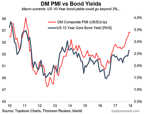
- At this stage of the economic cycle it is typical to see bond yields move higher, the first chart points to 10-year bond yields headed toward 3%.
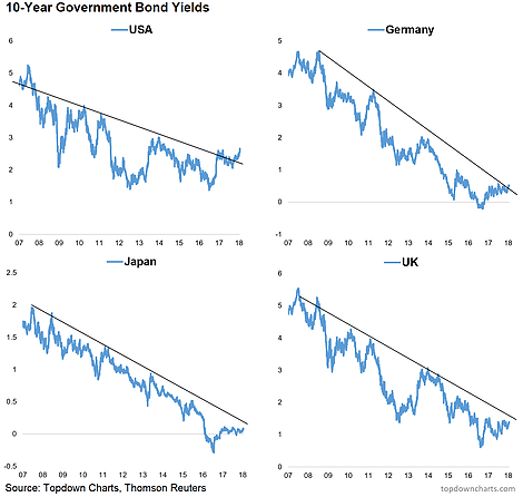
- Across global sovereign bond markets bond yields are progressively breaking out.
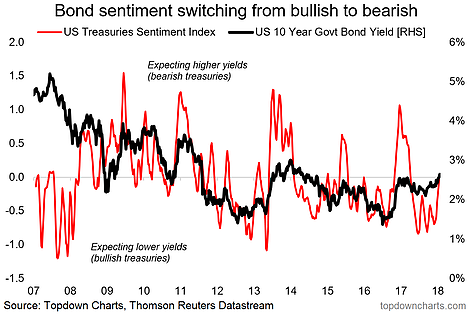
- Bond market sentiment has moved from extreme bullishness to neutral and the tendency is for sentiment to overshoot as investors capitulate.
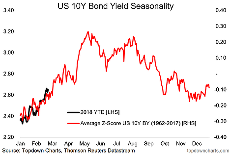
- Bond yield seasonality, though not infallible, adds to the case for higher bond yields short-term.
1. Economics Cycle: The Developed Markets composite manufacturing PMI (flash reading) fell slightly in January [from 56.8 to 56.7] leaving it still at the strongest level in years. It reflects a stronger global economy and in particular a maturing cycle among developed economies. The improved growth/inflation outlook is consistent with higher bond yields - as the chart suggests. I would say that at least part of the reason for the gap between these two indicators on the graph is the ongoing QE programs in Japan and Europe (which are in the late innings), and likely also some geopolitical risk premium. But if you take the chart literally then US 10-Year bond yields are headed to 3% and beyond.

2. Breakouts and Trendlines: There has been a lot of talk lately about trendlines, key levels and breakouts by some of the big names... Ray Dalio, Jeffrey Gundlach, Bill Gross. But you don't need to be a famous hedge fund manager to see the writing slowly showing up on the wall here across the major global sovereign bond markets. The charts below show US and German 10-year bond yields have already broken out, and Japan/UK are getting close.

3. Bond Market Sentiment: After going to extreme bullish levels through much of 2017 (a bearish signal, or a clue that bond yields may rise) our bond market sentiment indicators have moved back to neutral, and the typical pattern in a bond market selloff or yield spike is that sentiment moves all the way over into bearish mode (i.e. overshoots), so there is room to move on this indicator as investors are yet to fully capitulate.

4. Bond Yield Seasonality: Final chart brings in the seasonality aspect. This chart shows bond yield seasonality patterns from 1962 through 2017. On a methodological note, the approach used here is to average the z-score of the absolute level of bond yields each year (i.e. standardize each individual year so that they are on a comparable basis). So in that sense this is strictly the typical *pattern* that US 10-Year bond yields move through across an average year in the period 1962-2017. Bottom line is that there is a tendency for bond yields to move higher in the first part of the year, and 2018 is so far conforming to this historical pattern. It doesn't mean it will continue to follow the seasonal pattern, but this chart is certainly food for thought on the outlook for US bond yields.

