Summary- Many point to weakness in yields to signal economy has peaked
- Forward looking economic data suggests otherwise
- Evidence of a bull market top also not present
- Capitulation by active managers suggests near-term downside is likely limited
While the decline in long-term interest rates has many confused given the recent improvement in U.S. economic data, it appears the main driver is a flight to quality alongside a weakening global economy and heightened geopolitical concerns.
Neil Dutta, head of economics at Renaissance Macro Research, illustrated this recently in his piece, "Thinking Globally" (provided with permission):
Global weakness keeps US yields low
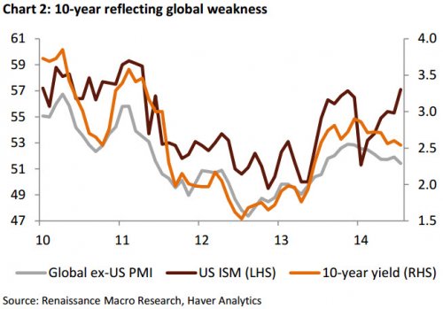
[T]he global economic recovery has been uneven and as disappointment mounts overseas Treasuries have rallied. Chart 2 illustrates the US ISM Manufacturing PMI, a Global ex-US PMI, which we derive using the US share of global GDP, and the 10-year Treasury yield. Believe it or not, the ex-US series has a stronger correlation with the 10-year US Treasury note yield than the US ISM, and this dynamic has only intensified over the last 24 months. Thus, in some respects, the strength of US Treasuries reflects rising concerns over the global economy.
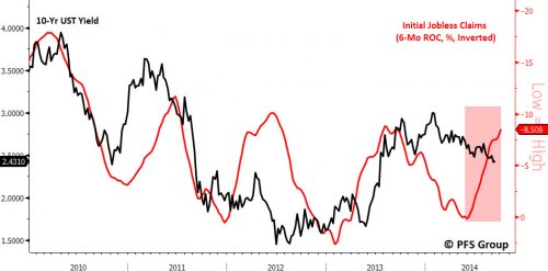
US Treasury rates fell last week, the same day US jobless claims reached a cycle low, which is incredibly odd. There has been a fairly tight inverse relationship between the six month rate of change in jobless claims and the U.S. 10-Year yield, but the relationship between the two has broken down recently (see red shaded box below).
Source: Bloomberg
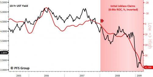
This was not the case back in 2006-2007 when interest rates peaked in the face of rising inflation as the bond market was anticipating a weakening economy ahead. The negative message signaled by the bond market was reinforced by initial jobless claims as both were signaling a deteriorating economic outlook well in advance of the onset of the 2007-2009 recession.
Source: Bloomberg
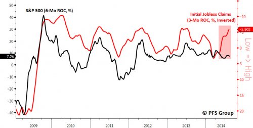
Not only are we seeing a breakdown in the relationship between jobless claims and UST yields, but also with the stock market (S&P 500). As seen below, the relationship between the two has broken down over the last few months as an improved labor market has not lifted the stock market higher.
Source: Bloomberg
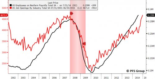
The stock market failing to react favorably to positive labor news was exemplified again yesterday as we learned that job openings have increased to their highest levels since 2001. Via Bloomberg:
Job openings rose in June to the highest level in more than 13 years, firming up the US labor market picture for the second half of the year.
The number of unfilled positions climbed by 94,000 to 4.67 million, the most since February 2001, from a revised 4.58 million in May, a report from the Labor Department showed today…
“There’s improvement, but it’s still slow and uneven,” said Joseph LaVorgna, chief US economist at Deutsche Bank Securities Inc. in New York. Hiring, firings and quits will need to be closer to pre-recession levels “before Yellen and Co. get concerned that maybe the economy might be overheating.”
The move to new highs in the job openings level is a bullish development for the economy as the series leads overall payroll levels and suggests the job market continues to expand for at least the remainder of 2014.
Source: Bloomberg
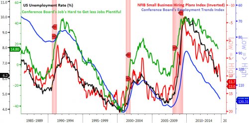
In addition to the strong JOLTS report yesterday we also were treated to the July National Federation of Independent Business (NFIB) report which showed the Hiring Plans Index for small businesses rose to the highest level since September 2007. Given the NFIB Hiring Plans Index tends to lead the unemployment rate, we are likely to see the unemployment rate continue to fall over the coming months, a message also corroborated by the following leading labor indicators below. (Of note: these labor indicators typically erode prior to the onset of a recession and suggest the risk of a recession on the horizon is low.)
Has a Bear Market Begun?
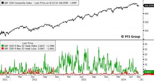
Some market pundits are making the claim that the July peak in the markets was THE peak, meaning we are now in the early stages of a bear market. When viewing market data I simply do not see the thumbprint of a bull market top. As I’ve highlighted several times in my writings, I use 52-week high and low data for the broad indexes for identifying bull market tops and bear market bottoms. Intuitively, during market rallies, new 52-week highs will obviously be larger than if the markets were declining and new 52-week lows will be expanding more during declines than rallies. What is key though is looking at the size of spikes in new 52-week highs during rallies in a bull market compared to spikes in 52-week lows during bull market pullbacks.
During the process of putting in a bull market top, breadth deteriorates and stocks begin to move into their own individual bear markets beneath the surface while the major indexes move to new highs. Near the market’s peak we see a hand-off between the bulls and the bears in which the spike in new 52-week lows during a pullback exceeds the spike in new 52-week highs during the preceding rally.
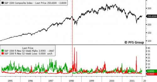
This dynamic was present in the last two bull market tops which were signaled when the spike in new 52-week highs during a rally was eclipsed by the spike in new 52-week lows on a subsequent decline. The handoff between the bulls and the bears occurred in 1998 as the bulk of the issues that make up the exchanges and broad indices like the S&P 1500 (inclusive of the S&P 500, S&P 600, and S&P 400) had peaked. You can see this by the vertical red line in the figure below where spikes in 52-week lows dominated the spike in 52-week highs until 2003.
Source: Bloomberg
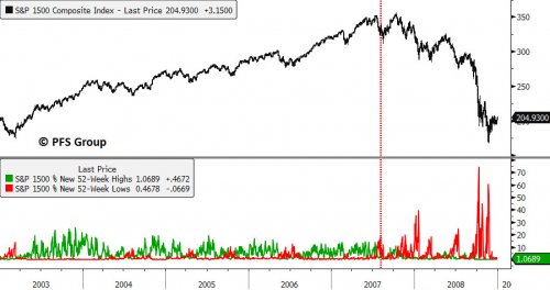
The same event took place in July 2007 when the spike in 52-week lows exceeded the spike in 52-week highs for the first time during the 2003-2007 bull market, signaling the bears were in control.
Source: Bloomberg
When looking at the current view of new highs and lows for the S&P 1500 we see that new highs continue to dominate new lows which remain silent at this time, signaling there has been no handoff from the bulls to the bears as they continue to maintain control of this market.
Source: Bloomberg
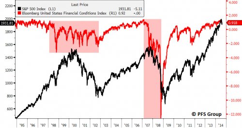
The credit markets are also not showing the same type of deterioration that they do at a bull market top or at the beginning of a recession. The Bloomberg Financial Conditions Index (BFCI, a composite of credit spreads) showed significant deterioration and elevated financial risk beginning in 1998 and the risk did not subside until 2003. Just as the BFCI warned of the 2000 top, it also gave an early warning of the 2007 top as it peaked in February of 2007, and yet the market didn’t peak until October of 2007. Likewise the BFCI hinted at a coming bottom as it troughed in October 2008 while the markets didn’t bottom until March 2009.
Source: Bloomberg
Signs of Capitulation?
While there is little evidence of a bull market top, active managers are acting to the contrary. BofA Merrill Lynch’s Fund Manager Survey (FMS) for August showed 27% of managers are overweight cash, up from 12% in July. Cash for active managers is now at its highest level since June 2012 and the number of respondents hedging against a sharp fall in the stock market in the coming three months rose to its highest level since October 2008.
Look at the Bloomberg Financial Conditions Index above one more time. Back in October 2008 we saw a negative 12 standard deviation event in the credit markets and currently the BFCI at is at a POSITIVE one standard deviation event, hardly a level worth hedging against.
As was highlighted last week, the bulk of the selling was in the small cap stock and junk bond markets and I showed signs of capitulation when looking at fund flows. With all the data in for last week, BofA Merrill Lynch’s “The Flow Show – Credit Capitulation” showed that there was $11.4B in high yield bond fund outflows, the biggest weekly outflow EVER in dollar terms and the 4th largest as a percent of assets under management.
Summary
While the decline in long-term interest rates has many confused given the improved labor backdrop, it appears that a weakening global economy and heightened geopolitical concerns are causing a flight to Treasuries and the decline in interest rates is not signaling a coming recession. In fact, we are seeing some of the best labor statistics in over a decade with many leading labor indicators pointing to a continued expansion in payrolls ahead. Given payrolls tend to be coincident with economic activity the rise in leading labor indicators suggests the US economy should skirt a recession in 2014 despite some of the growling by the bears to the contrary.
These same bears are also making a bold claim the stock market peaked last month and a bear market has begun, though we are devoid of any concrete evidence to make such a claim. As highlighted above, there has been no handoff between the bulls and the bears for control of this market looking at 52-week high and low data and there is negligible signs of stress coming from the credit markets.
Despite all of that, active fund managers have a high degree of fear and appear to be anticipating a repeat of 2008 as their hedging bets are the largest since October 2008. In addition to large hedges they also have the highest cash levels since 2012 according to BofA Merrill Lynch, who also pointed out the likely capitulation in the junk bond market which saw the highest weekly outflows ever.
The likely take-away from all of the above is that the bull market has not ended, a recession is not on the horizon, and we are likely at “A” low for this pullback given the capitulation in the junk bond market and heightened anxiety of active managers. For signs that a concrete bottom is in, rather than more digestion and consolidation in the markets, we need to see the major indexes clear their 50-day moving averages and I would also like to see the iShares Iboxx High Yield Corporate Bond ETF (ARCA:HYG) also recoup its 50-day moving average. Until that happens it is probably best to go slow and let the dust settle a little while longer.
