With the exception of Gold, the precious metals complex has been a tough place to trade since the last important high made in 2020. Since that 2020 high, the PM complex has been building a very bullish expanding falling wedge consolidation pattern, which has completed its work of killing off any remaining positive sentiment that once existed-which is a good thing.
In a secular bull market, big consolidation patterns take time to develop, but are a necessary evil to keep the health of the bull market alive. With the completion of the 2020 bullish expanding falling wedge in most of the PM stock indexes, the next big impulse move to the upside now has plenty of energy in reserve to last longer and go higher than what many think is possible.
We’ll start with the shorter-term daily charts and work our way out to the quarterly charts, so you can see how all the pieces of the puzzle fit together to paint a very bullish setup in the PM complex right now.
Let’s start with the most beaten-down sector, the CDNX, Canadian Venture Index, which is where many of the micro and small-cap PM stocks reside. Since May of last year, the CDNX has been working on an ascending triangle consolidation pattern, which is getting close to completion. Last week, we watched the price action hit the top trendline, where I was expecting to see an initial short-term decline, which happens many times at previous highs.
As you can see, the black triangle is made up of three smaller individual chart patterns:
The bullish expanding falling wedge, the small blue triangle that formed close to the halfway point in the last rally to the top trendline, and the most recent flat-top expanding triangle.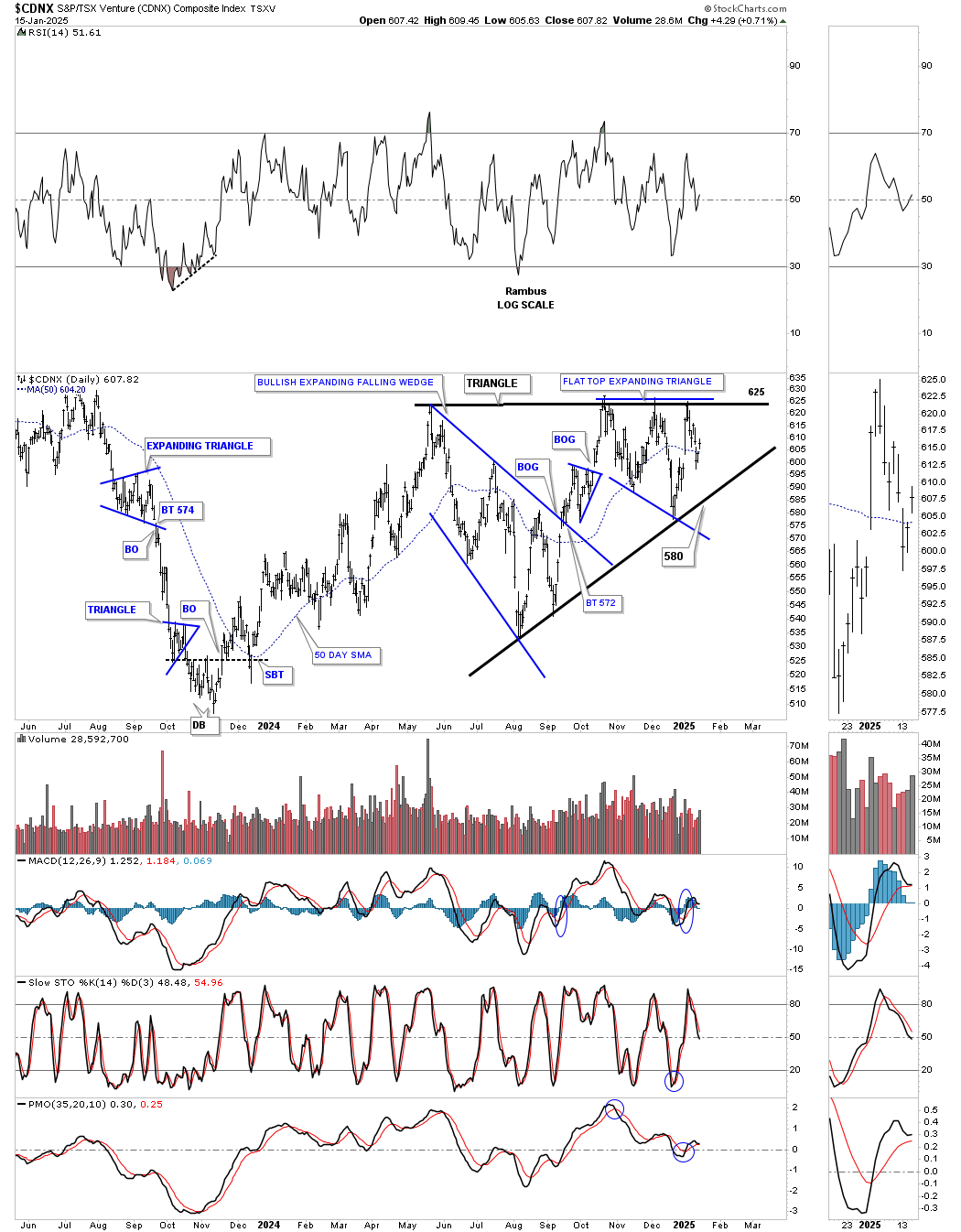
To put the triangle above in perspective, below is a longer-term daily chart, which shows a very symmetrical Head and Shoulders (H&S) bottom, with the ascending triangle being the right shoulder. Note the beautiful symmetry of this 2 1/2 year H&S bottom, as shown by the neckline symmetry line, which highlights the low for both the left and right shoulders. Also, both triangles are very close to the same size, adding more symmetry to the H&S bottom.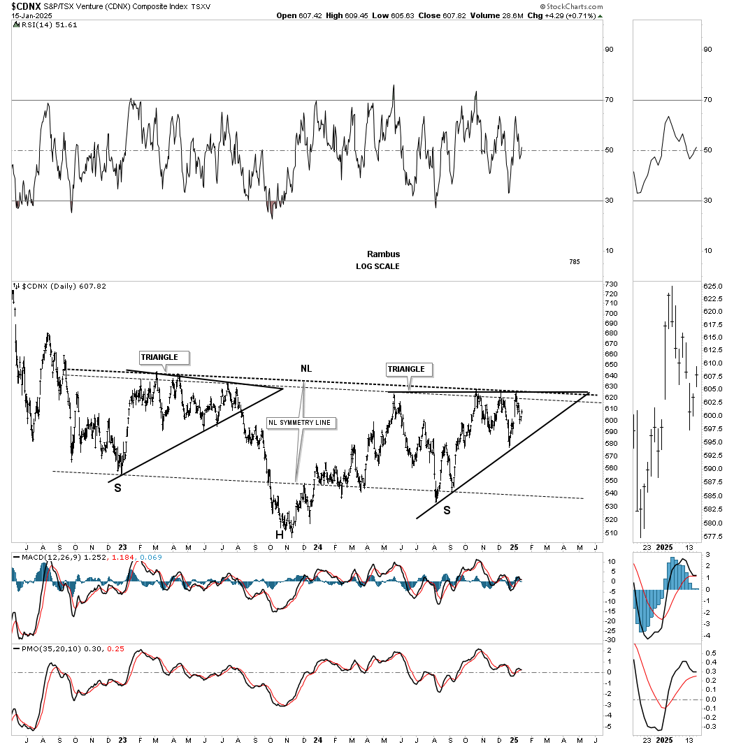
This next chart is a weekly look, which shows how the H&S bottom fits into the much bigger picture, going back to the spring of 2020, where the CDNX showed what it can do when conditions are right.
Most of the PM stock indexes began to consolidate their previous rally phase in 2020, but the CDNX topped out six months later, which is one reason it has been lagging.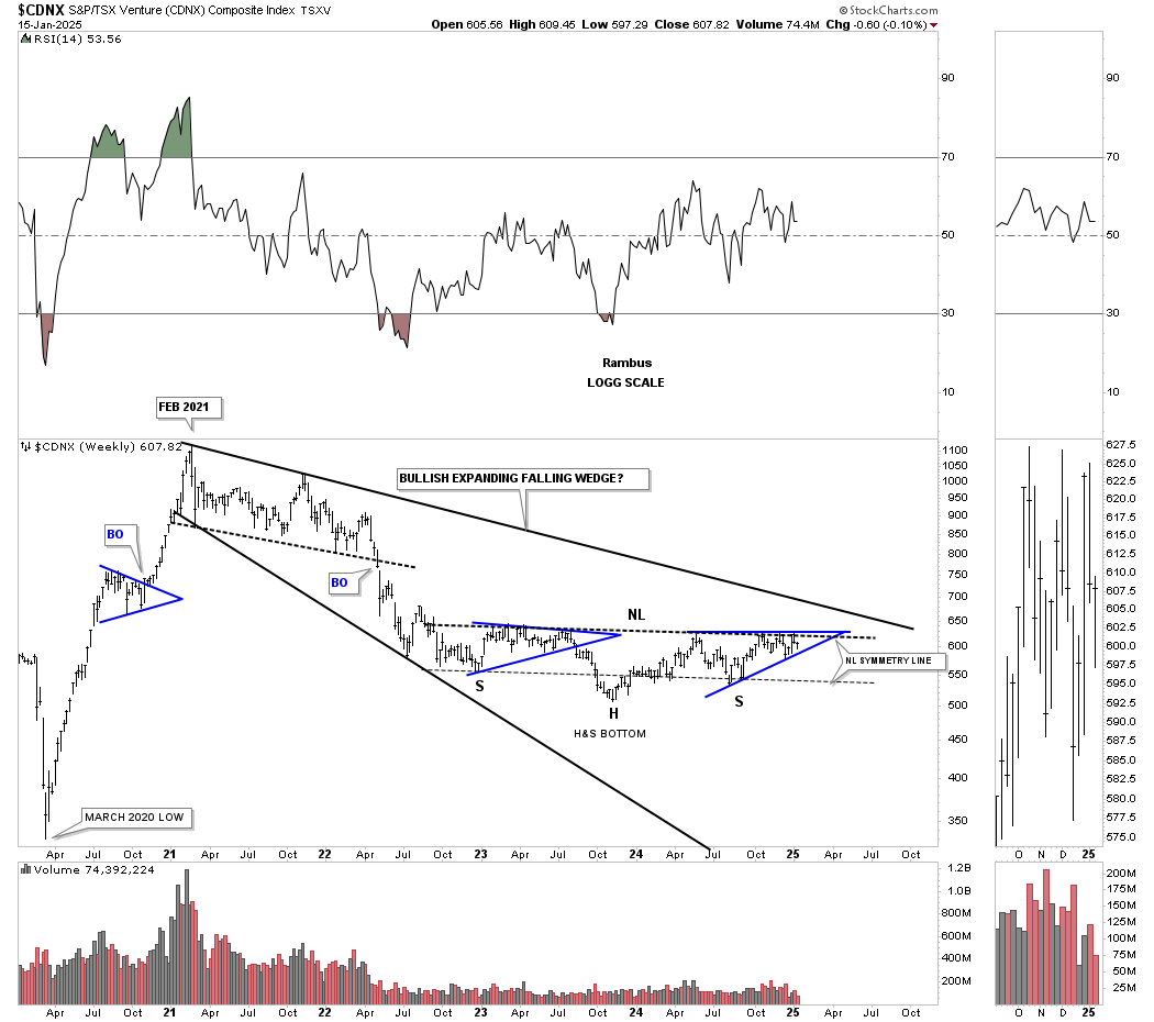
This last chart for the CDNX is its history chart, which shows all the chart patterns it has formed since its inception. Note the capitulation move down to its bear market low in early 2020, and the V-shaped rally to its 2021 high.
During the early days of the CDNX, note how light the volume was until the bull market got underway in 2002, with the breakout of the blue triangle. Now, note the current volume pattern on the right side of the chart, which has been drying up since the 2021 high decline and the formation of the very symmetrical H&S bottom. I expect to see the volume rise dramatically once the breakout above the neckline takes place and the impulse move begins.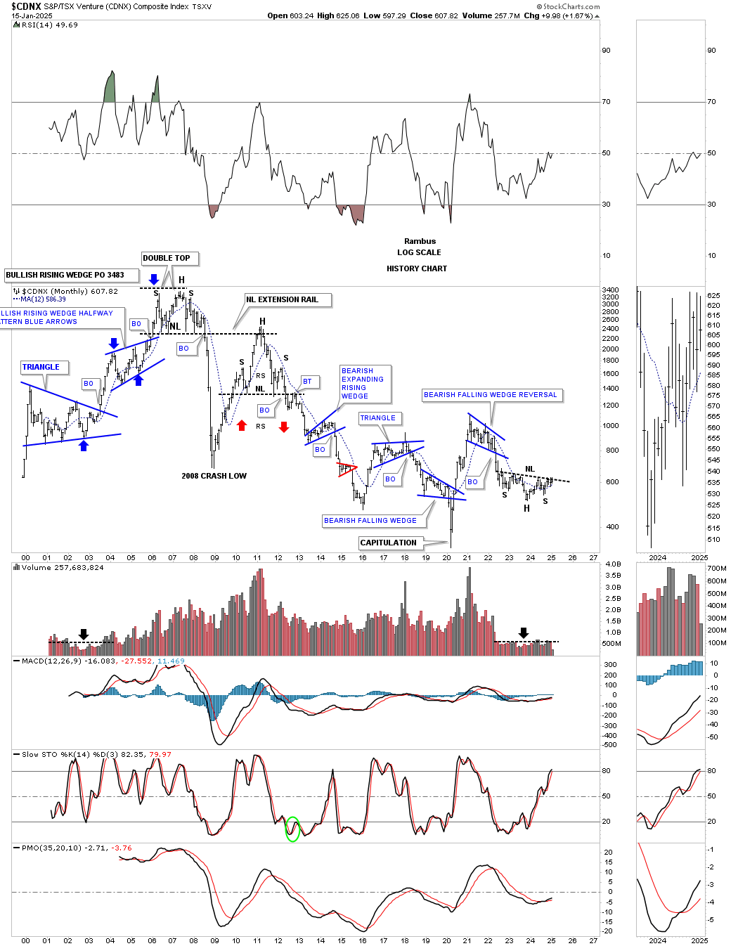
Moving on to the HUI, which I’m going to use as a proxy for the other PM stock indexes, you can see the rally that began at the February/March double-bottom low in 2024. That small double bottom doesn’t look that impressive, but it allowed us to start accumulating our first round of PM stocks.
Note how similar the January 2025 double-bottom low looks compared to the March 2024 double-bottom low. During the 2024 decline, you can see the small blue consolidation pattern that formed about halfway down, which was a clue that a possible bottom wasn’t too far below.
The correction that began at the October 2024 high into the January 2025 double-bottom low looks very similar to the 2024 decline, which again gave us the green light to start the second round of buys for our favorite PM stocks. This has been working out quite well so far, with a few more positions yet to acquire. The Silver area has been lagging a bit, but with silver’s nice move up today, that could be changing.
This daily line chart below shows the correction that began at the October 2024 high to the January 2025 double bottom low, which has formed a bullish falling wedge consolidation pattern. One by one, the top rail of the bullish falling wedges are giving way, completing the consolidation pattern and giving confirmation that the next impulse move to the upside is underway. Today, the GDX, SLV, and GDM joined GLD and XGD.TO in their breakout move. Note how much more pronounced the January double bottom low looks in this line chart vs. the bar chart above.
Since the bear market low in 2016, the HUI has formed just two large consolidation patterns: the 2016 bullish falling wedge and the current 2020 bullish expanding falling wedge. These two large consolidation patterns are responsible for the 2016 uptrend channel.
Keep in mind that big consolidation patterns lead to big impulse moves. Note how similar the breakout and backtest were to the 2016 bullish falling wedge, and the rally that followed, to the current breakout and backtest to the top rail of the 2020 bullish expanding falling wedge, which is just completing its backtest. There should be plenty of built-up energy to launch this next leg up to the top rail of the 2016 uptrend channel.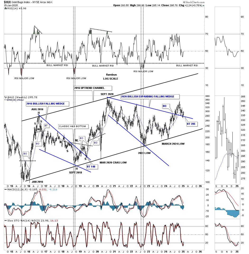
Next (LON:NXT) is the history chart for the HUI, which shows all of its big trading ranges since its inception in the mid-1990s. From the 2000 low to the 2008 high, the HUI formed a classic bull market, with one blue consolidation pattern forming on top of the previous one. Note how the 2008 crash low found support on the center dashed midline of its 2000 secular bull market uptrend channel.
The thin black rectangles, on the right side of the chart, measure price, not time, and show the beautiful 2000 parallel bull market uptrend channel. The weekly chart above is the bottom half of the lower channel, beginning at the 2016 bear market low. With the backtest now completing, the next rally phase should be underway, to at least the center dashed midline, before another consolidation pattern of importance begins to build out.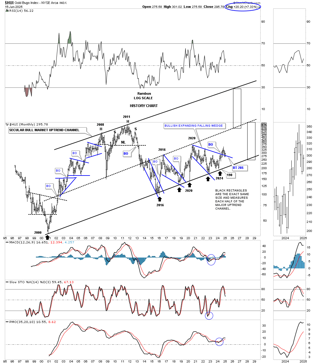
One thing I like about a quarterly line chart is that there is very little noise. If you see a chart pattern on a quarterly line chart, then you know it will most likely play out.
There is still a lot of time left for the first quarter of 2025, but you can see the breakout and backtest taking place to the 2020 bullish expanding falling wedge.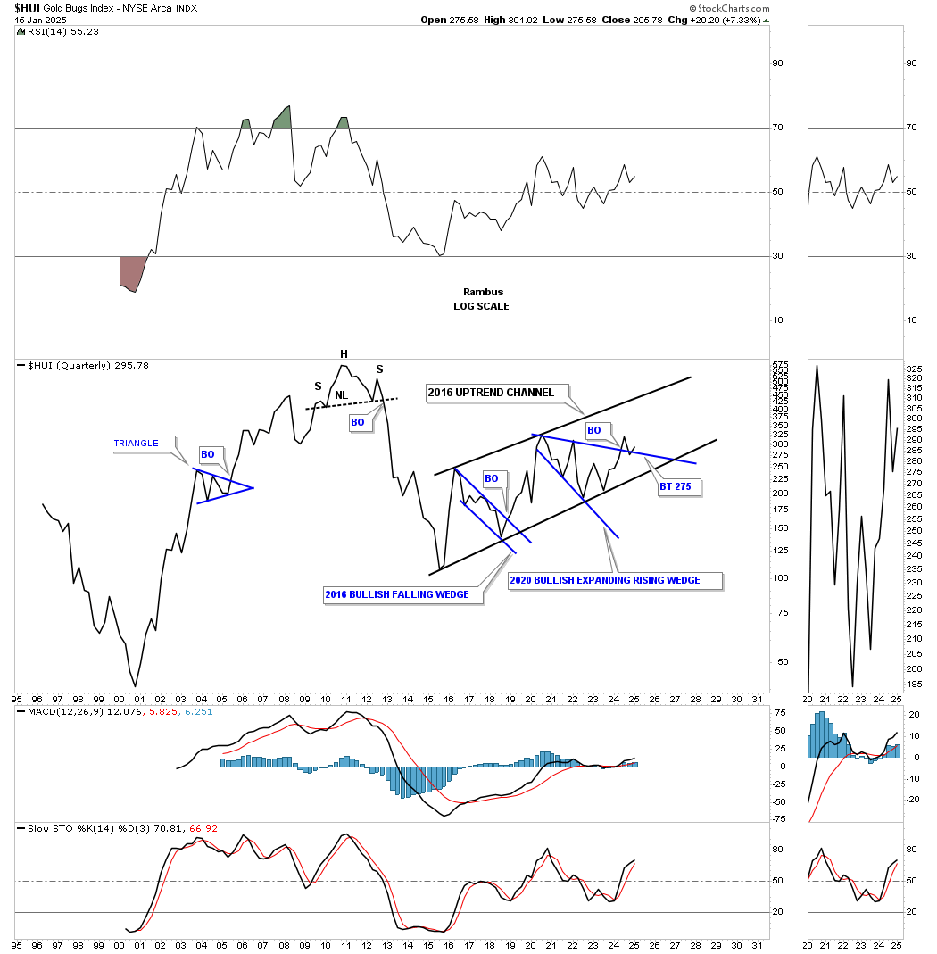
The GDX hasn’t been around nearly as long as the HUI, but you can see that the chart patterns are very similar.
The breakout and backtest to the top rail of the 2020 bullish expanding falling wedge have been a little more laborious than the HUI, but also appear to be completing.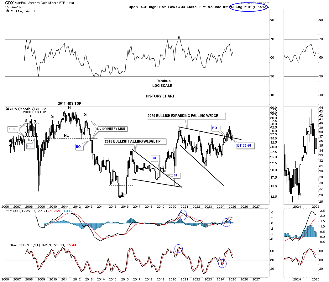
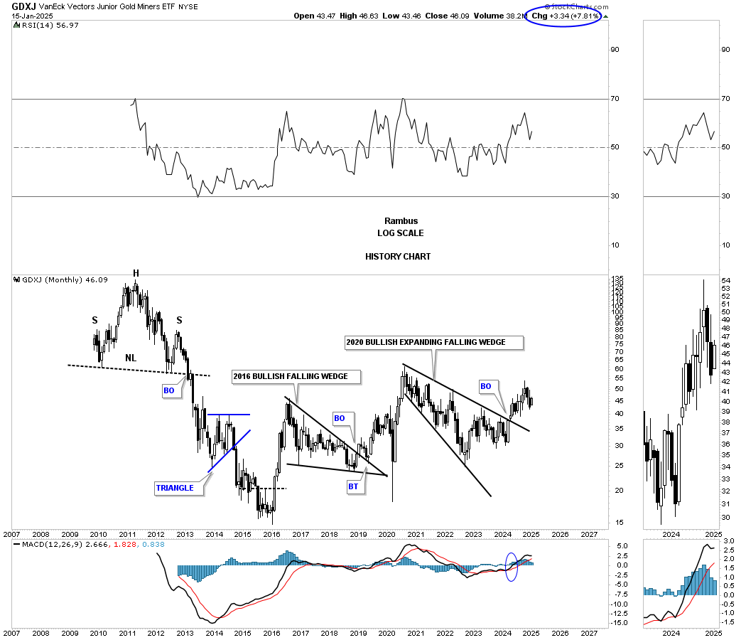
Here again, you can see the similar chart patterns on this history chart for the GDXJ, which shows its breakout a little more pronounced, with no backtest to the top rail of its 2020 bullish expanding falling wedge.
There is no question that gold has been leading the PM complex higher, in no uncertain terms. Since the October 2023 low, gold has formed a very nice parallel uptrend channel with three evenly spaced consolidation patterns. After hitting the top rail of its recent triangle consolidation pattern last week, with a small sell-off, gold is now testing the top rail once again.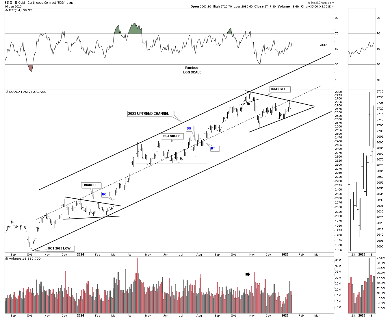
During the last strong bull run, which ran from 2018 to the 2020 high, you can see the small blue consolidation patterns that formed along the way, which is classic bull market price action. After reaching its 2020 high, all the energy had been used up, and it was time for Gold to consolidate those gains, forming the 2020 bullish flat-top expanding triangle consolidation pattern.
That 2020 flat-top expanding triangle has had enough energy to produce the current rally phase, with the blue triangle forming the next consolidation pattern.
This current setup should have enough energy to take gold above $3,000 once the triangle completes.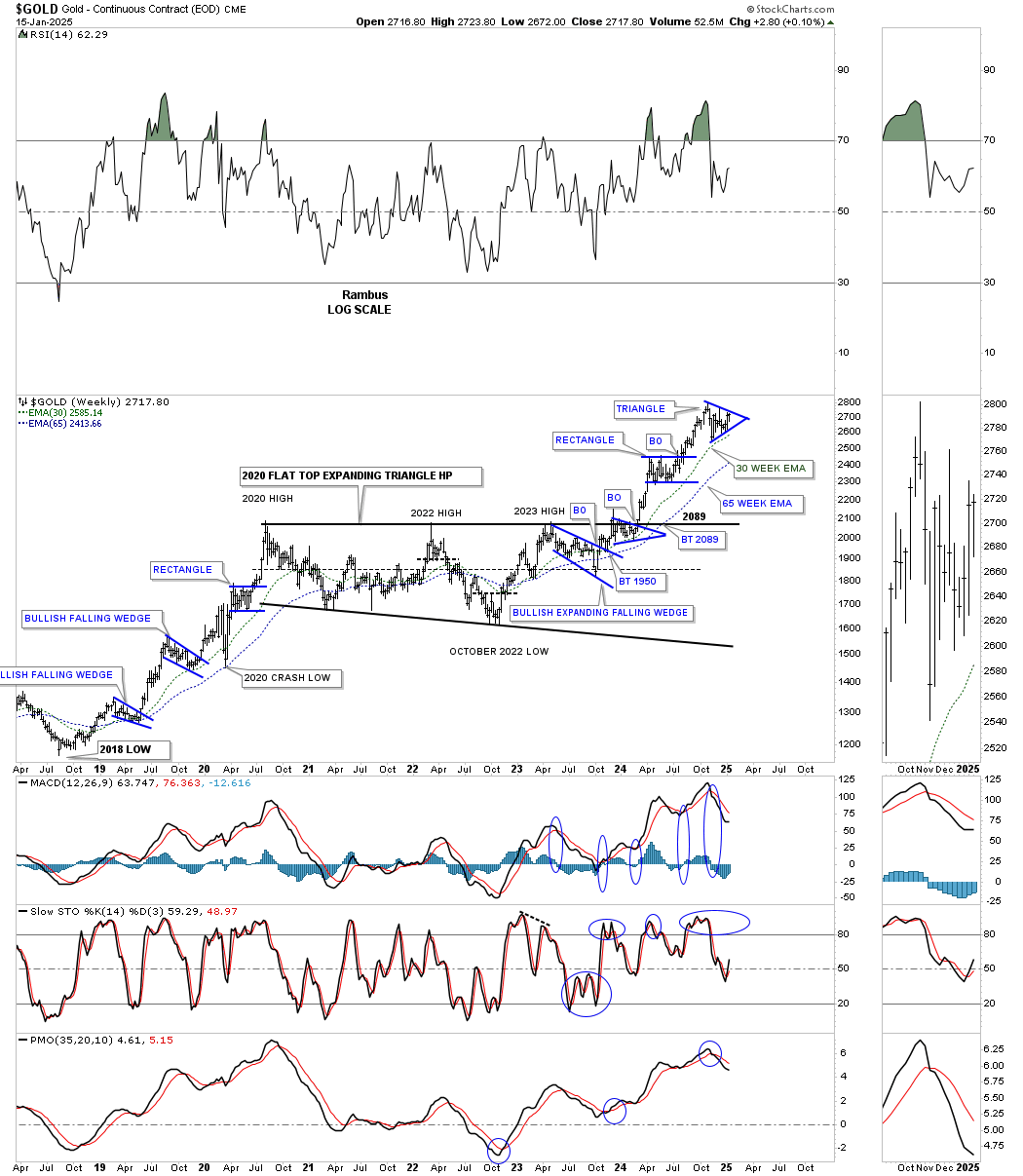
Just like the HUI, which began its secular bull market in 2000, so did Gold. From the 2000 low to the 2011 high, gold actually shows a parabolic rally, even on this log-scale chart. The bear market low formed that massive H&S consolidation pattern, which was big enough to launch this 2nd leg up in gold’s secular bull market uptrend channel.
During the bull market years from 2000 to the 2011 high, the 10- and 20-month EMAs did a beautiful job of holding support, except for the 2008 crash low. Notice how nicely aligned the 10- and 20-month EMAs are right now.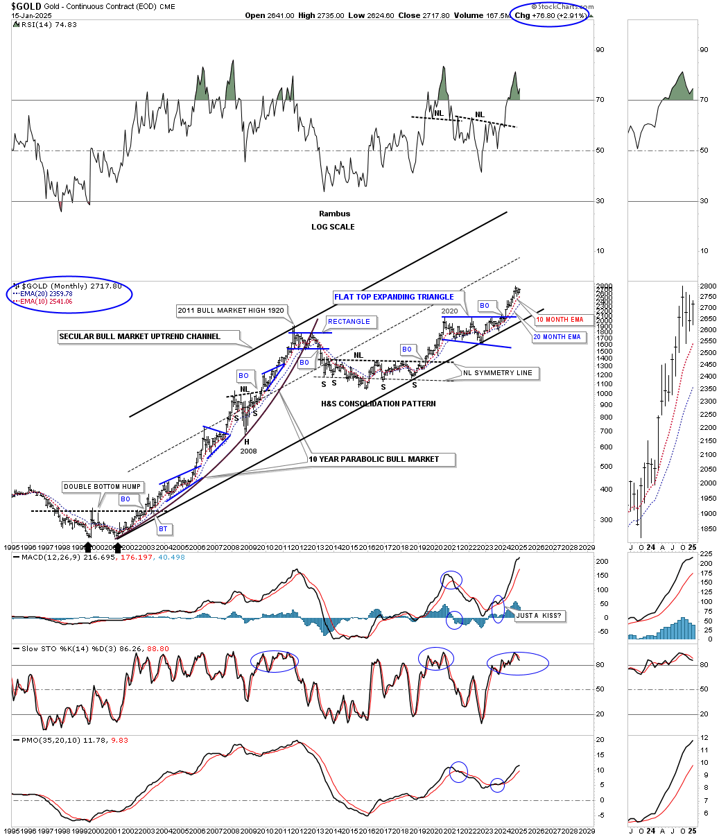
This quarterly bar chart shows the big base that Gold built in the late 1990s, which launched the secular bull market to the 2011 high. I measured the 2000 base, as shown by the black rectangle, and moved it up to the 2016 H&S bear market low, which shows that both bases are almost exactly the same in time and price. My conclusion was that if the 2000 base was large enough to launch an 11-year bull market, then the 2016 H&S base should be large enough to launch a similar bull market. Again, big patterns lead to big moves.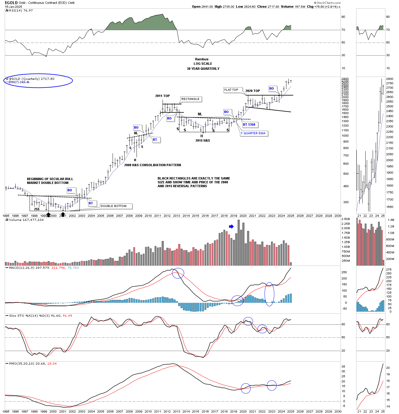
Below is the quarterly line chart for Gold, which shows its bull market from the 2000 low to the 2011 high and how smooth the price action was, with the exception of the 2008 correction low.
Since the breakout from the 2016 H&S base, note again how smooth the price action was until the beginning of the 2020 expanding triangle. Keep in mind that this is a quarterly line chart, so the large patterns may look a bit different. Since the breakout from the expanding triangle, again note how smooth the price action has been, except for the last quarter, where you can see a small sideways move before moving higher, starting in the first quarter of 2025.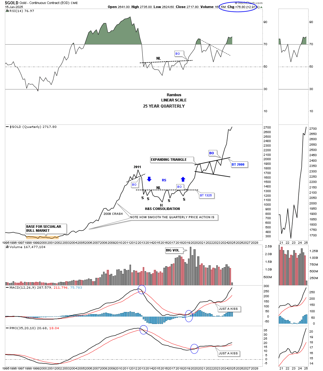
Below is a long-term monthly chart for Gold, which goes all the way back to the 1976 low, for perspective. After topping out in 1980, following that parabolic rise, it took 20 years to consolidate that massive bull run before gold was ready to launch a new bull market in 2000.
Note the classic Chartology at the 1980 high (horizontal black line). The small blue bullish rising wedge formed just below the 1980 horizontal line before the breakout, and then the backtest from above during the 2008 crash, which doesn’t look like much now, but it was the biggest correction from 2000 to 2011 that gold experienced.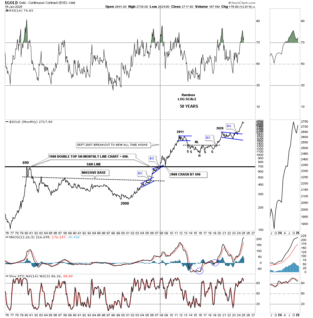
Silver has been a little frustrating, in that it has been taking its time moving higher, but the Chartology still looks fine, and nothing is broken. This daily chart shows the rally into the May 2024 high, where the black bullish expanding falling wedge began to form as the next consolidation pattern.
Sometimes, the breaking out and backtesting process can be very quick, and other times it can be a long, drawn-out affair, as Silver is showing right now. Note the last touch of the top rail of the bullish expanding falling wedge, which formed a small double bottom.
Last week, Silver broke out above the double bottom trendline and backtested it on Tuesday, and moved higher today, completing the backtest. Now, we just need to see silver make a new higher high to start the new uptrend.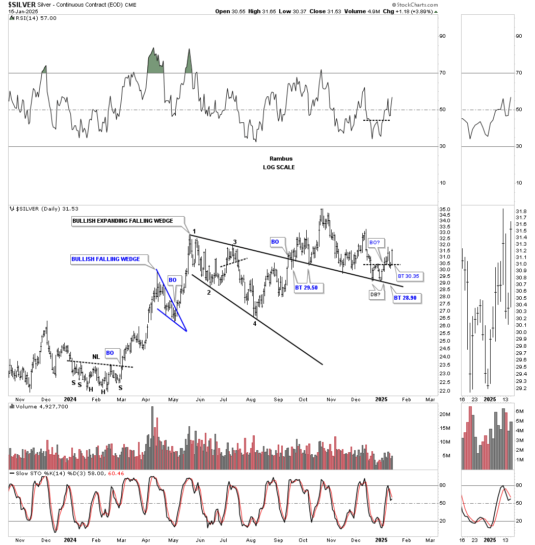
Moving on to this longer-term daily chart, silver has formed a very symmetrical H&S consolidation pattern, as shown by the neckline symmetry line, which shows the low for the left and right shoulders. After the initial breakout, Silver backtested the neckline before moving higher, where it formed the blue bullish expanding falling wedge that we just looked at on the shorter-term daily chart above. This H&S consolidation pattern has a price objective of up to the $40 area, at a minimum.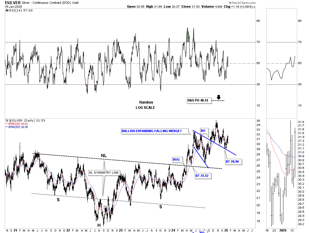
This weekly chart for Silver shows the same H&S consolidation pattern as the daily chart above, but with a horizontal neckline. It’s a horizontal neckline because I didn’t use the weekly reversal bar at the 2022 high.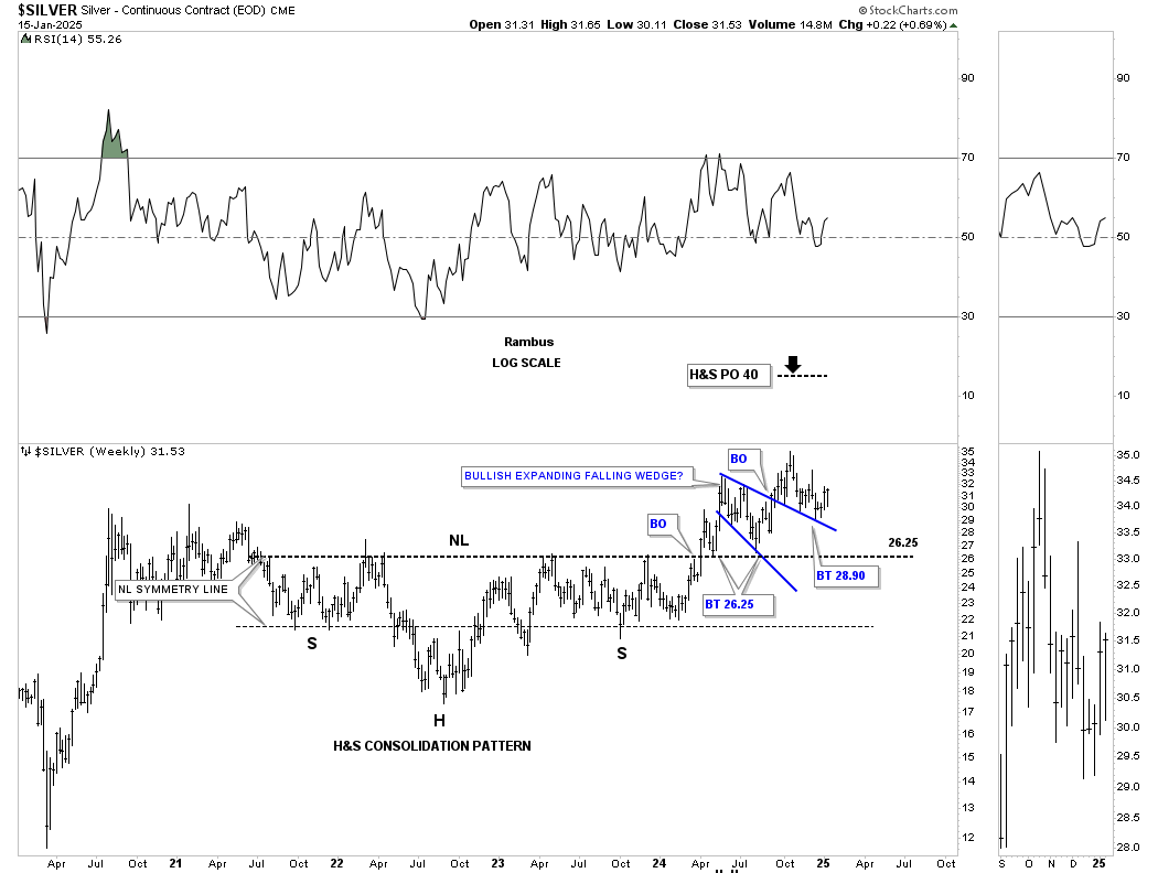
This long-term monthly chart shows Silver’s secular bull market uptrend channel, with the last consolidation pattern being the 2020 bullish expanding falling wedge.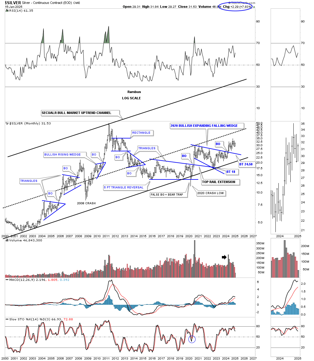
I would like to show you two more very large consolidation patterns that are strongly suggesting that the PM complex will have many years to go in its secular bull market, which began in 2000.
This next chart is a combo chart, which has silver on top and Gold below. I realize how hard it will be for many of you to grasp the significance of these 2011 H&S consolidation patterns, but we’ve been following these two H&S patterns since the right shoulder low.
As we know, gold has been much stronger than the rest of the PM complex, as shown by the up-sloping neckline vs. Silver’s down-sloping neckline. Gold has been trading in new all-time high territory since breaking out from its neckline, vs. Silver, which is only halfway to its all-time high at $50.
What is interesting about these two very similar 2011 H&S patterns, with different sloping necklines, is that they both broke out above their respective necklines at about the same time, which I find pretty amazing.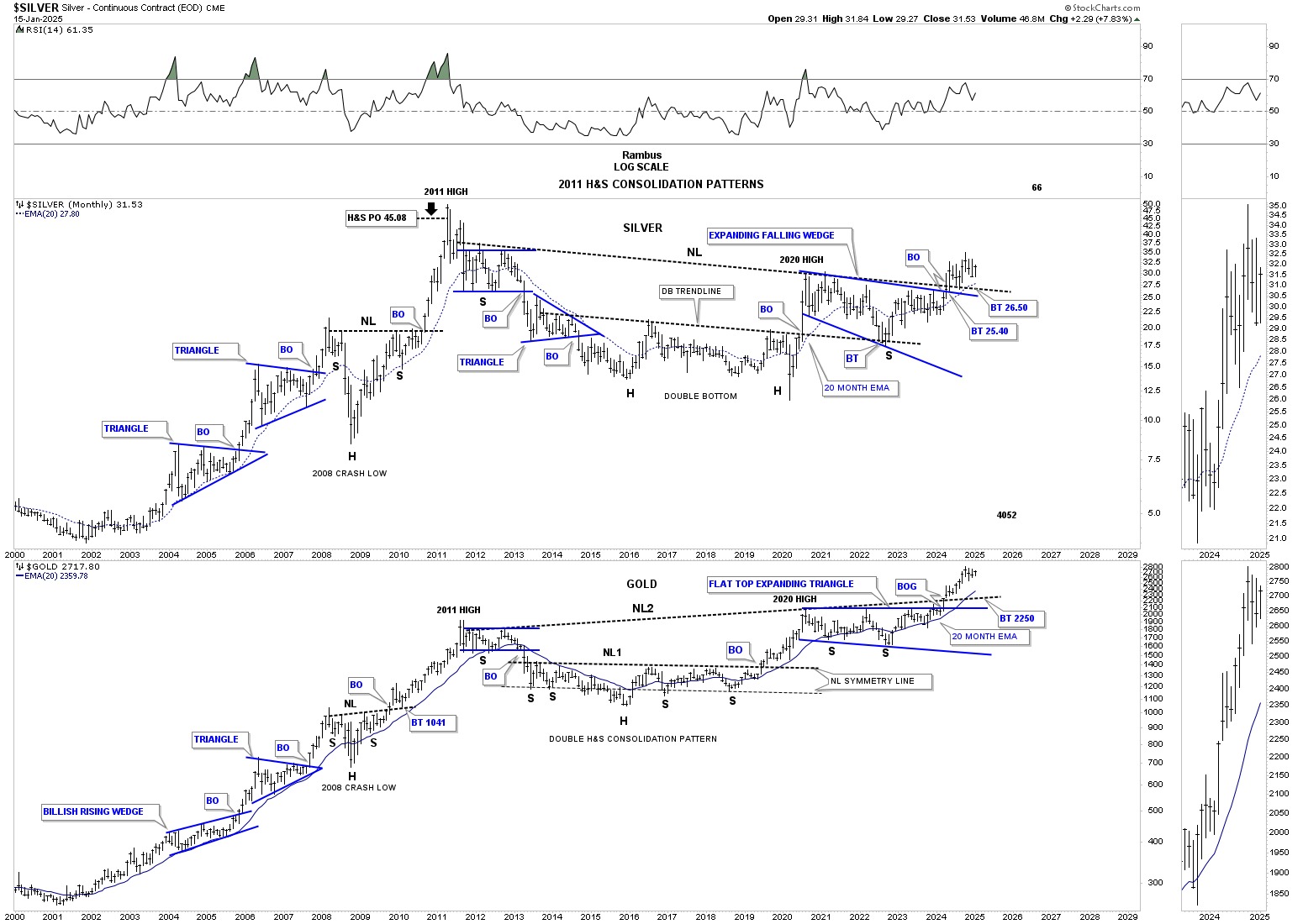
For years, I’ve always heard precious metals analysts throw out big numbers for Gold that seemed outrageous until I put together this 50-year quarterly chart for Gold. If we look at the correction that began at the 1980 high to the 2000 bear market low, a 20-year bullish falling wedge formed, which led to the secular bull market up to the 2011 high.
If you take the price action from the 2011 high to the last reversal point in the 2011 bullish rising wedge, we get a price objective for gold up to the $12,100 area, as shown by the long black arrows. So far, the current angle of the bull market, compared to the angle of the 2000 to 2011 bull market, has been identical, as shown by the blue arrows.
I’ll let the fundamentalists figure out what is going to cause another multi-year leg up in Gold and the precious metals stocks, but I’ll use what Chartology is strongly suggesting to guide my decisions in the PM complex. 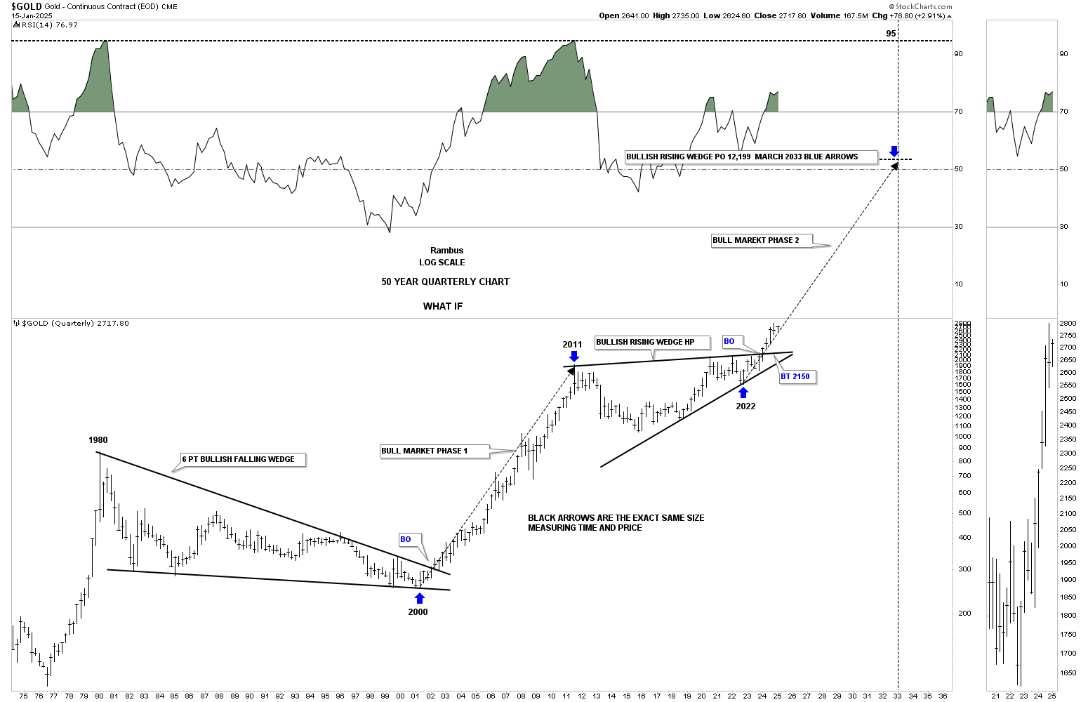
All the best… Rambus
