As we approach the final days of April, if you were to look back and try to put your finger on a theme for the last four months, one that you may select could be the growing divergence taking place in the S&P 500. What I’m referring to is the separation in performance that appears to be taking place among the largest of the S&P 500 stocks and the less large (smaller?) stocks that round out the index. Eyeing a long-term chart of the equity market there appears to have been a couple previous examples of this taking place, I’ll get into those later. First let’s look at present day…
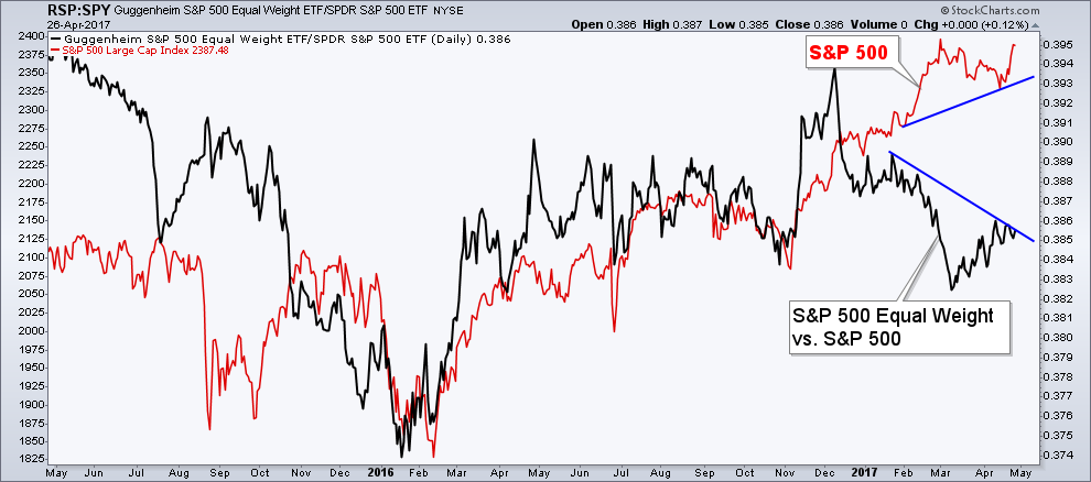
Below is a chart of the S&P 500 Index (red line) and the ratio between the Guggenheim Invest S&P 500 Equal Weight (NYSE:RSP) and the SPDR S&P 500 ETF Trust (AX:SPY) which is cap-weighted. (yes I could have used the indices but I, no big reason why I chose not to. I just naturally gravitate to ETFs). I tweeted out this chart yesterday but I wanted to provide a little more commentary to what’s taking place.
When the Black line is rising that is telling us that the Equal Weighted RSP is rising more (or falling less) than the cap-weighted SPY (NYSE:SPY), and when it’s declining the opposite is taking place. The latter is what we are seeing play out so far in 2017 with the largest of the S&P 500 components leading the charge higher.
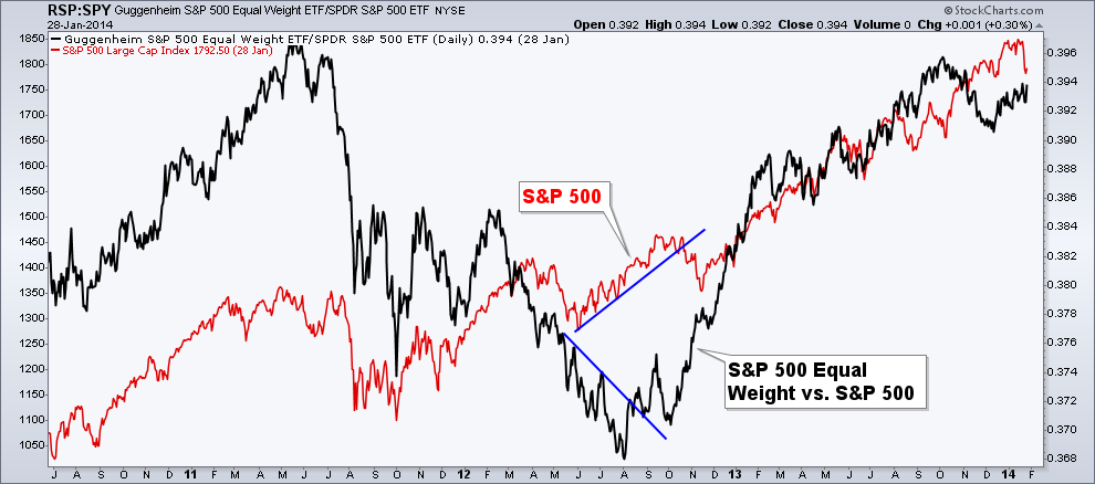
Another instance we saw this play out was in 2012. During the initial bounce off the low in May we saw the S&P 500 begin making higher lows but it was being done on the backs of the largest components – as we can see with the black ratio line making lower highs from May through August. This divergence was ultimately responded with the market as a whole heading to new highs and the smaller S&P companies once again taking the lead.
The reason that we may attention to which parts of the market are leading and lagging is because it provides insight into the level of risk taking that’s occurring within the market. It’s commonly believed that the larger the company’s market cap, the less riskier the stock (obviously there’s plenty of examples of this not being 100% true all the time). When the market is trending higher many bulls want to see the more riskier portions of the market, such as small caps and mid caps show strong relative performance. And one way we can measure that is by looking at which parts of the S&P 500 are showing that relative performance – the largest weighted or the smallest weighted stocks within the index.
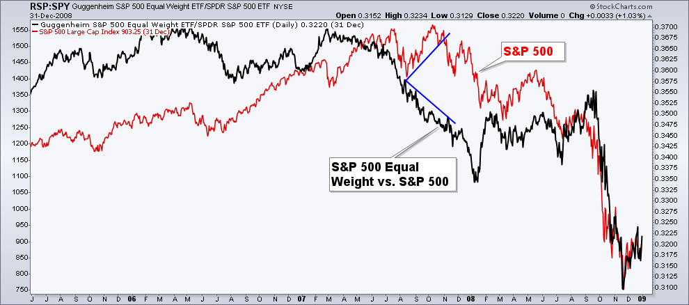
Here’s another example a divergence being formed between the two differently weighted ETFs. Let me first say, yes this is showing the 2007 peak in stocks before the Financial Crisis. No, I’m not calling for a long-term top in the S&P 500, this is just another example of a similar divergence. As with many major market peaks, the are lead by a narrowing of breadth, also known as participation. This showed up in the lack of relative strength among the smaller S&P 500 stocks in June 2007 through the rest of the year. And we know how that played out in the next twelve months….
So there are two examples of a growing separation in the largest and smallest stocks that make up everyone’s favorite equity index. One (2012) was resolved with the market going higher and another (2007) that led to a major bear market. Which one will we see? No idea, and there’s no reason we must replicate either of these instances. The important takeaway is the acknowledgement that the largest companies in the index are what have been leading it higher – that’s where bulls seem to be concentrating their efforts.
Disclaimer: Do not construe anything written in this post or this blog in its entirety as a recommendation, research, or an offer to buy or sell any securities. Everything in this post is meant for educational and entertainment purposes only. I or my affiliates may hold positions in securities mentioned in the blog. Please see my Disclosure page for full disclaimer.


