The advance/decline line (A/D) plots changes in the value of the advance-decline index over a certain time period -daily, weekly, or even monthly- and is used to confirm the strength of a current trend and its likelihood of reversing. If the slope of the A/D line is up and the market is trending up too, then the market is said to be healthy and we can expect continued higher prices.
But, if the markets are up while the A/D line is sloping downwards, it’s usually a sign that the markets are losing strength and may be setting up to head down. This is called negative divergence, and can happen on each time frame: from daily to monthly. The larger the time frame, the larger the potential down move. (E.g. the 2008 market crash was foretold by negative divergence on the monthly time frame; while the August 2015 correction was foretold by negative divergence on the weekly time frame).
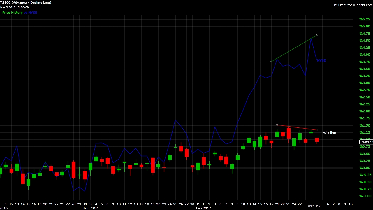
With that in mind, let’s take a look at the current A/D line and market price (NYSE). Figure 1 shows the daily A/D line (depicted as candlesticks) and what we can see is that whIle the NYSE went higher, the A/D line did not. That’s the negative divergence we mentioned earlier.
Figure 1. Daily A/D line and NYSE
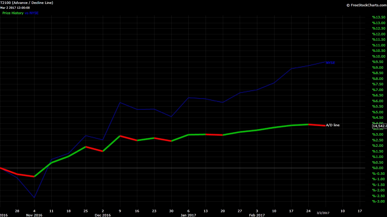
How about the weekly A/D line? Although this week is not yet over, also here we can observe negative divergence with the NYSE: price went up, while the A/D line is pointing down. What does this tell us? Odds are increasing that we’ll see lower prices going forward on a daily and weekly time frame. This prospect fits perfectly with our preferred view of the market, which we showed last weekend, in that intermediate iii of major 3 is about to peak as it is very close to Fib-extensions typical for (3rd) of 3rd waves. Forewarned is forearmed.
Figure 2. Weekly A/D line and NYSE (closing basis)

