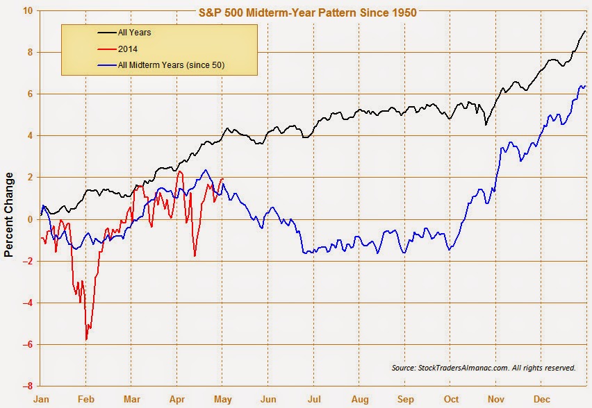
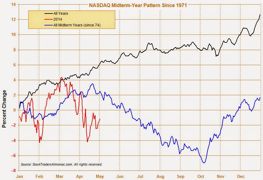
I received a ton of feedback from my post last week (see Should you sell in May?) and a lot of readers seemed to have misunderstood my views. Yes, I was calling for a 10-20% correction this summer, but, no, the reasons are not just based on midterm election year seasonality. It appeared that many people had read the headline and concluded that I was tilting bearishly because of the so-called Sell-in-May seasonality. Not true. While seasonality arguments created a tailwind for my call, my cautious stance was based on other factors, such as the change in market leadership and volatility regime (see Interpreting a possible volatility regime change and A case of risk exhaustion).
The market cycle analytical framework
Let me start again, but in the context of a market cycle framework to analyze the stock market. One key advantage of market cycle analysis over economic analysis is that market cycle analysis uses real-time data, which is more forward looking than economic statistics, which is by definition backward looking. In effect, market cycle analysis gives us a continuous real-time read of what Mr. Market thinks where we are in the cycle. While its views may not be necessarily right, it does measure market expectations.
Here is an idealized version of a market cycle and how market leadership evolves over the course of that cycle:
Early cycle: The economy is in recession or on the edge of a recession. In response, the central bank stimulates the economy with low interest rates (or unconventional policy). As a result, stock begin to rise, led by interest sensitive sectors, such as Financial and housing related stocks.
Mid cycle: Some analysts split this part of the cycle into several pieces, but here is roughly how market expectations change. The economy gets better, or is perceived to get better. More jobs are created and consumers have more money to spend. Corporations find that they start to get capacity constrained. They respond by hiring more people, which leads to a virtuous cycle of more consumer spending, and buy more capital equipment. During this part of the market cycle, Consumer Discretionary, capital equipment sensitive sectors like Technology and Industrial stocks lead the market higher.
Late cycle: The economy starts to overheat and inflation starts to tick up. At this point, inflation sensitive commodity related sectors like Energy and Materials start to outperform. The central bank responds to rising inflationary pressures by raising interest rates, which leads to...
Bear phase: The stock market falls because of the expectations of higher interest rates and falling growth. Defensive sectors such as Consumer Staples, Utilities and Healthcare outperform during this phase.
There are a number of important caveats to this analytical framework. First, this is an idealized cycle which ends with either an inventory recession or the expectations of slowdown caused by an inventory recession. What we went through was not a typical inventory recession but a balance sheet recession, which recovered very slowly.
More importantly, I am describing a market cycle and not an economic cycle. Realize that this framework is based on technical analysis and not economic analysis. A market cycle behaves like an economic cycle, but it only describes the market response to expectations, not the actual economic result. As an example, the economic cycle started at the trough of the Lehman Crisis in 2008-09, but I believe that the market cycle actually began in late 2011, when the markets got over the trauma of the debt ceiling impasse in Washington and the ECB acted to relieve the pressures of the eurozone crisis with its LTRO program.
A market cycle map
With that in mind, let us consider what has happened in the past few years in the context of the market cycle framework. I will be showing a series of charts below. They are all market relative charts - charts of the performance of sectors and industries relative to the market as measured by the SP500. You will see relative uptrends, where the sector or industry outperformed and downtrends, where they underperformed. Keep that in mind when you look at these charts. Moreover, you will see that the time frames for these charts is all three years, in order to maintain an easy apples-to-apples visual comparison of where each group is in the market cycle.
What what happened?
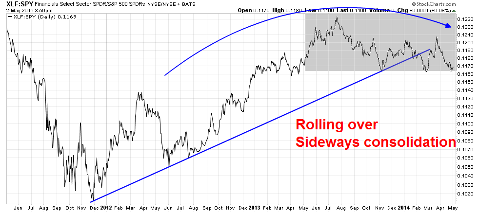
As expected, interest sensitive stocks led the market upward in late 2011. As the relative chart of Financial stocks show, they led the market upward, but their relative performance has stalled in the last year or so and they have been consolidating sideways relative to the SP 500.
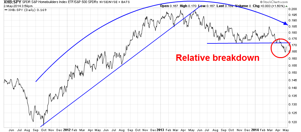
The homebuilders is another interest sensitive group that displayed a similar pattern as the financials. They initially led the market upward, but their relative performance has been rolling over. In fact, homebuilders have recently suffered a relative breakdown through a critical level of relative support.
Notwithstanding the debate between New Deal Democrat and Calculated Risk on tactical outlook housing, Barry Ritholz wrote about the secular headwinds faced by the homebuilding industry in the wake of the Great Recession:
When you consider the chain of purchasers that typically occurs in a residential real estate market, you will understand why homeowner equity is so important. Any home sale is usually part of a series of interdependent transactions. The newlyweds who buy a starter home are usually doing so from a married couple, who have a 3-year-old and another on the way. They want to buy a larger home with more bedrooms for the kids, and purchase that from the couple who are trading up to a nicer home in a better school district. Those sellers purchase their new home on more land, or with a better view or some other factor. The long chain of buyers and sellers, beginning with the first-time buyers, explains why household formation is so crucial.
But beyond the first-time buyers, there are other problems with the links in the home-selling chain. Jonathan Miller of Miller Samuel Inc. noted the down-payment issue was directly related to the low-equity problem...
This also creates a problem with decreased inventory, which drives prices higher and paradoxically hurts first-time buyers.
As households have been deleveraging from the mid-2000s credit binge, they also have maintained a low savings rate. Combine that with relatively low household equity -- as well as no-equity and underwater households -- and you end up with a housing market that lacks a crucial ingredient for a robust recovery.
Ritholz's observations were confirmed by a study by the St. Louis Fed, entitled "Housing Crash Continues to Overshadow Young Families' Balance Sheets", which came to a similar conclusion.
Mid-cycle sectors faltering
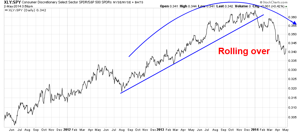
After the interest sensitive stocks, the leadership baton was passed on to the mid-cycle groups. As this chart shows, Consumer Discretionary stocks have been on a tear since the market bottom, but they have start to roll over on a relative basis. Note, however, that the date of the relative peak is later than that of the interest sensitive groups.
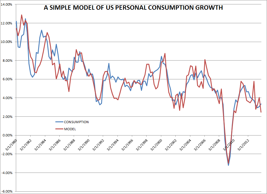
Macro Man recently weighed in on the US consumer and stated that his model of consumption is weak, largely because the restraints put on consumption from the tepid pace of the rise in housing prices (see analysis above about housing).
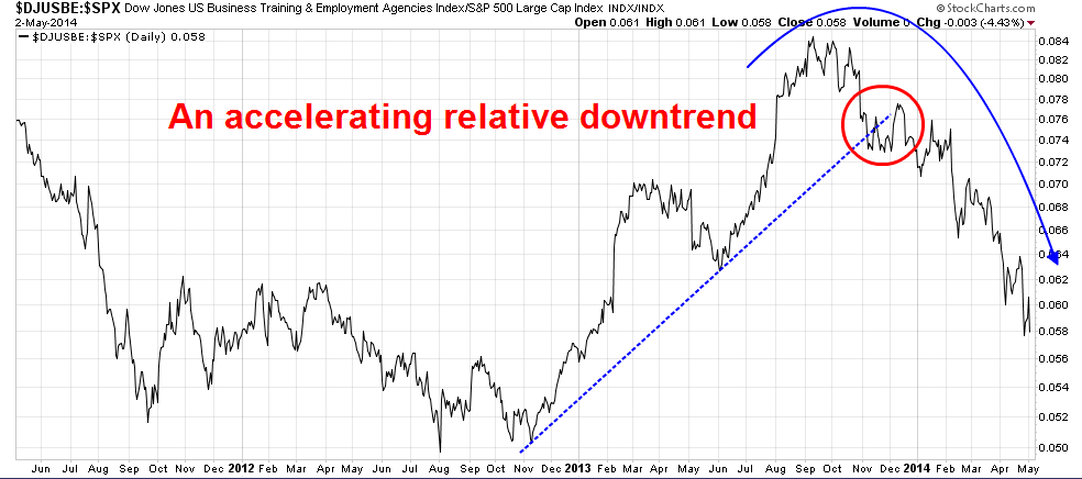
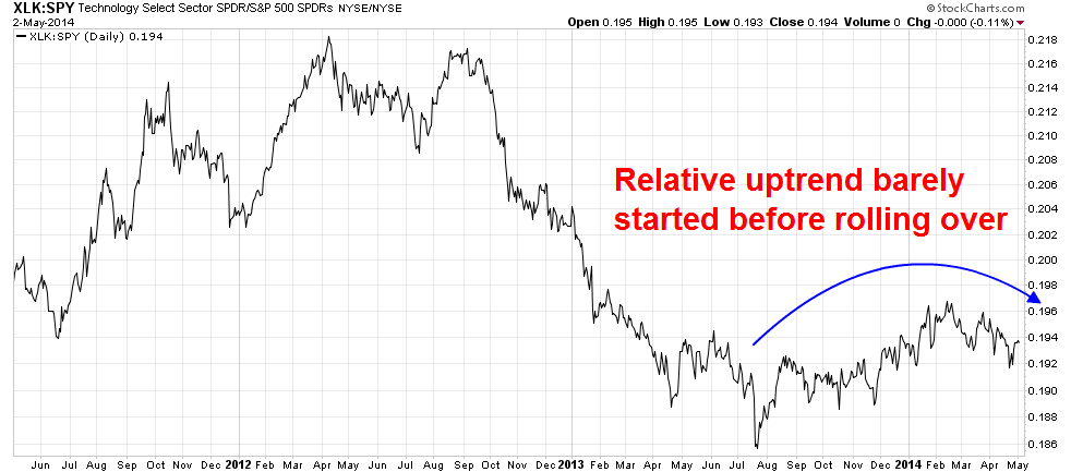
In addition to rising employment, mid-cycle expansions are accompanied by increasing investments in technology and capital equipment. Technology, another mid-cycle sector, never got the chance to assume the leadership mantle very much until about a year ago. Their leadership soon faltered by early 2014.
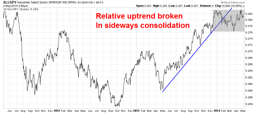
The capital equipment sensitive Industrial sector bottomed out on a relative basis in October 2012. They began to lead the market in earnest starting May 2013. Like the Technology sector, they peaked out on a relative in early 2014 and they are now consolidating sideways. This is a critical sector for the health of the bull as the US economy is mid-economic cycle where capex should begin to accelerate (see What the equity bulls need for the next phase). The reports for this group this Earnings Season contained good news and bad news. The good news is that earnings and the earnings outlook were generally positive. The bad news is that these companies continued to lack visibility in sales growth, either in their Q1 reports or their forward guidance (see CapEx: Still waiting for Godot).
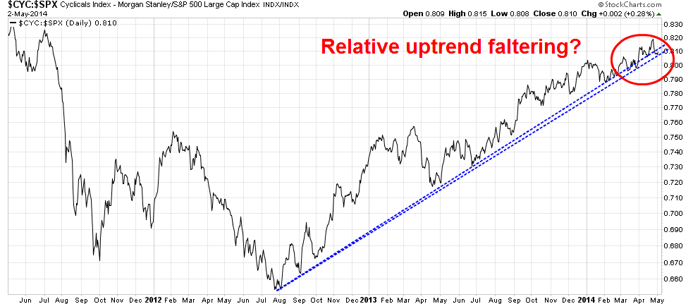
Another test of Mr. Market`s views about mid-cycle strength has been the relative performance of cyclical stocks. This relative performance chart of the Morgan Stanley Cyclical Index looks a little iffy. Cyclical stocks bottomed out on a relative basis at about the same time as Industrial stocks and they have been on a relative uptrend ever since. Depending on how you draw the trend-line, these stocks are either testing the relative uptrend, or they are faltering and doing the dance between the downside and the upside of the relative uptrend line.
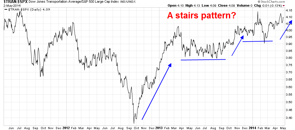
To be sure, the cyclical picture is not out-and-out bearish. The relative performance of the cyclically sensitive Transportation stocks show that they remain in a step-wise uptrend, which leads to a bullish interpretation. Note the timing of of the bottom of these mid-cycle groups, which all occurred at about the same time.
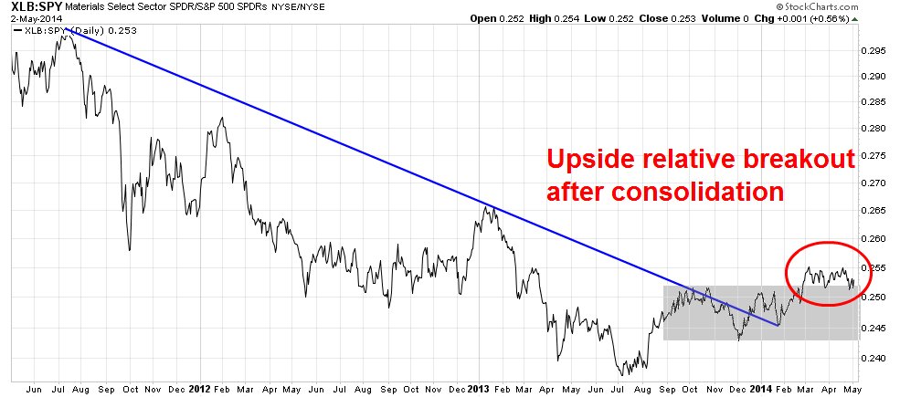
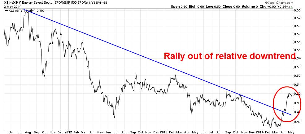
What I do find disturbing, however, is that late cycle stocks are starting to bottom and outperform. This relative chart of the Material sector is that they rallied out of a relative downtrend about a year ago, consolidated sideways and they have staged an upside relative breakout indicating a possible leadership change.
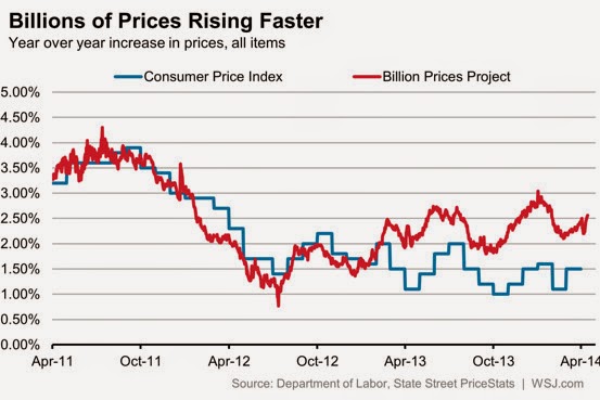
Indeed, several alternative measures of inflation are ticking up. The Dallas Fed`s measure of Trimmed Mean PCE rose to 1.9% in March on the annualized headline figure and 2.1% on an ex-food and energy basis. While these figures only represent a single month of data, they are very close to the Fed`s inflation target of 2% and should bear watching carefully.

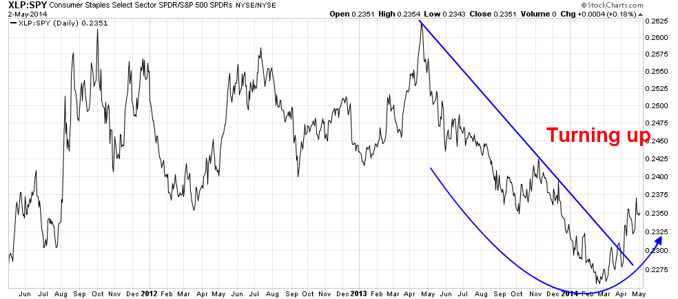
As an aside, astute readers may have noticed that I excluded the chart of Healthcare stocks in my analysis, as that sector has been thought to have defensive characteristics. I decided to exclude that sector because of the recent rise and fall of the biotech stocks, which is part of the sector, because their returns only serve to confuse the issue.
Market weakness ahead
There are two obvious differences. First, we came out of a balance sheet recession and not an inventory recession, so the magnitude of the responses were different with past cycles. As well, the performance of commodity sensitive sectors have been much affected by the economic cycle in China, which can distort the interpretation of cycle work.
When I put it all together, the mosaic that I see is a market all have bearish overtones because of the nature of the change in market leadership. Add in the news about growing individual investor participation (see A warning from the retail investor), rising volatility (see Interpreting a possible volatility regime change) and the seasonal effects of the mid-term election and the Sell-in-May effects, my conclusion is there is equity market weakness ahead.
Would this weakness be a correction or a full-blown bear market? The most likely proximate cause of a bear market would be the anticipation of an economic recession. Since most recessionary indicators show a low probability of a recession in the near-term, my conclusion is that we are likely to see a mid-cycle correction of 10-20%.
Bearish seasonality
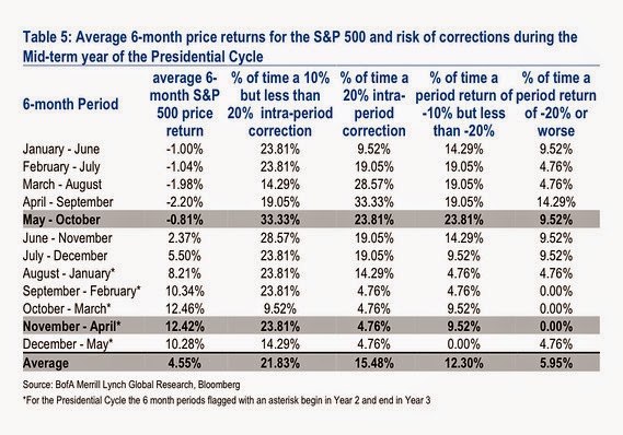
Indeed, analysis from Steve Suttmeier of BoAML indicates that the most likely outcome is a 10-20% correction during the May-October period during a mid-term election year. In fact, the combined probability of a correction of 10% or more during this period is 57%.
None of the information or opinions expressed in this blog constitutes a solicitation for the purchase or sale of any security or other instrument. Nothing in this blog constitutes investment advice and any recommendations that may be contained herein have not been based upon a consideration of the investment objectives, financial situation or particular needs of any specific recipient. Any purchase or sale activity in any securities or other instrument should be based upon your own analysis and conclusions. Past performance is not indicative of future results. Either Qwest or I may hold or control long or short positions in the securities or instruments mentioned.

