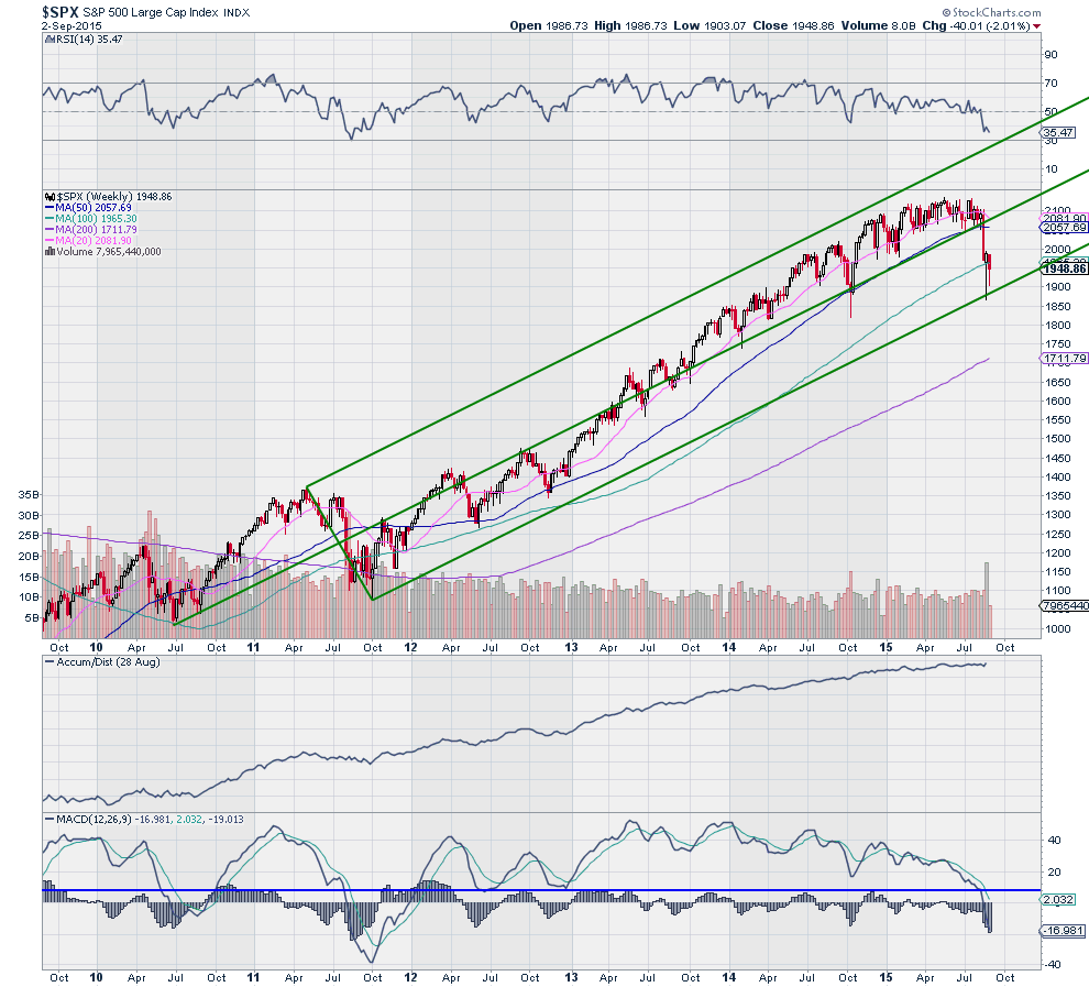
The S&P 500 has had a wild ride since Monday August 24th. Bouncing up and down, leaving islands above and below. When things get noisy in the markets it often makes sense to take a step back and look from a longer perspective. With stock charts that means dumping your daily data and looking at weekly charts.
The chart below is a weekly chart for the S&P 500 going back to 2010. There were some wild times back then as well. How soon we forget. Adding a couple of indicators to the charts makes for a n interesting story. There are 7 interesting facts worth point out.

1. The Andrews Pitchfork, used to identify trends, shows the correction has held so far at the lower Median Line, keeping uptrend in tact.
2. The index has bounced off of that Lower Median Line twice to the 100 week SMA, a sticky point it seems.
3. The long lower shadows show intra-week strength, as buyers overwhelm sellers at the lows to bring the index back higher.
4. Accumulation has not fallen off during this correction.
5. The current inside week shows a tightening range, consolidation, often, but not always, a sign of exhaustion in a downward move.
6. The RSI is in the bearish zone and at levels where the index has reversed in the past.
7. The MACD is far below 8, the level that acted as support during the trend higher, but also now at levels where bottoms in the index have occurred the last 2 times.
None of these facts is enough to say that the S&P 500 correction has run its course. But taken together they present a decent case that the bottom may be forming now. Time to start looking for evidence that it wants to move higher now before adding money.
The information in this blog post represents my own opinions and does not contain a recommendation for any particular security or investment. I or my affiliates may hold positions or other interests in securities mentioned in the Blog, please see my Disclaimer page for my full disclaimer.
