In the parlance of candlestick charting, a “wick” is the skinny line protruding either above or below the color rectangle (known as the “body”), and long wicks typically denote volatility and uncertainty. The year 2020 was certainly chockablock with wicks, and below are eleven charts, constructed with annual bars, with some comments in each captioned area.
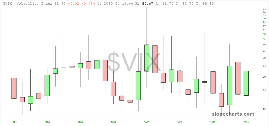
The only graph that consistently has long wicks is, understandably, volatility itself. This year was remarkable in the sheer length of the upper wick and the fact that its peak matched that of the global financial crisis in late 2008.
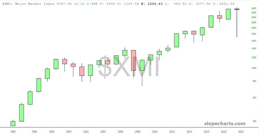
The Major Market Index illustrates nicely what a bizarre year 2020 was. Notice how, over a period of decades, there isn’t a single other bar with any resemblance to the most recent one.
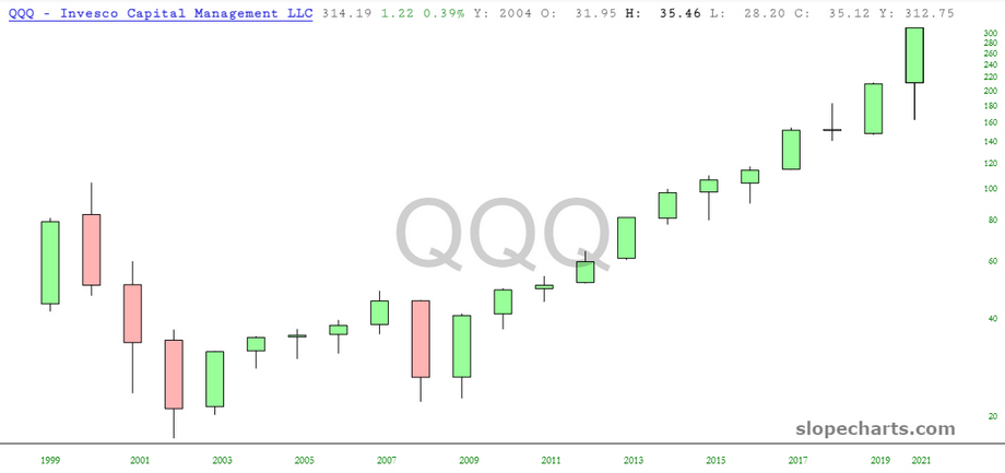
What’s intriguing about the NASDAQ ETF (NASDAQ:QQQ) is how it has consistently gone up for literally a dozen years in a row. Prior to this, it had its organic ups and downs.
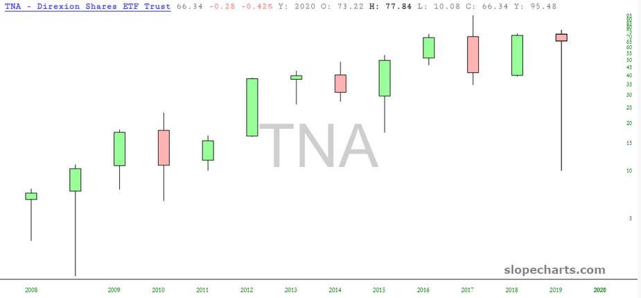
Because it is a leveraged instrument, Direxion Daily Small Cap Bull 3X Shares (NYSE:TNA) shows in an amplified fashion how insane the moves of 2020 were. This triple-bullish-on-small caps fund has a gargantuan lower wick and a very small body, showing how the closing price wasn’t much different than the open a year prior.
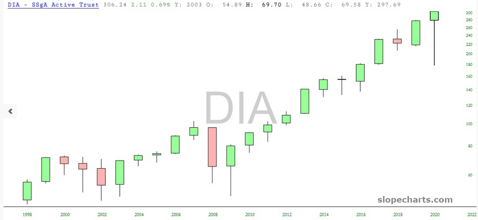
The Dow Industrials (NYSE:DIA) have gone up year after year since the financial crisis, with 2018 being the year that it seemed to even wobble a little bit. The assurances of the world’s central banks have done wonders for risk-free equity investing.
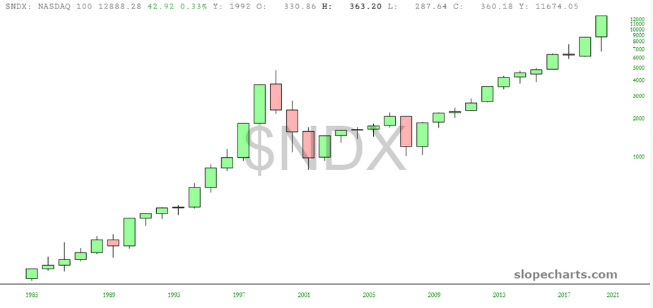
Because the NASDAQ 100 has been around longer than the QQQ itself, this chart shows how the past dozen years of “up all the time” is quite similar to what was going on in the 1990s. You can see how that “new paradigm” ended.
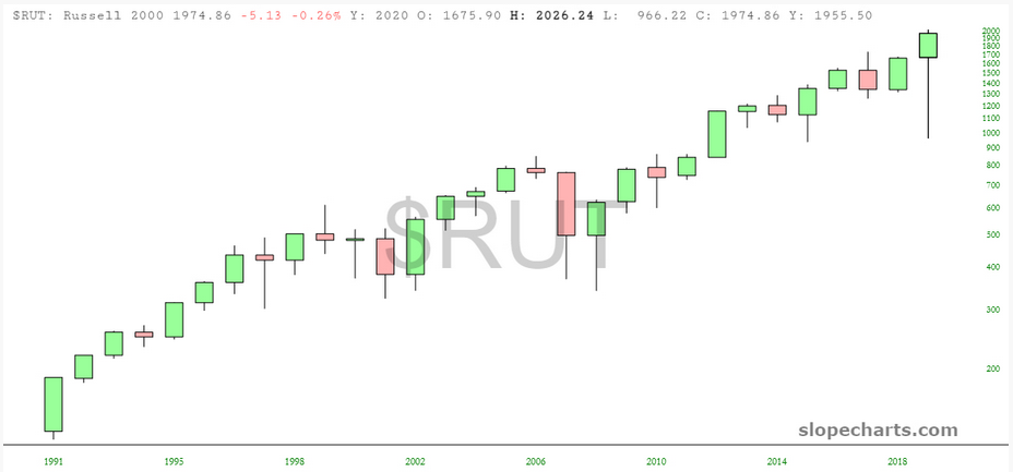
In the middle of this chart, you can see how the Russell small caps literally went nowhere in the span of eight years. Yes, they went up, but the GFC brought them right back down to where they started. Since then, however, it has been a Yellen (and now Powell) fueled love-fest.
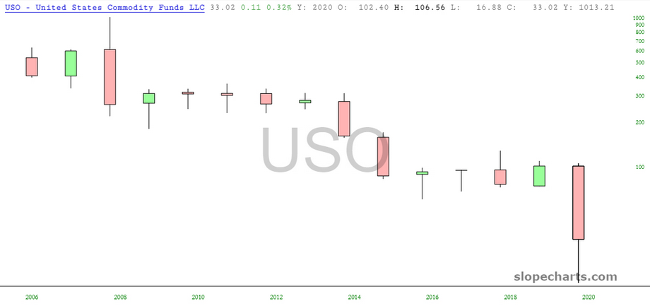
Just about the only asset that fell this year was oil (USO), and it fell hard. How ironic that the year began with an assassination in the Middle East, which briefly caused people to chatter about triple-digit oil prices. Nope.
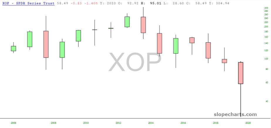
In turn, the oil and gas producers (SPDR® S&P Oil & Gas Exploration & Production ETF (NYSE:XOP)) fell.
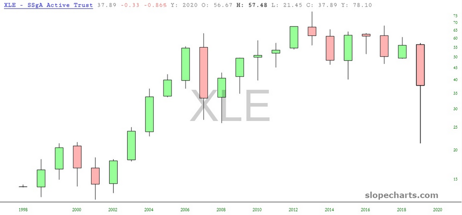
As did Energy stocks in general. Indeed, this is where TNRev and I part ways: he thinks 2021 is going to be great for energy, whereas I think it’ll be a wreck of a year.
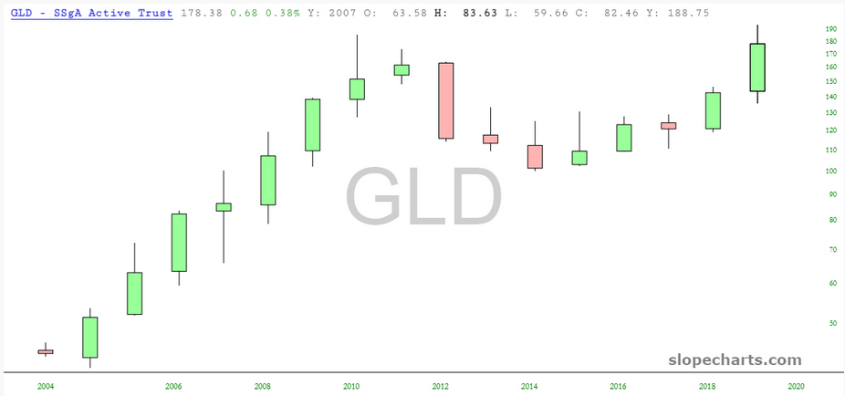
One chart, on an annual basis, that actually looks constructivw is good old gold (GLD). 2021 might just be the year where gold truly comes into its own.
