Last week we published the 2017 End of Year Special Edition of the Weekly Macro Themes report, a summary of some of the best, worst, and most notable charts of 2017 (and the ones to watch in 2018). This article brings you a look at an interesting section of the report: "The 2017 People's Choice Charts", and follows on from the 5 Charts for the Silly Season article. In this post we look at the 5 most popular charts we tweeted this year as ranked by views and engagement. I'm sure you along with our Twitter followers will find the charts interesting and insightful - of course if you think we missed one that you think should be included please let us know in the comments or get in contact.
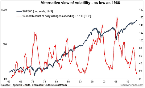
1. First is the alternative volatility metric for the S&P 500 (rolling 252-day count of daily moves greater than +/-1%), punchline is this measure of volatility has fallen to a 50-year low!
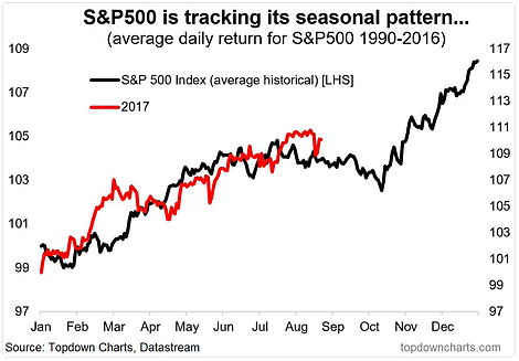
2. Next is a look at S&P 500 seasonality – that red line actually managed to defy gravity and avoid the Sep/Oct lull with a close-to straight-line rally through much of the year.
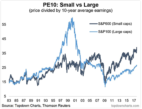
3. S&P again, this time the 600 (small caps) and the 100 (large caps). By this, small caps look expensive in both absolute and relative terms.
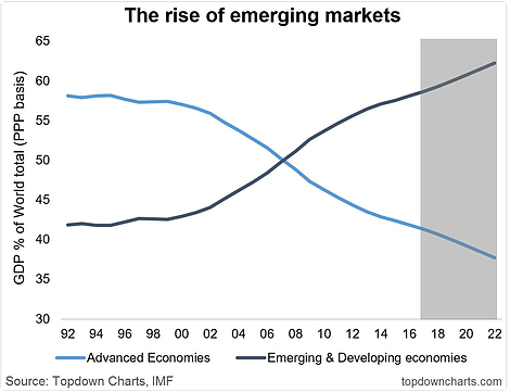
4. One of the classics (could have easily put this in the favourites section) IMF PPP measures show Emerging & Developing economies now account for the dominant share of world GDP.
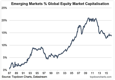
5. And a similar chart, but a big contrast, emerging market equities account for around 15% of global equity market cap, which is interesting compared to ~55% for GDP share.
