As we approach the last couple of days of 2014, I thought I would review the year in point form, over 12 simple charts. Obviously I cannot and will not cover everything that has happened, but let's give it a best shot:
Chart 1: US stock market has outperformed this year and over the past 5 years
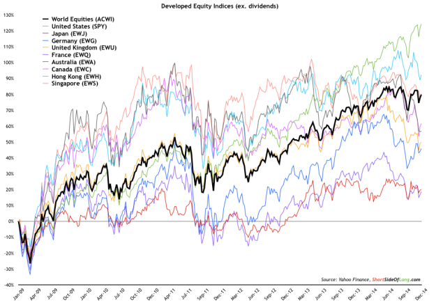
- The MSCI World Index had a decent, but unglamorous year in 2014. The majority of global equity markets were very weak in the second half of the year, while the US outperformed. Not only has the United States outperformed this year, but it has been the best performer since the bull market began in March 2009. Close behind the US, we find Hong Kong shares. This is mainly due to the fact that HK dollar is pegged to the US dollar.
Chart 2: Short term market breadth has rebounded from oversold levels
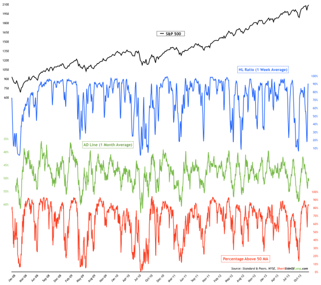
- Despite the fact the US has outperformed the rest of the world, there has been quite a lot of volatility since September of 2014. The S&P 500 suffered its first 10% (intra day) correction in several quarters, while small caps sold down by about 20% (typical bear market territory). Internals suggest that over the short term perspective, 52 week new highs continue to dominate new lows while we have over 80% of stocks trading above the 50 day moving average. Meanwhile monthly AD Line remains quite low.
Chart 3: After a decent correction, small caps are ready for a break out!
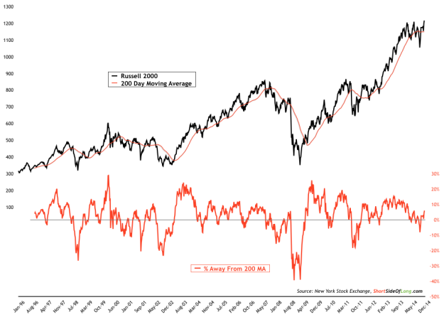
- As already mentioned, volatility was high during the second half of 2014. US small caps felt the brunt of that correction and sold of by almost 20% into middle of October low. The index was trading about 10% below its 200 day moving average… nothing serious from a bear market perspective, but nonetheless a decent correction. In recent posts, I’ve been hinting at the strong tape, which now indicates a move towards record highs.
Chart 4: In 2014, Treasuries outperformed stocks as the curve flattened
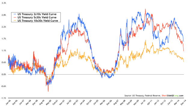
- Even thought it has been mentioned before, one interesting fact about 2014 is that US Treasury Long Bond outperformed the S&P 500 stock index. Not only that, but the outperformance was quite direct in the sense that the longer maturity bond markets rallied for almost the whole of 2014, with barley a pullback. At the same time, shorter maturity bonds sold off creating a strongest flattening since the Fed’s tightening cycle in 2005.
Chart 5: Bond market is telling us about low inflation expectations…
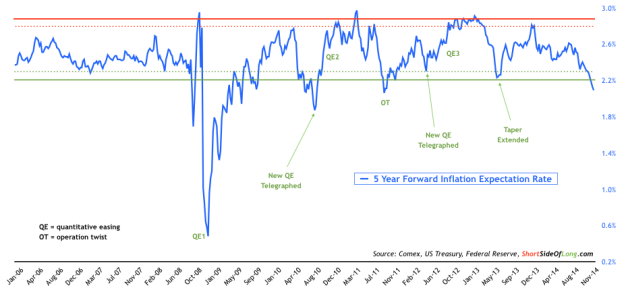
- One of the main reasons bonds outperformed in 2014, was due to the fact that just about everyone believed interest rates will rise. The reason consensus was completely wrong was due to the fact that not one major forecaster correctly anticipated a crash in Crude Oil prices. As energy prices almost halved, inflation expectations have now dropped to levels where the Federal Reserve could remain more dovish, as it worries about deflation. Let us remember that at current level, previous stimulus programs were started.
Chart 6: Hedge funds remain net long the dollar, as prices rise vertically
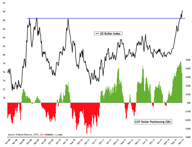
- A slowdown in the global economy has pushed many other central banks to cut interest rates and even enter into various forms of quantitative easing measures. In recent months we have seen Mario Draghi telegraph that ECB is ready to start a bond buying program, while Bank of Japan doubled down on its own QE. All of this has pushed the US Dollar Index to an 8 year high. However, a word of caution as just about every hedge fund remains net long the greenback. The possibility of a shake out is high.
Chart 7: After an impressive run, Sing Dollar seems to have topped out
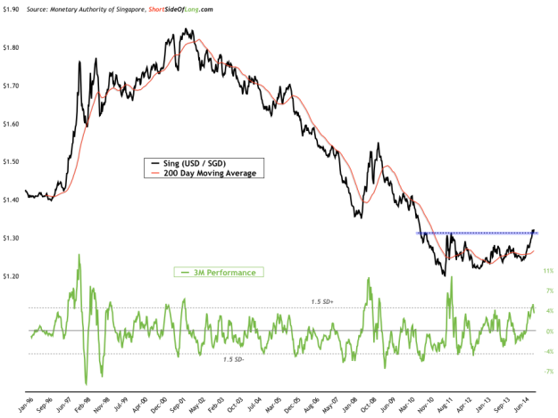
- The Singapore dollar has been one of the strongest currencies during the decade long US dollar weakness. Despite a powerful setback in 2008, as the Global Financial Crisis unfolded, the Sing managed to recover and achieve impressive gains rising from $1.85 per USD in 2001, all the way to almost $1.20 per USD in 2011. However, that seems to have come to an end, and if we were to break a major support seen in Chart 7, there could be more downside to come.
Chart 8: Equal-weighted GEM currency index is breaking to new lows…
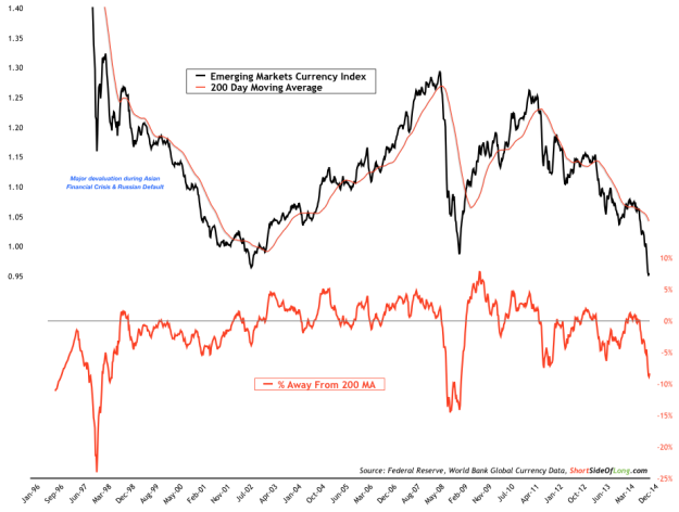
- The US dollar hasn’t only been strong against the euro, yen and the Aussie. It has absolutely hammered some of the emerging market currencies in recent months. The obvious one that comes to mind is the Russian ruble, but many others have also suffered to a lesser extent. The equal-weighted emerging market currency index is currently breaking below its 2002 and 2009 bottoms. This has really impacted GEM equities (and ETFs such as the iShares MSCI Emerging Markets Fund (ARCA:EEM)), when priced in US dollars.
Chart 9: Recent US dollar strength has not impacted Gold all that much
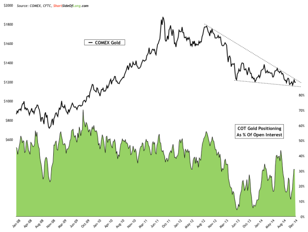
- Consensus outlook is that Gold goes lower, much lower and that US dollar goes higher, much higher. Maybe consensus is right. However, consider for a minute that the USD Index has gone through the roof since July of this year and Gold still remains at around $1,200 per ounce – the same level that it traded exactly 18 months ago. If and when the greenback takes a breather and pulls back, maybe Gold could surprise on the upside. Technically, the price remains compressed in a wedge, which should see a break in either direction sometime in earlier 2015.
Chart 10: Gold mining shares are oversold and rest on major support level
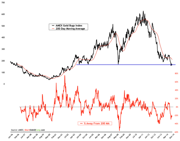
- One of the reasons why I think Gold might break upwards is because US dollar rally is overstretched and overbought. Another reason is because Gold mining shares are incredibly oversold, recently trading as far as 30% below its 200 day moving average. These producers also sit on an important support zone, where market participants have a strong memory of buying. An upside surprise is possible during early parts of 2015.
Chart 11: Brent Crude Oil has crashed from $115 all the way below $60!
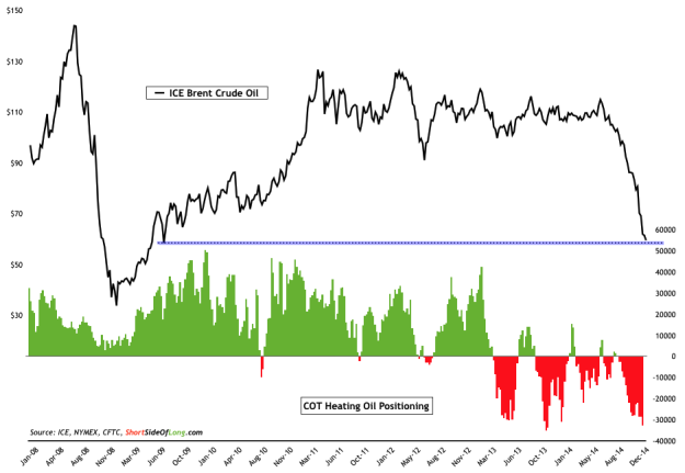
- North Sea Brent Crude Oil prices have almost halved in the second part of 2014. Who would have predicted that in January of 2014? Just about nobody. While I mentioned that the strong US dollar has not had that much of an impact on Gold, it certainly has pushed other commodities such as Oil down… and down a whole lot! Sentiment is now incredibly bearish and positioning extremely short, so a rebound is definitely possible. Nevertheless, it is important to let the selling completely exhaust itself first.
Chart 12: Agricultural prices are currently rebounding from major sell off
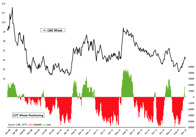
- Finally, we look at agricultural prices. For the majority of 2013 and 2014, agriculture has been in a major downtrend. However, since early October grains such as Wheat (seen in Chart 12), Corn and Soybeans have gone through a short squeeze rebound. Wheat prices have rallied by over 40% in only a space of a few months, a phenomenon that is not all to uncommon when shorts build to over 60,000 contracts.
