This week it’s a slightly different focus than usual given the quieter time-of-year — this edition takes a look at some of the most notable and enduring charts from the past year (similar to this edition from the same time last year).
Hope you enjoy, and Best Wishes for 2025!
1. Market Cap to GDP Ratio
This one made the list because the trend (and cycle around the trend) is very interesting — but perhaps more poignant is the fact that for the first time in history the US Stock market capitalization to GDP ratio broke through the 200% mark. A reflection of the time we live in with regards to US leadership in global markets, but also the stage we are at in the market cycle.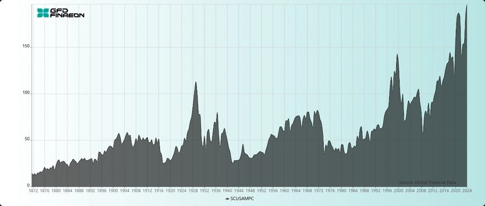
Source: Weekly ChartStorm 8 Dec 2024 [@MebFaber]
2. US Market Cap vs the World
Another market-cap milestone was set this year — the US stock market cap weighting in developed market equities reached a new high. Again this is interesting because of how it reflects US dominance, but also the subtle nod to future risks vs opportunities, its rare to see trends like this go on forever, and when they become extended like this it’s more common to see an eventual reversal.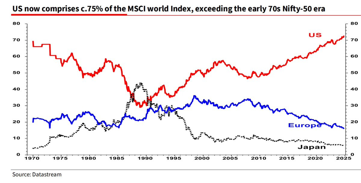
Source: Weekly ChartStorm 1 Dec 2024 [@albertedwards99]
3. Market Cap Weighting vs Equal Weighting
Staying with market cap stats, I find this one fascinating even if obvious. It really spells out the stark difference between the equal-weighted (i.e. 1/500) vs market cap-weighted version of the S&P 500 index. The “wow” stat is the largest 10 stocks in the cap-weighted carry a weighting almost 20x (38% vs 2% at the time of writing) that of their equivalent standing in the equal-weighted index. It makes you think — is index investing really diversification when it gets like this? And, what are the hidden risks/benefits of the index that you are investing in? (have you even thought about this?)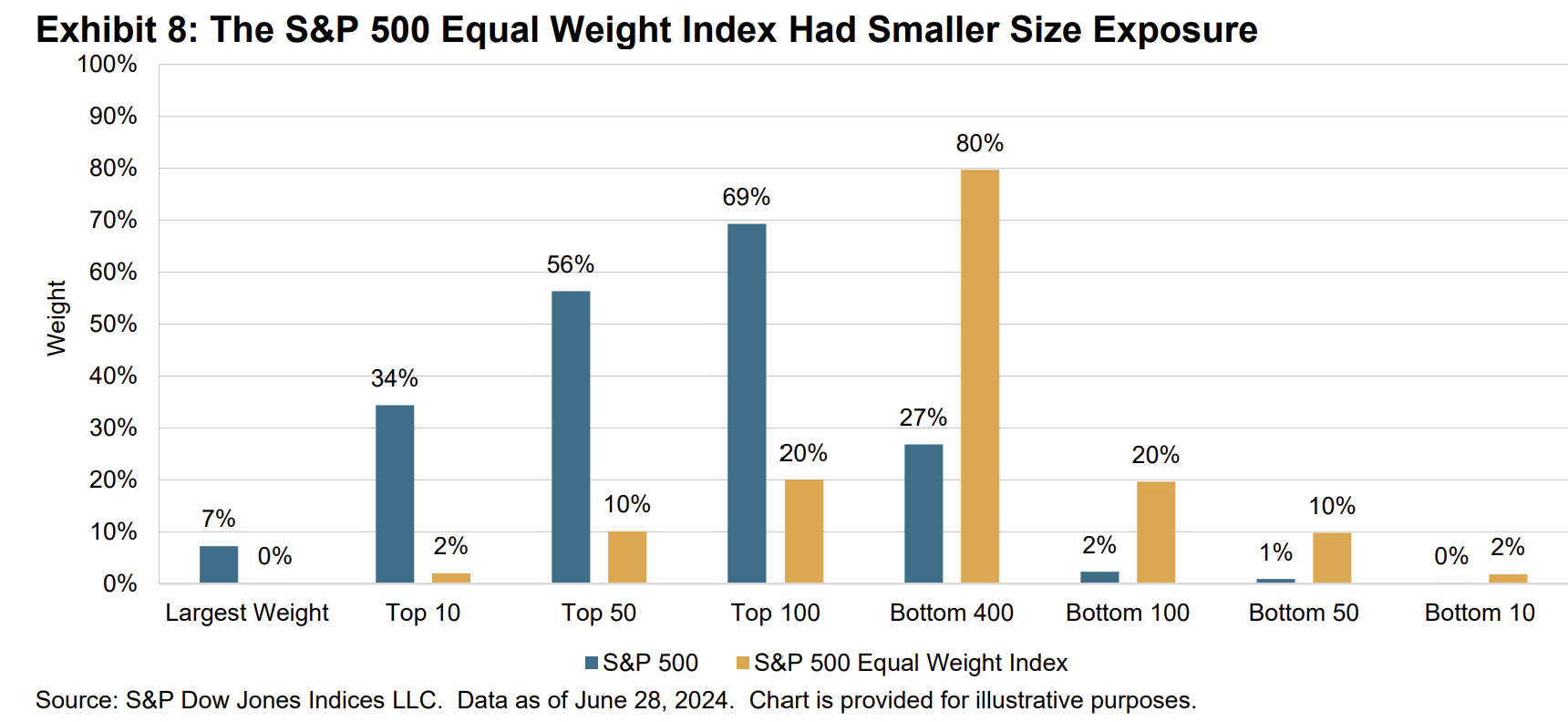
Source: Weekly ChartStorm 1 Sep 2024 [S&P Dow Jones Indices report]
4. Third-Year Bulls
This year saw the beginning of the 3rd year of the cyclical bull market that began from the low in October 2022. And as it seems, the 3rd year can be frustrating. The bright side is that if we make it through to October 2025 without the bull market ending, then there could be some good further years to follow. The downside however is obvious.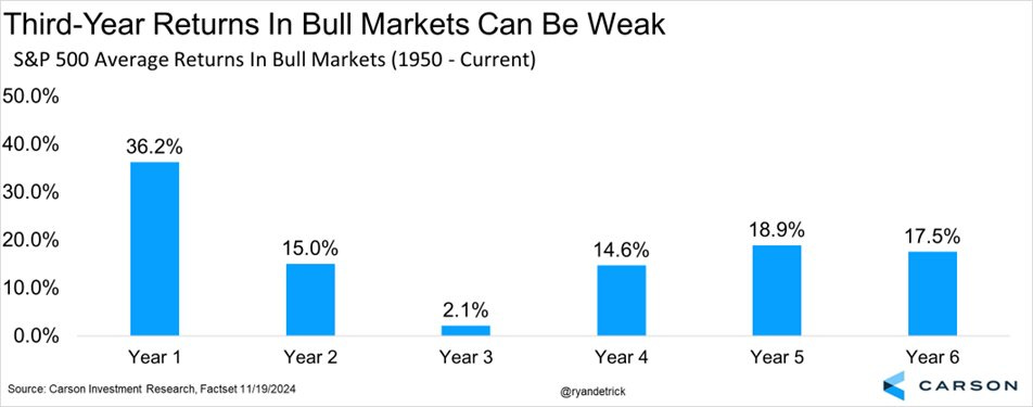
Source: Weekly ChartStorm 24 Nov 2024 [@RyanDetrick]
5. Gold vs Stocks
Speaking of bull markets, despite the epic bull run in gold, it’s “only” just keeping pace with stocks for now (both are sitting around 26% YTD as I write). And the gold vs stocks relative performance ratio has yet to turn the corner. Probably the main way that this chart would turn up (if it does) would be if stocks roll over into correction/bear market, and gold either holds ground or continues to move higher. Interesting chart because of its implications for asset allocation, but also because of that epic 30-year triangle pattern.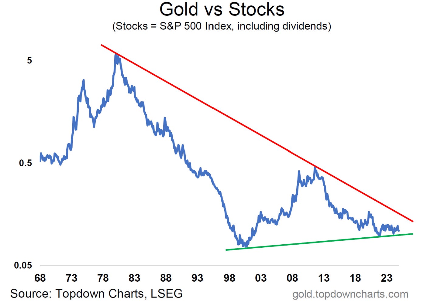
Source: Weekly ChartStorm 8 Dec 2024 [Gold Market Chartbook - November 2024]
6. Realized Equity Risk Premium
Speaking of asset allocation, for the past 10-years investors have been handsomely rewarded for owning stocks rather than bonds, with the rolling realized equity risk premium well above long-term average. And here comes the “but” — problem is this thing is quite cyclical, and it looks late cycle. The implication being that maybe the subsequent 10-year realized equity risk premium may not be as good, time will tell, and charts will give clues.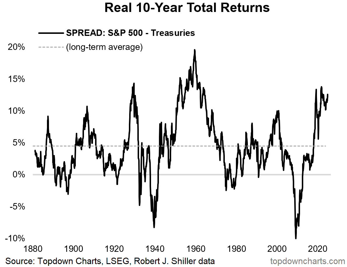
Source: Weekly ChartStorm 15 Dec 2024 [ Topdown Charts]
7. The Market Cycle
Speaking of cycles, here’s a good stylized representation of the market cycle and the mood of investors as the thing unfolds. I’ve written elsewhere about the market cycle, and how to navigate, but it’s worth remembering this and also reflecting on how hard it is to detect where we are in the cycle and how to keep a level and pragmatic head throughout.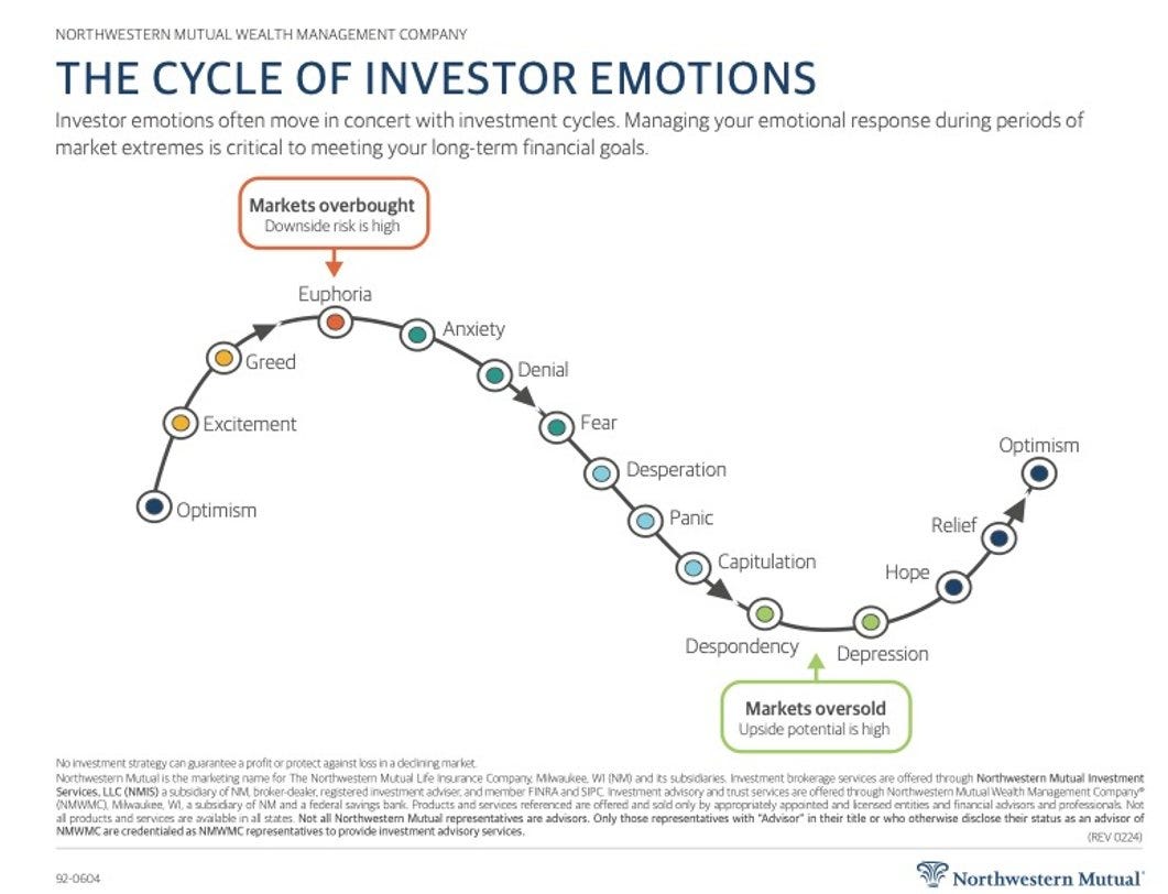
Source: Weekly ChartStorm 3 Nov 2024 [@MikeZaccardi]
8. The Hype Cycle
I’m a big believer in cycles, and the market cycle is not the only cycle that matters (I can think of probably about a dozen or so) — lately I would say the Gartner Hype Cycle has become exceptionally relevant to investors with regards to the AI tipping point. I would estimate we are either at or close to the peak of inflated expectations on Artificial Intelligence, and that means sooner or later we’re going to go down the dip and into the trough of disillusionment. This happened with the dot com bubble, and it will happen again.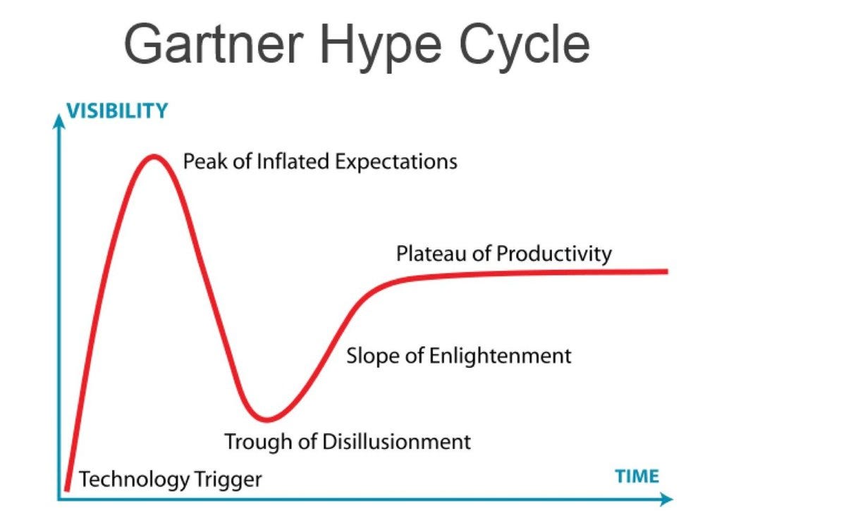
Source: Weekly ChartStorm 3 Nov 2024 [@Mayhem4Markets]
9. The Bubble Cycle
On that note, if you think about the psychology and structure of market bubbles, very often it is a combination of charts 7+8 (the market cycle and the hype cycle). The South Sea stock bubble of the 1700’s provides a good historical example of the bubble structure, and a reminder that these things are a constant through history — they repeat and happen over and over again and even the most brilliant of us fall prey and victim to the vicissitudes of markets/mentality.
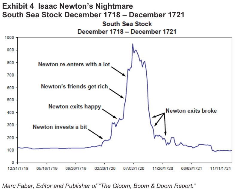
Source: Weekly ChartStorm 18 Aug 2024 [The Fifth Person]
10. Moar Moore’s Law
Given the rise of AI and tech stocks (and themes like fusion, space, and quantum computing), this definitely has to be a feature, and is probably a good cause for longer-term optimism. But hidden in here is also a subtle fact that even as humanity as a whole wins from the onward march of technological progress, the individual winners vs losers will be in near-constant flux and probably difficulty to pick with precision. Food for thought amongst a shopping trolly of food-for-thought charts this week! Thanks for following the Weekly ChartStorm this year, I look forward to delivering more charty goodness for you in 2025.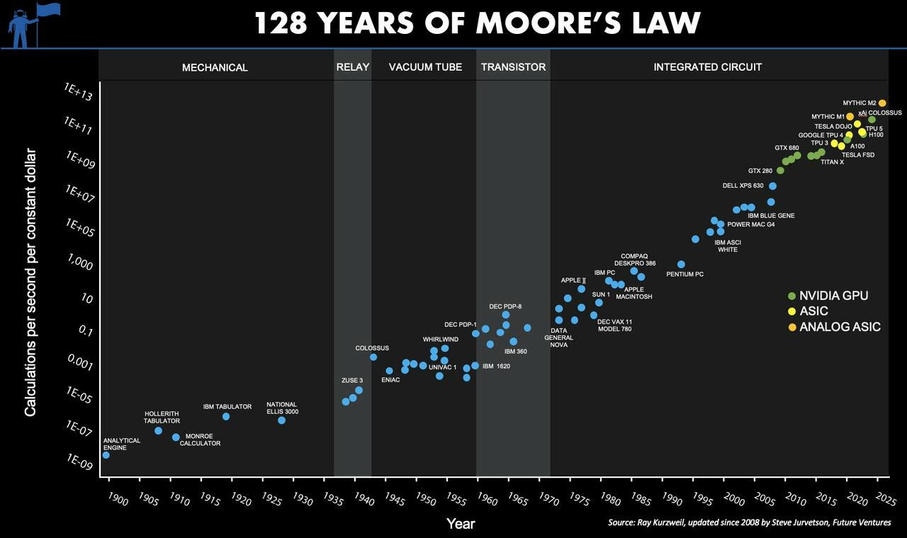
Source: Weekly ChartStorm 15 Dec 2024 [@FutureJurvetson]
