In January of 2013 NFTRH used the Semiconductor sector as a ‘canary in a coal mine’ to a potential coming phase of US manufacturing strength and an economic bounce. This had negative implications for gold but normally would have had positive implications for commodities positively correlated to the economy.
That did not materialize in 2013 (as China decelerated) although with the recent launch of various ‘outlier’ commodity sectors like agriculture, natural gas and uranium along with persistent strength in crude oil and the highly speculative TSX Venture Exchange (CDNX), we now consider the view that some inflationary chickens (rising cost effects) may be coming home to roost. The economic bounce was after all instigated by an inflationary mix of ZIRP on the Fed Funds rate and long-term Treasury bond buying.
We are managing precious metals and commodities on an ongoing basis, but today I want to focus back where it all began, with the canaries in the coal mine. Our early alert came in the form of personal information received about a ramp-up in Semiconductor fab equipment orders from a friend in the field. If fab equipment companies like Applied Materials Inc, (AMAT), and Lam Research Corporation, (LRCX), were ramping up, then it meant that the Semiconductor companies themselves were gearing for a new build cycle. This was ‘early warning’ stuff.
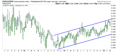
But now the Semiconductor index itself, which has led the rally since Q4, 2012 (and is still leading despite some other leadership indicators like the BKX-SPX ratio falling off lately) is at a very important big-picture pivot point. Here is SOX-SPX, showing leadership during the most intense phase of the cyclical bull market:
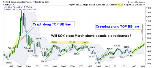
Dialing out to a monthly view of the nominal SOX index we find the really compelling picture. The Semiconductors are technically above 10 year old resistance! ← And you know I don’t use (!) very often in my analysis. A March close above 560.68 is needed to confirm this breakout.
Incidentally, NFTRH has added the HOLDRS Merrill Lynch Semiconductor ETF, (SMH), to the extensive list of strategic ETFs charted each week (joining several precious metals, commodity and stock ETFs) due to SOX’s current status.
What I find interesting is that most rallies over the last decade have pinged along from the bottom to the top Bollinger® Bands and back again. But the current trend is much like the pre-2000 (and pre-blow off) trend as it hugs the top BB line. This is very much in line with the current question we are asking of the markets, ‘melt up or correct here and now?’.
Put it this way, if the SOX holds above the resistance line through March, the odds become heavily tilted toward an upside market blow off, which I believe would be the nature of the bull’s end. We have had bull market termination scheduled for spring to mid-year for many months, but a picture like the above could force the analysis to adjust this potential out to Q4, 2014. We’ll just have to be patient and let things unfold.
Bottom Line: The red line on the chart directly above represents a key level for market players. It is exquisite in that the implications of success or failure at this line are so very different.
Success means a cyclical bull market blow off is probably engaging that would kill every bear before eventually wiping out greedy bulls (silver 2011 style) who overstay their welcome. Alternatively, take the breakout as a given at this moment and one risks the pain of a potential reversal and failure.
Regardless, the potential of the SOX is very clear. The best (and crazy sounding) measured target is 953. Improbable I know, but how much about this bull market has seemed probable well in advance? Respecting potentials and probabilities while keeping ego and intellect under control will see us through. So will following the market’s road maps, like the one above.


