Only two of the eight indexes in my international focus group posted gains over the past week, and they were fairly modest ones at that. Germany's DAXK rose 0.78% and the S&P 500 was up 0.51%. The four Asia-Pacific indexes constitute the bottom half of the list, and three of them lost over two percent.
The Shanghai Composite remains the only index on the watch list in bear territory -- the traditional designation for a 20% decline from an interim high. See the table inset (lower right) in the chart below. The index is down nearly 40% from its interim high of August 2009. At the other end, the DAXK and S&P 500 are fractionally off their highs.
Here is snapshot of the YTD performances, with the volatile Nikkei as the ongoing attention-grabber.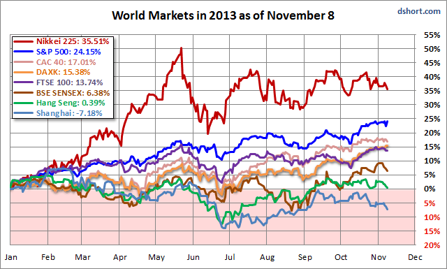
For the past couple of months I've included a daily chart of the Nikkei with its Fibonacci retracement highlighted. The behavior of the index against this metric remains fascinating. The index closed the week south of its 50% retracement. This Fibonacci "jungle gym" continues to be a feature of the Abenomics playground.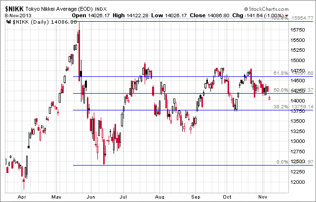
Here is a table highlighting the 2013 year-to-date gains, sorted in that order, along with the 2013 interim highs for the eight indexes. The strong performance of Japan's Nikkei, despite its big correction and subsequent volatility, puts it solidly in the top spot with a 35.51% YTD gain but well off its peak gain of 50.33%. Only the Shanghai Composite is stuck in the red YTD.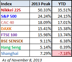
A Closer Look at the Last Four Weeks
The tables below provide a concise overview of performance comparisons over the past four weeks for these eight major indexes. I've also included the average for each week so that we can evaluate the performance of a specific index relative to the overall mean and better understand weekly volatility. The colors for each index name help us visualize the comparative performance over time.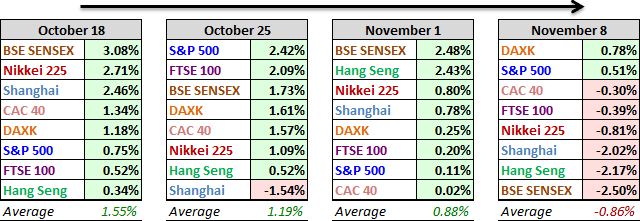
The chart below illustrates the comparative performance of World Markets since March 9, 2009. The start date is arbitrary: The S&P 500, CAC 40 and BSE SENSEX hit their lows on March 9th, the Nikkei 225 on March 10th, the DAX on March 6th, the FTSE on March 3rd, the Shanghai Composite on November 4, 2008, and the Hang Seng even earlier on October 27, 2008. However, by aligning on the same day and measuring the percent change, we get a better sense of the relative performance than if we align the lows.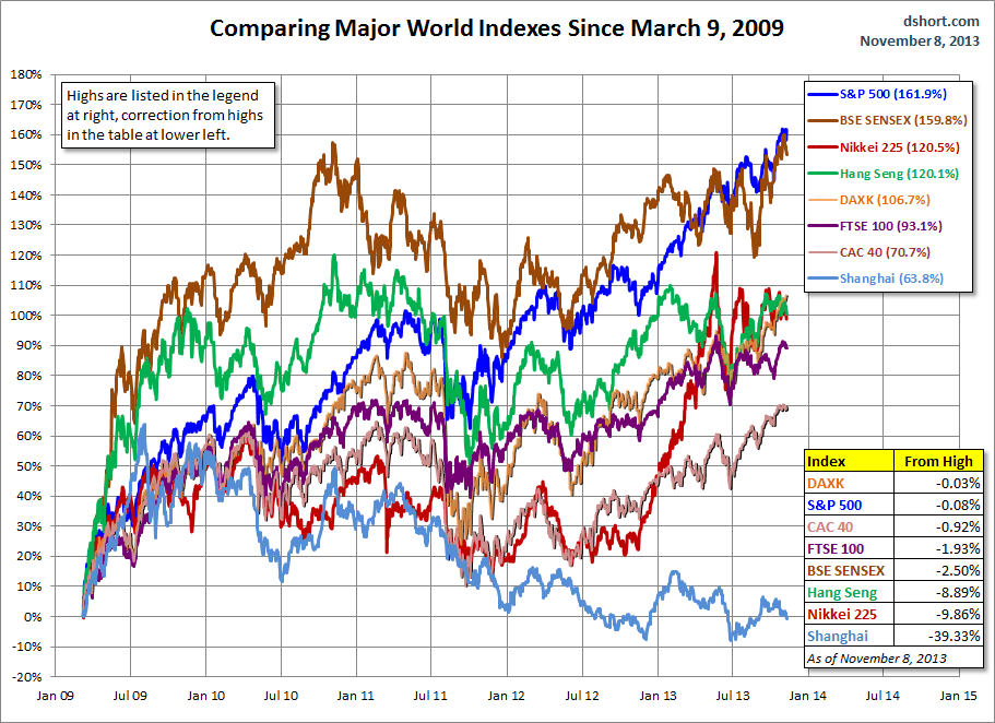
A Longer Look Back
Here is the same chart starting from the turn of 21st century. The relative over-performance of the emerging markets (Shanghai, Mumbai SENSEX and Hang Seng) up to their 2007 peaks is evident, and the SENSEX remains by far the top performer. The Shanghai, in contrast, formed a perfect Eiffel Tower from late 2006 to late 2009. 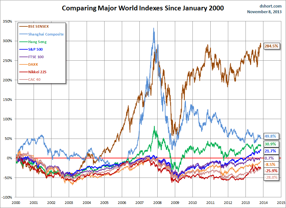
Check back next week for a new update.
Note from dshort: I track Germany's DAXK a price-only index, instead of the more familiar DAX index (which includes dividends), for constency with the other indexes, which do not include dividends.
- English (UK)
- English (India)
- English (Canada)
- English (Australia)
- English (South Africa)
- English (Philippines)
- English (Nigeria)
- Deutsch
- Español (España)
- Español (México)
- Français
- Italiano
- Nederlands
- Português (Portugal)
- Polski
- Português (Brasil)
- Русский
- Türkçe
- العربية
- Ελληνικά
- Svenska
- Suomi
- עברית
- 日本語
- 한국어
- 简体中文
- 繁體中文
- Bahasa Indonesia
- Bahasa Melayu
- ไทย
- Tiếng Việt
- हिंदी
World Markets Update: The Rally Takes A Pause
Published 11/10/2013, 12:12 AM
Updated 07/09/2023, 06:31 AM
World Markets Update: The Rally Takes A Pause
Latest comments
Loading next article…
Install Our App
Risk Disclosure: Trading in financial instruments and/or cryptocurrencies involves high risks including the risk of losing some, or all, of your investment amount, and may not be suitable for all investors. Prices of cryptocurrencies are extremely volatile and may be affected by external factors such as financial, regulatory or political events. Trading on margin increases the financial risks.
Before deciding to trade in financial instrument or cryptocurrencies you should be fully informed of the risks and costs associated with trading the financial markets, carefully consider your investment objectives, level of experience, and risk appetite, and seek professional advice where needed.
Fusion Media would like to remind you that the data contained in this website is not necessarily real-time nor accurate. The data and prices on the website are not necessarily provided by any market or exchange, but may be provided by market makers, and so prices may not be accurate and may differ from the actual price at any given market, meaning prices are indicative and not appropriate for trading purposes. Fusion Media and any provider of the data contained in this website will not accept liability for any loss or damage as a result of your trading, or your reliance on the information contained within this website.
It is prohibited to use, store, reproduce, display, modify, transmit or distribute the data contained in this website without the explicit prior written permission of Fusion Media and/or the data provider. All intellectual property rights are reserved by the providers and/or the exchange providing the data contained in this website.
Fusion Media may be compensated by the advertisers that appear on the website, based on your interaction with the advertisements or advertisers.
© 2007-2025 - Fusion Media Limited. All Rights Reserved.
