When gold ETFs broke out on August 31, we bought DB Gold Double Long (DGP), a leveraged version of the popular SPDR Gold Trust (GLD). In the following day’s commentary, we briefly pointed out that silver ETFs (such as SLV) had broken out as well. In fact, the spot silver commodity has actually been outperforming spot gold (and the corresponding precious metals ETFs) in recent weeks. So, if silver ETFs have been showing more near-term strength than gold ETFs, why did we enter a gold ETF trade instead? Here’s why:
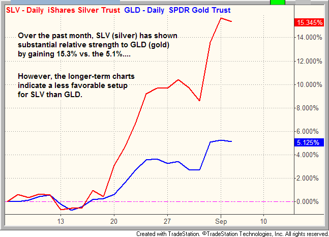
Below is a “percentage change chart” that compares the price of the main silver ETF (SLV) versus the popular gold ETF (GLD). Rather than showing actual prices of each ETF, this type of chart merely compares the performance of one instrument to another, and reports the percentage price differences between the two. The chart shows the relative price action between SLV versus GLD over the past 30 days. Take a look:
As you can see, SLV has clearly been showing relative strength to GLD over the past several weeks. Notice that GLD (the blue line) was tracking relatively in sync with SLV (the red line) until around 17 August. Then, SLV suddenly began to show relative strength by outperforming GLD. Over the past 30 days, the chart also indicates that SLV has gained 15%, while GLD has only rallied 5%. However, one mistake swing traders frequently make is limiting their technical analysis to analyzing only one particular timeframe, such as the daily chart, without comparing the patterns of longer-term chart intervals.
It is important to use multiple time frames when doing your daily research and technical analysis of potential stock and ETF trades because there are times when one chart timeframe indicates a completely different technical situation than another timeframe. As swing traders, we base most of our detailed entry and exit points on the daily chart patterns, but we always assess the longer-term weekly chart patterns to look for confirmation of trend. Ideally, we want both the daily and weekly charts to be aligned with one another. When they are not, the odds of a successful trade are reduced.
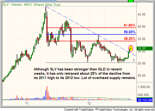
If comparing the longer-term weekly charts of SLV and GLD, it quickly becomes apparent that SLV has a lot more technical price resistance and overhead supply to work through before recovering back to its year 2011 highs. To illustrate this, we use a technical indicator known as Fibonacci retracement lines, which seeks to predict significant price levels where a stock or ETF may reverse, or at least take a significant pause. The first chart below is a weekly chart of $SLV: 
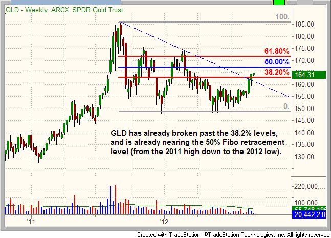
As shown on the chart above, SLV has only retraced about 25% of its decline from the April 2011 high to June 2012 low. It has not even recovered to the first major Fibonacci resistance level of 38.2%, despite its relative strength over the past few weeks. By comparison, take a look at the weekly chart of GLD with Fibonacci retracement lines:
Unlike SLV, GLD has already moved above its 38.2% Fibonacci retracement level, which means it has already reclaimed more of the loss from its year-long correction than SLV. As such, there is proportionately less overhead supply with GLD compared to SLV, which should make it easier for GLD to attempt to rally back to its 2011 highs over the longer-term.
In this situation, where the shorter-term chart of SLV is showing more strength than GLD, but the longer-term chart is showing the opposite, the longer-term chart interval bears the most weight, and therefore holds the most significance in ultimately determining the direction of the trend. If, for example, the daily chart of a stock or ETF shows a bullish breakout above resistance, but the weekly chart shows the breakout to merely be running into a one-year downtrend line, resistance of the downtrend line on the weekly chart should be viewed as more important than the breakout on the daily chart (except perhaps only for intraday traders).
Overall, SLV has indeed been showing relative strength to GLD over the past several weeks, but the question is how long will it be able to retain that relative strength, given that SLV has substantially more technical resistance and overhead supply to contend with than GLD. This is the reason we decided to trade a gold ETF, rather than a silver ETF, when both precious metals broke out above resistance of their 200-day moving averages on August 31. Even though we are primarily short-term stock and ETF traders, we still prefer to have intermediate and long-term price momentum in our favor, rather than fighting against it. Water running down a hill will always flow in the path of least resistance. The same is true of technical analysis in when trading ETFs and stocks, which is why multiple timeframe analysis is so important.
Disclosure: The commentary above is a shortened version of the September 6 issue of The Wagner Daily, our nightly stock and ETF trading newsletter since 2002.
Original post
- English (UK)
- English (India)
- English (Canada)
- English (Australia)
- English (South Africa)
- English (Philippines)
- English (Nigeria)
- Deutsch
- Español (España)
- Español (México)
- Français
- Italiano
- Nederlands
- Português (Portugal)
- Polski
- Português (Brasil)
- Русский
- Türkçe
- العربية
- Ελληνικά
- Svenska
- Suomi
- עברית
- 日本語
- 한국어
- 简体中文
- 繁體中文
- Bahasa Indonesia
- Bahasa Melayu
- ไทย
- Tiếng Việt
- हिंदी
Why We Bought A Gold ETF, Even Though Silver ETFs Were Stronger
Published 09/06/2012, 05:39 AM
Updated 07/09/2023, 06:31 AM
Why We Bought A Gold ETF, Even Though Silver ETFs Were Stronger
Latest comments
Loading next article…
Install Our App
Risk Disclosure: Trading in financial instruments and/or cryptocurrencies involves high risks including the risk of losing some, or all, of your investment amount, and may not be suitable for all investors. Prices of cryptocurrencies are extremely volatile and may be affected by external factors such as financial, regulatory or political events. Trading on margin increases the financial risks.
Before deciding to trade in financial instrument or cryptocurrencies you should be fully informed of the risks and costs associated with trading the financial markets, carefully consider your investment objectives, level of experience, and risk appetite, and seek professional advice where needed.
Fusion Media would like to remind you that the data contained in this website is not necessarily real-time nor accurate. The data and prices on the website are not necessarily provided by any market or exchange, but may be provided by market makers, and so prices may not be accurate and may differ from the actual price at any given market, meaning prices are indicative and not appropriate for trading purposes. Fusion Media and any provider of the data contained in this website will not accept liability for any loss or damage as a result of your trading, or your reliance on the information contained within this website.
It is prohibited to use, store, reproduce, display, modify, transmit or distribute the data contained in this website without the explicit prior written permission of Fusion Media and/or the data provider. All intellectual property rights are reserved by the providers and/or the exchange providing the data contained in this website.
Fusion Media may be compensated by the advertisers that appear on the website, based on your interaction with the advertisements or advertisers.
© 2007-2025 - Fusion Media Limited. All Rights Reserved.
