Putting aside the likely exit of Greece from the euro and the possible exit of Spain from the euro and the stresses this will cause on the currently forgotten woes of Italy and Portugal not to mention the European banks that will likely suffer from liquidity shocks of some sort along with the fact that the world’s biggest economy is sitting in the swamp-like stew of a more than 30-year low velocity of money – think liquidity trap – that could easily tip back into recession with its export-dependence on a recession-stricken Europe as growth in China slows, there are many fundamental reasons to believe that investors might flock to the “safety” of US Treasurys in the months ahead and something that would drive yields down with yield trading inverse to price.
Perhaps the real reason, though, to think that investors will be dumping risk assets left and right for US dollars and Treasurys is Japan and a possible debt crisis that will take most, genuinely, by surprise.
It is this sort of global systemic risk that could come together to drive a flight to liquidity that will cause investors to dump equities, commodities, high-yield debt, investment grade debt and anything attached to the word “risk” to the smallest degree and push them into the relative safety of US dollars and US Treasurys with the dollar index ready to move back toward 88 and the 10-year likely to skim 1% if not a bit lower. Sticking with the 10-year here with a bit of commentary on the buck in the back, this chart is perhaps the scariest chart out there right now relative to the possibility of a severe correction similar, if not worse, than the one in 2008 and 2009.
The reason this chart is so scary at this moment is the fact that the 10-year yield’s 200 DMA is diving through its 50 DMA for a Swan Song based on what happened to follow the last similar move in July 2008.
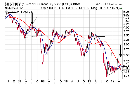
Interesting, though, is the fact that the current crossing actually looks worse than in July 2008 considering it is pretty clear that that the 200 DMA is taking out the flat-to-sagging 50 DMA whereas in 2008 you could have made the case at the time that it was a mutual cross. Both followed Death Crosses in the year prior with the whole set-up summarized by a relatively near-term and a long-term moving average confirming the downward momentum in the other.
Such downward momentum is unlikely to turn all that quickly to move the 10-year yield out of its major trough, but rather should continue on down on a declining yield as investors start to seek safety and quality quietly ahead of the real eye of the upcoming crisis storm and then probably pretty obviously to cause another spike down to 1% if not below.
Prior to turning to a chart that provides a pattern for that potential plunge, let’s turn back quickly to the chart of the 10-year’s 50 and 200 DMAs to discuss why crosses in 2009 and 2011 were neither the Swan Song slice dive or a Golden Cross and this is for the fact that the rising 50 DMA took out a drooping 200 DMA – it was not the 200 DMA taking out the 50 DMA to eliminate the Swan Song possibility – while it is not a legitimate Golden Cross due to the drooping 200 DMA. More important to discuss around this chart is the fact that Bear Fan Lines can be used to track past spike downs in the 10-year yield and this reversal technique suggests that the 10-year is likely to reverse its current sideways stall to the downside due to the very fact that it is possible to monitor that reversal in the first place.
Supporting this likely reversal and responsible for it really is a Symmetrical Triangle presenting in a very bearish manner at this point as opposed to as a bottoming pattern as it often is and this is shown well in the 3-year daily with an initial reaction out of the original pattern to the upside but one that proved to be false as shown by the recent pullback.
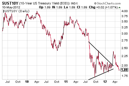
Likely now is more sideways scuffle to legitimately make this Symmetrical Triangle to give it a shot at the upside again.
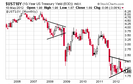
As can be seen, this Symmetrical Triangle is clearly favoring its downside causing it to look heavy but before that heaviness likely gives way to the downside, the 10-year yield may make a move back up toward 2.25% or so to fill out that pattern a bit more before making its true directional break.
If up, it confirms at 2.42% for a target of 3.12% and this possibility is supported by an unclosed gap at 2.82% and a descending trendline comprised of resistance.
If down, it confirms at 1.72% for an aggressive target of 0.69% and a more conservative target of 1.02% with the 200 DMA’s current slicing of the 50 DMA as both moving averages appear ready to keep sliding a strong signal that the 10-year’s Symmetrical Triangle will break to the downside.
It is for this reason, along with some of the other thoughts shared, that strongly suggests that the 10-year is going sub-1%.
Sam’s Stash, Gold and the S&P
Very quickly on the dollar index, it is fulfilling a bullish Falling Wedge with a target of about 88 and its next move up should be big and fast on the Symmetrical Triangle marked in to the right that confirms at 81.78 for a target of about 86 and right near the top trendline of that long-term Symmetrical Triangle.
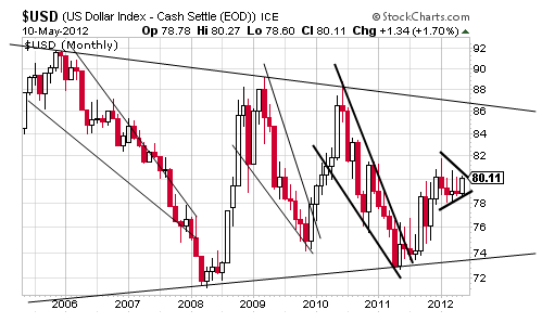
It is that Symmetrical Triangle that could truly take the dollar index higher in the years ahead and probably not on a new phase of economic strength but probably more on the previously discussed flight to relative safety and quality and something particularly true if accompanied by a sub-1% 10-year.
Perhaps the real reason, though, to think that investors will be dumping risk assets left and right for US dollars and Treasurys is Japan and a possible debt crisis that will take most, genuinely, by surprise.
It is this sort of global systemic risk that could come together to drive a flight to liquidity that will cause investors to dump equities, commodities, high-yield debt, investment grade debt and anything attached to the word “risk” to the smallest degree and push them into the relative safety of US dollars and US Treasurys with the dollar index ready to move back toward 88 and the 10-year likely to skim 1% if not a bit lower. Sticking with the 10-year here with a bit of commentary on the buck in the back, this chart is perhaps the scariest chart out there right now relative to the possibility of a severe correction similar, if not worse, than the one in 2008 and 2009.
3rd party Ad. Not an offer or recommendation by Investing.com. See disclosure here or remove ads.
The reason this chart is so scary at this moment is the fact that the 10-year yield’s 200 DMA is diving through its 50 DMA for a Swan Song based on what happened to follow the last similar move in July 2008.

Interesting, though, is the fact that the current crossing actually looks worse than in July 2008 considering it is pretty clear that that the 200 DMA is taking out the flat-to-sagging 50 DMA whereas in 2008 you could have made the case at the time that it was a mutual cross. Both followed Death Crosses in the year prior with the whole set-up summarized by a relatively near-term and a long-term moving average confirming the downward momentum in the other.
Such downward momentum is unlikely to turn all that quickly to move the 10-year yield out of its major trough, but rather should continue on down on a declining yield as investors start to seek safety and quality quietly ahead of the real eye of the upcoming crisis storm and then probably pretty obviously to cause another spike down to 1% if not below.
Prior to turning to a chart that provides a pattern for that potential plunge, let’s turn back quickly to the chart of the 10-year’s 50 and 200 DMAs to discuss why crosses in 2009 and 2011 were neither the Swan Song slice dive or a Golden Cross and this is for the fact that the rising 50 DMA took out a drooping 200 DMA – it was not the 200 DMA taking out the 50 DMA to eliminate the Swan Song possibility – while it is not a legitimate Golden Cross due to the drooping 200 DMA. More important to discuss around this chart is the fact that Bear Fan Lines can be used to track past spike downs in the 10-year yield and this reversal technique suggests that the 10-year is likely to reverse its current sideways stall to the downside due to the very fact that it is possible to monitor that reversal in the first place.
3rd party Ad. Not an offer or recommendation by Investing.com. See disclosure here or remove ads.
Supporting this likely reversal and responsible for it really is a Symmetrical Triangle presenting in a very bearish manner at this point as opposed to as a bottoming pattern as it often is and this is shown well in the 3-year daily with an initial reaction out of the original pattern to the upside but one that proved to be false as shown by the recent pullback.

Likely now is more sideways scuffle to legitimately make this Symmetrical Triangle to give it a shot at the upside again.

As can be seen, this Symmetrical Triangle is clearly favoring its downside causing it to look heavy but before that heaviness likely gives way to the downside, the 10-year yield may make a move back up toward 2.25% or so to fill out that pattern a bit more before making its true directional break.
If up, it confirms at 2.42% for a target of 3.12% and this possibility is supported by an unclosed gap at 2.82% and a descending trendline comprised of resistance.
If down, it confirms at 1.72% for an aggressive target of 0.69% and a more conservative target of 1.02% with the 200 DMA’s current slicing of the 50 DMA as both moving averages appear ready to keep sliding a strong signal that the 10-year’s Symmetrical Triangle will break to the downside.
3rd party Ad. Not an offer or recommendation by Investing.com. See disclosure here or remove ads.
It is for this reason, along with some of the other thoughts shared, that strongly suggests that the 10-year is going sub-1%.
Sam’s Stash, Gold and the S&P
Very quickly on the dollar index, it is fulfilling a bullish Falling Wedge with a target of about 88 and its next move up should be big and fast on the Symmetrical Triangle marked in to the right that confirms at 81.78 for a target of about 86 and right near the top trendline of that long-term Symmetrical Triangle.

It is that Symmetrical Triangle that could truly take the dollar index higher in the years ahead and probably not on a new phase of economic strength but probably more on the previously discussed flight to relative safety and quality and something particularly true if accompanied by a sub-1% 10-year.
Which stock should you buy in your very next trade?
AI computing powers are changing the stock market. Investing.com's ProPicks AI includes 6 winning stock portfolios chosen by our advanced AI. In 2024 alone, ProPicks AI identified 2 stocks that surged over 150%, 4 additional stocks that leaped over 30%, and 3 more that climbed over 25%. Which stock will be the next to soar?
Unlock ProPicks AI
