Does anything about 2014 remind you of 2008?
For example, the increasing signs of stress in the global financial system, from periphery currencies crashing to China’s shadow banking bailouts to the constant flow of official assurances that all is well and whatever situations aren’t well are on the mend.
The long lists of visible stress in the global financial system and the almost laughably hollow assurances that there are no bubbles, everything is under control, etc. etc. etc. certainly remind me of the late-2007-early 2008 period when the subprime mortgage meltdown was already visible and officialdom from Federal Reserve chairman Alan Greenspan on down were mounting the bully pulpit at every opportunity to declare that there was no bubble in housing and the system was easily able to handle little things like defaulting mortgages.
Some five years after repeatedly declaring there was no bubble in housing and nothing to worry about even as the global financial system was coming apart at the seams, Greenspan bleated out a shopworn and not very credible mea culpa, Never Saw It Coming: Why the Financial Crisis Took Economists By Surprise (Foreign Affairs magazine, December 2013). First, he claimed no one foresaw the crisis, and second, he attributed this failure to a lack of insight into “animal spirits,” the emotional drivers of behavior.
Greenspan claimed that the herd behavior of animal spirits drove financial firms (i.e. Wall Street and Too Big To Fail banks) to keep extending risky bets lest they lose fat profits by exiting the risk-on trade too early. In Greenspan’s view, the abundance of apparent liquidity in the bullish phase created the expectation that the liquidity would be available when everyone decided to sell their positions and exit the risk-on trades.
In Greenspan’s words:
“Financial firms accepted the risk that they would be unable to anticipate the onset of a crisis in time to retrench. However, they thought the risk was limited, believing that even if a crisis developed, the seemingly insatiable demand for exotic financial products would dissipate only slowly, allowing them to sell almost all their portfolios without loss.
They were mistaken. They failed to recognize that market liquidity is largely a function of the degree of investors’ risk aversion, the most dominant animal spirit that drives financial markets. Leading up to the onset of the crisis, the decreased risk aversion among investors had produced increasingly narrow credit yield spreads and heavy trading volumes, creating the appearance of liquidity and the illusion that firms could sell almost anything. But when fear-induced market retrenchment set in, that liquidity disappeared overnight, as buyers pulled back. In fact, in many markets, at the height of the crisis of 2008, bids virtually disappeared.”
It wasn’t just gamblers and financiers who were mistaken—so was Greenspan. Numerous analysts waved the warning flag long before 2008, and the financial media began publishing stories about the housing bubble as early as 2005. In claiming no one foresaw the inevitability of a subprime mortgage meltdown and a domino effect on securitized debt based on those mortgages, Greenspan is flat-out wrong.
Greenspan is also off-track on another of his claims: that the global financial meltdown of 2008 was widely considered a “once in a lifetime” tail risk, too unlikely to ever happen.
The founder of fractal mathematics, Benoit Mandelbrot, published a book in 2004 titled The (Mis)Behavior of Markets: A Fractal View of Risk, Ruin and Reward that completely eviscerated the standard portfolio model of immense faith in the low odds of major crises ever erupting in modern hedged markets.
On the contrary, Mandelbrot showed, major crises were likely to erupt far more often than predicted, and with less predictability than was assumed by the cohort of economists and financiers that dominated the Fed and Wall Street.
In other words, not only was the global meltdown of 2008 foreseeable, it was inevitable.
Looking to Charts for Clues
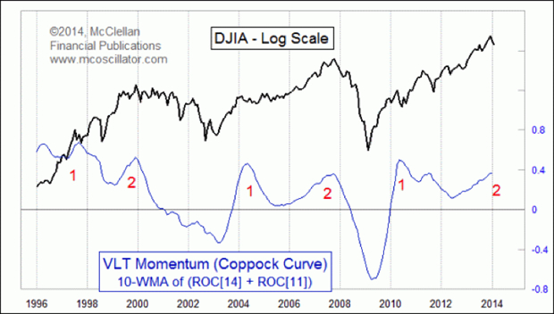
A number of technical analysts have been posting charts that suggest a meltdown-type decline in global markets could occur in 2014—there’s an analog chart of 1929 making the rounds, and Tom McClellan published a chart of the Coppock Curve indicator that looks like the next downdraft is imminent.
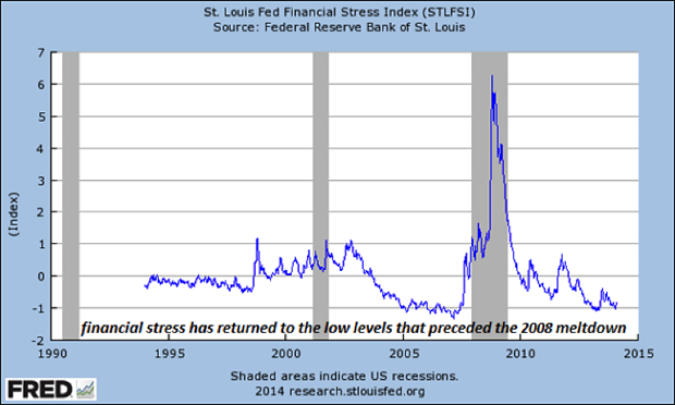
Chris Kimble published a chart of the St. Louis Fed financial stress index that suggests market complacency has returned to the low levels last touched just before the 2008 global financial meltdown. (Kimble annotated his copy of the chart; this is the plain chart.)
There are a great many indicators, metrics and correlations to watch for signs of a breakdown: analog charts that overlay the current markets onto past eras, corporate earnings, credit spreads, volatility indices, investor sentiment readings, inflation expectations, and various carry trades and ratios such as the S&P 500 (SPX) to gold, oil, Treasury yields and so on.
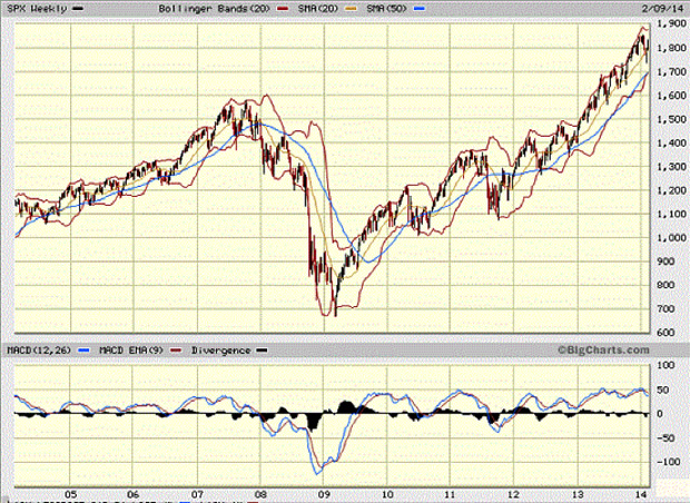
Just for context, here is a chart of the S&P 500 (SPX) from 2005 to the present:
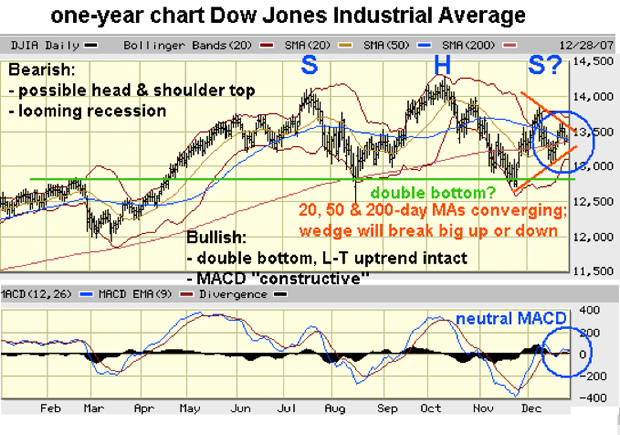
Hindsight is 20-20, as the saying goes, so it’s worthwhile to look at a chart of the Dow Jones Industrial Average (DJIA) I annotated on December 30, 2007. The head and shoulders visible in the above chart—a classic topping pattern—was already visible, but technically, a bullish case could still be made at the end of 2007.
By late summer 2008, just before the collapse of Lehman Brothers unleashed a cascading decline in global markets, the technical picture was much uglier:
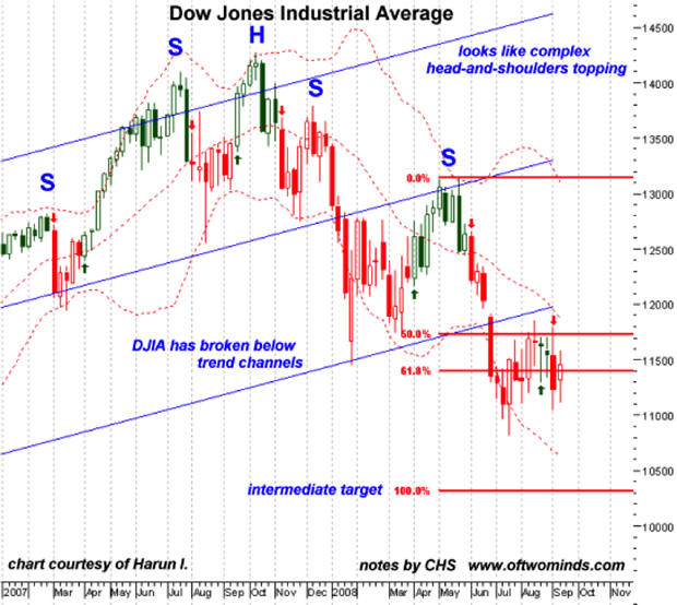
The Bullish case had been extinguished by June, when the recovery broke down at the uptrend line, and as a result there were technical reasons to target the 10,300 level (and once below that, then on to even lower targets).
Properly used, charts help us anticipate what might happen once various targets are hit, but that’s not the same as forecasting a timeline for a global crisis and meltdown. To do that, some fundamental and/or cyclical analysis must be brought to bear.
For example, consider this chart from my friend and colleague Gordon Long of Gordon T. Long Market Analytics & Technical Analysis.
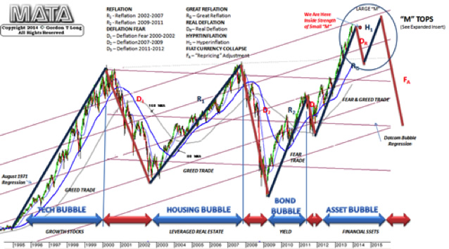
This chart combines an analysis of trend lines and patterns with cycles of speculative bubbles and inflation, deflationary fear, reflation and real deflation.
Martin Armstrong and other analysts have published forecasts based on cycles: the four-year cycle, the 8.3 year cycle, etc. It is noteworthy that the market peaks in January 2000 and late 2007 were about eight years apart, as were the bottoms in 2002 and 2009.
It’s tempting to extend these cycles and forecast the next top in 2015 and the next bottom in 2017, and perhaps that’s exactly what will transpire. But if we take Mandelbrot’s lessons to heart, we have to accept the fractal nature of markets and the possibility that these cycles may not be reliable guides.
Here are three more charts for your consideration, of income and employment. I’ve annotated the first chart to match what I view as the waves of financialization that have inflated speculative credit bubbles and temporarily, incomes:
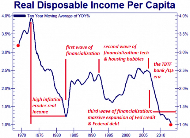
Notice that the current asset reflations (or bubbles, if you dare speak the word openly) in stocks, bonds and real estate have failed to lift the year-over-year rate of change in disposable per capita income, which has been declining since 2007.
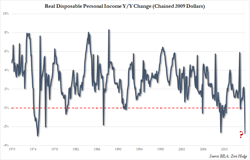
Income per capita doesn’t reflect the enormous divide between the top 10%, who have seen their incomes rise in financialization, and the bottom 90%, who have seen their income stagnate for four decades:
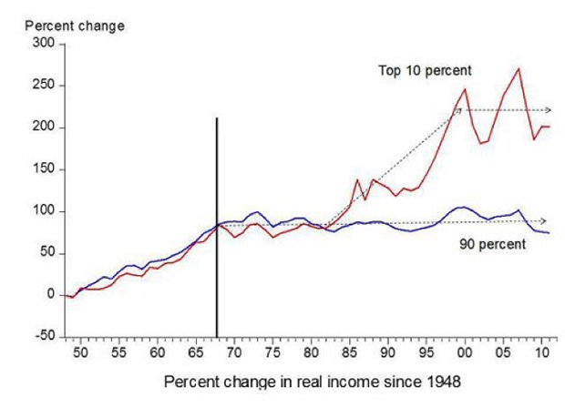
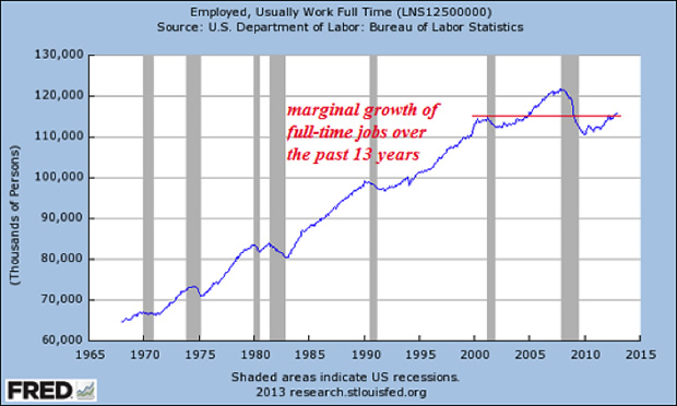
The number of full-time jobs has also failed to reach the peak set in 2007; clearly, the current asset bubbles have failed to boost meaningful (i.e. full-time) employment.
The Party Is Clearly Ending
Collectively, these charts above force us to ask two questions:
1. If asset bubbles no longer boost full-time employment or incomes across the board, what is the broad-based, “social good” justification for inflating them?
2. If employment and incomes are stagnating for the vast majority of Americans, how much longer can assets increase in price, presuming there is still some correlation between incomes and sales, profits, creditworthiness, etc.?
In Part 2: What Will Be Different About the Crisis of 2014/2015, we unpack the unprecedented state and central bank policies that turned a global financial rout into one of the most extended Bull markets in history, and make the case that these -- policies designed to combat a liquidity crisis and then a collateral crisis -- have reached diminishing returns.
As a result the next crisis will not be a repeat of 2008 but a much less fixable and much more monumental crisis.
by Charles Hugh Smith
